When Presenting Your Data, Get to the Point Fast by Nancy Duarte.
From the post:
Projecting your data on slides puts you at an immediate disadvantage: When you’re giving a presentation, people can’t pull the numbers in for a closer look or take as much time to examine them as they can with a report or a white paper. That’s why you need to direct their attention. What do you want people to get from your data? What’s the message you want them to take away?
Data slides aren’t really about the data. They’re about the meaning of the data. And it’s up to you to make that meaning clear before you click away. Otherwise, the audience won’t process — let alone buy — your argument.
Nancy starts off with a fairly detailed table full of numbers, that is less complex than some topic map diagrams I have seen. 😉
Moves onto the infamous pie chart* and then to a bar chart.
The lesson being to present information in a way it can be immediately comprehended by your audience.
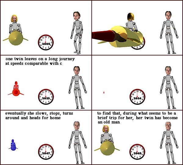
Here’s a non-topic map illustration, explaining time dilation:
Here’s another explanation of time dilation:
Both “explain” time dilation but one to c-suite types and the other to techies.
Problem: C-suite types control the purse strings.
Question: What issues do c-suite types see that topic maps can address?
*Leland Wilkinson in The Grammar of Graphics, 2nd ed., writes of pie charts:
A pie chart is perhaps the most ubiquitous of modern graphics. It has been reviled by statisticians (unjustifiably) and adored by managers (unjustifiably).
So far (I am at chapter 3), Wilkinson doesn’t elaborate on his response to criticisms of pie charts by statisticians.
Not important for this discussion but one of those tidbits that livens up a classroom discussion.
I first saw this in a tweet by Gregory Piatetsky.

