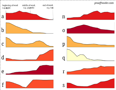
Graphing the distribution of English letters towards the beginning, middle or end of words by David Taylor.
From the post:
(partial image)
Some data visualizations tell you something you never knew. Others tell you things you knew, but didn’t know you knew. This was the case for this visualization.
Many choices had to be made to visually present this essentially semi-quantitative data (how do you compare a 3- and a 13-letter word?). I semi-exhaustively explain everything at on my other, geekier blog, prooffreaderplus, and provide the code I used; I’ll just repeat the most crucial here:
…
The counts here were generated from Brown corpus, which is composed of texts printed in 1961.
Take Taylor’s post as an inducement to read both Prooffreader Plus and Prooffreader on a regular basis.
