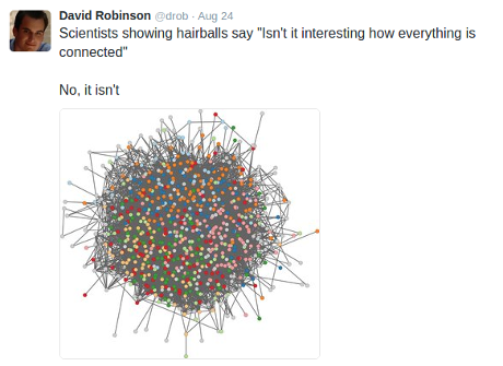
An example of a non-useful “hair ball” graph visualization:
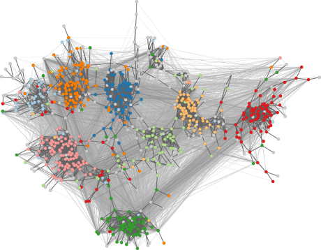
That image is labeled as “standard layout” at a site that offers this cohesion adapted layout alternative:
The full-size image is quite impressive.
If you were attempting to visualize vulnerabilities, which one would you pick?

