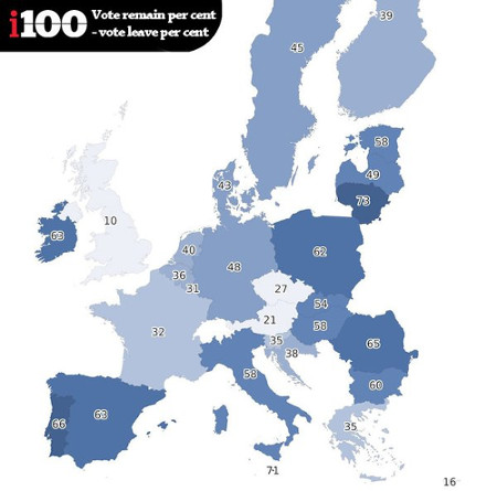
Before you read The map showing which countries want the UK to stay in the EU or my comment below, a question for you:
Do countries shaded in lighter colors support the UK remaining in the EU?
Simple enough question.
Unfortunately you are looking at one of the worst representations of sentiment I have seen in a long time.
From the post:
The indy100 have created the following graphic based on the data. In the map, the darker the shade of blue, the more support there is in that country for the UK to remain in the EU. The scores are calculated by subtracting the percentage of people who want Britain to leave, from those who want Britain to remain.
That last line:
“The scores are calculated by subtracting the percentage of people who want Britain to leave, from those who want Britain to remain.”
is what results in the odd visualization.
A chart later in the post reports that support for UK leaving the EU is only 18% in France, which would be hard to guess from the “32” shown on the map.
The map shows the gap between two positions, one for the UK to stay and the other for it to leave, and the shading represents the distance between staying and supporting positions.
That is if public opinion were 50% to stay in the EU and 50% to leave the EU, that county would be colored clear with a score of 0.
Reporting support and/or opposition percentages with coloration based on those percentages would be far clearer.
