This Chart Shows Who Marries CEOs, Doctors, Chefs and Janitors by Adam Pearce and Dorothy Gambrell.
From the post:
When it comes to falling in love, it’s not just fate that brings people together—sometimes it’s their jobs. We scanned data from the U.S. Census Bureau’s 2014 American Community Survey—which covers 3.5 million households—to find out how people are pairing up. Some of the matches seemed practical (the most common marriage is between grade-school teachers), and others had us questioning Cupid’s aim (why do female dancers have a thing for male welders?). High-earning women (doctors, lawyers) tend to pair up with their economic equals, while middle- and lower-tier women often marry up. In other words, female CEOs tend to marry other CEOs; male CEOs are OK marrying their secretaries.
The listing of occupations and spousal relationship is interactive on mouse-over and you can type in the name of a profession. (Warning: On typing in the profession name, it must be a case match for the term in this listing.
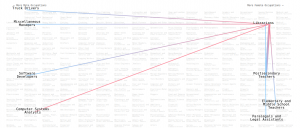
Here’s a sample for Librarians:
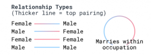
The relationships are gender-coded:
Try to guess which occupations have “marries within occupation” and those which do not.
For each of the following, what is your guess about marrying within the occupation or not?
- Ambulance Drivers
- Atmospheric and Space Scientists
- Economists
- Postal Service
This looks like a great browsing technique for exploring relationships (associations).

