I posted a color coded version of a congressional roll call vote in Jazzing a Roll Call Vote – Part 2 (XQuery, well XSLT anyway), using red for Republicans and blue for Democrats. #XQuery points out accessibility issues which depend upon color perception.
Color coding works better for me than the more traditional roman versus italic font face distinction but let’s improve the color coding to remove the accessibility issue.
The first question is what colors should I use for accessibility?
In searching to answer that question I found this thread at Edward Tufte’s site (of course), Choice of colors in print and graphics for color-blind readers, which has a rich list of suggestions and pointers to other resources.
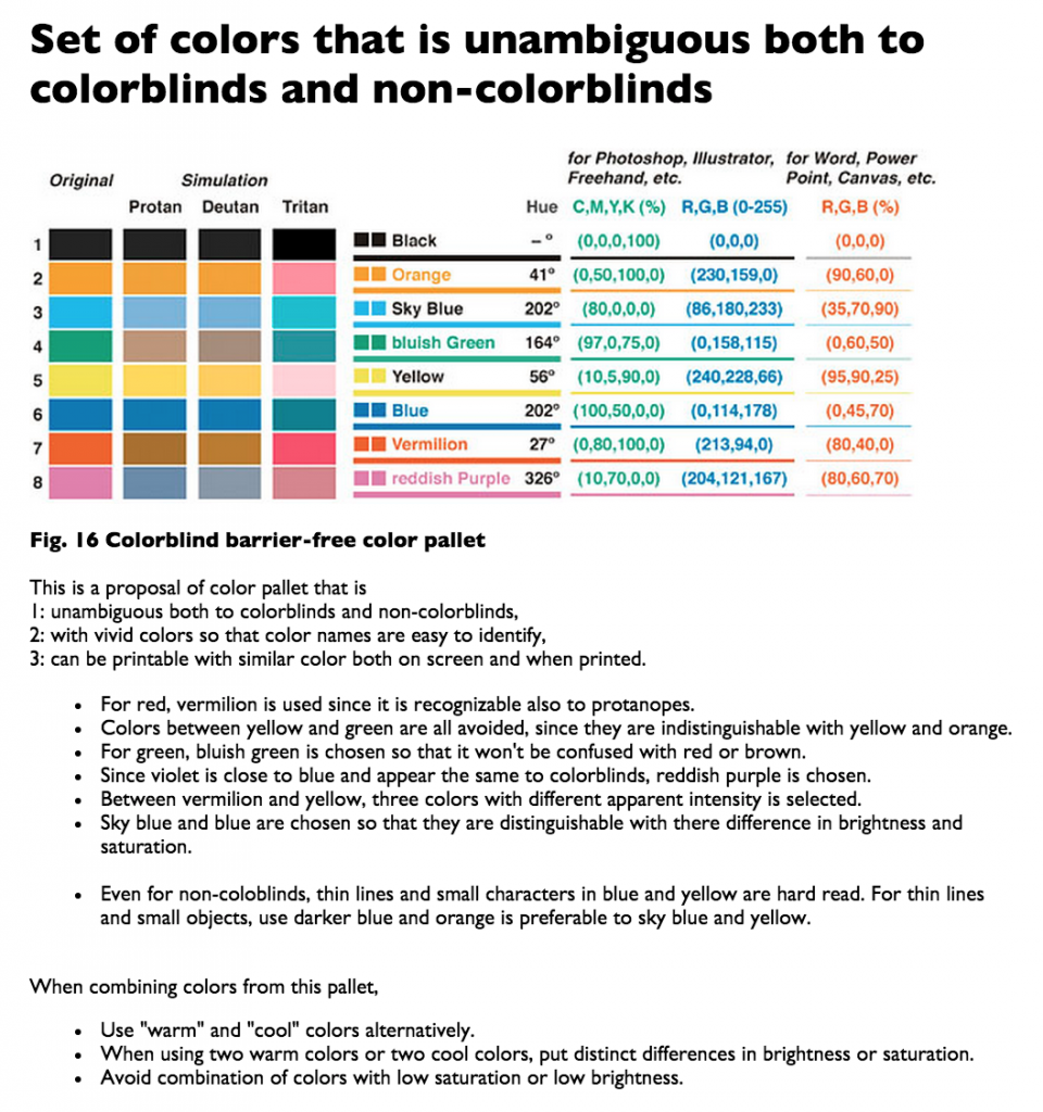
One in particular, Color Universal Design (CUD), posted by Maarten Boers, has this graphic on colors:
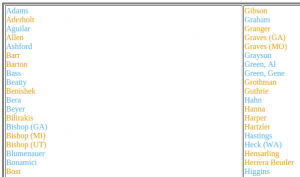
Relying on that palette, I changed the colors for the roll call vote to Republicans in orange; Democrats in sky blue and re-generated the roll call document.
Here is an accessible version, but color-coded version of: FINAL VOTE RESULTS FOR ROLL CALL 705.
An upside of XML is that changing the presentation of all 429 votes took only a few seconds to change the stylesheet and re-generate the results.
Thanks to #XQuery for prodding me on the accessibility issue which resulted in finding the thread at Tufte and the Colorblind barrier-free color pallet.
Other post on congressional roll call votes:
1. Jazzing Up Roll Call Votes For Fun and Profit (XQuery)
2. Jazzing a Roll Call Vote – Part 2 (XQuery, well XSLT anyway)

