From the webpage:
(a collaborative effort by @alexcpsec & @hrbrmstr)
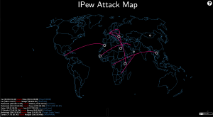
Why should security vendors be the only ones allowed to use silly, animated visualizations to “compensate”? Now, you can have your very own IP attack map that’s just as useful as everyone else’s.
IPew is a feature-rich, customizable D3 / javascript visualization, needing nothing more than a web server capable of serving static content and a sense of humor to operate. It’s got all the standard features that are expected including:
- Scary dark background!
- Source & destination country actor/victim attribution!
- Inane attack names!
BUT, it has one critical element that is missing from the others: SOUND EFFECTS! What good is a global cyberbattle without some cool sounds.
In all seriousness, IPew provides a simple framework – based on Datamaps – for displaying cartographic attack data in a (mostly) responsive way and shows how to use dynamic data via javascript event timers and data queues (in case you’re here to learn vs have fun – or both!).
…
One important feature, if you work inside the beltway in DC, you can set all attacks as originating from North Korea or China.
Instructive and fun!
Enjoy!
