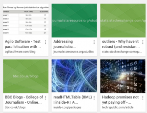
An update of Google Chrome on Ubuntu this morning took my normal bookmark manager list of small icons and text to:
What do the kids say these days?
That sucks!
Some of you may prefer the new display. Good for you.
As far as I can tell, Chrome does not offer an option to revert to the previous display.
I keep quite a few bookmarks with an active blog so the graphic images are a waste of screen space and force me to scroll far more often than otherwise. I often work with the bookmark manager open in a separate screen.
For people who like this style, great. My objection is to it being forced on users who may prefer the prior style of bookmarks.
Here’s your design tip for the day: Don’t help users without giving them the ability to decline the help. Especially with display features.
