I saw a tweet today referencing Cartographies of Time: A Visual History of the Timeline by Maria Popova by The O.C.R. I have posted about it before Cartographies of Time:… but re-reading material can result in different takes on it. Today is an example of that.
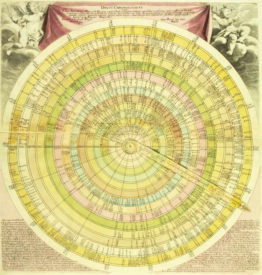
Today when I read the post I recognized the potential of the Discus chronologicus (which has no Wikipedia entry), could be the physical manifestation of a topic map. Or at least one with undisclosed reasons for mapping between domains.

Granting it does not provide you with the properties of each subject, save possibly a name (you need something to recognize), with each ring representing what Steve Newcomb calls a “universe of discourse,” and the movable arm represents warp holes between those universes of discourse at particular subjects.
This could be a useful prop for marketing topic maps.
First, it introduces the notion of different vocabularies (universes of discourse) in a very concrete way and demonstrates the advantage of being able to move from one to another. (Assuming here you have chosen universes of discourse of interest to the prospect.)
Second, the lack of space means that it is missing the properties that enabled the mapping, a nice analogy to the construction of most information systems. You can assure the prospect that digital topic maps include that information.
Third, unlike this fixed mapping, another analogy to current data systems, more universes of discourse and subjects can be added to a digital topic map. While at the same time, you retain all the previous mappings. “Recycling prior work,” “not paying 2, 3 or more times for mappings,” are just some of the phrases that come to mind.
I am assuming composing the map in Gimp or other graphics program is doable. The printing and assembly would be more problematic. Will be looking around. Suggestions welcome!