From the about:
Ekisto comes from ekistics, the science of human settlements.
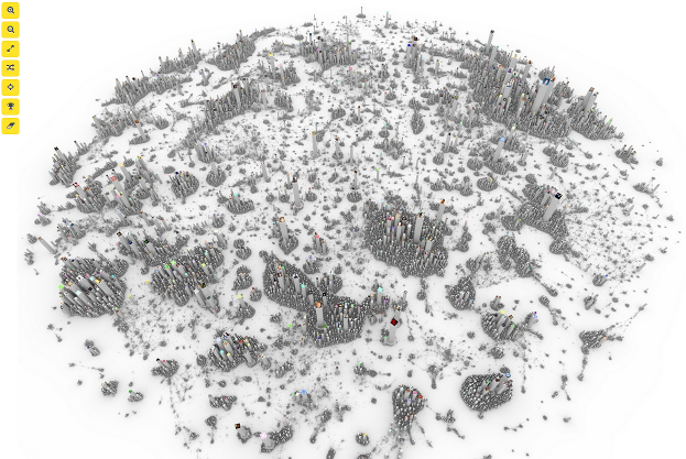
Ekisto is an interactive visualization of three online communities: StackOverflow, Github and Friendfeed. Ekisto tries to imagine and map our online habitats using graph algorithms and the city as a metaphor.
A graph layout algorithm arranges users in 2D space based on their similarity. Cosine similarity is computed based on the users’ network (Friendfeed), collaborate, watch, fork and follow relationships (Github), or based on the tags of posts contributed by users (StackOverflow). The height of each user represents the normalized value of the user’s Pagerank (Github, Friendfeed) or their reputation points (StackOverflow).
A project by Alex Dragulescu.
The three communities modeled are:
- stackoverflow.jul.2013
- github.mar.2012
- friendfeed.feb.2012
Stackoverflow can be searched by name but Github and FriendFeed, only by userid. Which makes moving from one community to the next along a particular user almost impossible.
I mention that because we all participate in many different communities and our roles and even status may vary widely from community to community.
Any one community view is an incomplete view of that person.
Beyond the need to map across communities, the other take away from Ekisto is the question of community formation?
That is, given the present snapshot of these communities, how did they evolve over time? Did particular people joining have a greater impact than others? Did some event trigger a rise in membership?
Deeply interesting work and a reason to learn more about ekistics.
I first saw this in a tweet by Neil Saunders.
