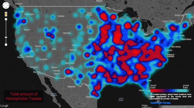
Geography of hate against gays, races, and the disabled by Nathan Yau.

Nathan reports on the work of Floating Sheep who relied on 150,000 tags to create this map.
More details at Nathan’s site but as Nathan says, read the FAQ before you get too torqued about the map.
If nothing else, this should be a good lesson in the choices made collecting and mapping “objective” data (the tweets) and what questions you should ask about that process.
I found it interesting that the sea coast along the Gulf of Mexico seemed to have less hate.
How would you defend the choices you make when making a topic map?
Some information, that is important to someone will have to be left out. Was that out of religious, political, social or ethnic bias?
You can’t avoid that sort of question but you can be comfortable with your own answers should it arise.
My stock response is:
“The paying client is happy with the map. Become a paying client and you can be map happy too.”