Another Word For It Patrick Durusau on Topic Maps and Semantic Diversity

February 10, 2013

Storyboarding in the Software Design Process

Filed under: Design,Interface Research/Design,Storyboarding — Patrick Durusau @ 3:44 pm

Storyboarding in the Software Design Process by Ambrose Little

From the post:

Using storyboards in software design can be difficult because of some common challenges and drawbacks to the tools we have. The good news is that there’s a new, free tool that tries to address many of these issues. But before I get into that, let’s revisit the value of using storyboards (and stories in general) in software design.

Using stories in some form or another is a well-established practice in software design, so much so that there are many meanings of the term “stories.” For instance, in agile processes, there is a concept of “user stories,” which are very basic units of expressing functional requirements: “As a user, I want to receive notifications when new applications are submitted.”

In user experience design, these stories take on more life through the incorporation of richer user and usage contexts and personas: real people in real places doing real things, not just some abstract, feature-oriented description of functionality that clothes itself in a generic “user.”

In their book, Storytelling for User Experience, Whitney Quesenbery and Kevin Brooks offer these benefits of using stories in software design:

  • They help us gather and share information about users, tasks, and goals.
  • They put a human face on analytic data.
  • They can spark new design concepts and encourage collaboration and innovation.
  • They are a way to share ideas and create a sense of shared history and purpose.
  • They help us understand the world by giving us insight into people who are not just like us.
  • They can even persuade others of the value of our contribution.

Whatever they’re called, stories are an effective and inexpensive way to capture, relate, and explore experiences in the design process.

The benefit of:

They help us understand the world by giving us insight into people who are not just like us.

was particularly interesting.

The storyboarding post was written for UI design but constructing a topic map could benefit from insight into “people who are not just like us.”

I lean toward the physical/hard copy version of storyboarding, mostly so that technology and it inevitable limitations, doesn’t get in the way.

What I want to capture are the insights of the users, not the insights of the users as limited by the software.

Or better yet, the insights of the users unlimited by my skill with the software.

Not to neglect the use of storyboarding for software, UI/UX purposes as well.

February 9, 2013

…the most hated man in America [circa 2003]

Filed under: Design,Interface Research/Design,Usability,Users — Patrick Durusau @ 8:22 pm

John E. Karlin, Who Led the Way to All-Digit Dialing, Dies at 94

The New York Time obituary for John E. Karlin, the father of the arrangement of numbers on push button phones and a host of other inventions is deeply moving.

Karlin did not have a series of lucky guesses but researched the capabilities and limitations of people to arrive at product design decisions.

Read the article to learn why one person said Karlin was “…the most hated man in America.”

I first saw this at Human Factors by Ed Lazowska.

February 7, 2013

The Semantic Web Is Failing — But Why? (Part 4)

Filed under: Interface Research/Design,RDF,Semantic Web — Patrick Durusau @ 4:30 pm

Who Authors The Semantic Web?

With the explosion of data, “big data” to use the oft-abused terminology, authoring semantics cannot be solely the province of a smallish band of experts.

Ordinary users must be enabled to author semantics on subjects of importance to them, without expert supervision.

The Semantic Web is designed for the semantic equivalent of:

F16 Cockpit

An F16 cockpit has an interface some people can use, but hardly the average user.

VW Dashboard

The VW “Bettle” has an interface used by a large number of average users.

Using a VW interface, users still have accidents, disobey rules of the road, lock their keys inside and make other mistakes. But the number of users who can use the VW interface is several orders of magnitude greater than the F-16/RDF interface.

Designing a solution that only experts can use, if participation by average users is a goal, is a path to failure.


The next series starts with Saving the “Semantic” Web (Part 1)

February 5, 2013

4 Reasons Your UX Investment Isn’t Paying Off [Topic Map UX?]

Filed under: Design,Interface Research/Design,Usability,Users — Patrick Durusau @ 2:18 pm

4 Reasons Your UX Investment Isn’t Paying Off by Hilary Little.

You can imagine why this caught my eye.

From the post:

“Every dollar spent on UX brings in between $2 and $100 dollars in return.”

We all know the business case for doing user experience work: investing upfront in making products easy to use really pays off. It reduces project risk, cost, and time while improving, efficiency, effectiveness, and end user satisfaction.

(Don’t know the business case? Read this or this. Or this.) But what if you’re investing in UX and not getting results?

There can be many factors behind an under-performing user experience effort. Anything from a lack of tools to the zombie apocalypse can wreak havoc on your teams. Addressing either of those factors are outside my area of expertise.

Here’s where I do know what I’m talking about. First, rule out the obvious: your UX folks are jerks, they don’t communicate well, they don’t understand business, they aren’t team players, they have such terrible body odor people stay 10 feet away …

Next, look at your organization. I’ve based the following list on observations accumulated over my years as a UX professional. These are some common organizational “behavior” patterns that can make even the best UX efforts ineffective.

Let that first line soak in for a bit: “Every dollar spent on UX brings in between $2 and $100 dollars in return.”

Then go read the rest of the post for the four organizational patterns to watch for.

Assuming you have invested in professional UX work at all.

I haven’t and my ability to communicate topic maps to the average user is poorer as a result.

Not that I expect average users to “get” that identifications exist in fabrics of identifiers and any identified subject is at the intersection of multiple fabrics of identifiers, whether represented or not.

But to use and appreciate topic maps, that isn’t necessary.

Any more than I have to understand thermodynamics to drive an automobile.

And yes, yes I am working on an automobile level explanation of why topic maps are important.

Or better yet, simply presenting a new automobile and being real quiet about why it works so well. 😉

Sharpening Your Competitive Edge…

Filed under: Design,Interface Research/Design,Usability,Users — Patrick Durusau @ 1:44 pm

Sharpening Your Competitive Edge with UX Research by Rebecca Flavin.

From the post:

It’s part of our daily work. We can’t imagine creating a product or an application without doing it: understanding the user.

Most of the clients we work with at EffectiveUI already have a good understanding of their customers from a market point of view. They know their target demographics and often have an solid sense of psychographics: their customers’ interests, media habits, and lifestyles.

This is all great information that is critical to a company’s success, but what about learning more about a customer than his or her age, gender, interests, and market segment? What about understanding the customer from a UX perspective?

Not all companies take the time to thoroughly understand exactly why, how, when, and where their customers interact with their brand’s, products and digital properties, as well as those of competing products and services. What are the influences, distractions, desires, and emotions that affect users as they try to purchase or engage with your product or interact with your service?

At EffectiveUI, we’ve seen that user research can be a powerful and invaluable tool for aiding strategic business decisions, identifying market opportunities, and ultimately driving better organizational results. When we’re talking to customers about a digital experience, we frequently uncover opportunities for their business as a whole to shift its strategic direction. Sometimes we even find out that the company has completely missed an opportunity with their customers.

As part of the holistic UX process, user research helps us learn more about customers’ pain points, needs, desires, and goals in order to inform digital design or product direction. The methods we generally employ include:

Great post that merits your attention!

What I continue to puzzle over is how to develop user testing for topic map interfaces?

The broad strokes of user testing are fairly well known, but how to implement those for topic map interfaces isn’t clear.

On one hand, a topic map could present its content much as any other web interface.

On the other hand, a topic map could present a “topicmappish” flavor interface.

And there are all the cases in between.

If it doesn’t involve trade secrets, can anyone comment on how they have tested topic map interfaces?

February 4, 2013

Dark Patterns Library

Filed under: Design,Interface Research/Design — Patrick Durusau @ 7:12 pm

Dark Patterns Library by Harry Brignull and Marc Miquel.

From the homepage:

A Dark Pattern is a type of user interface that has been carefully crafted to trick users into doing things, such as buying insurance with their purchase or signing up for recurring bills.

Normally when you think of “bad design”, you think of the creator as being sloppy or lazy but with no ill intent. This type of bad design is known as a “UI anti-pattern” Dark Patterns are different – they are not mistakes, they are carefully crafted with a solid understanding of human psychology, and they do not have the user’s interests in mind.

Has the potential to make you a better consumer.

First saw this at Four short links: 4 February 2013 by Nat Torkington.

jQuery Rain

Filed under: Design,Interface Research/Design,JQuery — Patrick Durusau @ 7:12 pm

jQuery Rain

I happened across jQuery Rain today and thought it worth passing on.

Other web interface sites that you would recommend?

Thinking if you can look at an interface and think, “topic map,” then the interface needs work.

The focus of any interface should be delivery of content and/or capabilities.

Including topic map interfaces.

February 1, 2013

Eight UX Design Trends for 2013

Filed under: Design,Interface Research/Design,Usability,Visualization — Patrick Durusau @ 8:07 pm

Eight UX Design Trends for 2013

Very visual so you will have to consult the post but I can list the titles for the experiences:

  • Downsampling
  • Foodism
  • Quantified Ambition
  • Augmented Dialogue
  • Sensory Bandwidth
  • Agile Economies
  • Faceted Video
  • RetroFuturism

One or more of these may help distinguish your product/services from less successful ones.

January 29, 2013

7 Incredible Web Design, Branding, Digital Marketing Experiences [Abandonment > 65%]

Filed under: Design,Interface Research/Design — Patrick Durusau @ 6:50 pm

7 Incredible Web Design, Branding, Digital Marketing Experiences by Avinash Kaushik.

From the post:

We are surrounded by incredible digital experiences. Masterful design, branding and marketing.

Yet, it would be fair to say we are also drowning in awful digital experiences – or, at the very minimum, experiences that seem to be stuck in 1991.

As a Digital Marketing Evangelist you can imagine how much that pains me.

When I work with companies, I do my very best to bring my deep and undying passion for creativity and digital awesomeness to them. One manifestation of that is the stories I tell by comparing and contrasting the client’s digital existence with others I consider best of breed.

In this blog post I want to try and do something similar by sharing some of my favorite digital experiences with you. There are 7 in total.

Each example is truly amazing and for each I’ll share my perspective on why. In each case there are also tips that highlight things that overtly or covertly make the company delightful.

What can you expect?

Inspiring landing pages, cool calls to action, delightful cart and checkout experiences, website copy delicious enough to eat, copy that convinces people to buy by respecting their intelligence, ecommerce reimagined, higher conversions via greater transparency, and examples of how to truly live your brand’s values online through an experience that leaves your customers happy and willing to pay more for your products!

I’m not promising anything this good on the renovation of TopicMaps.com but this is one source I am looking to for inspiration.

Sites you would like to suggest as incredible (in the good sense)? (The incredible in the bad sense are easy enough to find.)

BTW, I was very impressed by the “…cart abandonment rates routinely runs north of 65%…” line.

That’s higher than the U.S. divorce rate! 😉

An awesome post on web design!

Which of those lessons will you be applying to your website or topic map interface design?

January 28, 2013

…Repeated Hedonic Experiences

Filed under: Interface Research/Design — Patrick Durusau @ 1:19 pm

The Temporal and Focal Dynamics of Volitional Reconsumption: A Phenomenological Investigation of Repeated Hedonic Experiences by Cristel Antonia Russell and Sidney J. Levy, Journal of Consumer Research, Vol. 39, No.2 (August 2012) (pp 341-359).

Abstract:

Volitional reconsumption refers to experiences that consumers actively and consciously seek to experience again. Phenomenological interviews centered on the rereading of books, the rewatching of movies, and the revisiting of geographic places reveal the temporal and focal dimensions of hedonic volitional reconsumption phenomenon and five dominant categories therein. Consumers navigate within and between reconsumption experiences in a hyperresponsive and experientially controlled manner. The dynamics in time and focus fueled by the reconsumed object allow emotional efficiency, as consumers optimize the search for and attainment of the emotional outcomes sought in volitional reconsumption, and facilitate existential understanding, as the linkages across past, present, and future experiences enable an active synthesis of time and promote self-reflexivity. Consumers gain richer and deeper insights into the reconsumption object itself but also an enhanced awareness of their own growth in understanding and appreciation through the lens of the reconsumption object.

The research doesn’t mention any of my favorite repeated hedonic experiences but each to his own. 😉

Still, there is much here that will be useful to those investigating/testing interface designs.

Which do you think will attract more users?

An interface that is remembered with fear and loathing, or, one that made you look smart or helped you impress the boss with your work?

Remembering that utility in some objective sense is probably far down the ladder.

How else to explain users wading in search engine results every day? Search results are not without utility but the minimum level is a pretty low bar.

What the Blind Eye Sees…

Filed under: Interface Research/Design — Patrick Durusau @ 1:19 pm

What the Blind Eye Sees: Incidental Change Detection as a Source of Perceptual Fluency by Stewart A. Shapiro and Jesper H. Nielsen. Journal of Consumer Research, http://www.jstor.org/stable/10.1086/667852.

Abstract:

As competition for consumer attention continues to increase, marketers must depend in part on effects from advertising exposure that result from less deliberate processing. One such effect is processing fluency. Building on the change detection literature, this research brings a dynamic perspective to fluency research. Three experiments demonstrate that brand logos and product depictions capture greater fluency when they change location in an advertisement from one exposure to the ad to the next. As a consequence, logo preference and brand choice are enhanced. Evidence shows that spontaneous detection of the location change instigates this process and that change detection is incidental in nature; participants in all three experiments were unable to accurately report which brand logos or product depictions changed location across ad exposures. These findings suggest that subtle changes to ad design across repeated exposures can facilitate variables of import to marketers, even when processing is minimal.

Does this have implications for graphic presentation of data?

That is should parts of a data visualization that you wish to highlight, change slightly upon each presentation of the data?

Or would the same be true for presentation of important content to remember?

I first saw this at: In the Blink of an Eye: Distracted Consumers Are Most Likely to Remember Ads With Subtle Variations

January 24, 2013

Designing Search (part 6): Manipulating results

Filed under: Design,Interface Research/Design,Searching — Patrick Durusau @ 8:09 pm

Designing Search (part 6): Manipulating results by Tony Russell-Rose.

From the post:

One of the key insights to emerge from research into human information seeking is that search is more than just finding: in fact, search tasks of any complexity involve iteration across a number of levels of task context. From information retrieval at the lowest level to work task at the highest, searchers engage in a whole host of activities or search modes in the pursuit of their goals.

Of course, locating (known) items may be the stereotypical search task with which we are all familiar – but it is far from being the only one. Instead, for many search tasks we need to analyse, compare, verify, evaluate, synthesize… in short, we need to manipulate and interact with the results. While the previous post focused on informational features, our concern here is with interactivity. In this post, we consider techniques for managing and manipulating search results.

Not only does Tony have advice on “best practices,” but it is illustrated with real world examples.

January 23, 2013

Testling-CI

Filed under: Interface Research/Design,Software,Web Applications,Web Browser — Patrick Durusau @ 7:41 pm

Announcing Testling-CI by Peteris Krumins.

From the post:

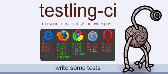
We at Browserling are proud to announce Testling-CI! Testling-CI lets you write continuous integration cross-browser tests that run on every git push!

testling-ci

There are a ton of modules on npm and github that aren’t just for node.js but for browsers, too. However, figuring out which browsers these modules work with can be tricky. It’s often that case that some module used to work in browsers but has accidentally stopped working because the developer hadn’t checked that their code still worked recently enough. If you use npm for frontend and backend modules, this can be particularly frustrating.

You will probably also be interested in: How to write Testling-CI tests.

A bit practical for me but with HTML5, browser-based interfaces are likely to become the default.

Useful to point out resources that will make it easier to cross-browser test topic map, browser-based interfaces.

January 21, 2013

Win ‘Designing the Search Experience:…’

Filed under: Interface Research/Design,Searching,Usability,Users — Patrick Durusau @ 7:29 pm

I mentioned the return of 1950’s/60’s marketing techniques just a day or so ago and then I find:

Win This Book! Designing the Search Experience: The information architecture of discovery by Tony Russell-Rose and Tyler Tate.

Three ways to enter, err, see the post for those.

January 14, 2013

Why you should try UserTesting.com

Filed under: Design,Interface Research/Design,Usability,Users — Patrick Durusau @ 8:37 pm

Why you should try UserTesting.com by Pete Warden.

From the post:

If you’re building a website or app you need to be using UserTesting.com, a service that crowd-sources QA. I don’t say that about many services, and I have no connection with the company (a co-worker actually discovered them) but they’ve transformed how we do testing. We used to have to stalk coffee shops and pester friends-of-friends to find people who’d never seen Jetpac before and were willing to spend half an hour of their life being recorded while they checked it out. It meant the whole process took a lot of valuable time, so we’d only do it a few times a month. This made life tough for the engineering team as the app grew more complex. We have unit tests, automated Selenium tests, and QA internally, but because we’re so dependent on data caching and crunching, a lot of things only go wrong when a completely new user first logs into the system.

Another approach to user testing of your website or interface design.

January 11, 2013

Re-Introducing Page Description Diagrams

Filed under: Design,Interface Research/Design,Usability,Users — Patrick Durusau @ 7:37 pm

Re-Introducing Page Description Diagrams by Colin Butler and Andrew Wirtanen.

From the post:

There’s no such thing as a “standard” client or project in a typical agency setting, because every business has its own specific goals—not to mention the goals of its users. Because of this, we’re constantly seeking ways to improve our processes and better meet the needs of our clients, regardless of their unique characteristics.

Recently, we discovered the page description diagram (PDD), a method for documenting components without specifying layout. At first, it seemed limited, even simplistic, relative to our needs. But with some consideration, we began to understand the value. We started looking at whether or not PDDs could help us improve our process.

As it turns out, these things have been around for quite a while. Dan Brown devised them way back in 1999 as a way to communicate information architecture to a client in a way that addressed some of his primary issues with wireframes. Those issues were that, looking at wireframes, clients would form expectations prematurely and that designers would be limited in their innovation by a prescribed layout. Brown’s approach was to remove layout entirely, providing priority instead. Each component of a page would be described in terms of the needs it met and how it met those needs, arranged into three priority columns with wireframe-like examples when necessary. …

Because of its UI context, I originally read this post as a means of planning interfaces.

But on reflection, the same questions of “needs to meet” and “how to meet those needs” applies equally to topics, associations and occurrences.

Users should be encouraged to talk through their expectations for what information comes together, in what order and how they will use it.

As opposed to focusing too soon on questions of how a topic map architecture will support those capabilities.

Interesting technical questions but no nearly as interesting, for users at any rate, as their information needs.

The post also cites a great primer on Page Description Diagrams.

Javascript Plugins To Handle Keyboard Events – 18 Items

Filed under: Interface Research/Design,Javascript,JQuery — Patrick Durusau @ 7:33 pm

Javascript Plugins To Handle Keyboard Events – 18 Items by Bogdan Sandu.

From the post:

Users want to see pages really quickly and avoid scrolling a site too much or using the mouse for various events that can be done easier in another way. In order to increase the functionality of a site many web designers use keyboard events so that the users’ experience on the site is better and more enjoyable by navigating easier and seeing more content faster. Of course, this is not the only reason why a web designer would add a jQuery plugin to handle keyboard events on a site, there are other.

Eighteen plugins that can help you with keyboard events in a web interface.

I think the case is fairly compelling for keyboard shortcuts but I type in my sleep. 😉

Your mileage, and that of your users, may vary.

Test with users, deploy and listen to user feedback.

(The opposite of where insiders design, then deploy and user feedback is discarded.)

January 9, 2013

izik Debuts as #1 Free Reference App on iTunes

Filed under: Interface Research/Design,izik,Search Engines,Search Interface — Patrick Durusau @ 12:04 pm

izik Debuts as #1 Free Reference App on iTunes

From the post:

We launched izik, our search app for tablets, last Friday and are amazed at the responses we’ve received! Thanks to our users, on day one izik was the #1 free reference app on iTunes and #49 free app overall. Yesterday we were mentioned twice in the New York Times, here and here (also in the B1 story in print). We are delighted that there is such a strong desire to see something fresh and new in search, and that our vision with izik is so well received.

The twitterverse has been especially active in spreading the word about izik. We’ve seen a lot of comments about the beautiful design and interface, the useful categories, and most importantly the high quality results that make izik a truly viable choice for searching on tablets.

Just last Monday I remarked: “From the canned video I get the sense that the interface is going to make search different.” (izik: Take Search for a Joy Ride on Your Tablet)

Users with tablets have supplied the input I asked for in that post and it is overwhelmingly in favor of izik.

To paraphrase Ray Charles in the Blues Brothers:

“E-excuse me, uh, I don’t think there’s anything wrong with the action on [search applications].”

There is plenty of “action” left in the search space.

izik is fresh evidence for that proposition.

January 8, 2013

NULL_SETS

Filed under: Graphics,Interface Research/Design,Visualization — Patrick Durusau @ 11:46 am

NULL_SETS

From the webpage:

null_sets is a new body of artwork aimed at exploring the gap between data and information. consisting of a set of images (plus a free app), this project stems from our interest in glitches, code-breaking, and translation. our custom script encodes text files as images, making it possible to visualize both the size and architecture of large-scale data sets through an aesthetic lens. so if you ever wanted to see hamlet as a jpeg and find artistic merit hiding within its code, here’s your chance.

The video on the homepage gives you a good introduction to the project.

I included this under “interface research/design” in addition to visualization.

If it is fair to talk about Hadoop needing to be “interactive,” it stands to reason that visualization of large data sets should be as well.

Does make me wonder what change tracking would look like for interactive visualization? So you could play-back or revert to some earlier view. (Or exchange snapshots of views with others.)

I first saw this at: Null_Sets: Encoding Text as Abstract Images by Andrew Vande Moere.

January 7, 2013

izik: Take Search for a Joy Ride on Your Tablet

Filed under: Interface Research/Design,Search Interface,Searching — Patrick Durusau @ 7:40 am

izik: Take Search for a Joy Ride on Your Tablet

From the post:

We are giddy to announce the launch of izik, our new search app built specifically with the iPad and Android tablets in mind. With izik, every search on your tablet is transformed into a beautiful, glossy page that utilizes rich images, categories, and, of course, gesture controls. Check it: so much content, so many ways to explore.

Tablets are increasingly getting integrated into our lives, so we wracked our noggins to figure out how we could use our search technology to optimally serve tablet users. Not surprisingly, our research revealed that tablets take on a very different role in our lives than laptops and desktops. Laptops are for work; tablets are for fun. Laptops are task-oriented (“what’s the capital of Bulgaria?”); tablets are more exploratory (“what’s Jennifer Lopez doing these days?”).

So, our goal with izik was to move the task-oriented search product we all use on our computers (aka 10 blue links) and turn it into a more fun, tablet-appropriate product. That means an image-rich layout with an appearance and experience very different than what we’re used to seeing on a laptop.

I remain without a tablet so am dependent upon your opinions for how izik works for real users.

From the canned video I get the sense that the interface is going to make search different.

Is the scroll gesture more natural than using a mouse? Are some movements easier using gestures?

What other features of a tablet interface can change/improve search experiences?

January 4, 2013

Stop Explaining UX and Start Doing UX [External Validation and Topic Maps?]

Filed under: Interface Research/Design,Marketing,Topic Maps — Patrick Durusau @ 8:02 pm

Stop Explaining UX and Start Doing UX by Kim Bieler.

I started reading this post for the UX comments and got hooked when I read the “external validation model:”

External Validation

The problem with this strategy is we’re stuck in step 1—endlessly explaining, getting nowhere, and waiting like wallflowers to be asked to dance.

I ought to know—I spent years as a consultant fruitlessly trying to convince clients to spend money on things like the discovery phase, user interviews, and usability testing. I knew this stuff was important because I’d read a lot of books and articles and had gone to a lot of conferences. Moreover, I knew that I couldn’t claim to be a “real” UX designer unless I was doing this stuff.

Here’s the ugly truth: I wanted clients to pay me to do user research in order to cement my credentials, not because I truly understood its value. How could I understand it? I’d never tried it, because I was waiting for permission.

The problem with the external validation model is that it puts success out of our control and into the hands of our clients, bosses, and managers. It creates a culture of learned helplessness and a childish “poor me” attitude that frequently manifests in withering scorn for clients and executives—the very people upon whom our livelihood depends.

Does any of that sound familiar?

Kim continues with great advice on an internal validation model, but you will have to see her post for the answers.

Read those, then comment here.

Thanks!

December 29, 2012

Treat Your Users Like Children

Filed under: Design,Interface Research/Design,Usability,Users — Patrick Durusau @ 7:09 pm

Treat Your Users Like Children by Jamal Jackson.

From the post:

Do you have kids of your own? How about young nieces, nephews, or nephews? Do you spend time around your friends’ children? Is there that one neighbor who has youngsters who makes it a point to disturb you any chance they get? If you’ve answered yes to any of these questions, then you understand that caring for kids is difficult! Many people would argue that my use of the word “difficult” is a strong understatement. They’d be right!

Young minds are almost impossible to predict and equally hard to control. A parent, or any other adult, can plan out an assortment of ideal procedures for a kid to follow to accomplish something, but it will likely feel like wasted time. This is because kids have no intention of following any form of procedures, no matter how beneficial to them.

Speaking of people with no intention of following any form of procedures, no matter how beneficial those procedures may be, I can’t help but wonder why dealing with children reminds me of the life of a UX professional.

How many hours have you spent toiling away in front of your monitor and notepad, hoping the end result will be to the user’s benefit? If they even bother to proceed as you predicted, that is. In the end, the majority of users end up navigating your site in a way that leaves head-scratching as the only suitable reaction. This is why web users should be treated like kids.

The post is worth reading if only for the images!

But having said that, it gives good advice on changing your perspective on design, to that of a user.

Designing for ourselves is a lot easier, at least for us.

Unfortunately, that isn’t the same a designing an interface users will find helpful or intuitive.

I “prefer” an interface that most users find intuitive.

An audience/market of < 10 can be pretty lonely, not to mention unprofitable.

The Top 5 Website UX Trends of 2012

Filed under: Graphics,Interface Research/Design,Usability,Users,WWW — Patrick Durusau @ 7:00 pm

The Top 5 Website UX Trends of 2012

From the post:

User interface techniques continued to evolve in 2012, often blurring the lines between design, usability, and technology in positive ways to create an overall experience that has been both useful and pleasurable.

Infinite scrolling, for example, is a technological achievement that also helps the user by enabling a more seamless experience. Similarly, advances in Web typography have an aesthetic dimension but also represent a movement toward greater clarity of communication.

Quick coverage of:

  1. Single-Page Sites
  2. Infinite Scrolling
  3. Persistent Top Navigation or “Sticky Nav”
  4. The Death of Web 2.0 Aesthetics
  5. Typography Returns

Examples of each trend but you are left on your own for the details.

Good time to review your web presence for the coming year.

December 27, 2012

Design by HiPPO?

Filed under: Design,Interface Research/Design,Usability,Users — Patrick Durusau @ 6:29 am

Mark Needham in Restricting your own learning, references: Practical Guide to Controlled Experiments on the Web: Listen to Your Customers not to the HiPPO by Ron Kohavi, Randal M. Henne and Dan Sommerfield.

HiPPO = “…the Highest Paid Person’s Opinion (HiPPO).”

Abstract:

The web provides an unprecedented opportunity to evaluate ideas quickly using controlled experiments, also called randomized experiments (single-factor or factorial designs), A/B tests (and their generalizations), split tests, Control/Treatment tests, and parallel flights. Controlled experiments embody the best scientific design for establishing a causal relationship between changes and their influence on user-observable behavior. We provide a practical guide to conducting online experiments, where end-users can help guide the development of features. Our experience indicates that significant learning and return-oninvestment (ROI) are seen when development teams listen to their customers, not to the Highest Paid Person’s Opinion (HiPPO). We provide several examples of controlled experiments with surprising results. We review the important ingredients of running controlled experiments, and discuss their limitations (both technical and organizational). We focus on several areas that are critical to experimentation, including statistical power, sample size, and techniques for variance reduction. We describe common architectures for experimentation systems and analyze their advantages and disadvantages. We evaluate randomization and hashing techniques, which we show are not as simple in practice as is often assumed. Controlled experiments typically generate large amounts of data, which can be analyzed using data mining techniques to gain deeper understanding of the factors influencing the outcome of interest, leading to new hypotheses and creating a virtuous cycle of improvements. Organizations that embrace controlled experiments with clear evaluation criteria can evolve their systems with automated optimizations and real-time analyses. Based on our extensive practical experience with multiple systems and organizations, we share key lessons that will help practitioners in running trustworthy controlled experiments.

Not recent (2007) but a real delight and as relevant today as when it was published.

The ACM Digital Library reports 37 citing publications.

Definitely worth a close read and consideration as you design your next topic map interface.

December 26, 2012

6 Must-See Usability Testing Videos

Filed under: Interface Research/Design,Usability,Users — Patrick Durusau @ 4:49 pm

6 Must-See Usability Testing Videos by Paul Veugen.

From the post:

Usability testing. Some people love it, some hate it, many don’t get it. Personally, I think they are the best thing anyone can do to learn from their users. In the same time, they are emotionally exhausting for moderators.

Here are 6 usability testing videos I love. Four serious ones, two not so much.

Just the titles:

  1. An intro to usability testing by Amberlight Partners
  2. Jenn Downs on guerrilla usability testing at Mailchimp as well as a participant’s perspective
  3. Usability testing with a young child using a paper prototype
  4. Steve Krug’s usability testing demo
  5. Usability testing of fruit by blinkux
  6. Behind the one-way mirror: what if you have had such a participant?

Interesting range of usability testing examples.

None are beyond the capabilities of the average web author.

December 18, 2012

Google Imagines a Real World That’s as Irritating as the Internet

Filed under: Design,Humor,Interface Research/Design — Patrick Durusau @ 5:43 pm

Google Imagines a Real World That’s as Irritating as the Internet by Rebecca Cullers.

From the post:

Google Analytics has put together a series of videos demonstrating what poor web design can do to an online commerce site—crap we’d never put up with in a brick-and-mortar store. There’s unintuitive search and site design that prevents you from finding the item you’re looking for—in this case, it’s a grocery store that makes it impossible to find an everyday item as simple as milk. There’s the obnoxious online checkout, where you’re forced to log in, agree to terms and prove you’re a real person before you get timed out, forcing you to start all over again. Then there’s a misplaced dig at Amazon’s highly successful, often copied suggestion of other items you might like. Produced in-house by Google Creative Lab, all the spots have the absurdity of a Monty Python skit. It seems weird for Google to be dissing online search and e-commerce, but here it serves the greater goal of telling people to learn more about their customers via Analytics. And in this case, it’s funny cause it’s true.

I won’t even attempt to describe the videos.

You will have to hold onto your chair to remain upright.

Seriously, they capture the essence of bad online shopping experiences.

Or should I say user interfaces?

The Flâneur Approach to User Experience Design

Filed under: Interface Research/Design,Usability — Patrick Durusau @ 3:28 pm

The Flâneur Approach to User Experience Design by Sarah Doody.

The entire article is a delight but Sarah’s take on how to prepare ourselves for random insights resonates with me:

So, how can we prepare our minds to recognize and respond to moments of random insight? Turns out the French may have an answer: flâner, a verb that means “to stroll.” Derived from this verb is the noun flâneur, a person who would stroll, lounge, or saunter about on the streets of Paris.

Throughout the 16th and 17th centuries, a flâneur was regarded as somewhat lazy, mindless, and loafing. However, in the 19th century a new definition of the word emerged that captures the essence of what I believe makes a great user experience designer.

By this definition, a flâneur is more than just an aimless wanderer. The flâneur’s mind in always in a state of observation. He or she connects the dots through each experience and encounter that comes his or her way. The flâneur is in constant awe of his surroundings. In the article “In Search Of Serendipity” for The Economist’s Intelligent Life Magazine, Ian Leslie writes that a flâneur is someone who “wanders the streets with purpose, but without a map.”

I rather like that image, “wanders the streets with purpose, but without a map.”

I always start the day with things I would like to blog about but some (most?) days the keyboard just gets away from me. 😉

I haven’t kept score but my gut feeling is that I have discovered more things while looking for something else than following a straight and narrow path.

You?

(See Sarah’s post for the qualities needed to have a prepared mind.)

December 17, 2012

Go3R [Searching for Alternatives to Animal Testing]

Go3R

A semantic search engine for finding alternatives to animal testing.

I mention it as an example of a search interface that assists the user in searching.

The help documentation is a bit sparse if you are looking for an opportunity to contribute to such a project.

I did locate some additional information on the project, all usefully with the same title to make locating it “easy.” 😉

[Introduction] Knowledge-based semantic search engine for alternative methods to animal experiments

[PubMed – entry] Go3R – semantic Internet search engine for alternative methods to animal testing by Sauer UG, Wächter T, Grune B, Doms A, Alvers MR, Spielmann H, Schroeder M. (ALTEX. 2009;26(1):17-31).

Abstract:

Consideration and incorporation of all available scientific information is an important part of the planning of any scientific project. As regards research with sentient animals, EU Directive 86/609/EEC for the protection of laboratory animals requires scientists to consider whether any planned animal experiment can be substituted by other scientifically satisfactory methods not entailing the use of animals or entailing less animals or less animal suffering, before performing the experiment. Thus, collection of relevant information is indispensable in order to meet this legal obligation. However, no standard procedures or services exist to provide convenient access to the information required to reliably determine whether it is possible to replace, reduce or refine a planned animal experiment in accordance with the 3Rs principle. The search engine Go3R, which is available free of charge under http://Go3R.org, runs up to become such a standard service. Go3R is the world-wide first search engine on alternative methods building on new semantic technologies that use an expert-knowledge based ontology to identify relevant documents. Due to Go3R’s concept and design, the search engine can be used without lengthy instructions. It enables all those involved in the planning, authorisation and performance of animal experiments to determine the availability of non-animal methodologies in a fast, comprehensive and transparent manner. Thereby, Go3R strives to significantly contribute to the avoidance and replacement of animal experiments.

[ALTEX entry – full text available] Go3R – Semantic Internet Search Engine for Alternative Methods to Animal Testing

December 9, 2012

Humans are difficult [Design by Developer]

Filed under: Design,Graphics,Interface Research/Design,Visualization — Patrick Durusau @ 7:10 pm

Humans are difficult by Kristina Chodorow.

From the post:

My web app, Noodlin, has two basic functions: 1) create notes and 2) connect them, so I tried to make it blindingly obvious how to do both in the UI. Unfortunately, when I first started telling people about it, the first feedback I got was, “how do you create a connection?”

The original scheme: you clicked on the dark border to start a connection.

At that point, the way you created a connection was to click on the border of a note (a dark border would appear around a note when the mouse got close). Okay, so that wasn’t obvious enough, even though the tutorial said, “click on my border to create a connection.” I learned a lesson there: no one reads tutorials. However, I didn’t know what users did expect.

I started trying things: I darkened the color of the border, I had little connections pop out of the edge and follow your mouse as you moved it near a note. I heard from one user that she had tried dragging from one note to another, so I made that work, too. But people were still confused.

So what tripped Kristina up? She has authored two books on MongoDB, numerous other contributions, so she really knows her stuff.

In a phrase, design by developer.

All of her solutions were perfectly obvious to her, but as you will read in her post, not to her users.

Not the release of commercial software (you can supply examples of those failures on your own) but illustrates a major reason for semantic diversity:

We all view the world from a different set of default settings.

So we react to interfaces differently. The only way to discover which one will work for others, is to ask.

BTW, strictly my default view but Kristina’s Noodlin is worth a long look!

December 7, 2012

Wikiweb [Clue to a topic map delivery interface]

Filed under: Graphs,Interface Research/Design,Networks,Visualization — Patrick Durusau @ 7:32 pm

Wikiweb

I don’t have an iPhone or IPad so I have to take the video at face value. 🙁

But, what it shows was quite impressive!

Still not convinced about graph layouts that move about but obviously some users really like them.

Imagine this display adapted to merged subject representatives. With configurable display of other subjects/connections.

Now that would rock!

« Newer PostsOlder Posts »

Powered by WordPress