Another Word For It Patrick Durusau on Topic Maps and Semantic Diversity

September 23, 2013

Map: Where the People Are

Filed under: Mapping,Maps — Patrick Durusau @ 6:14 pm

Map: Where the People Are by Joshua Keating.

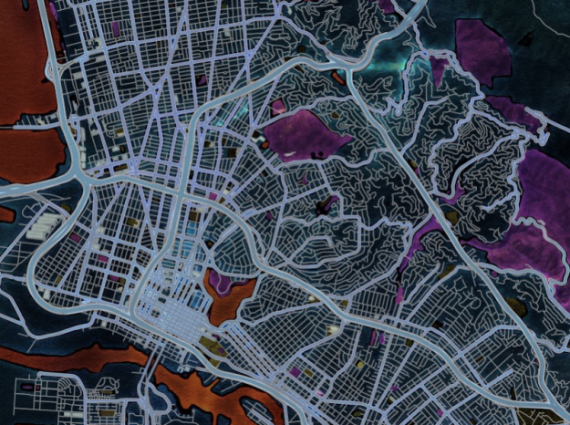
Maps created by Radical Cartography (yes, that is how I found the site) that show the distribution of the world population by latitude and longitude. Data for the year 2000.

Would be interesting to see latitude/longitude maps like this for every ten (10) years starting in about 1800.

Did the population increase in place or expand to new places? Or were there spikes of expansion followed by spikes of increased density?

Radical Cartography

Filed under: Cartography,Mapping,Maps — Patrick Durusau @ 6:04 pm

Radical Cartography

A very rich site with examples of cartography that I find hard to describe.

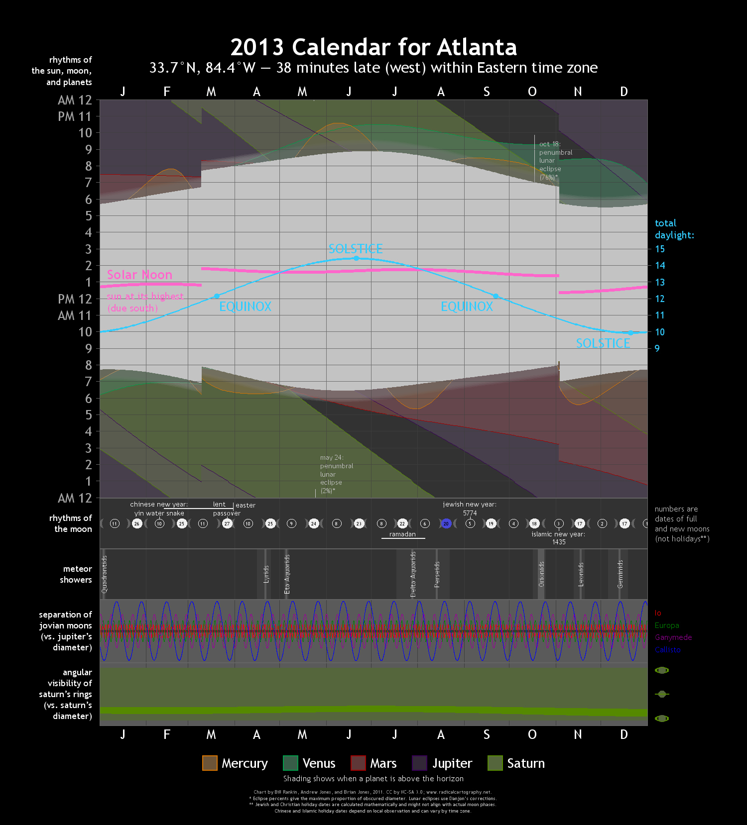
Rather than an inadequate description, here is an example of a custom map that the site generated at my request:

2013 Calendar for Atlanta

For best viewing, save the image to your computer and view in a browser.

See Your Calendar if you want to generate a custom calendar for yourself.

Don’t skip exploring the other projects at this site.

September 15, 2013

Are crowdsourced maps the future of navigation? [Supplying Context?]

Filed under: Crowd Sourcing,Mapping,Maps,Open Street Map — Patrick Durusau @ 3:05 pm

Are crowdsourced maps the future of navigation? by Kevin Fitchard.

From the post:

Given the craziness of the first two weeks in September in the tech world an interesting hire that should have gotten more attention slipped largely through the cracks. Steve Coast, founder of the OpenStreetMap project, has joined Telenav, signaling a big move by the navigation outfit toward crowdsourced mapping.

OpenStreetMap is the Wikipedia of mapping. OSM’s dedicated community of 1.3 million editors have gathered GPS data while driving, biking and walking the streets of the world to build a map from the ground up. They’ve even gone so far as to mark objects that exist on few other digital maps, from trees to park benches. That map was then offered up free to all comers.

Great story about mapping, crowd sourcing, etc., but it also has this gem:

For all of its strengths, OSM primarily has been a display map filled with an enormous amount of detail — Coast said editors will spend hours placing individual trees on boulevards. Many editors often don’t want to do the grunt work that makes maps truly useful for navigation, like filling in address data or labeling which turns are allowed at an intersection. (emphasis added)

Sam Hunting has argued for years that hobbyists, sports fans, etc., are naturals for entering data into topic maps.

Well, assuming an authoring interface with a low enough learning curve.

I went to the OpenStreetMap project, discovered an error in Covington, GA (where I live), created an account, watched a short editing tutorial and completed my first edit in about ten (10) minutes. I refreshed my browser and the correction is in place.

Future edits/corrections should be on the order of less than two minutes.

Care to name a topic map authoring interface that easy to use?

Not an entirely fair question because the geographic map provided me with a lot of unspoken context.

For example, I did not create associations between my correction and the City of Covington, Newton County, Georgia, United States, Western Hemisphere, Northern Hemisphere, Earth, or fill in types or roles for all those associations. Or remove any of the associations, types or roles that were linked to the incorrect information.

Baseball fans are reported to be fairly fanatical. But can you imagine any fan starting a topic map of baseball from scratch? I didn’t think so either. But on the other hand, what if there was an interface styled in a traditional play by play format, that allowed fans to capture games in progress? And as the game progresses, the associations and calculations on those associations (stats) are updated.

All the fan is doing is entering familiar information, allowing the topic map engine to worry about types, associations, etc.

Is that the difficulty with semantic technology interfaces?

That we require users to do more than enter the last semantic mile?
September 5, 2013

40 Maps…

Filed under: Mapping,Maps — Patrick Durusau @ 6:46 pm

40 Maps That Will Help You Make Sense of the World

From the post:

If you’re a visual learner like myself, then you know maps, charts and infographics can really help bring data and information to life. Maps can make a point resonate with readers and this collection aims to do just that.

Hopefully some of these maps will surprise you and you’ll learn something new. A few are important to know, some interpret and display data in a beautiful or creative way, and a few may even make you chuckle or shake your head.

If you enjoy this collection of maps, the Sifter highly recommends the r/MapPorn sub reddit. You should also check out ChartsBin.com. There were also fantastic posts on Business Insider and Bored Panda earlier this year that are worth checking out. Enjoy!

A must see collection of maps!

I’m not vouching for the accuracy of any of the maps.

After all, 20. Map of Countries with the Most Violations of Bribery shows none for the United States. Must have an odd definition of bribery.

United States Senators are paid $174,000 per year.

It cost $10.5 million on average to win a United States Senate seat.

Let’s see, six year term at $174,000 per year = $1,044,000. And you are going to spend more than 10X that amount to get the job? Plus that amount to retain it for another six years?

Or some public spirited person is going to give you > $10.5 million with no strings attached.

If you believe that last statement, please log off the Internet and never return. You are unsafe. (full stop)

July 11, 2013

DC Conference Swag

Filed under: Mapping,Maps — Patrick Durusau @ 2:58 pm

Sketching D.C. Crime Data With R by Matt Stiles.

From the post:

A car burglar last week nabbed a radio from our car, prompting me to think (once again) about crime in Washington, D.C., where I live.

I wanted to know if certain crimes were more common in particular neighborhoods, so I downloaded a list of every serious crime in 2012 from the city’s data portal. The data contained about 35,000 reported incidents of homicides, thefts, assaults, etc., with fields listing the date, time and neighborhood associated with each case.

I used the statistical programming language R, which is great for quickly creating small multiples to examine data, to make some rough visual sketches.

First, since we’re talking about cars, the first grid shows thefts from vehicles, by hour and “advisory neighborhood commission“. These commissions are the small groups of officials who represent their respective D.C. neighborhoods on issues like real estate development and alcohol sales, among other things. (I live in Brookland, which is governed by ANC 5B). You can find your ANC here.

(…)

Matt charts a variety of crimes in DC and is sure to get your attention.

Occurs to me that a map of DC, color coded by crime and time of day, would be great conference swag for conference tote bags.

With the subway system marked with “Do Not Exit” here signs.

June 28, 2013

Resources for Mapping Census Data

Filed under: Census Data,Mapping,Maps — Patrick Durusau @ 4:18 pm

Resources for Mapping Census Data by Katy Rossiter.

From the post:

Mapping data makes statistics come to life. Viewing statistics spatially can give you a better understanding, help identify patterns, and answer tough questions about our nation. Therefore, the Census Bureau provides maps, including digital files for use in a Geographic Information System (GIS), and interactive mapping capabilities in order to visualize our statistics.

Here are some of the mapping resources available from the Census Bureau:

(…)

That listing is just some of the resources that Katy covers in her post.

Combining your data or public data along with census data could result in a commercially successful map.

June 12, 2013

Building A Visual Planetary Time Machine

Filed under: Geography,Mapping,Maps,Visualization — Patrick Durusau @ 1:30 pm

Building A Visual Planetary Time Machine by by Randy Sargent, Google/Carnegie Mellon University; Matt Hancher and Eric Nguyen, Google; and Illah Nourbakhsh, Carnegie Mellon University.

From the post:

When a societal or scientific issue is highly contested, visual evidence can cut to the core of the debate in a way that words alone cannot — communicating complicated ideas that can be understood by experts and non-experts alike. After all, it took the invention of the optical telescope to overturn the idea that the heavens revolved around the earth.

Last month, Google announced a zoomable and explorable time-lapse view of our planet. This time-lapse Earth enables you explore the last 29 years of our planet’s history — from the global scale to the local scale, all across the planet. We hope this new visual dataset will ground debates, encourage discovery, and shift perspectives about some of today’s pressing global issues.

This project is a collaboration between Google’s Earth Engine team, Carnegie Mellon University’s CREATE Lab, and TIME Magazine — using nearly a petabyte of historical record from USGS’s and NASA’s Landsat satellites. And in this post, we’d like to give a little insight into the process required to build this time-lapse view of our planet.

Great imaging and a benchmark to compare future progress in this area.

Within three to five (3-5) years, this should be doable as senior CS project. Graduate students and advanced hackers will be using higher resolution “spy” satellite images.

From five to eight (5-8) years, software packages appear for the average consumer, processing on the local “grid.”

From eight to ten (8-10) years, mostly due to the long product cycle, appears in MS Office XXI. 😉

If not sooner!

Easy mapping with Map Stack

Filed under: Interface Research/Design,Mapping,Maps,Usability — Patrick Durusau @ 11:25 am

Easy mapping with Map Stack by Nathan Yau.

Map Stack image

Nathan writes:

It seems like the technical side of map-making, the part that requires code or complicated software installations, fades a little more every day. People get to focus more on actual map-making than on server setup. Map Stack by Stamen is the most recent tool to help you do this.

(…)

It’s completely web-based, and you edit your maps via a click interface. Pick what you want (or use Stamen’s own stylish themes) and save an image. For the time being, the service is open only from 11am to 5pm PST, so just come back later if it happens to be closed.

Over 3,000 maps have been made over the last four days! Examples.

Now to see semantic mapping interfaces improve.

May 22, 2013

Subway Maps and Visualising Social Equality

Filed under: Graphics,Mapping,Maps,Visualization — Patrick Durusau @ 6:45 pm

Subway Maps and Visualising Social Equality by James Chesire.

From the post:

Most government statistics are mapped according to official geographical units. Whilst such units are essential for data analysis and making decisions about, for example, government spending, they are hard for many people to relate to and they don’t particularly stand out on a map. This is why I tried a new method back in July 2012 to show life expectancy statistics in a fresh light by mapping them on to London Tube stations. The resulting ”Lives on the Line” map has been really popular with many people surprised at the extent of the variations in the data across London and also grateful for the way that it makes seemingly abstract statistics more easily accessible. To find out how I did it (and read some of the feedback) you can see here.

James gives a number of examples of the use of transportation lines making “abstract statistics more easily accessible.”

Worth a close look if you are interested in making dry municipal statistics part of the basis for social change.

May 20, 2013

Consumers of Furry Pornography = Tax Dodgers?

Filed under: Data Science Toolkit (DSTK),Heatmaps,Mapping,Maps — Patrick Durusau @ 5:00 pm

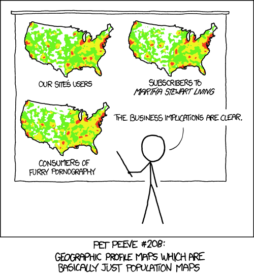
heatmaps cartoon

No more heatmaps that are just population maps! by Pete Warden.

From the post:

I'm pleased to announce that there's a brand new 0.50 version of the DSTK out! It has a lot of bug fixes, and a couple of major new features, and you can get it on Amazon's EC2 as ami-7b9df412, download the Vagrant box from http://static.datasciencetoolkit.org/dstk_0.50.box, or grab it as a BitTorrent stream from http://static.datasciencetoolkit.org/dstk_0.50.torrent

What are the new features?

The biggest is the integration of high resolution (sub km-squared) geostatistics for the entire globe. You can get population density, elevation, weather and more using the new coordinates2statistics API call. Why is this important? No more heatmaps that are just population maps, for the love of god! I'm using this extensively to normalize my data analysis so that I can actually tell which places actually have an unusually high occurrence of X, rather than just having more people.

If you use the DSTK (and you should), do send Pete a note of appreciation.

I can’t wait to start mapping tax dodgers!

May 19, 2013

Google Map Redesign [Brain Buds]

Filed under: Google Maps,Mapping,Maps — Patrick Durusau @ 1:22 pm

Google Map Redesign by Caitlin Dempsey.

From the post:

Googles Maps is preparing to debut its newly revamped Google Maps. Terming it “smart recommendations” the new functionality of Google Maps is intended to be more interactive and custom tailored to the specific user. The more you use the map to search for locations, favorite items by starring them, and write location reviews, the more unique the map becomes. Clicking a specific business or feature will result in the map features adjusting to show roads and locations related to that place.

(…)

Previewing the new Google Maps is currently only available by invite at the moment. You can request your invite via the Preview page.

Technology could be exposing you to a broader view of the world, perhaps even as other see it.

Instead:

  • Apple brought us ear buds that wall us off from ambient sound and others.
  • Apple also brought us eye buds (iPhones) that wall us off from our visual surroundings.
  • Google is building brain buds to wrap you in a customized cocoon of content.

Ironic if you remember the original MacIntosh commercial:

Timothy Leary today would say:

Turn on, tune in, unplug.

May 15, 2013

Geography of hate against gays, races, and the disabled

Filed under: Geography,Mapping,Maps — Patrick Durusau @ 3:51 pm

Geography of hate against gays, races, and the disabled by Nathan Yau.

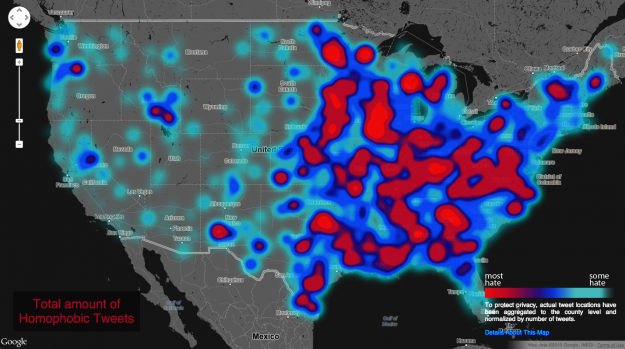
Hate Map

Nathan reports on the work of Floating Sheep who relied on 150,000 tags to create this map.

More details at Nathan’s site but as Nathan says, read the FAQ before you get too torqued about the map.

If nothing else, this should be a good lesson in the choices made collecting and mapping “objective” data (the tweets) and what questions you should ask about that process.

I found it interesting that the sea coast along the Gulf of Mexico seemed to have less hate.

How would you defend the choices you make when making a topic map?

Some information, that is important to someone will have to be left out. Was that out of religious, political, social or ethnic bias?

You can’t avoid that sort of question but you can be comfortable with your own answers should it arise.

My stock response is:

“The paying client is happy with the map. Become a paying client and you can be map happy too.”

May 11, 2013

The Map Myth of Sandy Island

Filed under: Geographic Data,Geography,Mapping,Maps — Patrick Durusau @ 4:39 pm

The Map Myth of Sandy Island by Rebecca Maxwell.

From the post:

Sandy Island has long appeared on maps dating back to the early twentieth century. This island was supposedly located in the Pacific Ocean northwest of Australia in the Coral Sea. It first appeared on an edition of a British admiralty map back in 1908 proving that Sandy Island had been discovered by the French in 1876. Even modern maps, like the General Bathymetic Chart of the Oceans (the British Oceanopgraphic Dat Centre issued an errata about Sandy Island) and Google Earth, show the presence of an island at its coordinates. Sandy Island is roughly the size of Manhattan; it is about three miles wide and fifteen miles long. However, there is only one problem. The island does not actually exist.

Back in October 2012, an Australian research ship undiscovered the island. The ship, called the Southern Surveyor, was led by Maria Seton, a scientist from the University of Sydney. The purpose of the twenty-five-day expedition was to gather information about tectonic activity, map the sea floor, and gather rock samples from the bottom. The scientific data that they had, including the General Bathymetic Chart of the Oceans, indicated the presence of Sandy Island halfway between Australia and the island of New Caledonia, a French possession. The crew began to get suspicious, however, when the chart from the ship’s master only showed open water. Plus, Google Earth only showed a dark blob where it should have been.

When the ship arrived at Sandy Island’s supposed coordinates, they found nothing but ocean a mile deep. One of the ship’s crewmembers, Steven Micklethwaite, said that they all had a good laugh at Google’s expense as they sailed through the island. The crew was quick to make their findings known. The story originally appeared in the Sydney Morning Herald and prompted a large amount of controversy. Cartographers were the most puzzled of all. Many wondered whether the island had ever existed or if it had been eroded away by the ocean waves over the years. Others wondered if the island mysteriously disappeared into the ocean like the legendary city of Atlantis. An “obituary” for Sandy Island, reporting the findings, was published in Eos, Transactions of the Geophysical Union in April of 2013.

Rebecca details the discovered/undiscovered history of Sandy Island in rich detail.

It’s a great story and you should treat yourself by reading it.

My only disagreement with Rebecca comes when she writes:

Maps are continually changing and modern maps still contain a human element that is vulnerable to mistakes.

On the contrary, maps, even modern ones, are wholly human constructs.

Not just the mistakes but the degree of accuracy, the implicit territorial or political claims, what is interesting enough to record, etc., are all human choices in production.

To say nothing of humans on the side of reading/interpretation as well.

If there were no sentient creatures to read it, would a map have any meaning?

May 8, 2013

OpenStreetMap Editor Designed by MapBox Goes Live

Filed under: Mapping,Maps,Open Street Map — Patrick Durusau @ 4:03 pm

OpenStreetMap Editor Designed by MapBox Goes Live by Caitlin Dempsey.

From the post:

A new easy-to-use editor for OpenStreetMap has gone live. Called iD, the development of in-browser data editor was coordinated by MapBox and funded by a grant from the Knight Foundation. The Alpha version of iD was released in January of this year, but was only recently added as an option to the edit drop down menu on www.openstreetmap.org.

From the announcement on the OpenStreetMap blog:

The new editor, codenamed ‘iD’, boasts an intuitive interface and clear walk-throughs that make editing much easier for new mappers. By lowering the barrier to contributions, we believe that more people can contribute their local knowledge to the map – the crucial factor that sets OSM apart from closed-source commercial maps.

You really need to see this to appreciate the ease of adding information to a map.

Excellent!

Largest Coffee Table Book

Filed under: Geographic Data,Geography,Mapping,Maps — Patrick Durusau @ 3:19 pm

Largest Atlas in the World Created using ArcGIS by Caitlin Dempsey.

From the post:

Earth Platinum, the largest atlas ever printed, was released in February 2012 by Millennium House, Australia. Only 31 copies of the 330 pound, leather-bound book exist and each are priced at $100,000. The book measures 6ft by 9ft and has been recognized by Chris Sheedy of the Guinness Book of World Records as the largest atlas in existence. The book contains 128 pages and requires at least two hands, or in some case multiple people, to turn the pages.

Earth Platinum has surpassed the previous holder of the world record for largest atlas, the famous Klencke Atlas (which measures about 5′ 9″ by 6′ 3″ when opened). The Klencke Atlas is housed in the Antiquarian Mapping Division of the British Library in London and held the title for largest atlas worldwide from 1660 until the publication of Earth Platinum. Published as a one-off over 350 years ago, the Klencke Atlas is reported to contain all geographical knowledge of that time, just as Earth Platinum does today.

Amazon doesn’t have it listed so I can’t say if you get a discount and/or free shipping or both. 😉

Interesting but only as a publishing oddity.

I would rather have a digital version that is a geographic interface into a general knowledge topic map.

May 1, 2013

History of San Francisco street names mapped

Filed under: Mapping,Maps — Patrick Durusau @ 4:19 pm

History of San Francisco street names mapped by Nathan Yau.

Nathan points to a project that has captured not only street names but the history of those names for part of San Francisco.

You don’t have to be there to appreciate the map.

Reminded me of a highway in a small town where I lived in Louisiana that was variously known as Hwy. 84, Winnfield Highway, “Front street” or simply the “front.”

Each of those names had a history, had anyone cared to capture them.

April 30, 2013

Mapping the News [Idea for a NewsApp]

Filed under: Mapping,News — Patrick Durusau @ 10:32 am

NewsRel Uses Machine Learning To Summarize News Stories And Put Them On A Map by Frederic Lardinois.

From the post:

After 24 hours of staring at their screens, the teams that participated in our Disrupt NY 2013 Hackathon have now finished their projects and are currently presenting them onstage. With more than 160 hacks, there are far too many cool ones to write about, but one that stood out to me was NewsRel, an iPad-based news app that uses machine-learning techniques to understand how news stories relate to one other. The app uses Google Maps as its main interface and automatically decides which location is most appropriate for any given story.

The app currently uses Reuters‘ RSS feed and analyzes the stories, looking for clusters of related stories and then puts them on the map. Say you are looking at a story about the Boston Marathon bombings. The app, of course, will show you a number of news stories about it clustered around Boston, then maybe something about the president’s comments about it from Washington and another article that relates it to the massacre during the Munich Olympics in 1972.

In addition to this, the team built an algorithm that picks the most important sentences from each story to summarize it for you.

No pointers to software, just the news blurb.

But, does raise an interesting possibility.

What if news video streams were tagged with geolocation and type information?

So I could exclude “train hits parade float” stories from several states away, automobile accidents, crime stories and replaces it with substantive commentary from the BBC or Al Jazeera.

Now that would be a video feed worth paying for. Particularly if for a premium it was commercial free.

Freedom from Wolf Blitzer’s whines in disaster areas should come as a free pre-set.

Just a small amount of additional semantics could lead to entirely new markets and delivery systems.

April 29, 2013

Atlas of Design

Filed under: Design,Graphics,Interface Research/Design,Mapping,Maps,Visualization — Patrick Durusau @ 2:01 pm

Atlas of Design by Caitlin Dempsey.

From the post:

Do you love beautiful maps? The Atlas of Design has been reprinted and is now available for purchase. Published by the North American Cartographic Information Society (NACIS), this compendium showcases cartography at some of its finest. The atlas was originally published in 2012 and features the work of 27 cartographers. In early 2012, a call for contributions was sent out and 140 entries from 90 different individuals and groups submitted their work. A panel of eight volunteer judges plus the book’s editors evaluated the entries and selected the finalists.

The focus of the Atlas of Design is on the aesthetics and design involved in mapmaking. Tim Wallace and Daniel Huffman, the editors of Atlas of Design explain the book’s introduction about the focus of the book:

Aesthetics separate workable maps from elegant ones.

This book is about the latter category.

My personal suspicion is that aesthetics separate legible topic maps from those that attract repeat users.

The only way to teach aesthetics (which varies by culture and social group) is by experience.

This is a great starting point for your aesthetics education.

April 21, 2013

The OpenStreetMap Package Opens Up

Filed under: Geographic Data,ggmap,Mapping,Maps,OpenStreetMap — Patrick Durusau @ 1:50 pm

The OpenStreetMap Package Opens Up

From the post:

A new version of the OpenStreetMap package is now up on CRAN, and should propagate to all the mirrors in the next few days. The primary purpose of the package is to provide high resolution map/satellite imagery for use in your R plots. The package supports base graphics and ggplot2, as well as transformations between spatial coordinate systems.

The bigest change in the new version is the addition of dozens of tile servers, giving the user the option of many different map looks, including those from Bing, MapQuest and Apple.

Very impressive display of the new capabilities in OpenStreetMap and this note about OpenStreetMap and ggmap:

Probably the main alternative to OpenStreetMap is the ggmap package. ggmap is an excellent package, and it is somewhat unfortunate that there is a significant duplication of effort between it and OpenStreetMap. That said, there are some differences that may help you decide which to use:

Reasons to favor OpenStreetMap:

  • More maps: OpenStreetMap supports more map types.
  • Better image resolution: ggmap only fetches one png from the server, and thus is limited to the resolution of that png, whereas OpenStreetMap can download many map tiles and stich them together to get an arbitrarily high image resolution.
  • Transformations: OpenStreetMap can be used with any map coordinate system, whereas ggmap is limited to long-lat.
  • Base graphics: Both packages support ggplot2, but OpenStreetMap also supports base graphics.
Reasons to favor ggmap:
  • No Java dependency: ggmap does not require Java to be installed.
  • Geocoding: ggmap has functions to do reverse geo coding.
  • Google maps: While OpenStreetMap has more map types, it currently does not support google maps.

Fair enough?

April 4, 2013

Visualizing Biological Data Using the SVGmap Browser

Filed under: Biology,Biomedical,Graphics,Mapping,Maps,SVG,Visualization — Patrick Durusau @ 1:26 pm

Visualizing Biological Data Using the SVGmap Browser by Casey Bergman.

From the post:

Early in 2012, Nuria Lopez-Bigas‘ Biomedical Genomics Group published a paper in Bioinformatics describing a very interesting tool for visualizing biological data in a spatial context called SVGmap. The basic idea behind SVGMap is (like most good ideas) quite straightforward – to plot numerical data on a pre-defined image to give biological context to the data in an easy-to-interpret visual form.

To do this, SVGmap takes as input an image in Scalable Vector Graphics (SVG) format where elements of the image are tagged with an identifier, plus a table of numerical data with values assigned to the same identifier as in the elements of the image. SVGMap then integrates these files using either a graphical user interface that runs in standard web browser or a command line interface application that runs in your terminal, allowing the user to display color-coded numerical data on the original image. The overall framework of SVGMap is shown below in an image taken from a post on the Biomedical Genomics Group blog.

svgmap image

We’ve been using SVGMap over the last year to visualize tissue-specific gene expression data in Drosophila melanogaster from the FlyAtlas project, which comes as one of the pre-configured “experiments” in the SVGMap web application.

More recently, we’ve been also using the source distribution of SVGMap to display information about the insertion preferences of transposable elements in a tissue-specific context, which as required installing and configuring a local instance of SVGMap and run it via the browser. The documentation for SVGMap is good enough to do this on your own, but it took a while for us to get a working instance the first time around. We ran into the same issues again the second time, so I thought I write up my notes for future reference and to help others get SVGMap up and running as fast as possible.

Topic map interfaces aren’t required to take a particular form.

A drawing of a fly could be topic map interface.

Useful for people studying flies, less useful (maybe) if you are mapping Lady Gaga discography.

What interface do you want to create for a topic map?

March 31, 2013

Map Projection Transitions

Filed under: Mapping,Maps — Patrick Durusau @ 2:31 pm

Map Projection Transitions by Jason Davies.

A delightful world map that transitions between projections.

How many projections you ask?

  1. Aitoff
  2. August
  3. Baker
  4. Boggs
  5. Bromley
  6. Collignon
  7. Craster Parabolic
  8. Eckert I
  9. Eckert II
  10. Eckert III
  11. Eckert IV
  12. Eckert V
  13. Eckert VI
  14. Eisenlohr
  15. Equirectangular (Plate Carrée)
  16. Hammer
  17. Goode Homolosine
  18. Kavrayskiy VII
  19. Lambert cylindrical equal-area
  20. Lagrange
  21. Larrivée
  22. Laskowski
  23. Loximuthal
  24. Mercator
  25. Miller
  26. McBryde–Thomas Flat-Polar Parabolic
  27. McBryde–Thomas Flat-Polar Quartic
  28. McBryde–Thomas Flat-Polar Sinusoidal
  29. Mollweide
  30. Natural Earth
  31. Nell–Hammer
  32. Polyconic
  33. Robinson
  34. Sinusoidal
  35. Sinu-Mollweide
  36. van der Grinten
  37. van der Grinten IV
  38. Wagner IV
  39. Wagner VI
  40. Wagner VII
  41. Winkel Tripel

Far more than I would have guessed. And I suspect this listing isn’t complete.

By analogy, how would you construct a semantic projection for a topic map?

Varying by language or names of subjects would be one projection.

What about projecting entire semantic views?

Rather than displaying Cyprus from an EU view, why not display the Cyprus view as the frame of reference?

Or display the sovereignty of nations, where their borders are subject to violation at the whim and caprice of larger nations.

Or closer to home, projecting the views of departments in an enterprise.

You may be surprised at the departments that consider themselves the glue holding the operation together.

March 30, 2013

gvSIG

gvSIG

I encountered the gvSIG site while tracking down the latest release of i3Geo.

From its mission statement:

The gvSIG project was born in 2004 within a project that consisted in a full migration of the information technology systems of the Regional Ministry of Infrastructure and Transport of Valencia (Spain), henceforth CIT, to free software. Initially, It was born with some objectives according to CIT needs. These objectives were expanded rapidly because of two reasons principally: on the one hand, the nature of free software, which greatly enables the expansion of technology, knowledge, and lays down the bases on which to establish a community, and, on the other hand, a project vision embodied in some guidelines and a plan appropriate to implement it.

Some of the software projects you will find at gvSIG are:

gvSIG Desktop

gvSIG is a Geographic Information System (GIS), that is, a desktop application designed for capturing, storing, handling, analyzing and deploying any kind of referenced geographic information in order to solve complex management and planning problems. gvSIG is known for having a user-friendly interface, being able to access the most common formats, both vector and raster ones. It features a wide range of tools for working with geographic-like information (query tools, layout creation, geoprocessing, networks, etc.), which turns gvSIG into the ideal tool for users working in the land realm.

gvSIG Mobile

gvSIG Mobile is a Geographic Information System (GIS) aimed at mobile devices, ideal for projects that capture and update data in the field. It’s known for having a user-friendly interface, being able to access the most common formats and a wide range of GIS and GPS tools which are ideal for working with geographic information.

gvSIG Mobile aims at broadening gvSIG Desktop execution platforms to a range of mobile devices, in order to give an answer to the needings of a growing number of mobile solutions users, who wish to use a GIS on different types of devices.

So far, gvSIG Mobile is a Geographic Information System, as well as a Spatial Data Infrastructures client for mobile devices. Such a client is also the first one licensed under open source.

I3Geo

i3Geo is an application for the development of interactive web maps. It integrates several open source applications into a single development platform, mainly Mapserver and OpenLayers. Developed in PHP and Javascript, it has functionalities that allows the user to have better control over the map output, allowing to modify the legend of layers, to apply filters, to perform analysis, etc.

i3Geo is completely customizable and can be tailor to the different users using the interactive map. Furthermore, the spatial data is organized in a catalogue that offers online access services such as WMS, WFS, KML or the download of files.

i3Geo was developed by the Ministry of the Environment of Brazil and it is actually part of the Brazilian Public Software Portal.

gvSIG Educa

What is gvSIG Educa?

“If I can’t picture it, I can’t understand it (A. Einstein)”

gvSIG Educa is a customization of the gvSIG Desktop Open Source GIS, adapted as a tool for the education of issues that have a geographic component.

The aim of gvSIG Educa is to provide educators with a tool that helps students to analyse and understand space, and which can be adapted to different levels or education systems.

gvSIG Educa is not only useful for the teaching of geographic material, but can also be used for learning any subject that contains a spatial component such as history, economics, natural science, sociology…

gvSIG Educa facilitates learning by letting students interact with the information, by adding a spatial component to the study of the material, and by facilitating the assimilation of concepts through visual tools such as thematic maps.

gvSIG Educa provides analysis tools that help to understand spatial relationships.

Definitely a site to visit if you are interested in open source GIS software and/or projects.

i3Geo

Filed under: Geographic Data,Geographic Information Retrieval,Geography,GIS,Mapping,Maps — Patrick Durusau @ 1:08 pm

i3Geo

From the homepage:

i3Geo is an application for the development of interactive web maps. It integrates several open source applications into a single development platform, mainly Mapserver and OpenLayers. Developed in PHP and Javascript, it has functionalities that allows the user to have better control over the map output, allowing to modify the legend of layers, to apply filters, to perform analysis, etc.

i3Geo is completely customizable and can be tailor to the different users using the interactive map. Furthermore, the spatial data is organized in a catalogue that offers online access services such as WMS, WFS, KML or the download of files.

i3Geo was developed by the Ministry of the Environment of Brazil and it is actually part of the Brazilian Public Software Portal.

I followed an announcement about i3Geo 4.7 being available when the line “…an application for the development of interactive web maps,” caught my eye.

Features include:

  • Basic display: fix zoom, zoom by rectangle, panning, etc.
  • Advanced display: locator by attribute, zoom to point, zoom by geographical area, zoom by selection, zoom to layer
  • Integrated display: Wikipedia, GoogleMaps, Panoramio and Confluence
  • Integration with the OpenLayers, GoogleMaps and GoogleEarth APIs
  • Loading of WMS, KML, GeoRSS, shapefile, GPX and CSV layers
  • Management of independent databases
  • Layer catalog management system
  • Management of layers in maps: Change of the layers order, opacity change, title change, filters, thematic classification, legend and symbology changing
  • Analysis tools: buffers, regular grids, points distribution analysis, layer intersection, centroid calculation, etc.
  • Digitalization: vector editing that allows to create new geometries or edit xisting data.
  • Superposition of existing data at the data of the Google Maps and GoogleEarth catalogs.

Unless you want to re-invent mapping software, this could be quite useful for location relevant topic map data.

I first saw this at New final version of i3Geo available: i3Geo 4.7.

March 26, 2013

MapEquation.org

Filed under: Graphics,Graphs,Mapping,Mathematics,Networks,Visualization — Patrick Durusau @ 1:30 pm

MapEquation.org by Daniel Edler and Martin Rosvall.

From the “about” page:

What do we do?

We develop mathematics, algorithms and software to simplify and highlight important structures in complex systems.

What are our goals?

To navigate and understand big data like we navigate and understand the real world by maps.

Suggest you start with the Apps.

Very impressive and has data available for loading.

You can also upload your own data.

Spend some time with Code and Publications as well.

I first saw this in a tweet by Chris@SocialTexture.

March 13, 2013

A map of worldwide email traffic, created with R

Filed under: Mapping,Maps,R — Patrick Durusau @ 1:00 pm

A map of worldwide email traffic, created with R by David Smith.

The Washing Post reports that by analyzing more than 10 million emails sent through the Yahoo! Mail service in 2012, a team of researchers used the R language to create a map of countries whose citizens email each other most frequently:

Worldwide Email traffic

Some discussion of Huntington’s Clash of Civilizations, but I have a different question:

If a map is a snapshot of a territory, can’t a later snapshot might show changes to the same territory?

Rather than debating Huntington and his money making but shallow view of the world and its history, why not intentionally broaden the communication network you see above?

A map, even a topic map, isn’t destiny, it’s a guide to finding a path to a new location or information.

eSpatial launches free edition of mapping software

Filed under: Geographic Data,GIS,Mapping,Maps — Patrick Durusau @ 12:22 pm

eSpatial launches free edition of mapping software

From the post:

eSpatial, leading provider of powerful mapping software today announced the launch of a free edition of their flagship mapping software, also called eSpatial.

eSpatial mapping software lets users convert spreadsheet data into map form, with just a few clicks. This visualization provides immediate insights into market trends and challenges.

The new free edition of eSpatial is available to anyone who signs up for an account at www.espatial.com. Once logged on, users can create maps from their existing data and then post them on websites as interactive maps.

Since it launched last year, eSpatial has made strong inroads into the sales mapping and territory mapping software market, especially in the United States.

Paid editions (including Basic, Pro and Team) of the application with greater functionality – including the ability to handle increased amounts of data, reporting and sharing options – start at $399 for an annual subscription.

www.espatial.com

Just starting playing with this but it could be radically cool!

For example, what if you mapped a particular congressional district and then mapped by zip codes the donations to their campaign?

I need to read the manual and find some data to import.

BTW, high marks for one of the easiest registrations I have ever encountered.

March 4, 2013

D3 World Maps: Tooltips, Zooming, and Queue

Filed under: D3,Graphics,Mapping,Maps,Visualization — Patrick Durusau @ 5:16 pm

D3 World Maps: Tooltips, Zooming, and Queue

From the post:

D3 has a lot of built in support (a powerful geographic projection system) for creating Maps from GeoJSON. If you have never used D3 for maps, I think you should take a look at this D3 Map Tutorial. It covers the essentials of making a map with D3 and TopoJSON, which I will use below in more advanced examples. TopoJson encodes topology and eliminates redundancy, resulting in a much smaller file and the GeoJSON to TopoJSON converter is built with NodeJS.

Thus, I encourage you all to start using TopoJSON and below, I will go over a couple examples of building a D3 World Map with colors, tooltips, different zooming options, plotting points from geo coordinates, and listening to click events to load new maps. I will also use Mike Bostock’s queue script to load the data asynchronously.

Creating geographic maps with D3? This is a must stop.

What I need to look for is a library not for geo-coordinates but one that supports arbitrary, user-defined coordinates.

The sort of thing that could map locations in library stacks.

Suggestions/pointers?

February 28, 2013

VFR MAP

Filed under: Mapping,Maps — Patrick Durusau @ 1:31 pm

VFR MAP

From the about:

Here you will find

  • Seamlessly stitched VFR and IFR aeronautical charts
  • A searchable Airport / Facility Directory
  • Terminal Procedure Publications
  • Real-time weather

VFR MAP is optimized for mobile devices. Try us on your Android phone, iPhone, or iPad (or click here to see some screenshots).

Plus Google maps for terrain, satellite and roads.

Quite a remarkable site.

What would you want to combine with these maps?

February 10, 2013

Mapping the census…

Filed under: Census Data,Mapping,Maps,R,Transparency — Patrick Durusau @ 4:20 pm

Mapping the census: how one man produced a library for all by Simon Rogers.

From the post:

The census is an amazing resource – so full of data it’s hard to know where to begin. And increasingly where to begin is by putting together web-based interactives – like this one on language and this on transport patterns that we produced this month.

But one academic is taking everything back to basics – using some pretty sophisticated techniques. Alex Singleton, a lecturer in geographic information science (GIS) at Liverpool University has used R to create the open atlas project.

Singleton has basically produced a detailed mapping report – as a PDF and vectored images – on every one of the local authorities of England & Wales. He automated the process and has provided the code for readers to correct and do something with. In each report there are 391 pages, each with a map. That means, for the 354 local authorities in England & Wales, he has produced 127,466 maps.

Check out Simon’s post to see why Singleton has undertaken such a task.

Question: Was the 2011 census more “transparent,” or “useful” after Singleton’s work or before?

I would say more “transparent” after Singleton’s work.

You?

January 22, 2013

User evaluation of automatically generated keywords and toponyms… [of semantic gaps]

User evaluation of automatically generated keywords and toponyms for geo-referenced images by Frank O. Ostermann, Martin Tomko, Ross Purves. (Ostermann, F. O., Tomko, M. and Purves, R. (2013), User evaluation of automatically generated keywords and toponyms for geo-referenced images. J. Am. Soc. Inf. Sci.. doi: 10.1002/asi.22738)

Abstract:

This article presents the results of a user evaluation of automatically generated concept keywords and place names (toponyms) for geo-referenced images. Automatically annotating images is becoming indispensable for effective information retrieval, since the number of geo-referenced images available online is growing, yet many images are insufficiently tagged or captioned to be efficiently searchable by standard information retrieval procedures. The Tripod project developed original methods for automatically annotating geo-referenced images by generating representations of the likely visible footprint of a geo-referenced image, and using this footprint to query spatial databases and web resources. These queries return raw lists of potential keywords and toponyms, which are subsequently filtered and ranked. This article reports on user experiments designed to evaluate the quality of the generated annotations. The experiments combined quantitative and qualitative approaches: To retrieve a large number of responses, participants rated the annotations in standardized online questionnaires that showed an image and its corresponding keywords. In addition, several focus groups provided rich qualitative information in open discussions. The results of the evaluation show that currently the annotation method performs better on rural images than on urban ones. Further, for each image at least one suitable keyword could be generated. The integration of heterogeneous data sources resulted in some images having a high level of noise in the form of obviously wrong or spurious keywords. The article discusses the evaluation itself and methods to improve the automatic generation of annotations.

An echo of Steve Newcomb’s semantic impedance appears at:

Despite many advances since Smeulders et al.’s (2002) classic paper that set out challenges in content-based image retrieval, the quality of both nonspecialist text-based and content-based image retrieval still appears to lag behind the quality of specialist text retrieval, and the semantic gap, identified by Smeulders et al. as a fundamental issue in content-based image retrieval, remains to be bridged. Smeulders defined the semantic gap as

the lack of coincidence between the information that one can extract from the visual data and the interpretation that the same data have for a user in a given situation. (p. 1353)

In fact, text-based systems that attempt to index images based on text thought to be relevant to an image, for example, by using image captions, tags, or text found near an image in a document, suffer from an identical problem. Since text is being used as a proxy by an individual in annotating image content, those querying a system may or may not have similar worldviews or conceptualizations as the annotator. (emphasis added)

That last sentence could have come out of a topic map book.

Curious what you make of the author’s claim that spatial locations provide an “external context” that bridges the “semantic gap?”

If we all use the same map of spatial locations, are you surprised by the lack of a “semantic gap?”

« Newer PostsOlder Posts »

Powered by WordPress