Another Word For It Patrick Durusau on Topic Maps and Semantic Diversity

July 7, 2015

Ancient [?] Craft of Information Visualization

Filed under: History,Mapping,Maps — Patrick Durusau @ 2:35 pm

Vintage Infodesign [125]: More examples of the ancient craft of information visualization by Tiago Veloso.

From the post:

To open this week’s edition of Vintage InfoDesign, we picked some of the maps published in the 1800s/early 1900’s about the Battle of Waterloo . As we showed you before, on June 18th several newspapers marked with stunning pieces of infographic design the 200th anniversary of Napoleon’s final attempt to rule Europe, and since we haven’t feature any “oldies” related to this topic, we thought it would be interesting to do some Internet “digging”.

Hope you enjoy our findings, and feel free to leave the links to other charts and maps about Waterloo, in the comments section.

I’m not entirely comfortable with using the term “ancient” to describe maps depicting the Battle of Waterloo. I think of the fall of the New Kingdom of Egypt, in about 343 BCE as the beginning of “ancient” history.

June 20, 2015

Creating-maps-in-R

Filed under: Mapping,Maps,R — Patrick Durusau @ 2:37 pm

Creating-maps-in-R by Robin Lovelace.

From the webpage:

Introductory tutorial on graphical display of geographical information in R, to contribute to teaching material. For the context of this tutorial and a video introduction, please see here: http://robinlovelace.net/r/2014/01/30/spatial-data-with-R-tutorial.html

All of the information needed to run the tutorial is contained in a single pdf document that is kept updated: see github.com/Robinlovelace/Creating-maps-in-R/raw/master/intro-spatial-rl.pdf.

By the end of the tutorial you should have the confidence and skills needed to convert a diverse range of geographical and non-geographical datasets into meaningful analyses and visualisations. Using data and code provided in this repository all of the results are reproducible, culminating in publication-quality maps such as the faceted map of London’s population below:

Quite a treat in thirty (30) pages! You will have R and some basic spatial data packages installed and be well on your way to creating maps in R. From a topic map perspective, the joining of attributes to polygons is quite similar to adding properties to topics. Assuming you want to treat each polygon as a subject to be represented by a topic.

Enjoy!

PS:

You will also enjoy:

Cheshire, J. & Lovelace, R. (2014). Spatial data visualisation with R. In Geocomputation, a Practical Primer. In Press with Sage. Preprint available online

and other publications by Robin.

June 18, 2015

Thematic Cartography Guide

Filed under: Cartography,Mapping,Maps — Patrick Durusau @ 8:29 pm

Thematic Cartography Guide

From the webpage:

Welcome! In this short guide we share some insights and tips for making thematic maps. Our goal is to cover the important concepts in cartography and flag the important decision points in the map-making process. As with many activities in life, there isn’t always a single best answer in cartography, and in those cases we’ve tried to outline some of the pros and cons to different solutions.

This is by no means a replacement for a full textbook on cartography; rather it is a quick reference guide for those moments when you’re stumped, unsure of what to do next, or unfamiliar with the terminology. While the recommendations on these pages are short and not loaded with academic references, please appreciate that they represent a thoughtful synthesis of decades of map-making research.

This guide was written by Axis Maps, adapted from documentation written for indiemapper in 2010. However, the content here is about general cartography principles, not software-specific tips. To see the material in its original context, visit indiemapper and its help pages.

If that doesn’t sound exciting, perhaps this will:

Thematic maps are meant not simply to show locations, but rather to show attributes or statistics about places, spatial patterns of those attributes, and relationships between places. For example, while a reference map might show the locations of cities, a thematic map might also represent the population of those cities. It’s the difference between mapping places and mapping data. This site is about thematic maps, describing some of the different types and basic principles.

Hmmm, data about places? Relationships? That’s starting to sound suspiciously like a topic map expressed in a different vocabulary.

The same principles apply, in addition to places on a geographic grid, you can have subjects that exist only on your own intellectual grid, arranged in relationships as you see fit.

Over the years you have no doubt seen a number of offenses against the art of presentation in the name of topic maps. You have the power to break from that tradition. Seeing what works in other mapping domains is one place to start.

Where else would you look for fresh ideas and themes?

June 15, 2015

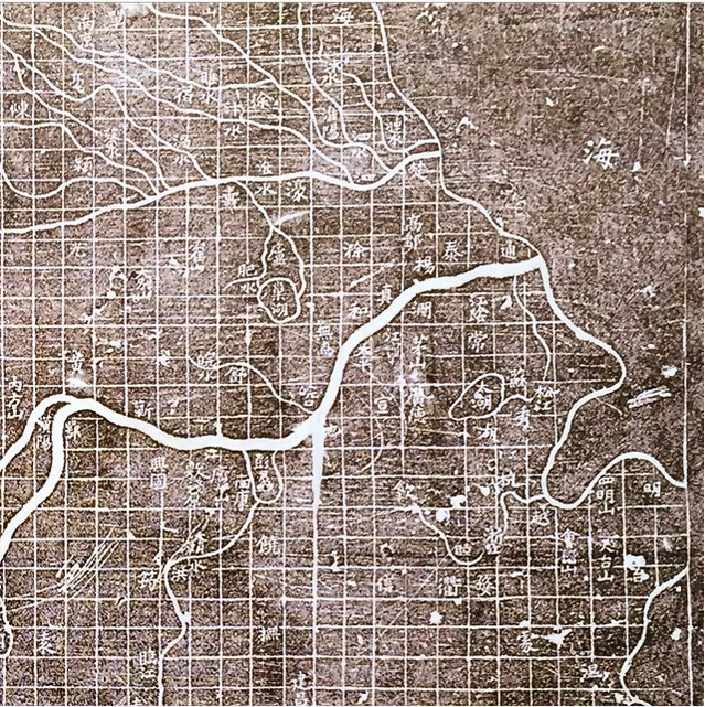
Map of the Tracks of Yu, 1136

Filed under: History,Mapping,Maps — Patrick Durusau @ 12:47 pm

Tracks-of-Yu-1136

I first saw this on Instagram at: https://instagram.com/p/363b2lOpn7/ with the following comment:

Map of the Tracks of Yu, 1136, is the first known map to use a cartographic grid.

The David Rumsey Map Collection, Cartography Associates, offers this more complete image from the Harvard Fine Arts Library:

Yujitu1136

And the following blurb:

Yujitu (Map of the Tracks of Yu), 1136. This map’s title derives from the Yugong, a treatise describing the sage-king Yu’s mythical channeling of China’s rivers. It is a rare surviving example of cartography used in the 12th century for public education, mixing classical references with later administrative history. Carved on a large stone tablet so that students or visitors could make rubbings, the map strikingly depicts a riverine network on a regular grid of squares intended to represent 100 li to a side. Read a more detailed description of this map by Alexander Akin, Ph.D. View the map in Google Earth. The image is courtesy Harvard Fine Arts Library.

To temp you into further reading, Alexander Akin’s description opens with these lines:

The Yijitu (Map of the Tracks of Yu) is the earliest extant map based on the Yugong (introduced below). Engraved in stone in 1136, the map measures about one meter to a side. It was carved into the face of an upright monument on the grounds of a school in Xi’an so that visitors could make detailed rubbings using paper and ink. These rubbings could be taken away for later reference. The stone plaque thus functioned as something like an immovable printing block, remaining in Xi’an while copies of its map found their way further afield. Harvard University holds one such rubbing made from the original stone, and has generously granted permission for the use of this unusually clear image, which shows more detail than any previously published version….

Alexander struggles, as only a modern would, over the “accuracy” of the map. A map that at times accords with the findings of modern map makers and at times accords with its Confucian heritage.

With maps in general and topic maps in particular, a question of “accuracy” cannot be answered with being supplied with the measurement to be applied in answering that question.

June 3, 2015

Mapping the History of L.A.’s Notorious Sprawl

Filed under: Mapping,Maps — Patrick Durusau @ 2:27 pm

Mapping the History of L.A.’s Notorious Sprawl by Betsy Mason.

From the post:

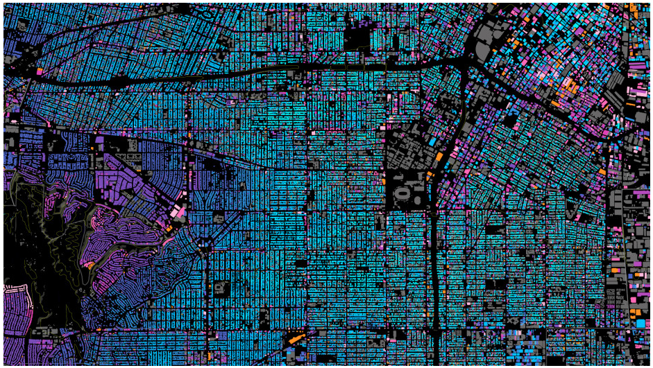
build-la

(Apologies for the distortion, the map really needs a full page and to be seen when interactive.)

From the post:

THE SPRAWLING BUILTSCAPE of Los Angeles always seems to have people there riled up in one way or another. Lately there are rumblings about “classic” L.A. homes being displaced by bigger, more modern houses, changing the face of established neighborhoods. Even people with enormous mansions are complaining about the enormouser mansions people are building next door. And this is just one of the ongoing storylines in an ever-morphing city.

Now, urban designer Omar Ureta has created an interactive map to help tell some of these stories. His Built:LA project shows the ages of almost every existing building in the city, and can break them down by decade to reveal how the city has grown over time (works best in Chrome or Firefox).

“There’s so much discussion going on right now in how L.A. is urbanizing, I wanted to create a tool that could contribute to the dialogue,” Ureta, who moved to L.A. nine years ago from the Inland Empire, told me in an email. “I’m excited that the map is actually making people ask more questions about their neighborhood, their city and the whole region.”

Ureta’s combining of data from a variety of sources enables users to peel back layers of construction in L.A. Makes me curious about forward looking “what-if” maps based on local history of development?

This project should be an inspiration for either historical or future projecting maps of urban construction.

June 2, 2015

Spatial Humanities Workshop

Filed under: Humanities,Mapping,Maps,Spatial Data — Patrick Durusau @ 9:51 am

Spatial Humanities Workshop by Lincoln Mullen.

From the webpage:

Scholars in the humanities have long paid attention to maps and space, but in recent years new technologies have created a resurgence of interest in the spatial humanities. This workshop will introduce participants to the following subjects:

  • how mapping and spatial analysis are being used in humanities disciplines
  • how to find, create, and manipulate spatial data
  • how to create historical layers on interactive maps
  • how to create data-driven maps
  • how to tell stories and craft arguments with maps
  • how to create deep maps of places
  • how to create web maps in a programming language
  • how to use a variety of mapping tools
  • how to create lightweight and semester-long mapping assignments

The seminar will emphasize the hands-on learning of these skills. Each day we will pay special attention to preparing lesson plans for teaching the spatial humanities to students. The aim is to prepare scholars to be able to teach the spatial humanities in their courses and to be able to use maps and spatial analysis in their own research.

Ahem, the one thing Larry forgets to mention is that he is a major player in spatial humanities. His homepage is an amazing place.

The seminar materials don’t disappoint. It would be better to be at the workshop but in lieu of attending, working through these materials will leave you well grounded in spatial humanities.

May 31, 2015

Hand Drawn Map Association

Filed under: Mapping,Maps — Patrick Durusau @ 9:38 am

Hand Drawn Map Association

The homepage promises:

The Hand Drawn Map Association (HDMA) is an ongoing archive of user submitted maps and other interesting diagrams created by hand.

From Here to There: A Curious Collection: A Curious Collection from the Hand Drawn Map Association.

From the page about the book:

The situation is as familiar as it is mundane: planning to visit friends in an unfamiliar part of the city, you draw yourself a basic map with detailed directions. In 2008, artist and designer Kris Harzinski founded the Hand Drawn Map Association to collect simple drawings of the everyday. Fascinated by these accidental records of a moment in time, he soon amassed a wide variety of maps, ranging from simple directions to maps of fictional locations, found maps, and maps of unusual places (such as a map of a high school locker), including examples by such well-known luminaries as Abraham Lincoln, Ernest Shackleton, and Alexander Calder.

From Here to There celebrates these ephemeral documents—usually forgotten or tossed after having served their purpose—and gives them their due as everyday artifacts. The more than 140 maps featured in this book, including, among many others, maps of an imaginary country for ants, of a traffic island in Australia, of a childhood fort, and of the Anne Frank House in Amseterdam, are as varied and touching as the stories they tell.

Does the ephemeral nature of these maps have a lesson for topic maps? While long lived topic maps are one use case, are temporary, even very temporary topic maps another?

Are there topic maps that I don’t need/want to persist beyond their immediate use?

The time and resources would vary from topic maps meant for long term usage, but so should the doctrines for subject identity?

I don’t have a copy of the book, yet, but there is much to be learned here.

May 28, 2015

Understanding Map Projections

Filed under: Cartography,Geography,Mapping,Maps — Patrick Durusau @ 3:22 pm

Understanding Map Projections by Tiago Veloso.

From the post:

Few subjects are so controversial – or at least, misunderstood- in cartography as map projections, especially if you’re taking your first steps in this field. And that’s simply because every flat map misrepresents the surface of the Earth in some way. So, in this matter, your work in map-mapping is basically to choose the best projection that suits your needs and reduces the distortion of the most important features you are trying to show/highlight.

But it’s not because you don’t have enough literature about it. There are actually a bunch of great resources and articles that will help you choose the correct projection for your map, so we decided to bring together a quick reference list.

Hope you enjoy it!

I rather like the remark:

…reduces the distortion of the most important features you are trying to show/highlight.

In part because I read it as a concession that all projections are distortions, including those that suit our particular purposes.

I would argue that all maps are at their inception distortions. They never represent every detail of what is being mapped and that implies a process of selective omission. Someone will consider what was omitted important, but it was less important than some other detail to the map maker.

Would the equivalent of projections for topic maps be choice of associations between topics or choices of subjects? Or both?

I lean towards the choice of associations and subjects because graphical rendering of associations creates impressions of the existence and strengths of relationships. Subjects because they are the anchors of the associations.

Speaking of distortion, I would consider any topic map about George H. W. Bush that doesn’t list his war crimes and members of his administration who were also guilty of war crimes as incomplete. There are other opinions on that topic (or at least so I am told).

Suggestions on how to spot “tells” of omission? What can be left out of a map that clues you in that something is missing? Varies from subject to subject but even a rough list would be helpful.

April 24, 2015

Animation of Gerrymandering?

Filed under: Geographic Data,Geospatial Data,Government,Mapping,Maps — Patrick Durusau @ 1:45 pm

United States Congressional District Shapefiles by Jeffrey B. Lewis, Brandon DeVine, and Lincoln Pritcher with Kenneth C. Martis.

From the description:

This site provides digital boundary definitions for every U.S. Congressional District in use between 1789 and 2012. These were produced as part of NSF grant SBE-SES-0241647 between 2009 and 2013.

The current release of these data is experimental. We have had done a good deal of work to validate all of the shapes. However, it is quite likely that some irregulaties remain. Please email jblewis@ucla.edu with questions or suggestions for improvement. We hope to have a ticketing system for bugs and a versioning system up soon. The district definitions currently available should be considered an initial-release version.

Many districts were formed by aggregragating complete county shapes obtained from the National Historical Geographic Information System (NHGIS) project and the Newberry Library’s Atlas of Historical County Boundaries. Where Congressional district boundaries did not coincide with county boundaries, district shapes were constructed district-by-district using a wide variety of legal and cartographic resources. Detailed descriptions of how particular districts were constructed and the authorities upon which we relied are available (at the moment) by request and described below.

Every state districting plan can be viewed quickly at https://github.com/JeffreyBLewis/congressional-district-boundaries (clicking on any of the listed file names will create a map window that can be paned and zoomed). GeoJSON definitions of the districts can also be downloaded from the same URL. Congress-by-Congress district maps in ERSI ShapefileA format can be downloaded below. Though providing somewhat lower resolution than the shapefiles, the GeoJSON files contain additional information about the members who served in each district that the shapefiles do not (Congress member information may be useful for creating web applications with, for example, Google Maps or Leaflet).

Project Team

The Principal Investigator on the project was Jeffrey B. Lewis. Brandon DeVine and Lincoln Pitcher researched district definitions and produced thousands of digital district boundaries. The project relied heavily on Kenneth C. Martis’ The Historical Atlas of United States Congressional Districts: 1789-1983. (New York: The Free Press, 1982). Martis also provided guidance, advice, and source materials used in the project.

How to cite

Jeffrey B. Lewis, Brandon DeVine, Lincoln Pitcher, and Kenneth C. Martis. (2013) Digital Boundary Definitions of United States Congressional Districts, 1789-2012. [Data file and code book]. Retrieved from http://cdmaps.polisci.ucla.edu on [date of
download].

An impressive resource for anyone interested in the history of United States Congressional Districts and their development. An animation of gerrymandering of congressional districts was the first use case that jumped to mind. 😉

Enjoy!

I first saw this in a tweet by Larry Mullen.

April 17, 2015

Join the Letter Hunt from Space with Aerial Bold

Filed under: MapBox,Mapping,Maps — Patrick Durusau @ 2:17 pm

Join the Letter Hunt from Space with Aerial Bold by Alex Barth.

From the post:

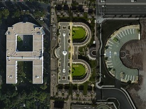
Imagine you could write text entirely made up of satellite imagery. Each letter would be a real world feature from a bird’s eye view. A house in the shape of an “A”, a lake in the shape of a “B”, a parking lot in the shape of a “C” and so on. This is the idea behind the nascent kickstarter funded project Aerial Bold. Its inventors Benedikt Groß and Joey Lee are right now collecting font shapes in satellite imagery for Aerial Bold and you can join the letter hunt from space.

mapbox-earth-letters

Letters are recognized from space, based on letter forms. But, more letter forms are needed!

Read the post, join the hunt:

Letter Finder App.

Enjoy!

April 13, 2015

An experimental bird migration visualization

Filed under: CartoDB,Cartography,Mapping,Science — Patrick Durusau @ 9:36 am

Time Integrated Multi-Altitude Migration Patterns by Wouter Van den Broeck, Jan Klaas Van Den Meersche, Kyle Horton, and Sérgio Branco.

From the webpage:

The Problem

Every year hundreds of millions of birds migrate to and from their wintering and breeding grounds, often traveling hundreds, if not thousands of kilometers twice a year. Many of these individuals make concentrated movements under the cover of darkness, and often at high altitudes, making it exceedingly difficult to precisely monitor the passage of these animals.

However one tool, radar, has the ability to measure the mass flow of migrants both day and night at a temporal and spatial resolution that cannot be matched by any other monitoring tool. Weather surveillance radars such as those of the EUMETNET/OPERA and NEXRAD networks continually monitor and collect data in real-time, monitoring meteorological phenomena, but also biological scatters (birds, bats, and insects). For this reason radar offers a unique tool for collecting large-scale data on biological movements. However, visualizing these data in a comprehensive manner that facilitates insight acquisition, remains a challenge.

Our contribution

To help tackle this challenge, the European Network for the Radar Surveillance of Animal Movement (ENRAM) organized the Bird Migration Visualization Challenge & Hackathon in March 2015 with the support of the European Cooperation in Science and Technology (COST) programme. We participated and explored a particular approach.

Using radar measures of bioscatter (birds, bats, and insects), algorithms can estimate the density, speed, and direction of migration movement at different altitudes around a radar. By interpolating these data both spatially and temporally, and mapping these geographically in the form of flow lines, a visualization might be obtained that offers insights in the migration patterns when applied to a large-scale dataset. The result is an experimental interactive web-based visualization that dynamically loads data from the given case study served by the CartoDB system.

Impressive work with both static and interactive visualizations!

Enjoy!

March 28, 2015

NewsStand: A New View on News (+ Underwear Down Under)

Filed under: Aggregation,Georeferencing,Geospatial Data,Mapping,Maps,News — Patrick Durusau @ 5:05 pm

NewsStand: A New View on News by Benjamin E. Teitler, et al.

Abstract:

News articles contain a wealth of implicit geographic content that if exposed to readers improves understanding of today’s news. However, most articles are not explicitly geotagged with their geographic content, and few news aggregation systems expose this content to users. A new system named NewsStand is presented that collects, analyzes, and displays news stories in a map interface, thus leveraging on their implicit geographic content. NewsStand monitors RSS feeds from thousands of online news sources and retrieves articles within minutes of publication. It then extracts geographic content from articles using a custom-built geotagger, and groups articles into story clusters using a fast online clustering algorithm. By panning and zooming in NewsStand’s map interface, users can retrieve stories based on both topical signifi cance and geographic region, and see substantially diff erent stories depending on position and zoom level.

Of particular interest to topic map fans:

NewsStand’s geotagger must deal with three problematic cases in disambiguating terms that could be interpreted as locations: geo/non-geo ambiguity, where a given phrase might refer to a geographic location, or some other kind of entity; aliasing, where multiple names refer to the same geographic location, such as “Los Angeles” and “LA”; and geographic name ambiguity or polysemy , where a given name might refer to any of several geographic locations. For example, “Springfield” is the name of many cities in the USA, and thus it is a challenge for disambiguation algorithms to associate with the correct location.

Unless you want to hand disambiguate all geographic references in your sources, this paper merits a close read!

BTW, the paper dates from 2008 and I saw it in a tweet by Kirk Borne, where Kirk pointed to a recent version of NewsStand. Well, sort of “recent.” The latest story I could find was 490 days ago, a tweet from CBS News about the 50th anniversary of the Kennedy assassination in Dallas.

Undaunted I checked out TwitterStand but it seems to suffer from the same staleness of content, albeit it is difficult to tell because links don’t lead to the tweets.

Finally I did try PhotoStand, which judging from the pop-up information on the images, is quite current.

I noticed for Perth, Australia, “A special section of the exhibition has been dedicated to famous dominatrix Madame Lash.”

Sadly this appears to be one the algorithm got incorrect, so members of Congress should not select purchase on their travel arrangements just yet.

Sarah Carty for Daily Mail Australia reports in From modest bloomers to racy corsets: New exhibition uncovers the secret history of women’s underwear… including a unique collection from dominatrix Madam Lash:

From the modesty of bloomers to the seductiveness of lacy corsets, a new exhibition gives us a rare glimpse into the most intimate and private parts of history.

The Powerhouse Museum in Sydney have unveiled their ‘Undressed: 350 Years of Underwear in Fashion’ collection, which features undergarments from the 17th-century to more modern garments worn by celebrities such as Emma Watson, Cindy Crawford and even Queen Victoria.

Apart from a brief stint in Bendigo and Perth, the collection has never been seen by any members of the public before and lead curator Edwina Ehrman believes people will be both shocked and intrigued by what’s on display.

So the collection was once shown in Perth, but for airline reservations you had best book for Sydney.

And no, I won’t leave you without the necessary details:

Undressed: 350 Years of Underwear in Fashion opens at the Powerhouse Museum on March 28 and runs until 12 July 2015. Tickets can be bought here.

Ticket prices do not include transportation expenses to Sydney.

Spoiler alert: The exhibition page says:

Please note that photography is not permitted in this exhibition.

Enjoy!
March 20, 2015

Landsat-live goes live

Filed under: MapBox,Mapping,Maps — Patrick Durusau @ 7:10 pm

Landsat-live goes live by Camilla Mahon.

From the post:

Today we’re releasing the first edition of Landsat-live, a map that is constantly refreshed with the latest satellite imagery from NASA’s Landsat 8 satellite. Landsat 8 data is now publicly available on Amazon S3 via the new Landsat on AWS Public Data Set, making our live pipeline possible. We’re ingesting the data directly from Amazon S3, which is how we’re able to go from satellite to Mapbox map faster than ever. With every pixel captured within the past 32 days, Landsat-live features the freshest imagery possible around the entire planet.

With a 30 meter resolution, a 16 day revisit rate, and 10 multispectral bands, this imagery can be used to check the health of agricultural fields, the latest update on a natural disaster, or the progression of deforestation. Interact with the map above to see the freshest imagery anywhere in the world. Be sure to check back often and observe the constantly changing nature of our planet as same day imagery hits this constantly updating map. Scroll down the page to see some of our favorite stills of the earth from Landsat’s latest collection.

See Camilla’s post, you will really like the images.

Even with 30 meter resolution you will be able to document the impact of mapping projects that are making remote areas more accessible to exploitation.

March 16, 2015

Computing the optimal road trip across the U.S.

Filed under: Mapping,Maps,Python — Patrick Durusau @ 4:31 pm

Computing the optimal road trip across the U.S. by Randal S. Olson.

From the webpage:

This notebook provides the methodology and code used in the blog post, Computing the optimal road trip across the U.S..

This is a nice surprise for a Monday!

The original post goes into the technical details and is quite good.

March 2, 2015

CartoDB and Plotly Analyze Earthquakes

Filed under: CartoDB,Mapping,Maps,Plotly — Patrick Durusau @ 8:06 pm

CartoDB and Plotly Analyze Earthquakes

From the post:

CartoDB lets you easily make web-based maps driven by a PostgreSQL/PostGIS backend, so data management is easy. Plotly is a cloud-based graphing and analytics platform with Python, R, & MATLAB APIs where collaboration is easy. This IPython Notebook shows how to use them together to analyze earthquake data.

Assuming your data/events have geographic coordinates, this post should enable you to plot that information as easy as earthquakes.

For example, if you had traffic accident locations, delays caused by those accidents and weather conditions, you could plot where the most disruptive accidents happen and the weather conditions in which they occur.

February 17, 2015

Making Maps in R

Filed under: Mapping,Maps,R — Patrick Durusau @ 5:14 pm

Making Maps in R by Kevin Johnson.

from the post:

I make a lot of maps in my line of work. R is not the easiest way to create maps, but it is convenient and it allows for full control of what the map looks like. There are tons of different ways to create maps, even just within R. In this post I’ll talk about the method I use most of the time. I will assume you are proficient in R and have some level of familiarity with the ggplot2 package.

The American Community Survey provides data on almost any topic imaginable for various geographic levels in the US. For this example I will look at the 2012 5-year estimates of the percent of people without health insurance by census tract in the state of Georgia (obtained from the US Census FactFinder). Shapefiles were obtained from the US Census TIGER database. I generally use the cartographic boundary files since they are simplified representations of the boundaries, which saves a lot of space and processing time.

Occurs to me that getting students to make maps of their home states with a short list of data options (for a class), could be an illustration of testing whether results are “likely” or not. Reasoning that students are likely to have some sense of demographic distributions for their home states (or should).

I first saw this in a tweet by Neil Saunders.

February 14, 2015

Streets of Paris Colored by Orientation

Filed under: Mapping,Maps,R — Patrick Durusau @ 8:12 pm

Streets of Paris Colored by Orientation by Mathieu Rajerison.

From the post:

Recently, I read an article by datapointed which presented maps of streets of different cities colored by orientation.

The author gave some details about the method, which I tried to reproduce. In this post, I present the different steps from the calculation in my favorite spatial R ToolBox to the rendering in QGIS using a specific blending mode.

An opportunity to practice R and work with maps. More enjoyable than sifting data to find less corrupt politicians.

I first saw this in a tweet by Caroline Moussy.

In Defense of the Good Old-Fashioned Map

Filed under: Interface Research/Design,Mapping,Maps — Patrick Durusau @ 1:40 pm

In Defense of the Good Old-Fashioned Map – Sometimes, a piece of folded paper takes you to places the GPS can’t by Jason H. Harper.

A great testimonial to hard copy maps in addition to being a great read!

From the post:


But just like reading an actual, bound book or magazine versus an iPad or Kindle, you consume a real map differently. It’s easier to orient yourself on a big spread of paper, and your eye is drawn to roads and routes and green spaces you’d never notice on a small screen. A map invites time and care and observance of the details. It encourages the kind of exploration that happens in real life, when you’re out on the road, instead of the turn-by-turn rigidity of a digital device.

You can scroll or zoom with a digital map or digital representation of a topic map, but that isn’t quite the same as using a large, hard copy representation. Digital scrolling and zooming is like exploring a large scale world map through a toilet paper tube. It’s doable but I would argue it is a very different experience from a physical large scale world map.

Unless you are at a high-end visualization center or until we have walls as high resolution displays, you may want to think about production of topic maps as hard copy maps for some applications. While having maps printed isn’t cheap, it pales next to the intellectual effort that goes into constructing a useful topic map.

A physical representation of a topic map would have all the other advantages of a hard copy map. It would survive and be accessible without electrical power, it could be manually annotated, it could shared with others in the absence of computers, it could be compared to observations and/or resources, in fact it could be rather handy.

I don’t have a specific instance in mind but raise the point to keep in mind the range of topic map deliverables.

February 12, 2015

Digital Cartography [87]

Filed under: Cartography,Mapping,Maps — Patrick Durusau @ 7:44 pm

Digital Cartography [87] by Tiago Veloso.

Tiago has collected twenty-two (22) interactive maps that cover everything from “Why Measles May Just Be Getting Started | Bloomberg Visual Data” and “A History of New York City Basketball | NBA” (includes early stars as well) to “Map of 73 Years of Lynchings | The New York Times” and “House Vote 58 – Repeals Affordable Care Act | The New York Times.”

Sad to have come so far and yet not so far. Rather than a mob we have Congress, special interest groups and lobbyists. Rather than lynchings, everyone outside of the top 5% or so becomes poorer, less healthy, more stressed and more disposable. But we have a “free market” Shouting that at Galgotha would not have been much comfort.

February 7, 2015

Geojournalism.org

Filed under: Geographic Data,Geography,Geospatial Data,Journalism,Mapping,Maps — Patrick Durusau @ 3:05 pm

Geojournalism.org

From the webpage:

Geojournalism.org provides online resources and training for journalists, designers and developers to dive into the world of data visualization using geographic data.

From the about page:

Geojournalism.org is made for:

Journalists

Reporters, editors and other professionals involved on the noble mission of producing relevant news for their audiences can use Geojournalism.org to produce multimedia stories or simple maps and data visualization to help creating context for complex environmental issues

Developers

Programmers and geeks using a wide variety of languages and tools can drink on the vast knowledge of our contributors. Some of our tutorials explore open source libraries to make maps, infographics or simply deal with large geographical datasets

Designers

Graphic designers and experts on data visualizations find in the Geojournalism.org platform a large amount of resources and tips. They can, for example, improve their knowledge on the right options for coloring maps or how to set up simple charts to depict issues such as deforestation and climate change

It is one thing to have an idea or even a story and quite another to communicate it effectively to a large audience. Geojournalism is designed as a community site that will help you communicate geophysical data to a non-technical audience.

I think it is clear that most governments are shy about accurate and timely communication with their citizens. Are you going to be one of those who fills in the gaps? Geojournalism.org is definitely a site you will be needing.

February 5, 2015

Linguistic Geographies: The Gough Map of Great Britain and its Making

Filed under: Cartography,History,Mapping,Maps — Patrick Durusau @ 2:31 pm

Linguistic Geographies: The Gough Map of Great Britain and its Making

From the home page:

The Gough Map is internationally-renowned as one of the earliest maps to show Britain in a geographically-recognizable form. Yet to date, questions remain of how the map was made, who made it, when and why.

This website presents an interactive, searchable edition of the Gough Map, together with contextual material, a blog, and information about the project and the Language of Maps colloquium.

Another snippet from the about page:

The Linguistic Geographies project involved a group of researchers from across three UK HEIs, each bringing distinctive skills and expertise to bear. Each has an interest in maps and mapping, though from differing disciplinary perspectives, from geography, cartography and history. Our aim was to learn more about the Gough Map, specifically, but more generally to contribute to ongoing intellectual debates about how maps can be read and interpreted; about how maps are created and disseminated across time and space; and about technologies of collating and representing geographical information in visual, cartographic form. An audio interview with two of the project team members – Keith Lilley and Elizabeth Solopova – is available via the Beyond Text web-site, at http://projects.beyondtext.ac.uk/video.php (also on YouTube).

The project’s focus on a map, as opposed to a conventional written text, thus opens up theoretical and conceptual issues about the relationships between ‘image’ and ‘text’ – for maps comprise both – and about maps as objects and artifacts with a complex and complicated ‘language’ of production and consumption. To explore these issues the project team organized an international colloquium on The Language of Maps, held over the weekend of June 23-25 2011 at the Bodleian Library Oxford. Further details and a short report on the colloquium are available here.

Be sure to visit the Beyond Text web-site. The interface under publications isn’t impressive but the publications for any given project are.

February 1, 2015

Mapping the Blind Spots:…

Filed under: Data Science,Mapping,Maps,Privacy — Patrick Durusau @ 4:48 pm

Mapping the Blind Spots: Developer Unearths Secret U.S. Military Bases by Lorenzo Franceschi-Bicchierai.

From the post:

If you look closely enough on Google or Bing Maps, some places are blanked out, hidden from public view. Many of those places disguise secret or sensitive American military facilities.

The United States military has a foothold in every corner of the world, with military bases on every continent. It’s not even clear how many there are out there. The Pentagon says there are around 5,000 in total, and 598 in foreign countries, but those numbers are disputed by the media.

But how do these facilities look from above? To answer that question, you first need to locate the bases. Which, as it turns out, is relatively easy.

That’s what Josh Begley, a data artist, found out when he embarked on a project to map all known U.S. military bases around the world, collect satellite pictures of them using Google Maps and Bing Maps, and display them all online.

The project, which he warns is ongoing, was inspired by Trevor Paglen’s book “Blank Spots on the Map” which goes inside the world of secret military bases that are sometimes censored on maps.

A great description of how to combine public data to find information others prefer to not be found.

I suspect the area is well enough understood to make a great high school science fair project, particularly if countries that aren’t as open as the United States were used as targets for filling in the blank spaces. Would involve obtaining public maps for that country, determining what areas are “blank,” photo analysis of imagery, correlation with press and other reports.

Or detection of illegal cutting of forests, mining, or other ecological crimes. All of those are too large scale to be secret.

Better imagery is only a year or two away, perhaps sufficient to start tracking polluters who truck industrial wastes to particular states for dumping.

With satellite/drone imagery and enough eyes, no crime is secret.

The practices of illegal forestry, mining, pollution, virtually any large scale outdoor crime will wither under public surveillance.

That might not be a bad trade-off in terms of privacy.

January 30, 2015

So You’d Like To Make a Map Using Python

Filed under: Mapping,Maps,Python — Patrick Durusau @ 8:25 pm

So You’d Like To Make a Map Using Python by Stephan Hügel.

From the post:

Making thematic maps has traditionally been the preserve of a ‘proper’ GIS, such as ArcGIS or QGIS. While these tools make it easy to work with shapefiles, and expose a range of common everyday GIS operations, they aren’t particularly well-suited to exploratory data analysis. In short, if you need to obtain, reshape, and otherwise wrangle data before you use it to make a map, it’s easier to use a data analysis tool (such as Pandas), and couple it to a plotting library. This tutorial will be demonstrating the use of:

  • Pandas
  • Matplotlib
  • The matplotlib Basemap toolkit, for plotting 2D data on maps
  • Fiona, a Python interface to OGR
  • Shapely, for analyzing and manipulating planar geometric objects
  • Descartes, which turns said geometric objects into matplotlib “patches”
  • PySAL, a spatial analysis library

The approach I’m using here uses an interactive REPL (IPython Notebook) for data exploration and analysis, and the Descartes package to render individual polygons (in this case, wards in London) as matplotlib patches, before adding them to a matplotlib axes instance. I should stress that many of the plotting operations could be more quickly accomplished, but my aim here is to demonstrate how to precisely control certain operations, in order to achieve e.g. the precise line width, colour, alpha value or label position you want.

I didn’t catch this when it was originally published (2013) so you will probably have to update some of the specific package versions.

Still, this looks like an incredibly useful exercise.

Not just for learning Python and map creation but deeper knowledge about particular cities as well. On a good day I can find my way around the older parts of Rome from the Trevi Fountain but my knowledge fades pretty rapidly.

Creating a map using Python could help flesh out your knowledge of cities that are otherwise just names on the news. Isn’t that one of those quadruple learning environments? Geography + Cartography + Programming + Demographics? That’s how I would pitch it in any event.

I first saw this in a tweet by YHat, Inc.

January 22, 2015

Digital Cartography [84]

Filed under: Cartography,Mapping,Maps — Patrick Durusau @ 6:35 pm

Digital Cartography [84] by Visual Loop.

From the post:

Welcome to the year’s first edition of Digital Cartography, our weekly column where we feature the most recent interactive maps that came to our way. And being this the first issue of 2015, of course that it’s fully packed with more than 40 new interactive maps and cartographic-based narratives.

That means that you’ll need quite a bit of time to spend exploring these examples, but if that isn’t enough, there’s always the list with our 100 favorite interactive maps of 2014 (part one and two), guaranteed to keep you occupied for the next day or so.

…[M]ore than 40 new interactive maps and cartographic-based narratives.

How very cool!

With a couple of notable exceptions (see the article) mostly geography based mappings. There’s nothing wrong with geography based mappings but it makes me curious why there isn’t more diversity in mapping?

Just as a preliminary thought, could it be that geography gives us a common starting point for making ourselves understood? Rather than undertaking a burden of persuasion before we can induce someone to use the map?

From what little I have heard (intentionally) about #Gamergate, I would say a mapping of the people, attitudes, expressions of same and the various forums would vary significantly from person to person. If you did a non-geographic mapping of that event(?) (sorry, I don’t have more precise language to use), what would it look like? What major attitudes, factors, positions would you use to lay out the territory?

Personally I don’t find the lack of a common starting point all that troubling. If a map is extensive enough, it will surely intersect some areas of interest and a reader can start to work outwards from that intersection. They may or may not agree with what they find but it would have the advantage of not being snippet sized texts divorced from some over arching context.

A difficult mapping problem to be sure, one that poses far more difficulties than one that uses physical geography as a starting point. Would even an imperfect map be of use to those trying to sort though issues in such a case?

January 15, 2015

Open Addresses

Filed under: Government,Government Data,Mapping — Patrick Durusau @ 10:23 am

Open Addresses

From the homepage:

At Open Addresses, we are bringing together information about the places where we live, work and go about our daily lives. By gathering information provided to us by people about their own addresses, and from open sources on the web, we are creating an open address list for the UK, available to everyone.

Do you want to enter our photography competition?

Or do you want to get involved by submitting an address?

It’s as simple as entering it below.

Addresses are a vital part of the UK’s National Information Infrastructure. Open Addresses will be used by a whole range of individuals and organisations (academics, charities, public sector and private sector). By having accurate information about addresses, we’ll all benefit from getting more of the things we want, and less of the things we don’t.

Datasets as of 10 December 2014 are available for download now. Via BitTorrent so I assume the complete datasets are fairly large. Anyone downloaded them?

If you do download all or part of the records, curious what other public data sets would you combine with them?

January 5, 2015

Mapping Boston’s Religions:…

Filed under: History,Mapping,Maps — Patrick Durusau @ 8:13 pm

Mapping Boston’s Religions: Next Steps in Mapping U.S. Religious History by Lincoln Mullen.

From the first slide:

This conference paper and visualizations are to be delivered January 5, 2015, at the annual meeting of the American Society of Church History. It is part of a panel on “Mapping Religious Space: Four American Cities from the Colonial Era to the Twentieth Century.

The slides aren’t numbered but I think from slide 4:

My general argument is that there are large sources of data on American religion after the colonial period and before Word War II which historians have not used to make maps. Scholars have not passed over these sources because they are unaware of them, but because they could not meaningfully represent them in print maps. The problem is one of resolution. Print atlases could convey relatively few data points. Furthermore, because atlases can contain only so many maps, they have often been forced to set their chronological or geographic scope very large. By using these more detailed sources we are able to make maps which better approximate the sophisticated thinking about religious categories that we expect from our prose. These richer maps can tell us not just more, but more humanistic, things about religious history. To take advantage of these more comprehensive sources we need digital maps. To be sure, digital history has had more than its share of hubris, more than we have time to repent of today. But digital maps do offer the possibility for working at different scales, for displaying change over time, for integrating maps with our sources, and for crafting narratives with maps. While none of these advantages entirely solves with the problem of mapping humanistically, they do permit us to at least start to address these theoretical concerns.

Lowering the barriers and constraints on map making, such as the limitations and cost of print maps, is empowering new map makers, like Lincoln Mullen, to craft maps no one has attempted before. Where those maps will take us remains to be seen.

I first saw this in a tweet by Lincoln Mullen.

January 2, 2015

Making a Map with QGIS

Filed under: Mapping,Maps,QGIS — Tags: — Patrick Durusau @ 3:57 pm

Making a Map with QGIS by Fred Gibbs.

From the post:

Even if you have some experience with GIS in general and QGIS in particular, it’s always helpful to review the fundamentals. Read through “Introducing GIS”, “Vector Data”, and “Raster Data” from this gentle introduction to GIS.

If (= when), during your QGIS adventures, you get stuck or have questions, consult the QGIS Training Manual, the QGIS wiki, and an array of tutorials. You may not at first find exactly what you’re looking for, but it’s worth browsing through these sites to help better understand the software and prevent conceptual misunderstandings. Be aware that many tutorials are for older versions of QGIS, so the screen shots and menu labels may not match exactly what you see in your version–but often the concepts are the same.

Also, remember that Google searches are your friend. You’re not the first one to haul yourself up the learning curve of QGIS; many people have likely posted similar questions on forums where someone eventually provided a useful explanation. Others have written tutorials or blog posts that can shed more light on your issue. You won’t always find exactly what you need, but this kind of searching helps you better understand the tool and build your vocabulary for how to search and solve problems on your own.

If you think maps may not be relevant to issues of interest to you, consider the following passage:

The first thing to recognize when it comes to GIS software like QGIS is that it doesn’t display maps, it displays data (most of which will have strong geographic ties). You are in charge of composing the map you want from the relevant geographic and social data you’re interested in. This might sound annoying, but it’s actually incredibly powerful.

The second thing to recognize is that GIS tools are not only for projects centered on geographic analysis. Whether you’re thinking about people, commodities, ideas, political power, or whatever, these all have a grounding in space with various features (transportation networks like roads or railroads, political boundaries, access to natural resources, wealth disparity, demographic data, etc). While these features might not be a direct concern of yours, they can add extremely useful context to your research. Before easily accessible data and GIS software, the work to create maps for secondary research concerns far exceeded the benefit. The barrier now is far, far lower.

The last two sentences of the first paragraph:

You are in charge of composing the map you want from the relevant geographic and social data you’re interested in. This might sound annoying, but it’s actually incredibly powerful. (emphasis added)

are directly applicable to topic maps. If you are expecting to open most topic maps software and find a map for you, you are likely to be very disappointed.

The second paragraph, about maps not being limited to geographic analysis, comes to mind when you think about #blacklivesmatter, for instance. Where do most fatal police shootings happen, geographically speaking? It is one thing to “know” where they happen and quite another to have a map that graphically displays that knowledge. It is harder for others to dodge pointed questions if the data is presented in an open and persuasive manner.

Or if you want to do some data mining, where do most police stops occur for particular types of traffic violations? Or do that by time of day.

Or map all the petit jury pools by geographic location.

Rather hard for the establishment to argue with data it generated. Yes?

PS: If you are interested, I have suggestions on how a local neighborhood police watch could collect verifiable data on police patrols and their activities. Collate that to a map and other documents. Areas without regular patrols might stand out, areas with high levels of police activity, etc.

Mapbox: Innovating with Landsat

Filed under: Government,MapBox,Mapping,Maps — Patrick Durusau @ 2:52 pm

Mapbox: Innovating with Landsat by Larisa Serbina and Holly Miller.

From the post:

Mapbox* is a cloud-based map platform startup that creates custom maps with open source tools. The team at Mapbox consists of over fifty cartographers, data analysts and software engineers, located in Washington, D.C. and San Francisco, California. One of the open-source tools used by Mapbox is Landsat imagery. The company has a satellite team consisting of five employees dedicated to projects that use Landsat imagery to develop new products and enhance existing imagery.

Charlie Loyd, a member of the satellite team at Mapbox, points out that Landsat imagery is an integral part of the satellite base layer which is a vital part of the business. “There are more than 800 billion Landsat-derived pixels of land in our imagery. If we printed out just our Landsat-based world map at poster resolution, it would cover two acres,” says Loyd.

Internal estimates at Mapbox show that licensing commercial imagery equivalent to Landsat would cost $4 million per year for the base layer alone. The company would face costs beyond $4 million to produce the current cloudless basemap product, which requires more input pixels than output pixels. These costs would prohibit further development of medium-resolution products. “In other words,” Loyd notes, “we make goods with Landsat that otherwise would not get made.” An example of a cloudless map derived from Landsat is shown in Figure 1.

MapBox Figure 1.65 percent

Figure 1. Example of a cloudless image of the western states in the U.S., composed using Landsat. Courtesy of Mapbox.

A great example of government undertaking a task that is beyond the reach of any individual and most enterprises. A task that results in data that can be re-used by others for a multitude of purposes.

Kudos to Mapbox and the USGS (US Geological Survey)!

If you are not familiar with the resources available from the USGS (US Geological Survey), you are in for a real treat.

December 25, 2014

Turf: GIS for web maps

Filed under: GIS,MapBox,Mapping,Maps — Patrick Durusau @ 8:51 pm

Turf: GIS for web maps by Morgan Herlocker.

From the post:

Turf is GIS for web maps. It’s a fast, compact, and open-source JavaScript library that implements the most common geospatial operations: buffering, contouring, triangular irregular networks (TINs), and more. Turf speaks GeoJSON natively, easily connects to Leaflet, and is now available as a Mapbox.js plugin on our cloud platform. We’re also working to integrate Turf into our offline products and next-generation map rendering tools.

newyork-pop-lines

(Population data from the US Census transformed in read-time into population isolines with turf-isoline.)

The image in the original post is interactive. Plus there are several other remarkable examples.

Turf is part of a new geospatial infrastructure. Unlike the ArcGIS API for JavaScript, Turf can run completely client-side for all operations, so web apps can work offline and sensitive information can be kept local. We’re constantly refining Turf’s performance. Recent research algorithms can make operations like clipping and buffering faster than ever, and as JavaScript engines like V8 continue to optimize, Turf will compete with native code.

Can you imagine how “Steal This Book” would have been different if Abbie Hoffman had access to technology such as this?

Would you like to try? 😉

Cartographer: Interactive Maps for Data Exploration

Filed under: Cartography,D3,Mapping,Maps,R — Patrick Durusau @ 11:45 am

Cartographer: Interactive Maps for Data Exploration by Lincoln Mullen.

From the webpage:

Cartographer provides interactive maps in R Markdown documents or at the R console. These maps are suitable for data exploration. This package is an R wrapper around Elijah Meeks’s d3-carto-map and d3.js, using htmlwidgets for R.

Cartographer is under very early development.

Data visualization enthusiasts should consider the screen shot used to illustrate use of the software.

What geographic assumptions are “cooked” in that display? Or are they?

Screenshot makes me think data “exploration” is quite misleading. As though data contains insights that are simply awaiting our arrival. On the contrary, we manipulate data until we create one or more patterns of interest to us.

Patterns of non-interest to us are called noise, gibberish, etc. That is to say there are no meaningful patterns aside from us choosing patterns as meaningful.

If data “exploration” is iffy, then so are data “mining” and data “visualization.” All three imply there is something inherent in the data to be found, mined or visualized. But, apart from us, those “somethings” are never manifest and two different people can find different “somethings” in the same data.

The different “somethings” implies to me that users of data play a creative role in finding, mining or visualizing data. A role that adds something to the data that wasn’t present before. I don’t know of a phrase that captures the creative interaction between a person and data. Do you?

In this particular case, the “cooked” in data isn’t quite that subtle. When I say “United States,” I don’t make a habit of including parts of Canada and a large portion of Mexico in that idea.

Map displays often have adjacent countries displayed for context but in this mapping, data values are assigned to points outside of the United State proper. Were the data values constructed on a different geographic basis than the designation of “United States?”

« Newer PostsOlder Posts »

Powered by WordPress