Another Word For It Patrick Durusau on Topic Maps and Semantic Diversity

January 15, 2014

Vega

Filed under: BigData,Graphics,Visualization,XDATA — Patrick Durusau @ 4:40 pm

Vega

From the webpage:

Vega is a visualization grammar, a declarative format for creating, saving and sharing visualization designs.

With Vega you can describe data visualizations in a JSON format, and generate interactive views using either HTML5 Canvas or SVG.

Read the tutorial, browse the documentation, join the discussion, and explore visualizations using the web-based Vega Editor.

vega.min.js (120K)

Source (GitHub)

Of interest mostly because of its use with XDATA@Kitware for example.

January 13, 2014

The Art of Data Visualization (Spring 2014)

Filed under: Graphics,Visualization — Patrick Durusau @ 7:45 pm

The Art of Data Visualization (Spring 2014) by Kaiser Fung.

February 8, 2014 – March 29, 2014
Saturday
9:00AM – 12:00PM

Description:

Data visualization is storytelling in a graphical medium. The format of this course is inspired by the workshops used extensively to train budding writers, in which you gain knowledge by doing and redoing, by offering and receiving critique, and above all, by learning from each another. Present your project while other students offer critique and suggestions for improvement. The course offers immersion into the creative process, the discipline of sketching and revising, and the practical use of tools. Develop a discriminating eye for good visualizations. Readings on aspects of the craft are assigned throughout the term.

Kaiser is teaching this course at NYU’s School of Continuing and Professional Studies.

And yes, it is a physical presence offering.

If you follow Kaiser’s blog you know this is going to be a real treat.

Even if you can’t attend, pass this along to someone who can.

January 10, 2014

Dirty Wind Paths

Filed under: Climate Data,Climate Informatics,Graphics,Visualization,Weather Data — Patrick Durusau @ 6:38 pm

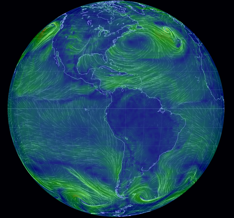
earth wind patterns

Interactive display of wind patterns on the Earth. Turn the globe, zoom in, etc.

Useful the next time a nuclear power plant cooks off.

If you doubt the “next time” part of that comment, review Timeline: Nuclear plant accidents from the BBC.

I count eleven (11) “serious” incidents between 1957 and 2014.

Highly dangerous activities are subject to catastrophic failure. Not every time or even often.

On the other hand, how often is an equivalent to the two U.S. space shuttle failures acceptable with a nuclear power plant?

If I were living nearby or in the wind path from a nuclear accident, I would say never.

You?

According to Dustin Smith at Chart Porn, where I first saw this, the chart updates every three hours.

WTFViz, ThumbsUpViz, and HelpMeViz

Filed under: Graphics,Visualization — Patrick Durusau @ 4:48 pm

WTFViz, ThumbsUpViz, and HelpMeViz by Robert Kosara.

Robert gives a quick heads up on three new visualization sites:

WTFViz – Visualizations done poorly and/or just wrong.

ThumbsUpViz – Good visualizations.

HelpMeViz – Where you can try to avoid WTFViz and hope to be seen on ThumbsUpViz.

More resources listed in Robert’s post.

Where are your visualizations destined?

PS: You owe it to your users to avoid what you see at WTFViz. I was stunned.

January 8, 2014

Create Real-Time Graphs with PubNub and D3.js

Filed under: Charts,D3,Graphics — Patrick Durusau @ 8:19 pm

Create Real-Time Graphs with PubNub and D3.js by Dan Ristic.

From the post:

Graphs make data easier to understand for any user. Previously we created a simple graph using D3.js to show a way to Build a Real-Time Bitcoin Pricing and Trading Infrastructure. Now we are going to dive a bit deeper with the power of D3.js, showing how graphs on web pages can be interactive and display an array of time plot data using a standard Cartesian coordinate system in an easily understandable fashion.

Unfortunately, once a user has loaded a web graph, the data is already stale and the user would normally need to refresh the entire page to get the latest information. However, not having the most current, updated information can be extremely detrimental to a decision making process. Thus, the need for real-time charting! This blog post will show how you can fix this problem and use the PubNub Real-Time Network to enhance D3.js with Real-Time graphing without reloading the page or polling with AJAX requests for changes.

Want to see it in action? Check out our live, working bitcoin graph demo here.

Yes, I know, it is a chart, not a graph. 😉

Maybe that should be an early vocabulary to propose. A vocabulary that distinguishes graphic representations from data structures. It would make for much better search results.

Suggestions?

PS: Despite my quibbles about the terminology, the article has techniques you will find generally useful.

January 2, 2014

Algorithms for manipulating large geometric data

Filed under: Graphics,Visualization — Patrick Durusau @ 7:25 pm

Algorithms for manipulating large geometric data by Jiri Skala.

Abstract:

This thesis deals with manipulating huge geometric data in the field of computer graphics. The proposed approach uses a data stream technique to allow processing gigantic datasets that by far exceed the size of the main memory. The amount of data is hierarchically reduced by clustering and replacing each cluster by a representative. The input data is organised into a hierarchical structure which is stored on the hard disk. Particular clusters from various levels of the hierarchy can be loaded on demand. Such a multiresolution model provides an efficient access to the data in various resolutions. The Delaunay triangulation (either 2D or 3D) can be constructed to introduce additional structure into the data. The triangulation of the top level of the hierarchy (the lowest resolution) constitutes a coarse model of the whole dataset. The level of detail can be locally increased in selected parts by loading data from lower levels of the hierarchy. This can be done interactively in real time. Such a dynamic triangulation is a versatile tool for visualisation and maintenance of large geometric models. Further applications include local computations, such as height field interpolation, gradient estimation, and mesh smoothing. The algorithms can take advantage of a high local detail and a coarse context around. The method was tested on large digital elevation maps (digital terrain models) and on large laser scanned 3D objects, up to half a billion points. The data stream clustering processes roughly 4 million points per minute, which is rather slow, but it is done only once as a preprocessing. The dynamic triangulation works interactively in real time.

The touchstone for this paper is a scan of David which contains 468.6 million vertices.

Visualization isn’t traditional graph processing but then traditional graph traversal isn’t the only way to process a graph.

Perhaps future graph structures will avoid being hard coded for particular graph processing models.

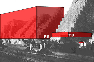
Big Data Illustration

Filed under: BigData,Graphics,Visualization — Patrick Durusau @ 3:55 pm

big data image

An image from Stefano Bertolo (Attribution-NonCommercial-ShareAlike 2.0 Generic) for a presentation on big data.

Stefano notes:

A pictured I edited with Inkscape to illustrate the non-linear effects in process management that result from changes in data volumes. I thank the National Library of Scotland for the original.

This illustrates the “…non-linear effects in process management that result from changes in data volumes” but does it also illustrate the increased demands on third-parties to use data?

I need an illustration for the proposition that if data (and its structures) are annotated at the moment of creation, that reduces the burden on every subsequent user.

Stefano’s image works fine for talking about the increased burden of non-documented data, but it doesn’t add a burden to each user who lacks knowledge of the data nor take it away if the data is properly prepared.

If you start with an unknown 1 GB of data, there is some additional cost for you to acquire knowledge of the data. If someone uses that data set after you, they have to go through the same process. So the cost of unknown data isn’t static but increases with the number of times it is used.

By the same token, properly documented data doesn’t exert a continual drag on its users.

Suggestions on imagery?

Comments/suggestions?

Stefano’s posting.

Over 2000 D3.js Examples and Demos

Filed under: D3,Graphics,Visualization — Patrick Durusau @ 2:06 pm

Over 2000 D3.js Examples and Demos

From the post:

Here is an update to my over 1000 D3 examples compilation and in addition to many more d3 examples, the list is now sorted alphabetically. Examples are really helpful when doing any kind of development so I am hoping that this big list of D3 examples will be a valuable resource. Bookmark and share with others. Here is the huge list of D3 demos:

An amazing collection that defies general characterization.

The demos run from an Analog Clock and Game of Life to Rotating Winkel Tripel and Spermatozoa.

That leaves you 1,999 more examples/demos to explore, plus the author’s d3 examples.

Sam Hunting, an old hand at topic maps, forwarded this link to me.

December 28, 2013

Visualization [Harvard/Python/D3]

Filed under: D3,Graphics,Python,Visualization — Patrick Durusau @ 4:51 pm

Visualization [Harvard/Python/D3]

From the webpage:

The amount and complexity of information produced in science, engineering, business, and everyday human activity is increasing at staggering rates. The goal of this course is to expose you to visual representation methods and techniques that increase the understanding of complex data. Good visualizations not only present a visual interpretation of data, but do so by improving comprehension, communication, and decision making.

In this course you will learn how the human visual system processes and perceives images, good design practices for visualization, tools for visualization of data from a variety of fields, collecting data from web sites with Python, and programming of interactive web-based visualizations using D3.

Twenty-two (22) lectures, nine (9) labs (for some unknown reason, “lab” becomes “section”) and three (3) bonus videos.

Just as a sample, I tried Lab 3 Sketching Workshop I.

I don’t know that I will learn how to draw a straight line but if I don’t, it won’t be the fault of the instructor!

This looks very good.

I first saw this in a tweet by Christophe Viau.

Superconductor

Filed under: Graphics,Visualization — Patrick Durusau @ 11:52 am

Superconductor

From the about page:

Superconductor is a framework for creating interactive big data visualizations in the web browser. It contains two components: a JavaScript library for running visualizations in your browser, and a compiler which generates the high-performance visualization code from our simple domain specific language for describing visualizations.

Superconductor was created by Leo Meyerovich and Matthew Torok at the University of California, Berkeley’s Parallel Computing Laboratory. The ideas behind it evolved out of our research in the parallel browser project. Over the last two years, we’ve worked to apply the ideas behind that research to the task of big data visualization, and to create a polished, easy-to-use framework based around that work. Superconductor is the result.

The demos are working with 100,000 data points, interactively. Very impressive.

Available as a developer preview with the following requirements:

The developer preview of Superconductor currently only supports the following platform:

  • An Apple laptop/desktop computer
  • Mac OS X 10.8 (‘Mountain Lion’) or newer
  • An NVIDIA (preferred) or ATI graphics chip available in your computer

Support for more platforms is a high priority, and we’re working hard to add that to Superconductor.

Suggestions of a commercially available OS X 10.8 VM for Ubuntu? 😉

I first saw this in Nat Torkington’s Four short links: 27 December 2013.

December 26, 2013

Topotime gallery & sandbox

Filed under: D3,Graphics,JSON,Time,Time Series,Timelines,Visualization — Patrick Durusau @ 8:31 pm

Topotime gallery & sandbox

From the website:

A pragmatic JSON data format, D3 timeline layout, and functions for representing and computing over complex temporal phenomena. It is under active development by its instigators, Elijah Meeks (emeeks) and Karl Grossner (kgeographer), who welcome forks, comments, suggestions, and reasonably polite brickbats.

Topotime currently permits the representation of:

  • Singular, multipart, cyclical, and duration-defined timespans in periods (tSpan in Period). A Period can be any discrete temporal thing, e.g. an historical period, an event, or a lifespan (of a person, group, country).
  • The tSpan elements start (s), latest start (ls), earliest end (ee), end (e) can be ISO-8601 (YYYY-MM-DD, YYYY-MM or YYYY), or pointers to other tSpans or their individual elements. For example, >23.s stands for ‘after the start of Period 23 in this collection.’
    • Uncertain temporal extents; operators for tSpan elements include: before (<), after (>), about (~), and equals (=).
  • Further articulated start and end ranges in sls and eee elements, respectively.
  • An estimated timespan when no tSpan is defined
  • Relations between events. So far, part-of, and participates-in. Further relations including has-location are in development.

Topotime currently permits the computation of:

  • Intersections (overlap) between between a query timespan and a collection of Periods, answering questions like “what periods overlapped with the timespan [-433, -344] (Plato’s lifespan possibilities)?” with an ordered list.

To learn more, check out these and other pages in the Wiki and the Topotime web page

I am currently reading the A Song of Fire and Ice (first volume, A Game of Thrones) and the uncertain temporal extents of Topotime may be useful for modeling some aspects of the narrative.

What will be more difficult to model will be facts known to some parties but not to others, at any point in the narrative.

Unlike graph models where every vertex is connected to every other vertex.

As I type that, I wonder if the edge connecting a vertex (representing a person) to some fact or event (another vertex), could have a property that represents the time in the novel’s narrative when the person in question knows a fact or event?

I need to plot out knowledge of a lineage. If you know the novel you can guess which one. 😉

December 25, 2013

Christmas tree with three.js

Filed under: D3,Graphics,Visualization — Patrick Durusau @ 8:37 pm

Christmas tree with three.js

From the webpage:

Today’s article refers to the Christmas and new year in the most direct manner. I prepared a remarkable and relevant demonstration of possibilities of three.js library in the form of an interactive Christmas card. This postcard has everything we need – the Christmas tree with toys, the star in the top, snow, snowflakes in the air – all to raise new year spirit of Christmas time. In this tutorial I will show you how to work with 3D scene, fog, cameras, textures, materials, basic objects (meshes), ground, lights, particles and so on.

Late for this year but a great demonstration of the power of visualization in a web browser.

Enjoy!

December 21, 2013

Document visualization: an overview of current research

Filed under: Data Explorer,Graphics,Text Mining,Visualization — Patrick Durusau @ 3:13 pm

Document visualization: an overview of current research by Qihong Gan, Min Zhu, Mingzhao Li, Ting Liang, Yu Cao, Baoyao Zhou.

Abstract:

As the number of sources and quantity of document information explodes, efficient and intuitive visualization tools are desperately needed to assist users in understanding the contents and features of a document, while discovering hidden information. This overview introduces fundamental concepts of and designs for document visualization, a number of representative methods in the field, and challenges as well as promising directions of future development. The focus is on explaining the rationale and characteristics of representative document visualization methods for each category. A discussion of the limitations of our classification and a comparison of reviewed methods are presented at the end. This overview also aims to point out theoretical and practical challenges in document visualization.

The authors evaluate document visualization methods against the following goals:

  • Overview. Gain an overview of the entire collection.
  • Zoom. Zoom in on items of interest.
  • Filter. Filter out uninteresting items.
  • Details-on-demand. Select an item or group and get details when needed.
  • Relate. View relationship among items.
  • History. Keep a history of actions to support undo, replay, and progressive refinement.
  • Extract. Allow extraction of sub-collections and of the query parameters.

A useful review of tools for exploring texts!

December 18, 2013

d3.js breakout clone

Filed under: D3,Graphics,Visualization — Patrick Durusau @ 7:28 pm

Data Visualization and D3.js Newsletter, Issue 57 has this description:

D3.js Breakout Clone
People always ask “Can I do ____ in d3?” The answer is generally always, yes. To prove that, I made a very simple clone of the classic arcade game breakout. If you die, click to restart the game.

I’m just glad it wasn’t Missile Command.

I might have missed the holidays. 😉

December 16, 2013

Mapping 400,000 Hours of U.S. TV News

Filed under: Graphics,News,Visualization — Patrick Durusau @ 8:26 pm

Mapping 400,000 Hours of U.S. TV News by Roger Macdonald.

From the post:

We are excited to unveil a couple experimental data-driven visualizations that literally map 400,000 hours of U.S. television news. One of our collaborating scholars, Kalev Leetaru, applied “fulltext geocoding” software to our entire television news research service collection. These algorithms scan the closed captioning of each broadcast looking for any mention of a location anywhere in the world, disambiguate them using the surrounding discussion (Springfield, Illinois vs Springfield, Massachusetts), and ultimately map each location. The resulting CartoDB visualizations provide what we believe is one of the first large-scale glimpses of the geography of American television news, beginning to reveal which areas receive outsized attention and which are neglected.

Stunning even for someone who thinks U.S. television news is self-obsessive.

In the rough early stages, but you need to see this.

Not that I expect it to change the coverage of U.S. television news, any more than campaign finance disclosure has made elected officials any the less promiscuous.

I first saw this in a tweet by Hilary Mason.

Data and visualization year in review, 2013

Filed under: Graphics,Visualization — Patrick Durusau @ 8:02 pm

Data and visualization year in review, 2013 by Nathan Yau.

Nathan has collected the high points of data visualization for 2013 in a very readable post.

If you are not already interested in data visualization, Nathan’s review of 2013 is likely to awaken that interest in you.

Enjoy!

December 14, 2013

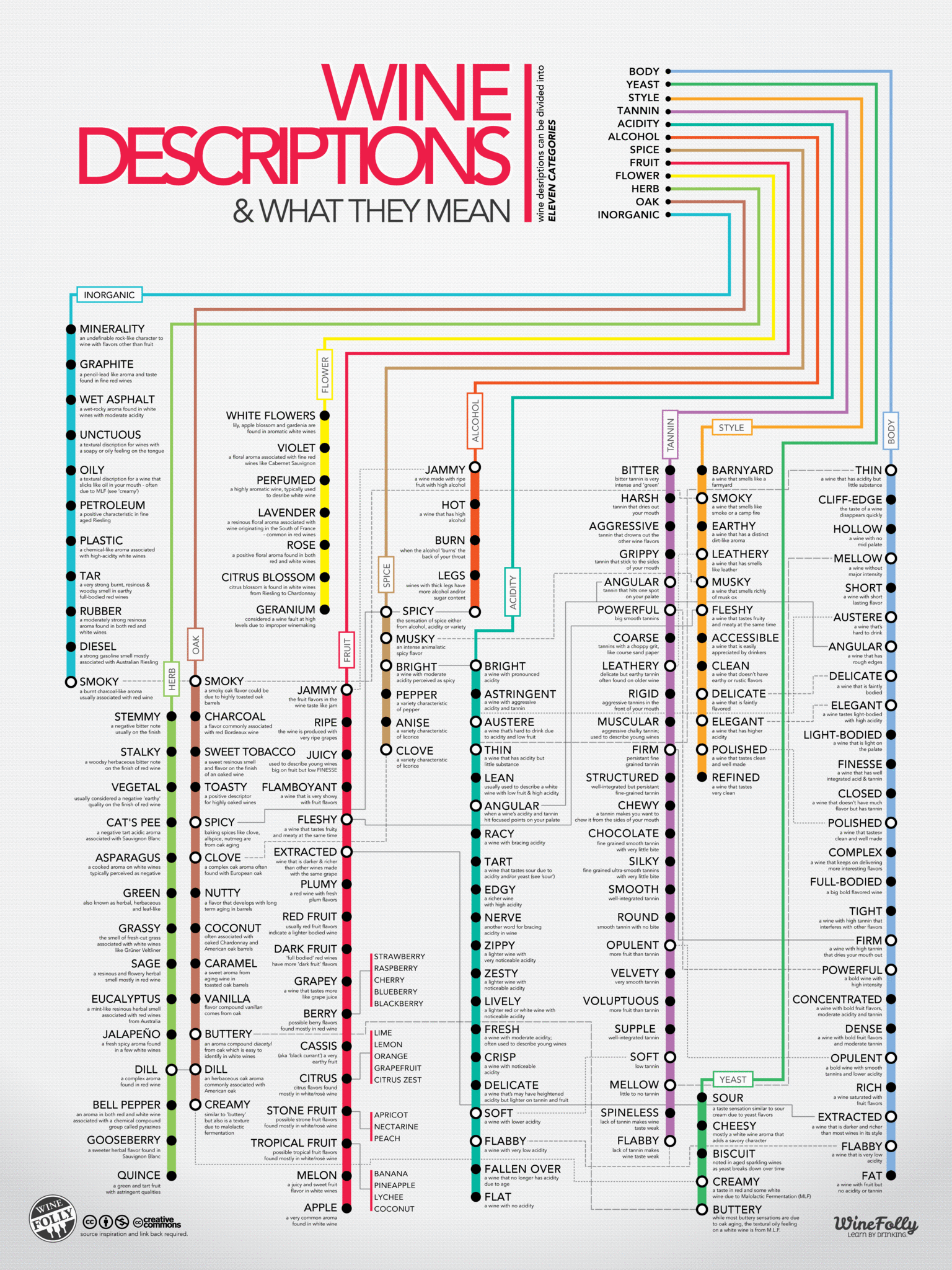
Wine Descriptions and What They Mean

Filed under: Graphics,Uncategorized,Visualization — Patrick Durusau @ 8:20 pm

Wine Descriptions and What They Mean

wine chart

At $22.80 for two (2), you need one of these for your kitchen and another for the office.

Complex information doesn’t have to be displayed in a confusing manner.

This chart is evidence of that proposition.

BTW, the original site (see above) is interactive, zooms, etc.

December 6, 2013

Glitch is Dead, Long Live Glitch!

Filed under: Graphics,Open Source — Patrick Durusau @ 6:58 pm

Glitch is Dead, Long Live Glitch!: Art & Code from the Game Released into Public Domain by Tiny Speck.

From the website:

The collaborative, web-based, massively multiplayer game Glitch began its initial private testing in 2009, opened to the public in 2010, and was shut down in 2012. It was played by more than 150,000 people and was widely hailed for its original and highly creative visual style.

The entire library of art assets from the game, has been made freely available, dedicated to the public domain. Code from the game client is included to help developers work with the assets. All of it can be downloaded and used by anyone, for any purpose. (But: use it for good.)

Tiny Speck, Inc., the game’s developer, has relinquished its ownership of copyright over these 10,000+ assets in the hopes that they help others in their creative endeavours and build on Glitch’s legacy of simple fun, creativity and an appreciation for the preposterous. Go and make beautiful things.

I never played Glitch but the art could be useful.

Or perhaps even the online game code if you are looking to create a topic map gaming site.

Read the release for the details of the licensing.

I first saw this in Nat Torkington’s Four short links: 22 November 2013.

December 3, 2013

Bokeh

Filed under: Graphics,Python,Visualization — Patrick Durusau @ 3:42 pm

Bokeh

From the webpage:

Bokeh is a Python interactive visualization library for large datasets that natively uses the latest web technologies. Its goal is to provide elegant, concise construction of novel graphics in the style of Protovis/D3, while delivering high-performance interactivity over large data to thin clients.

For more information about the goals and direction of the project, please see the Technical Vision.

To get started quickly, follow the Quickstart.

Visit the source repository: https://github.com/ContinuumIO/bokeh

Be sure to follow us on Twitter @bokehplots!

The technical vision makes the case for Bokeh quite well:

Photographers use the Japanese word “bokeh” to describe the blurring of the out-of-focus parts of an image. Its aesthetic quality can greatly enhance a photograph, and photographers artfully use focus to draw attention to subjects of interest. “Good bokeh” contributes visual interest to a photograph and places its subjects in context.

In this vein of focusing on high-impact subjects while always maintaining a relationship to the data background, the Bokeh project attempts to address fundamental challenges of large dataset visualization:

  • How do we look at all the data?
    • What are the best perceptual approaches to honestly and accurately represent the data to domain experts and SMEs so they can apply their intuition to the data?
    • Are there automated approaches to accurately reduce large datasets so that outliers and anomalies are still visible, while we meaningfully represent baselines and backgrounds? How can we do this without “washing away” all the interesting bits during a naive downsampling?
    • If we treat the pixels and topology of pixels on a screen as a bottleneck in the I/O channel between hard drives and an analyst’s visual cortex, what are the best compression techniques at all levels of the data transformation pipeline?
  • How can scientists and data analysts be empowered to use visualization fluidly, not merely as an output facility or one stage of a pipeline, but as an entire mode of engagement with data and models?
    • Are language-based approaches for expressing mathematical modeling and data transformations the best way to compose novel interactive graphics?
    • What data-oriented interactions (besides mere linked brushing/selection) are useful for fluid, visually-enable analysis?

Not likely any time soon but posting data for scientific research in ways that enable interactive analysis by readers (and snapshotting their results) could take debates over data and analysis to a whole new level.

As opposed to debating dots on a graph not of your own making and where alternative analyses are not available.

December 1, 2013

Bourbon family tree

Filed under: Graphics,Humor — Patrick Durusau @ 8:59 pm

Bourbon family tree by Nathan Yau.

Nathan has located and reproduced a family tree for bourbon produced by the major distillers in three states.

Print out and use this over the holidays to track your drinking across family lines. 😉

November 30, 2013

Krona: Hierarchical data browser

Filed under: Graphics,Visualization — Patrick Durusau @ 8:02 pm

Krona: Hierarchical data browser

From the webpage:

Krona allows hierarchical data to be explored with zoomable pie charts. Krona charts can be created using an Excel template or KronaTools, which includes support for several bioinformatics tools and raw data formats. The charts can be viewed with a recent version of any major web browser (see Browser support).

I’m not sure that “zoomable pie chart” is an entirely accurate description of Krona. Not inaccurate, just doesn’t clue the reader in on what awaits.

Here are two of the non-specialized examples:

Nutrition facts for granola.

Disk usage for a folder.

Play with the technique and let me know if you find it useful.

Obviously others do but I am missing something about it. I will read some of the literature and come back to it.

November 21, 2013

Experimenting with visualisation tools

Filed under: Graphics,Metaphors,Thesaurus,Visualization — Patrick Durusau @ 2:34 pm

Experimenting with visualisation tools by Brian Aitken.

From the post:

Over the past few months I’ve been working to develop some interactive visualisations that will eventually be made available on the Mapping Metaphor website. The project team investigated a variety of visualisation approaches that they considered well suited to both the project data and the connections between the data, and they also identified a number of toolkits that could be used to generate such visualisations.

Brian experiments with the JavaScript InfoVis Toolkit for the Mapping Metaphor with the Historical Thesaurus project.

Interesting read. Promises to cover D3 in a future post.

Could be very useful for other graph or topic map visualizations.

November 20, 2013

Middle Earth and Hobbits, A Winning Combination!

Filed under: Graphics,Interface Research/Design,Visualization — Patrick Durusau @ 8:16 pm

Google turns to Middle Earth and Hobbits to show off Chrome’s magic by Kevin C. Tofel.

From the post:

Google has a new Chrome Experiment out in the wild — or the wilds, if you prefer. The latest is a showcase for the newest web technologies packed into Chrome for mobile devices, although it works on traditional computers as well. And what better or richer world to explore on your mobile device is there then J.R.R. Tolkien’s Middle Earth?

Point your Chrome mobile browser to middle-earth.thehobbit.com to explore the Trollshaw Forrest, Rivendell and Dol Guldur with additional locations currently locked. Here’s a glimpse of what to expect:

“It may not feel like it, but this cinematic part of the experience was built with just HTML, CSS, and JavaScript. North Kingdom used the Touch Events API to support multi-touch pinch-to-zoom and the Full Screen API to allow users to hide the URL address bar. It looks natural on any screen size thanks to media queries and feels low-latency because of hardware-accelerated CSS Transitions.”

(Note, I repaired the link to http://middle-earth.thehobbit.com in the post which as posted, simply returned you to the post.)

This project and others like it should have UI coders taking a hard look at browsers.

What are your requirements that can’t be satisfied by a browser interface? (Be sure you understand the notion of sunk costs before answering that question.)

November 19, 2013

Got Space? Got Time? Want Space + Time?

Filed under: BigData,Graphics,Visualization — Patrick Durusau @ 3:37 pm

FAU Neuroscientists Receive Patent for New 5D Method to Understand Big Data
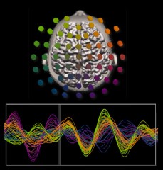
5-D image of brain

From the news release:

Florida Atlantic University received a U.S. patent for a new method to display large amounts of data in a color-coded, easy-to-read graph. Neuroscientists Emmanuelle Tognoli, Ph.D., and Scott Kelso, Ph.D., both researchers at the Center for Complex Systems and Brain Sciences at FAU, originally designed the method to interpret enormous amounts of data derived from their research on the human brain. The method, called a five dimensional (5D) colorimetric technique, is able to graph spatiotemporal data (data that includes both space and time), which has not previously been achieved. Until now, spatiotemporal problems were analyzed either from a spatial perspective (for instance, a map of gas prices in July 2013), or from a time-based approach (evolution of gas prices in one county over time), but not simultaneously from both perspectives. Without both space and time, analysts have been faced with an incomplete picture until now, with the creation of the 5D colorimetric technique.

The new method has already been used to examine climatic records of sea surface temperature at 65,000 points around the world over a period of 28 years and provided scientists with a clear understanding of when and where temperature fluctuations occur. While the possibilities are endless, a few practical examples of use for the 5D colorimetric technique could include tracking gas prices per county, analyzing foreclosure rates in different states or tracking epidemiological data for a virus.

Tognoli and Kelso’s research involves tracking neural activity from different areas of the human brain every one thousandth of a second. This creates a massive amount of data that is not easy to understand using conventional methods.

“Using the 5D colorimetric technique, these huge datasets are transformed into a series of color-coded dynamic patterns that actually reveal the neural choreography completely,” said Kelso. Combining this new method with conceptual and theoretical tools in real experiments will help us and others elucidate the basic coordination dynamics of the human brain.”

A new visualization technique for big data.

Interesting that we experience multiple dimensions of data embedded in a constant stream of time and space, yet have no difficulty interacting with it and others embedded in the same context.

When we have to teach our benighted servants (computers) to display what we intuitively understand, difficulties ensue.

Just in case you are interested: System and method for analysis of spatio-temporal data, Patent #8,542,916.
November 8, 2013

Diagrams for hierarchical models: New drawing tools

Filed under: Graphics,Visualization — Patrick Durusau @ 7:41 pm

Diagrams for hierarchical models: New drawing tools

From the post:

Two new drawing tools for making hierarchical diagrams have been recently developed. One tool is a set of distribution and connector templates in LibreOffice Draw and R, created by Rasmus Bååth. Another tool is scripts for making the drawings in LaTeX via TikZ, created by Tinu Schneider. Here is an example of a diagram made by Tinu Schneider, using TikZ/LaTeX with Rasmus Bååth’s distribution icons:

New tools for your diagram drawing toolbelt!

October 22, 2013

Titanic Machine Learning from Disaster (Kaggle Competition)

Filed under: Data Mining,Graphics,Machine Learning,Visualization — Patrick Durusau @ 4:34 pm

Titanic Machine Learning from Disaster (Kaggle Competition) by Andrew Conti.

From the post (and from the Kaggle page):

The sinking of the RMS Titanic is one of the most infamous shipwrecks in history. On April 15, 1912, during her maiden voyage, the Titanic sank after colliding with an iceberg, killing 1502 out of 2224 passengers and crew. This sensational tragedy shocked the international community and led to better safety regulations for ships.

One of the reasons that the shipwreck led to such loss of life was that there were not enough lifeboats for the passengers and crew. Although there was some element of luck involved in surviving the sinking, some groups of people were more likely to survive than others, such as women, children, and the upper-class.

In this contest, we ask you to complete the analysis of what sorts of people were likely to survive. In particular, we ask you to apply the tools of machine learning to predict which passengers survived the tragedy.

This Kaggle Getting Started Competition provides an ideal starting place for people who may not have a lot of experience in data science and machine learning.”

From Andrew’s post:

Goal for this Notebook:

Show a simple example of an analysis of the Titanic disaster in Python using a full complement of PyData utilities. This is aimed for those looking to get into the field or those who are already in the field and looking to see an example of an analysis done with Python.

This Notebook will show basic examples of:

Data Handling

  • Importing Data with Pandas
  • Cleaning Data
  • Exploring Data through Visualizations with Matplotlib

Data Analysis

  • Supervised Machine learning Techniques:
    • Logit Regression Model
    • Plotting results
  • Unsupervised Machine learning Techniques
    • Support Vector Machine (SVM) using 3 kernels
    • Basic Random Forest
    • Plotting results

Valuation of the Analysis

  • K-folds cross validation to valuate results locally
  • Output the results from the IPython Notebook to Kaggle

Required Libraries:

This is wicked cool!

I first saw this in Kaggle Titanic Contest Tutorial by Danny Bickson.

PS: Don’t miss Andrew Conti’s new homepage.

October 21, 2013

Responsive maps with D3.js

Filed under: D3,Graphics,Visualization — Patrick Durusau @ 6:35 pm

Responsive maps with D3.js by Nathan Yau.

Nathan has uncovered three posts on creating responsive (to your device) maps, charts, and legends.

Chris Amico on using D3.js to create responsive maps, charts, and legends.

Cool!

October 20, 2013

Visual Sedimentation

Filed under: Data Streams,Graphics,Visualization — Patrick Durusau @ 3:21 pm

Visual Sedimentation

From the webpage:

VisualSedimentation.js is a JavaScript library for visualizing streaming data, inspired by the process of physical sedimentation. Visual Sedimentation is built on top of existing toolkits such as D3.js (to manipulate documents based on data), jQuery (to facilitate HTML and Javascript development) and Box2DWeb (for physical world simulation).

I had trouble with the video but what I saw was very impressive!

From the Visual Sedimentation paper by Samuel Huron, Romain Vuillemot, and Jean-Daniel Fekete:

Abstract:

We introduce Visual Sedimentation, a novel design metaphor for visualizing data streams directly inspired by the physical process of sedimentation. Visualizing data streams (e. g., Tweets, RSS, Emails) is challenging as incoming data arrive at unpredictable rates and have to remain readable. For data streams, clearly expressing chronological order while avoiding clutter, and keeping aging data visible, are important. The metaphor is drawn from the real-world sedimentation processes: objects fall due to gravity, and aggregate into strata over time. Inspired by this metaphor, data is visually depicted as falling objects using a force model to land on a surface, aggregating into strata over time. In this paper, we discuss how this metaphor addresses the specific challenge of smoothing the transition between incoming and aging data. We describe the metaphor’s design space, a toolkit developed to facilitate its implementation, and example applications to a range of case studies. We then explore the generative capabilities of the design space through our toolkit. We finally illustrate creative extensions of the metaphor when applied to real streams of data.

If you are processing data streams, definitely worth a close look!

October 15, 2013

How to design better data visualisations

Filed under: Graphics,Perception,Psychology,Visualization — Patrick Durusau @ 6:25 pm

How to design better data visualisations by Graham Odds.

From the post:

Over the last couple of centuries, data visualisation has developed to the point where it is in everyday use across all walks of life. Many recognise it as an effective tool for both storytelling and analysis, overcoming most language and educational barriers. But why is this? How are abstract shapes and colours often able to communicate large amounts of data more effectively than a table of numbers or paragraphs of text? An understanding of human perception will not only answer this question, but will also provide clear guidance and tools for improving the design of your own visualisations.

In order to understand how we are able to interpret data visualisations so effectively, we must start by examining the basics of how we perceive and process information, in particular visual information.

Graham pushes all of my buttons by covering:

A reading list from this post would take months to read and years to fully digest.

No time like the present!

October 14, 2013

Diagrams for hierarchical models – we need your opinion

Filed under: Bayesian Data Analysis,Bayesian Models,Graphics,Statistics — Patrick Durusau @ 10:49 am

Diagrams for hierarchical models – we need your opinion by John K. Kruschke.

If you haven’t done any good deeds lately, here is a chance to contribute to the common good.

From the post:

When trying to understand a hierarchical model, I find it helpful to make a diagram of the dependencies between variables. But I have found the traditional directed acyclic graphs (DAGs) to be incomplete at best and downright confusing at worst. Therefore I created differently styled diagrams for Doing Bayesian Data Analysis (DBDA). I have found them to be very useful for explaining models, inventing models, and programming models. But my idiosyncratic impression might be only that, and I would like your insights about the pros and cons of the two styles of diagrams. (emphasis in original)

John’s post has the details of the different diagram styles.

Which do you like better?

John is also the author of: Doing Bayesian data analysis : a tutorial with R and BUGS. My library system doesn’t have a copy but I can report that it has gotten really good reviews.

« Newer PostsOlder Posts »

Powered by WordPress