Another Word For It Patrick Durusau on Topic Maps and Semantic Diversity

July 19, 2016

JuxtaposeJS

Filed under: Graphics,Visualization — Patrick Durusau @ 1:17 pm

JuxtaposeJS Frame comparisons. Easy to make. Seamless to publish. (Northwestern University Knight Lab, Alex Duner.)

From the webpage:

JuxtaposeJS helps storytellers compare two pieces of similar media, including photos, and GIFs. It’s ideal for highlighting then/now stories that explain slow changes over time (growth of a city skyline, regrowth of a forest, etc.) or before/after stories that show the impact of single dramatic events (natural disasters, protests, wars, etc.).

It is free, easy to use, and works on all devices. All you need to get started are links to the images you’d like to compare.

Perhaps an unexpected use, but if you are stumped on a “find all the differences” pair of photos, split them and create a slider!

This isn’t a hard one but for example use these two images:

http://www.durusau.net/publications/ocean-beach-san-diego-alley-shopping-cart-left.png

http://www.durusau.net/publications/ocean-beach-san-diego-alley-shopping-cart-right.png

As the slider moves over a change between the two images, your eye will be drawn towards the motion. (Visit Cranium Crunches Blog for more puzzles and images like this one.)

On a more serious note, imagine the use of this app for comparison of aerial imagery (satellite, plane, drone) and using the human eye to spot changes in images. Could be more timely than streaming video for automated analysis.

Or put differently, it isn’t the person with the most intell, eventually, that wins, but the person with the best intell, in time.
June 28, 2016

D3 4.0.0

Filed under: D3,Graphics,Visualization — Patrick Durusau @ 4:15 pm

Mike Bostock tweets:

After 12+ months and ~4,878 commits, I am excited to announce the release of D3 4.0! https://github.com/d3/d3/releases/v4.0.0 … #d3js

After looking at the highlights page on Github, I couldn’t in good conscience omit any of it:

D3 is now modular, composed of many small libraries that you can also use independently. Each library has its own repo and release cycle for faster development. The modular approach also improves the process for custom bundles and plugins.

There are a lot of improvements in 4.0: there were about as many commits in 4.0 as in all prior versions of D3. Some changes make D3 easier to learn and use, such as immutable selections. But there are lots of new features, too! These are covered in detail in the release notes; here are a few highlights.

Colors, Interpolators and Scales

Shapes and Layouts

Selections, Transitions, Easings and Timers

Even More!

Don’t complain to me that you are bored over the Fourth of July weekend in the United States.

Downloads: d3.zip, Source code (zip), Source code (tar.gz).

June 9, 2016

ggplot2 – Elegant Graphics for Data Analysis – At Last Call

Filed under: Ggplot2,Graphics,R — Patrick Durusau @ 4:53 pm

ggplot2 – Elegant Graphics for Data Analysis by Hadley Wickham.

Hadley tweeted today that “ggplot2” is still up but will be removed after publication.

If you want/need a digital copy, now would be a good time to acquire one.

May 12, 2016

For The Artistically Challenged (that includes me)

Filed under: Art,Graphics,Visualization — Patrick Durusau @ 8:29 pm

via GIPHY

If you are looking for animated gifs for a blog post, presentation, etc., give GIPHY a try.

Now that I have found it, I’m likely to spend too much time looking for the perfect animated GIF.

Enjoy!

May 5, 2016

Countries Wanting UK to Stay in EU [Bad Graphics]

Filed under: Graphics,Visualization — Patrick Durusau @ 8:47 am

eu-england-02

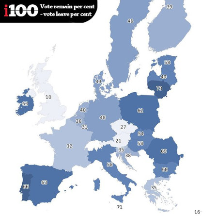
Before you read The map showing which countries want the UK to stay in the EU or my comment below, a question for you:

Do countries shaded in lighter colors support the UK remaining in the EU?

Simple enough question.

Unfortunately you are looking at one of the worst representations of sentiment I have seen in a long time.

From the post:

The indy100 have created the following graphic based on the data. In the map, the darker the shade of blue, the more support there is in that country for the UK to remain in the EU. The scores are calculated by subtracting the percentage of people who want Britain to leave, from those who want Britain to remain.

That last line:

The scores are calculated by subtracting the percentage of people who want Britain to leave, from those who want Britain to remain.

is what results in the odd visualization.

A chart later in the post reports that support for UK leaving the EU is only 18% in France, which would be hard to guess from the “32” shown on the map.

The map shows the gap between two positions, one for the UK to stay and the other for it to leave, and the shading represents the distance between staying and supporting positions.

That is if public opinion were 50% to stay in the EU and 50% to leave the EU, that county would be colored clear with a score of 0.

Reporting support and/or opposition percentages with coloration based on those percentages would be far clearer.

April 5, 2016

Python Code + Data + Visualization (Little to No Prose)

Filed under: Graphics,Programming,Python,Visualization — Patrick Durusau @ 12:46 pm

Up and Down the Python Data and Web Visualization Stack

Using the “USGS dataset listing every wind turbine in the United States:” this notebook walks you through data analysis and visualization with only code and visualizations.

That’s it.

Aside from very few comments, there is no prose in this notebook at all.

You will either hate it or be rushing off to do a similar notebook on a topic of interest to you.

Looking forward to seeing the results of those choices!

March 29, 2016

WordsEye [Subject Identity Properties]

Filed under: Graphics,Natural Language Processing,Visualization — Patrick Durusau @ 8:50 am

WordsEye

A site that enables you to “type a picture.” What? To illustrate:

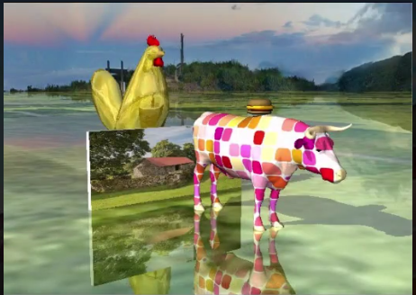
A [mod] ox is a couple of feet in front of the [hay] wall. It is cloudy. The ground is shiny grass. The huge hamburger is on the ox. An enormous gold chicken is behind the wall…

Results in:

word-eye

The site is in a close beta test but you can apply for an account.

I mention “subject identity properties” in the title because the words we use to identify subjects, are properties of subjects, just like any other properties we attribute to them.

Unfortunately, words are viewed by different people as identifying different subjects and the different words as identifying the same subjects.

The WordsEye technology can illustrates the fragility of using a single word to identify a subject of conversation.

Or that multiple identifications have the same subject, with side by side images that converge on a common image.

Imagine that in conjunction with 3-D molecular images for example.

I first saw this in a tweet by Alyona Medelyan.

March 28, 2016

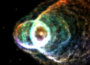
Nebula Bliss

Filed under: Graphics,Visualization — Patrick Durusau @ 9:22 pm

Nebula Bliss

Visually impressive 3-D modeling of six different nebula.

I did not tag this with astroinformatics as it is a highly imaginative but non-scientific visualization.

Enjoy!

nebula-bliss

The image is a screen capture from the Butterfly Nebula visualization.

March 8, 2016

So You Want To Visualize Data? [Nathan Yau’s Toolbox]

Filed under: Graphics,Visualization — Patrick Durusau @ 11:53 am

What I Use to Visualize Data by Nathan Yau.

From the post:

“What tool should I learn? What’s the best?” I hesitate to answer, because I use what works best for me, which isn’t necessarily the best for someone else or the “best” overall.

If you’re familiar with a software set already, it might be better to work off of what you know, because if you can draw shapes based on numbers, you can visualize data. After all, this guy uses Excel to paint scenery.

It’s much more important to just get started already. Work with as much data as you can.

Nevertheless, this is the set of tools I use in 2016, which converged to a handful of things over the years. It looks different from 2009, and will probably look different in 2020. I break it down by place in my workflow.

As Nathan says up front, these may not be the best tools for you but it is a great starting place. Add and subtract from this set as you develop your own workflow and habits.

Enjoy!

PS: Nathan Yau tweeted a few hours later: “Forgot to include this:”

yau-tablet

February 25, 2016

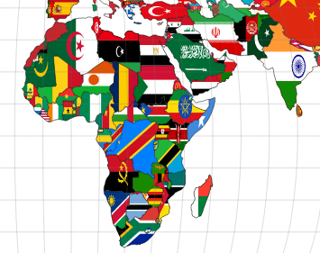
World Flag Map (D3.js)

Filed under: D3,Graphics — Patrick Durusau @ 9:32 pm

D3.js Boetti by sepinielli

For those who believe in national borders:

world-map-d3

D3.js is powerful enough to portray self-serving fictions.

Source code included.

I first saw this in a tweet by Christophe Viau.

16 Famous Designers Show Us Their Favorite Notebooks [Analog Notebooks]

Filed under: Design,Graphics,Visualization — Patrick Durusau @ 5:45 pm

16 Famous Designers Show Us Their Favorite Notebooks by John Brownlee.

From the post:

Sure, digital design apps might be finally coming into their own, but there’s still nothing better than pen and paper. Here at Co.Design, we’re notebook fetishists, so we recently asked a slew of designers about their favorites—and whether they would mind giving us a look inside.

It turns out they didn’t. Across multiple disciplines, almost every designer we asked was thrilled to tell us about their notebook of choice and give us a look at how they use it. Our operating assumption going in was that most designers would probably be pretty picky about their notebooks, but this turned out not to be true: While Muji and Moleskine notebooks were the common favorites, some even preferred loose paper.

But what makes the notebooks of designers special isn’t so much what notebook they use, as how they use them. Below, enjoy a peek inside the working notebooks of some of the most prolific designers today—as well as their thoughts on what makes a great one.

Images of analog notebooks with links to sources!

I met a chief research scientist at a conference who had a small pad of paper for notes, contact information, etc. Could have had the latest gadget, etc., but chose not to.

That experience wasn’t unique as you will find from reading John’s post.

Notebooks, analog ones, have fewer presumptions and limitations than any digital notebook.

Albert Einstein had pen/pencil and paper.

Albert_Einstein_Head

Same was true for John McCarty.

200px-John_McCarthy_Stanford

Not to mention Donald Knuth.

192px-KnuthAtOpenContentAlliance

So, what have you done with your pen and paper lately?*


* I’m as guilty as anyone in thinking that pounding a keyboard = being productive. But the question: So, what have you done with your pen and paper lately? remains a valid one.

February 13, 2016

Valentine’s Day Hearts

Filed under: Graphics,TeX/LaTeX — Patrick Durusau @ 8:42 am

If you have an appropriate other to send Valentine’s cards, greetings, etc., consider:

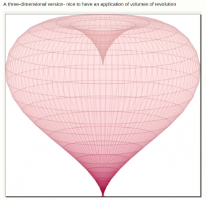
Can we make a love heart with LaTeX?

A few of the images you can customize:

heart-text

heart-birthday

heart-3D

For searches like “valentines day hearts TeX” and “valentines day hearts LaTeX,” you really wish that Google was less “helpful.”

As you know, TeX “corrects” to text and LaTeX, well, you know how that is corrected. 😉

Even if you convince Google that you really meant “TeX,” the returns remain mostly garbage.

Here a search that returns 74 “hits” that Google dedupes down to 18 (most of which are dupes):

valentine heart site:tex.stackexchange.com

But 18 “hits” are manageable:

drawing water droplets with tikz mentions Example: Valentine heart at TeXample.net.

Then you will find 13 “hits” that include this sentence:

We have questions about Christmas trees and Hearts for Valentines but we have no questions that specialize in Halloween or Dia de los Muertos art.

Why Google doesn’t dedupe those isn’t known.

I tried several of the better known TeX/LaTeX sites with “valentine” and the site name. Not anything like a comprehensive survey but there were several zero search results.

Is it the case that the TeX/LaTeX communities don’t have much interest in Valentine heart drawing? 😉

You will fare even worse if you search for heart limited to the domain processing.org.

On the other hand, SVG and valentine “searches” fairly well.

Here’s one from Wiki Commons:

529px-Love_Heart_SVG.svg

Credit your sources (discretely) on any artwork you reproduce.

Enjoy!

PS: Now all I have to do is corral an old inkjet color printer into working as a local printer, pray the color cartridge hasn’t dried up, etc. Happy Valentine’s Day!

February 7, 2016

‘Avengers’ Comic Book Covers [ + MAD, National Lampoon]

Filed under: Art,Graphics,Visualization — Patrick Durusau @ 3:31 pm

50 Years of ‘Avengers’ Comic Book Covers Through Color by Jon Keegan.

From the post:

When Marvel’s “Avengers: Age of Ultron” opens in theaters next month, a familiar set of iconic colors will be splashed across movie screens world-wide: The gamma ray-induced green of the Hulk, Iron Man’s red and gold armor, and Captain America’s red, white and blue uniform.

How the Avengers look today differs significantly from their appearance in classic comic-book versions, thanks to advancements in technology and a shift to a more cinematic aesthetic. As Marvel’s characters started to appear in big-budget superhero films such as “X-Men” in 2000, the darker, muted colors of the movies began to creep into the look of the comics. Explore this shift in color palettes and browse more than 50 years of “Avengers” cover artwork below. Read more about this shift in color.

The fifty years of palettes are a real treat and should be used alongside your collection of the Avenger comics for the same time period. 😉

From what I could find quickly, you will have to purchase the forty year collection separately from more recent issues.

Of course, if you really want insight into American culture, you would order Absolutely MAD Magazine – 50+ Years.

MAD issues from 1952 to 2005 (17,500 pages in full color). Annotating those issues to include social context would be a massive but highly amusing project. And you would have to find a source for the following issues.

A more accessible collection that is easily as amusing as MAD would be the National Lampoon collection. Unfortunately, only 1970 – 1975 are online. 🙁

One of my personal favorites:

justice-lampoon

Visualization of covers is a “different” way to view all of these collections and with no promises, could be interesting comparisons to contemporary events when they were published.

Mapping the commentaries you will find in MAD and National Lampoon to current events when they were published, say to articles in New York Time historical archive, would be a great history project for students and an education in social satire as well.

If anyone objects to the lack of a “serious” nature of such a project, be sure to remind them that reading the leading political science journal of the 1960’s, the American Political Science Review would have left the casual reader with few clues that the United States was engaged in a war that would destroy the lives of millions in Vietnam.

In my experience, “serious” usually equates with “supports the current system of privilege and prejudice.”

You can be “serious” or you can choose to shape a new system of privilege and prejudice.

Your call.

January 29, 2016

Twitter Graph Analytics From NodeXL (With Questions)

Filed under: Graphics,Graphs,NodeXL,Twitter — Patrick Durusau @ 4:35 pm

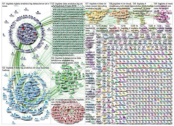
I’m sure you have seen this rather impressive Twitter graphic:

node-js-graph

And you can see a larger version, with a link to the interactive version here: https://nodexlgraphgallery.org/Pages/Graph.aspx?graphID=61591

Impressive visualization but…, tell me, what can you learn from these tweets about big data?

I mean, visualization is a great tool but if I am not better informed after using the visualization than before, what’s the point?

If you go to the interactive version, you will find lists derived from the data, such as “top 10 vertices, ranked by Betweeness Centrality,” top 10 URLs in the graph and groups in the graph, top domains in the graph and groups in the graph, etc.

None of which is evident from casual inspection of the graph. (Top influencers might be if I could get the interactive version to resize but difficult unless the step between #11 and #10 was fairly large.

Nothing wrong with eye candy but for touting the usefulness of visualization, let’s look for more intuitive visualizations.

I saw this particular version in a tweet by Kirk D. Borne.

January 24, 2016

Introducing d3-scale

Filed under: D3,Graphics,Visualization — Patrick Durusau @ 4:33 pm

Introducing d3-scale by Mike Bostock.

From the post:

I’d like D3 to become the standard library of data visualization: not just a tool you use directly to visualize data by writing code, but also a suite of tools that underpin more powerful software.

To this end, D3 espouses abstractions that are useful for any visualization application and rejects the tyranny of charts.

…(emphasis in original)

Quoting from both Leland Wilkinson (The Grammar of Graphics) and Jacques Bertin (Semiology of Graphics, Mike says D3 should be used for ordinal and categorical dimensions, in addition to real numbers.

Much as been done to expand the capabilities of D3 but it remains up to you to expand the usage of D3 in new and innovative ways.

I suspect you can already duplicate the images (most of them anyway) from the Semiology of Graphics, for example, but that isn’t the same as choosing a graphic and scale that will present information usefully to a user.

Much is left to be done but Mike has given D3 a push in the right direction.

Will you be pushing along side him?

January 7, 2016

Visual Tools From NPR

Filed under: Graphics,Journalism,News,Visualization — Patrick Durusau @ 3:45 pm

Tools You Can Use

From the post:

Open-source tools for your newsroom. Take a look through all our repos, read about our best practices, and learn how to setup your Mac to develop like we do.

Before you rush off to explore all the repos (there are more than a few), check out these projects on the Tools You Can Use page:

App Template – An opinionated template that gets the first 90% of building a static website out of the way. It integrates with Google Spreadsheets, Bootstrap and Github seamlessly.

Copytext – A Python library for accessing a spreadsheet as a native object suitable for templating.

Dailygraphics – A framework for creating and deploying responsive graphics suitable for publishing inside a CMS with pym.js. It includes d3.js templates for many different types of charts.

Elex – A command-line tool to get election results from the Associated Press Election API v2.0. Elex is designed to be friendly, fast and agnostic to your language/database choices.

Lunchbox – A suite of tools to create images for social media sharing.

Mapturner – A command line utility for generating topojson from various data sources for fast maps.

Newscast.js – A library to radically simplify Chromecast web app development.

Pym.js – A JavaScript library for responsive iframes.

More tools to consider for your newsroom or other information delivery center.

January 5, 2016

Koch Snowflake

Filed under: Fractals,Graphics — Patrick Durusau @ 7:53 pm

Koch Snowflake by Nick Berry.

From the post:

We didn’t get a White Christmas in Seattle this year.

Let’s do the next best thing, let’s generate fractal snowflakes!

What is a fractal? A fractal is a self-similar shape.

Fractals are never-ending infinitely complex shapes. If you zoom into a fractal, you get see a shape similar to that seen at a higher level (albeit it at smaller scale). It’s possible to continuously zoom into a fractal and experience the same behavior.

Two of the most well-known fractal curves are Hilbert Curves and Koch Curves. I’ve written about the Hilbert Curve in a previous article, and today will talk about the Koch Curve.

There wasn’t any snow for Christmas in Atlanta, GA either but this is one of the clearest and most complete explanations of the Koch curve that I have seen.

Whether you get snow this year or not, take some time for a slow walk on Koch snowflakes.

Enjoy!

December 23, 2015

10 Best Data Visualization Projects of 2015
[p-hacking]

Filed under: Graphics,Visualization — Patrick Durusau @ 10:11 am

10 Best Data Visualization Projects of 2015 by Nathan Yau.

From the post:

Fine visualization work was alive and well in 2015, and I’m sure we’re in for good stuff next year too. Projects sprouted up across many topics and applications, but if I had to choose one theme for the year, it’d have to be teaching, whether it be through explaining, simulations, or depth. At times it felt like visualization creators dared readers to understand data and statistics beyond what they were used to. I liked it.

These are my picks for the best of 2015. As usual, they could easily appear in a different order on a different day, and there are projects not on the list that were also excellent (that you can easily find in the archive).

Here we go.

As great selection but I would call your attention to Nathan’s Lessons in statistical significance, uncertainty, and their role in science.

It is a review of work on p-hacking, that is the manipulation of variables to get a low enough p-value to merit publication in a journal.

A fine counter to the notion that “truth” lies in data.

Nothing of the sort is the case. Data reports results based on the analysis applied to it. Nothing more or less.

What questions we ask of data, what data we choose as containing answers to those questions, what analysis we apply, how we interpret the results of our analysis, are all wide avenues for the introduction of unmeasured bias.

December 21, 2015

ggplot 2.0.0

Filed under: Ggplot2,Graphics,R,Visualization — Patrick Durusau @ 6:25 pm

ggplot 2.0.0 by Hadley Wickham.

From the post:

I’m very pleased to announce the release of ggplot2 2.0.0. I know I promised that there wouldn’t be any more updates, but while working on the 2nd edition of the ggplot2 book, I just couldn’t stop myself from fixing some long standing problems.

On the scale of ggplot2 releases, this one is huge with over one hundred fixes and improvements. This might break some of your existing code (although I’ve tried to minimise breakage as much as possible), but I hope the new features make up for any short term hassle. This blog post documents the most important changes:

  • ggplot2 now has an official extension mechanism.
  • There are a handful of new geoms, and updates to existing geoms.
  • The default appearance has been thoroughly tweaked so most plots should look better.
  • Facets have a much richer set of labelling options.
  • The documentation has been overhauled to be more helpful, and require less integration across multiple pages.
  • A number of older and less used features have been deprecated.

These are described in more detail below. See the release notes for a complete list of all changes.

It’s one thing to find an error in the statistics of a research paper.

It is quite another to visualize the error in a captivating way.

No guarantees for some random error but ggplot 2.0.0 is one of the right tools for such a job.

December 16, 2015

O’Reilly Web Design Site

Filed under: CSS3,Graphics,Interface Research/Design,Visualization — Patrick Durusau @ 9:37 pm

O’Reilly Web Design Site

O’Reilly has launched a new website devoted to website design.

Organized by paths, what I have encountered so far is “free” for the price of registration.

I have long ignored web design much the same way others ignore the need for documentation. Perhaps there is more similarity there than I would care to admit.

It’s never too late to learn so I am going to start pursuing some of the paths at the O’Reilly Web Design site.

Suggestions or comments concerning your experience with this site welcome.

Enjoy!

December 15, 2015

A Day in the Life of Americans

Filed under: Graphics,Visualization — Patrick Durusau @ 3:38 pm

A Day in the Life of Americans – This is how America runs by Nathan Yau.

You are accustomed to seeing complex graphs which are proclaimed to hold startling insights:

day-in-the-life

Nathan’s post starts off that way but you are quickly draw into one a visual presentation of daily activities of Americans as the clock runs from 4:00 AM.

Nathan has produced a number of stunning visualizations over the years but well, here’s his introduction:

From two angles so far, we’ve seen how Americans spend their days, but the views are wideout and limited in what you can see.

I can tell you that about 40 percent of people age 25 to 34 are working on an average day at three in the afternoon. I can tell you similar numbers for housework, leisure, travel, and other things. It’s an overview.

What I really want to see is closer to the individual and a more granular sense of how each person contributes to the patterns. I want to see how a person’s entire day plays out. (As someone who works from home, I’m always interested in what’s on the other side.)

So again I looked at microdata from the American Time Use Survey from 2014, which asked thousands of people what they did during a 24-hour period. I used the data to simulate a single day for 1,000 Americans representative of the population — to the minute.

More specifically, I tabulated transition probabilities for one activity to the other, such as from work to traveling, for every minute of the day. That provided 1,440 transition matrices, which let me model a day as a time-varying Markov chain. The simulations below come from this model, and it’s kind of mesmerizing.

Not only is it “mesmerizing,” its informative as well. To a degree.

Did you know that 74% of 1,000 average Americans are asleep when Jimmy Fallon comes on at 11:30 EST? 😉

What you find here and elsewhere on Nathan’s site is the result of a very talented person who practices data visualization ever day.

For me, the phrase, “a day in the life,” will always be associated with:

How does your average day compare to the average day? Or the average day in your office to the average day?

December 11, 2015

d3.compose [Charts as Devices of Persuasion]

Filed under: Charts,D3,Graphics,Visualization — Patrick Durusau @ 10:17 pm

d3.compose

Another essential but low-level data science skill, data-driven visualizations!

From the webpage:

Composable

Create small and sharp charts/components that do one thing one well (e.g. Bars, Lines, Legend, Axis, etc.) and compose them to create complex visualizations.

d3.compose works great with your existing charts (even those from other libraries) and it is simple to extend/customize the built-in charts and components.

Automatic Layout

When creating complex charts with D3.js and d3.chart, laying out and sizing parts of the chart are often manual processes.
With d3.compose, this process is automatic:

  • Automatically size and position components
  • Layer components and charts by z-index
  • Responsive by default, with automatic scaling

Why d3.compose?

  • Customizable: d3.compose makes it easy to extend, layout, and refine charts/components
  • Reusable: By breaking down visualizations into focused charts and components, you can quickly reconfigure and reuse your code
  • Integrated: It’s straightforward to use your existing charts or charts from other libraries with d3.compose to create just the chart you’re looking for

Don’t ask me why but users/executives are impressed by even simple charts.

(shrugs) I have always assumed that people use charts to avoid revealing the underlying data and what they did to it before making the chart.

That’s not very charitable but I have never been disappointed in assuming either incompetence and/or malice in chart preparation.

People prepare charts because they are selling you a point of view. It may be a “truthful” point of view, at least in their minds but it is still an instrument of persuasion.

Use well-constructed charts to persuade others to your point of view and be on guard for the use of charts to persuade you. Both of those principles will serve you well as a data scientist.

December 10, 2015

The Preservation of Favoured Traces [Multiple Editions of Darwin]

Filed under: Books,Graphics,Text Encoding Initiative (TEI),Visualization,XQuery — Patrick Durusau @ 1:19 pm

The Preservation of Favoured Traces

From the webpage:

Charles Darwin first published On the Origin of Species in 1859, and continued revising it for several years. As a result, his final work reads as a composite, containing more than a decade’s worth of shifting approaches to his theory of evolution. In fact, it wasn’t until his fifth edition that he introduced the concept of “survival of the fittest,” a phrase that actually came from philosopher Herbert Spencer. By color-coding each word of Darwin’s final text by the edition in which it first appeared, our latest book and poster of his work trace his thoughts and revisions, demonstrating how scientific theories undergo adaptation before their widespread acceptance.

The original interactive version was built in tandem with exploratory and teaching tools, enabling users to see changes at both the macro level, and word-by-word. The printed poster allows you to see the patterns where edits and additions were made and—for those with good vision—you can read all 190,000 words on one page. For those interested in curling up and reading at a more reasonable type size, we’ve also created a book.

The poster and book are available for purchase below. All proceeds are donated to charity.

For textual history fans this is an impressive visualization of the various editions of On the Origin of Species.

To help students get away from the notion of texts as static creations, plus to gain some experience with markup, consider choosing a well known work that has multiple editions that is available in TEI.

Then have the students write XQuery expressions to transform a chapter of such a work into a later (or earlier) edition.

Depending on the quality of the work, that could be a means of contributing to the number of TEI encoded texts and your students would gain experience with both TEI and XQuery.

November 18, 2015

A Timeline of Terrorism Warning: Incomplete Data

Filed under: Data Analysis,Graphics,Skepticism,Visualization — Patrick Durusau @ 2:41 pm

A Timeline of Terrorism by Trevor Martin.

From the post:

The recent terrorist attacks in Paris have unfortunately once again brought terrorism to the front of many people’s minds. While thinking about these attacks and what they mean in a broad historical context I’ve been curious about if terrorism really is more prevalent today (as it feels), and if data on terrorism throughout history can offer us perspective on the terrorism of today.

In particular:

  • Have incidents of terrorism been increasing over time?
  • Does the amount of attacks vary with the time of year?
  • What type of attack and what type of target are most common?
  • Are the terrorist groups committing attacks the same over decades long time scales?

In order to perform this analysis I’m using a comprehensive data set on 141,070 terrorist attacks from 1970-2014 compiled by START.

Trevor writes a very good post and the visualizations are ones that you will find useful for this and other date.

However, there is a major incompleteness in Trevor’s data. If you follow the link for “comprehensive data set” and the FAQ you find there, you will find excluded from this data set:

Criterion III: The action must be outside the context of legitimate warfare activities.

So that excludes the equivalent of five Hiroshimas dropped on rural Cambodia (1969-1973), the first and second Iraq wars, the invasion of Afghanistan, numerous other acts of terrorism using cruise missiles and drones, all by the United States, to say nothing of the atrocities committed by Russia against a variety of opponents and other governments since 1970.

Depending on how you count separate acts, I would say the comprehensive data set is short by several orders of magnitude in accounting for all the acts of terrorism between 1970 to 2014.

If that additional data were added to the data set, I suspect (don’t know because the data set is incomplete) that who is responsible for more deaths and more terror would have a quite different result from that offered by Trevor.

So I don’t just idly complain, I will contact the United States Air Force to see if there are public records on how many bombing missions and how many bombs were dropped on Cambodia and in subsequent campaigns. That could be a very interesting data set all on its own.

November 9, 2015

Vintage Infodesign [138] Old Map, Charts and Graphics

Filed under: Graphics,Maps,Visualization — Patrick Durusau @ 11:50 am

Vintage Infodesign [138] Old Map, Charts and Graphics by Tiago Veloso

From the post:

Those who follow these weekly updates with vintage examples of information design know how maps fill a good portion of our posts. Cartography has been having a crucial role in our lives for centuries and two recent books help understand this influence throughout the ages: The Art of Illustrated Maps by John Roman, and Map: Exploring The World, featuring some of the most influential mapmakers and institutions in history, like Gerardus Mercator, Abraham Ortelius, Phyllis Pearson, Heinrich Berann, Bill Rankin, Ordnance Survey and Google Earth.

Gretchen Peterson reviewed the first one in this article, with a few questions answered by the author. As for the second book recommendation, you can learn more about it in this interview conducted by Mark Byrnes with John Hessler, a cartography expert at the Library of Congress and one of the people behind the book, published in CityLab. Both publications seem quite a treat for map lovers and additions to

All delightful and instructive but I think my favorite is How Many Will Die Flying the Atlantic This Season? (Aug, 1931).

The cover is a must see graphic/map.

It reminds me of the over-the-top government reports on terrorism which are dutifully parroted by both traditional and online media.

Any sane person who looks at the statistics for causes of death in Canada, the United States and Europe, will conclude that “terrorism” is a government-fueled and media-driven non-event. Terrorist events should qualify as Trivial Pursuit questions.

The infrequent victims of terrorism and their families deserve all the support and care we can provide. But the same is true of traffic accident victims and they are far more common than victims of terrorism.

November 5, 2015

Information Visualization MOOC 2015

Filed under: Computer Science,Graphics,Visualization — Patrick Durusau @ 2:39 pm

Information Visualization MOOC 2015 by Katy Börner.

From the webpage:

This course provides an overview about the state of the art in information visualization. It teaches the process of producing effective visualizations that take the needs of users into account.

Among other topics, the course covers:

  • Data analysis algorithms that enable extraction of patterns and trends in data
  • Major temporal, geospatial, topical, and network visualization techniques
  • Discussions of systems that drive research and development.

The MOOC ended in April of 2015 but you can still register for a self-paced version of the course.

A quick look at 2013 client projects or the current list of clients and projects, with who students can collaborate, will leave no doubt this is a top-rank visualization course.

I first saw this in a tweet by Kirk Borne.

November 3, 2015

Glue [icon/sound for lossy search engine use]

Filed under: Graphics — Patrick Durusau @ 7:29 pm

Glue

Glue is a simple command line tool to generate sprites:

$ glue source output
  • Automatic Sprite (Image + Metadata) creation including:
    • css (less, scss)
    • cocos2d
    • json (array, hash)
    • CAAT
  • Automatic multi-dpi retina sprite creation.
  • Support for multi-sprite projects.
  • Create sprites from multiple folders (recursively).
  • Multiple algorithms available.
  • Automatic crop of unnecessary transparent borders around source images.
  • Configurable paddings and margin per image, sprite or project.
  • Watch option to keep glue running watching for file changes.
  • Project-, Sprite- and Image-level configuration via static config files.
  • Customizable output using jinja templates.
  • CSS: Optional .less/.scss output format.
  • CSS: Configurable cache busting for sprite images.
  • CSS: Customizable class names.

An example from Your First Sprite:

sprites

What sprites would you make for topic map operations?

If you are graphically inclined and taking requests, I would like to have a sprite of a toilet with a flushing sound that pops up every time I navigate away from a search engine result.

Good way to reinforce the reality that the use of standard search engines is a lossy proposition.

Think of paying a firm full of lawyers who are all using standard search engines. With every new search, whatever they found during the last one is lost to other searchers.

Makes your wallet heat up just thinking about it. 😉

Python Mode for Processing

Filed under: Graphics,Processing,Python — Patrick Durusau @ 6:35 pm

Python Mode for Processing

From the post:

Python Mode for Processing 3 is out! Download it through the contributions manager, and try it out.

Processing is a programming language, development environment, and online community. Since 2001, Processing has promoted software literacy within the visual arts and visual literacy within technology. Today, there are tens of thousands of students, artists, designers, researchers, and hobbyists who use Processing for learning, prototyping, and production.

Processing was initially released with a Java-based syntax, and with a lexicon of graphical primitives that took inspiration from OpenGL, Postscript, Design by Numbers, and other sources. With the gradual addition of alternative progamming interfaces — including JavaScript, Python, and Ruby — it has become increasingly clear that Processing is not a single language, but rather, an arts-oriented approach to learning, teaching, and making things with code.

We are thrilled to make available this public release of the Python Mode for Processing, and its associated documentation. More is on the way! If you’d like to help us improve the implementation of Python Mode and its documentation, please find us on Github!

When I see new language support, I am reminded that semantic diversity is far more commonplace than you would think.

Enjoy!

I first saw this in a tweet by Lynn Cherny.

October 31, 2015

A Cartoon Guide to Flux

Filed under: Graphics,Visualization — Patrick Durusau @ 2:09 pm

A Cartoon Guide to Flux by Lin Clark.

From the webpage:

Flux is both one of the most popular and one of the least understood topics in current web development. This guide is an attempt to explain it in a way everyone can understand.

Lin uses cartoons to explain Flux (and in a separate posting Redux).

For more formal documentation, Flux and Redux.

BTW, in our semantically uncertain times, searching for Redux Facebook will not give you useful results for Redux as it is used in this post.

Successful use of cartoons as explanation is harder than more technical and precise explanations. In part because you have to abandon the shortcuts that technical jargon make available to the writer. Technical jargon that imposes a burden on the reader.

What technology would you want to explain using cartoons?

October 20, 2015

Pixar Online Library

Filed under: Graphics,Visualization — Patrick Durusau @ 9:52 pm

Pixar Online Library

The five most recent titles:

  • Vector Field Processing on Triangle Meshes
  • Convolutional Wasserstein Distances: Efficient Optimal Transportation on Geometric Domains
  • Approximate Reflectance Profiles for Efficient Subsurface Scattering
  • Subspace Condensation: Full Space Adaptivity for Subspace Deformations
  • A Data-Driven Light Scattering Model for Hair

Even with help from PIXAR, your app isn’t going to be compelling enough to make users forego breaks, etc.

But, on the other hand, you won’t know until you try. 😉

I was surprised that a list of Pixar films didn’t have an edgy one in the bunch.

The techniques valid for G-rated fare can be amped up for your app.

What graphics or sounds would you program for bank apps?

I first saw this in a tweet by Ozge Ozcakir.

« Newer PostsOlder Posts »

Powered by WordPress