Another Word For It Patrick Durusau on Topic Maps and Semantic Diversity

March 10, 2014

The Elements According to Relative Abundance

Filed under: Graphics,Visualization — Patrick Durusau @ 1:44 pm

The Elements According to Relative Abundance (A Periodic Chart by Prof. Wm. F. Sheehan, University of Santa Clara. CA 95053. Ref. Chemistry. Vol. 49.No.3. p. 17-18, 1976)

From the caption:

Roughly, the size of an element’s own niche is proportioned to its abundance on Earth’s surface, and in addition, certain chemical similarities.

Very nice.

A couple of suggestions for the graphically inclined:

  • How does a proportionate periodic table of your state (in the United States, substitute other appropriate geographic subdivisions if outside the United States) compare to other states?
  • Adjust your periodic table to show the known elements at important dates in history.

I first saw this in a tweet by Maxime Duprez.

March 9, 2014

IMDB Top 100K Movies Analysis in Depth (Parts 1- 4)

Filed under: Graphics,IMDb,Visualization — Patrick Durusau @ 2:27 pm

IMDB Top 100K Movies Analysis in Depth Part 1 by Bugra Akyildiz.

IMDB Top 100K Movies Analysis in Depth Part 2

IMDB Top 100K Movies Analysis in Depth Part 3

IMDB Top 100K Movies Analysis in Depth Part 4

From part 1:

Data is from IMDB and it includes all of the popularly voted 100042 movies from 1950 to 2013.(I know why 100000 is there but have no idea how 42 movies get squeezed. Instead of blaming my web scraping skills, I blame the universe, though).

The reason why I chose the number of votes as a metric to order the movies is because, generally the information (title, certificate, outline, director and so on) about movie are more likely to be complete for the movies that have high number of votes. Moreover, IMDB uses number of votes as a metric to determine the ranking as well so number of votes also correlate with the rating as well. Further, everybody at least has an idea on IMDB Top 250 or IMDB Top 1000 which are ordered by the ratings computed by IMDB.

Although the data is quite rich in terms of basic information, only year, rating and votes are complete for all of the movies. Only ~80% of the movies have runtime information(minutes). The categories are mostly 90% complete which could be considered good but the certificate information of the movies is the most sparse (only ~25% of them have it).

This post aims to explore data for diffferent aspects of data(categories, rating and categories) and also useful information(best movie in terms of rating or votes for each year).

An interesting analysis of the Internet Movie Database (IMDB) that incorporates other sources, such as for revenue and actors’ and actresses’ age and height information.

Suggestions on other data to include or representation techniques?

I first saw this in a tweet by Gregory Piatetsky.

March 6, 2014

The “Tube” as History of Music

Filed under: Maps,Music,Visualization — Patrick Durusau @ 9:14 pm

The history of music shown by the London Underground

I have serious difficulties with the selection of music to be mapped, but that should not diminish your enjoyment of this map if you find it more to your taste.

Great technique if somewhat lacking in content. 😉

It does illustrate the point that every map is from a point of view, even if it is an incorrect one (IMHO).

I first saw this in a tweet by The O.C.R.

Visualising UK Ministerial Lobbying…

Filed under: Government,Government Data,Visualization — Patrick Durusau @ 9:01 pm

Visualising UK Ministerial Lobbying & “Buddying” Over Eight Months by Roland Dunn.

From the post:

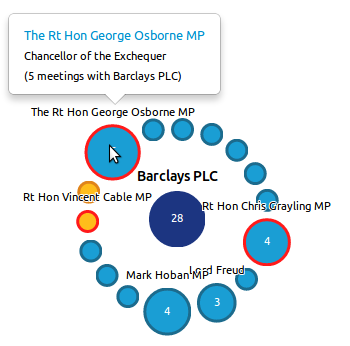
barclays

[This is a companion piece to our visualisation of ministerial lobbying – open it up and take a look!].

Eight Months Worth of Lobbying Data

Turns out that James Ball, together with the folks at Who’s Lobbying had collected together all the data regarding ministerial meetings from all the different departments across the UK’s government (during May to December 2010), tidied the data up, and put them together in one spreadsheet: https://docs.google.com/spreadsheet/ccc?key=0AhHlFdx-QwoEdENhMjAwMGxpb2kyVnlBR2QyRXJVTFE.

It’s important to understand that despite the current UK government stating that it is the most open and transparent ever, each department publishes its ministerial meetings in ever so slightly different formats. On that page for example you can see Dept of Health Ministerial gifts, hospitality, travel and external meetings January to March 2013, and DWP ministers’ meetings with external organisations: January to March 2013. Two lists containing slightly different sets of data. So, the work that Who’s Lobbying and James Ball did in tallying this data up is considerable. But not many people have the time to tie such data-sets together, meaning the data contained in them is somewhat more opaque than you might at first be led to believe. What’s needed is one pan-governmental set of data.

An example to follow in making “open” data a bit more “transparent.”

Not entirely transparent for as the author notes, minutes from the various meetings are not available.

Or I suppose when minutes are available, their completeness would be questionable.

I first saw this in a tweet by Steve Peters.

March 4, 2014

Lyra Gets its First Visualization Tutorial

Filed under: Graphics,Lyra,Visualization — Patrick Durusau @ 3:48 pm

Lyra Gets its First Visualization Tutorial by Bryan Connor.

From the post:

Before the demo session even began, Tapestry was humming with talk of “Lyra.” A group gathered around Arvind Satyanarayan as he took us for a spin around the tool he helped developed at UW Interactive Data Lab.

It’s just a few day later and the tool’s open source code is up on Github. You can run the app yourself in the browser and now the first tutorial about Lyra has been written.

Jim Vallandingham’s Lyra tutorial is naturally a tentative investigation of an app that is in early alpha. It does a fantastic job of teasing apart the current features of Lyra and making predictions about how it can be used in the future. Some sections are highlighted below.

You will also want to visit:

The Lyra Visualization Design Environment (VDE) alpha by Arvind Satyanarayan, Kanit “Ham” Wongsuphasawat, Jeffrey Heer.

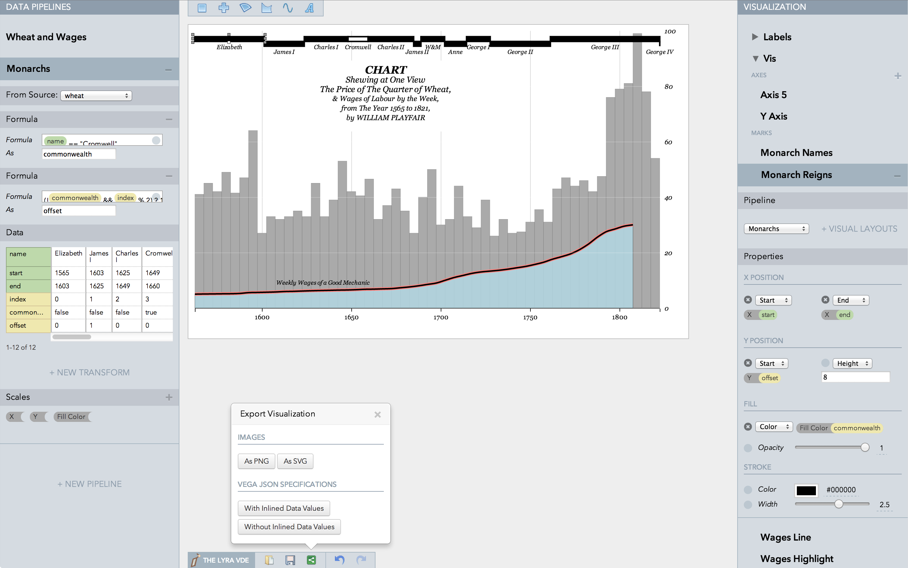
playfair
William Playfair’s classic chart comparing the price of wheat and wages in England recreated in the Lyra VDE.

Lyra is an interactive environment that enables custom visualization design without writing any code. Graphical “marks” can be bound to data fields using property drop zones; dynamically positioned using connectors; and directly moved, rotated, and resized using handles. Lyra also provides a data pipeline interface for iterative visual specification of data transformations and layout algorithms. Lyra is more expressive than interactive systems like Tableau, allowing designers to create custom visualizations comparable to hand-coded visualizations built with D3 or Processing. These visualizations can then be easily published and reused on the Web.

This looks very promising!

March 3, 2014

Data Science – Chicago

Filed under: Challenges,Data Mining,Government Data,Visualization — Patrick Durusau @ 8:19 pm

OK, I shortened the headline.

The full headline reads: Accenture and MIT Alliance in Business Analytics launches data science challenge in collaboration with Chicago: New annual contest for MIT students to recognize best data analytics and visualization ideas.: The Accenture and MIT Alliance in Business Analytics

Don’t try that without coffee in the morning.

From the post:

The Accenture and MIT Alliance in Business Analytics have launched an annual data science challenge for 2014 that is being conducted in collaboration with the city of Chicago.

The challenge invites MIT students to analyze Chicago’s publicly available data sets and develop data visualizations that will provide the city with insights that can help it better serve residents, visitors, and businesses. Through data visualization, or visual renderings of data sets, people with no background in data analysis can more easily understand insights from complex data sets.

The headline is longer than the first paragraph of the story.

I didn’t see an explanation for why the challenge is limited to:

The challenge is now open and ends April 30. Registration is free and open to active MIT students 18 and over (19 in Alabama and Nebraska). Register and see the full rule here: http://aba.mit.edu/challenge.

Find a sponsor and setup an annual data mining challenge for your school or organization.

Although I would suggest you take a pass on Bogata, Mexico City, Rio de Janeiro, Moscow, Washington, D.C. and similar places where truthful auditing could be hazardous to your health.

Or as one of my favorite Dilbert cartoons had the pointy-haired boss observing:

When you find a big pot of crazy it’s best not to stir it.

February 28, 2014

Cool Infographics: Best Practices Group on LinkedIn

Filed under: Graphics,Visualization — Patrick Durusau @ 7:27 pm

Cool Infographics: Best Practices Group on LinkedIn by Randy Krum.

From the post:

I am excited to announce the launch of a new LinkedIn Group, Cool Infographics: Best Practices. I have personally been a part of many great discussion groups over the years and believe that this group fills an unmet need. Please accept this invitation to join the group to share your own experiences and wisdom.

There are many groups that share infographics, but I felt that a discussion group dedicated to the craft of infographics and data visualization was missing. This group will feature questions and case studies about how companies are leveraging infographics and data visualization as a communication tool. Any posts that are just links to infographics will be moderated to keep the focus on engaging discussions. Topics and questions from the Cool Infographics book will also be discussed.

Join us in a professional dialogue surrounding case studies and strategies for designing infographics and using them as a part of an overall marketing strategy. We welcome both beginning and established professionals to share valuable tactics and experiences as well as fans of infographics to learn more about this growing field.

Anyone with a drawing program can create an infographic.

This group is where you may learn to make “cool” infographics.

Think of it as the difference between failing to communicate and communicating.

If you are trying to market an idea, a service or a product, the latter should be your target.

February 24, 2014

GenomeBrowse

Filed under: Bioinformatics,Genomics,Interface Research/Design,Visualization — Patrick Durusau @ 4:36 pm

GenomeBrowse

From the webpage:

Golden Helix GenomeBrowse® visualization tool is an evolutionary leap in genome browser technology that combines an attractive and informative visual experience with a robust, performance-driven backend. The marriage of these two equally important components results in a product that makes other browsers look like 1980s DOS programs.

Visualization Experience Like Never Before

GenomeBrowse makes the process of exploring DNA-seq and RNA-seq pile-up and coverage data intuitive and powerful. Whether viewing one file or many, an integrated approach is taken to exploring your data in the context of rich annotation tracks.

This experience features:

  • Zooming and navigation controls that are natural as they mimic panning and scrolling actions you are familiar with.
  • Coverage and pile-up views with different modes to highlight mismatches and look for strand bias.
  • Deep, stable stacking algorithms to look at all reads in a pile-up zoom, not just the first 10 or 20.
  • Context-sensitive information by clicking on any feature. See allele frequencies in control databases, functional predictions of a non-synonymous variants, exon positions of genes, or even details of a single sequenced read.
  • A dynamic labeling system which gives optimal detail on annotation features without cluttering the view.
  • The ability to automatically index and compute coverage data on BAM or VCF files in the background.

I’m very interested in seeing how the interface fares in the bioinformatics domain. Every domain is different but there may be some cross-over in term of popular UI features.

I first saw this in a tweet by Neil Saunders.

Word Tree [Standard Editor’s Delight]

Filed under: Data Mining,Text Analytics,Visualization — Patrick Durusau @ 3:45 pm

Word Tree by Jason Davies.

From the webpage:

The Word Tree visualisation technique was invented by the incredible duo Martin Wattenberg and Fernanda Viégas in 2007. Read their paper for the full details.

Be sure to also check out various text analysis projects by Santiago Ortiz

Created by Jason Davies. Thanks to Mike Bostock for comments and suggestions. .

This is excellent!

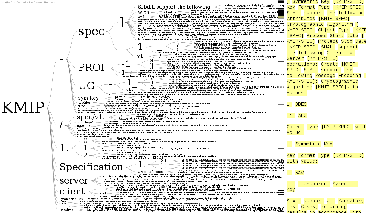
I pasted in the URL from a specification I am reviewing and got this result:

wordtree

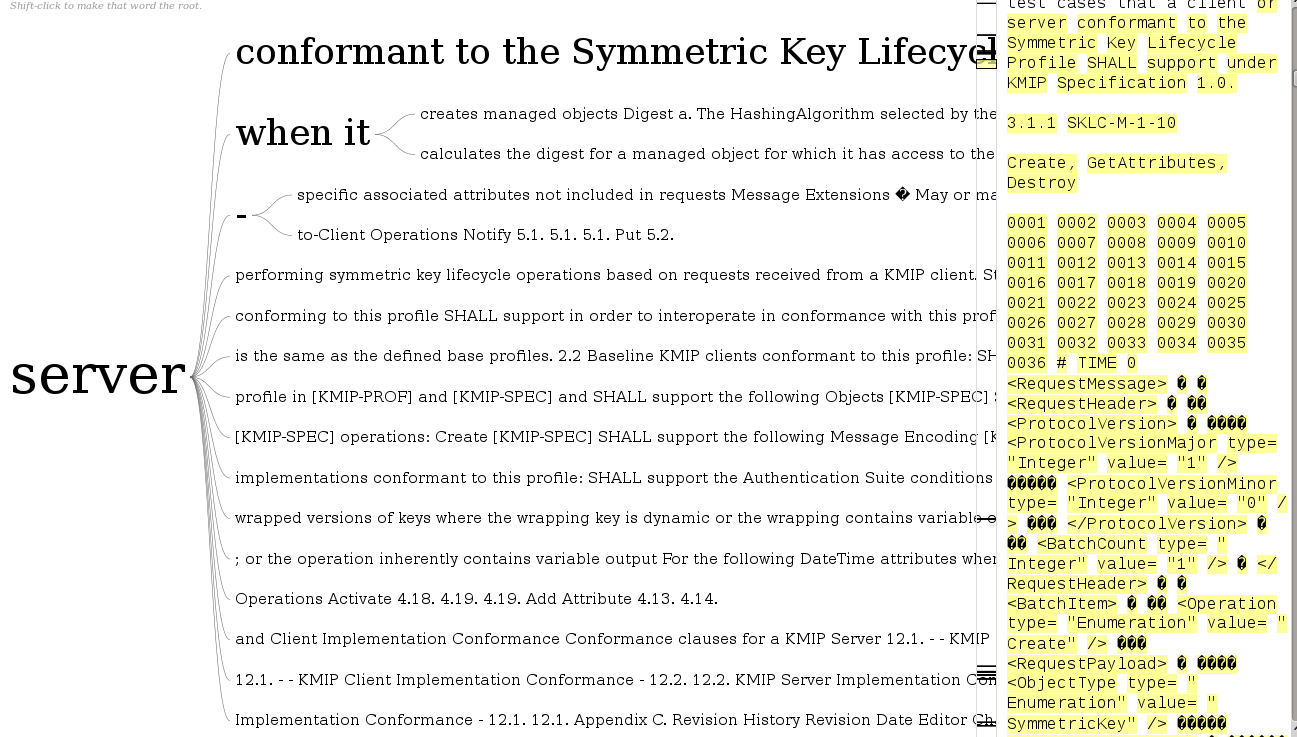
I then changed the focus to “server” and had this result:

wordtree2

Granted I need to play with it a good bit more but not bad for throwing a URL at the page.

I started to say this probably won’t work across multiple texts, in order to check consistency of the documents.

But, I already have text versions of the files with various formatting and boilerplate stripped out. I could just cat all the files together and then run word tree on the resulting file.

Would make checking for consistency a lot easier. True, tracking down the inconsistencies will be a pain but that’s going to be true in any event.

Not feasible to do it manually with 600+ pages of text spread over twelve (12) documents. Well, could if I were in a monastery and had several months to complete the task. 😉

This also looks like a great data exploration tool for topic map authoring as well.

I first saw this in a tweet by Elena Glassman.

Word Storms:…

Filed under: Text Analytics,Text Mining,Visualization,Word Cloud — Patrick Durusau @ 1:58 pm

Word Storms: Multiples of Word Clouds for Visual Comparison of Documents by Quim Castellà and Charles Sutton.

Abstract:

Word clouds are popular for visualizing documents, but are not as useful for comparing documents, because identical words are not presented consistently across different clouds. We introduce the concept of word storms, a visualization tool for analyzing corpora of documents. A word storm is a group of word clouds, in which each cloud represents a single document, juxtaposed to allow the viewer to compare and contrast the documents. We present a novel algorithm that creates a coordinated word storm, in which words that appear in multiple documents are placed in the same location, using the same color and orientation, across clouds. This ensures that similar documents are represented by similar- looking word clouds, making them easier to compare and contrast visually. We evaluate the algorithm using an automatic evaluation based on document classifi cation, and a user study. The results con rm that a coordinated word storm allows for better visual comparison of documents.

I never have cared for word clouds all that much but word storms as presented by the authors looks quite useful.

The paper examines the use of word storms at a corpus, document and single document level.

You will find Word Storms: Multiples of Word Clouds for Visual Comparison of Documents (website) of particular interest, including its like to Github for the source code used in this project.

Of particular interests for topic mappers is the observation:

similar documents should be represented by visually similar clouds (emphasis in original)

Now imagine for a moment visualizing topics and associations with “similar” appearances. Even if limited to colors that are easy to distinguish, that could be a very powerful display/discover tool for topic maps.

Not the paper’s use case but one that comes to mind with regard to display/discovery in a heterogeneous data set (such as a corpus of documents).

February 23, 2014

Making the meaning of contracts visible…

Filed under: Law,Law - Sources,Legal Informatics,Transparency,Visualization — Patrick Durusau @ 4:27 pm

Making the meaning of contracts visible – Automating contract visualization by Stefania Passera, Helena Haapio, Michael Curtotti.

Abstract:

The paper, co-authored by Passera, Haapio and Curtotti, presents three demos of tools to automatically generate visualizations of selected contract clauses. Our early prototypes include common types of term and termination, payment and liquidated damages clauses. These examples provide proof-of-concept demonstration tools that help contract writers present content in a way readers pay attention to and understand. These results point to the possibility of document assembly engines compiling an entirely new genre of contracts, more user-friendly and transparent for readers and not too challenging to produce for lawyers.

Demo.

Slides.

From slides 2 and 3:

Need for information to be accessible, transparent, clear and easy to understand
   Contracts are no exception.

Benefits of visualization

  • Information encoded explicitly is easier to grasp & share
  • Integrating pictures & text prevents cognitive overload by distributing effort on 2 different processing systems
  • Visual structures and cues act as paralanguage, reducing the possibility of misinterpretation

Sounds like the output from a topic map doesn’t it?

A contract is “explicit and transparent” to a lawyer, but that doesn’t mean everyone reading it sees the contract as “explicit and transparent.”

Making what the lawyer “sees” explicit, in other words, is another identification of the same subject, just a different way to describe it.

What’s refreshing is the recognition that not everyone understands the same description, hence the need for alternative descriptions.

Some additional leads to explore on these authors:

Stefania Passera Homepage with pointers to her work.

Helena Haapio Profile at Lexpert, pointers to her work.

Michael Curtotti – Computational Tools for Reading and Writing Law.

There is a growing interest in making the law transparent to non-lawyers, which is going to require a lot more than “this is the equivalent of that, because I say so.” Particularly for re-use of prior mappings.

Looks like a rapid growth area for topic maps to me.

You?

I first saw this at: Passera, Haapio and Curtotti: Making the meaning of contracts visible – Automating contract visualization.
…Into Dreamscapes

Filed under: Communication,Graphics,Visualization — Patrick Durusau @ 10:43 am

A Stunning App That Turns Radiohead Songs Into Dreamscapes by Liz Stinson.

From the post:

There’s something about a good Radiohead song that lets your mind roam. And if you could visualize what a world in which Radiohead were the only soundtrack, it would look a lot like the world Universal Everything created for the band’s newly released app PolyFauna (available on iOS and Android). Which is to say, a world that’s full of cinematic landscapes and bizarre creatures that only reside in our subconscious minds.

“I got an email out of nowhere from Thom [Yorke], who’d seen a few projects we’d done,” says Universal Everything founder Matt Pyke. Radiohead was looking to design a digital experience for its 2011 King of Limbs session that departed from the typical music apps available, which tend to put emphasis on discography or tour dates. Instead, the band wanted an audio/visual piece that was more digital art than serviceable app.

Pyke met with Yorke and Stanley Donwood, the artist who’s been responsible for crafting Radiohead’s breed of peculiar, moody aesthetics. “We had a really good chat about how we could push this into a really immersive atmospheric audio/visual environment,” says Pyke. What they came up with was PolyFauna, a gorgeously weird interactive experience based on the skittish beats and melodies of “Bloom,” the first track off of King of Limbs.

Does this suggest a way to visualize financial or business data? Everyone loves staring at rows and rows of spreadsheet numbers, but just for a break, what if you visualized the information corridors for departments in an annual (internal) report? Where each corridors is as wide or narrow as access by other departments to their data?

Or approval processes where gate-keepers are trolls by bridges?

I wouldn’t do an entire report that way but one or two slide or two images could leave a lasting impression.

Remembering the more powerfully you communicate information, the more powerful the information becomes.

February 20, 2014

Selfie City:…

Filed under: Mapping,Visualization — Patrick Durusau @ 9:30 pm

Selfie City: a Visualization-Centric Analysis of Online Self-Portraits by Andrew Vande Moere.

From the post:

Selfie City [selfiecity.net], developed by Lev Manovich, Moritz Stefaner, Mehrdad Yazdani, Dominikus Baur and Alise Tifentale, investigates the socio-popular phenomenon of self-portraits (or selfies) by using a mix of theoretic, artistic and quantitative methods.

The project is based on a wide, sophisticated analysis of tens of thousands of selfies originating from 5 different world cities (New York, Sao Paulo, Berlin, Bangkok, Moscow), with statistical data derived from both automatic image analysis and crowd-sourced human judgements (i.e. Amazon Mechanical Turk). Its analysis process and its main findings are presented through various interactive data visualizations, such as via image plots, bar graphs, an interactive dashboard and other data graphics.

Andrew’s description is great but you need to visit the site to get the full impact.

Are there patterns in the images we take or posts?

February 19, 2014

Visualization Course Diary

Filed under: Graphics,Visualization — Patrick Durusau @ 9:06 pm

Enrico Bertini is keeping a course diary for his Information Visualization course at NYU. As he describes it:

Starting from this week and during the rest of the semester I will be writing a new series called “Course Diary” where I report about my experience while teaching Information Visualization to my students at NYU. Teaching to them is a lot of fun. They often challenge me with questions and comments which force me to think more deeply about visualization. Here I’ll report about some of my experiences and reflections on the course.

Start at the beginning: Course Diary #1: Basic Charts

If you teach or aspire to teach (well) this will be a lot of fun for you!

February 17, 2014

ViziCities

Filed under: Mapping,Maps,Visualization,WebGL — Patrick Durusau @ 11:43 am

ViziCities: Bringing cities to life using the power of open data and the Web by Robin Hawkes and Peter Smart.

From the webpage:

ViziCities is a 3D city and data visualisation platform, powered by WebGL. Its purpose is to change the way you look at cities and the data contained within them. It is the brainchild of Robin Hawkes and Peter Smartget in touch if you’d like to discuss the project with them in more detail.

Demonstration

Here’s a demo of ViziCities so you can have a play without having to build it for yourself. Cool, ey?

What does it do?

ViziCities aims to combine data visualisation with a 3D representation of a city to provide a better understanding what’s going on. It’s a powerful new way of looking at and understanding urban areas.

Aside from seeing a city in 3D, here are some of the others things you’ll have the power to do:

This is wickedly cool! (Even though in pre-alpha state.)

Governments, industry, etc. have had these capabilities for quite some time.

Now, you too can do line of sight, routing, and integration of other data onto a representation of a cityscape.

Could be quite important in Bangkok, Caracas, Kiev, and other locations with non-responsive governments.

Used carefully, information can become an equalizer.

Other resources:

ViziCities website

ViziCities announcement

Videos of ViziCities experiments

“ViziCities” as a search term shows a little over 1,500 “hits” today. Expect that to expand rapidly.

February 15, 2014

MPLD3…

Filed under: D3,Graphics,Python-Graph,Visualization — Patrick Durusau @ 11:33 am

MPLD3: Bringing Matplotlib to the Browser

From the webpage:

The mpld3 project brings together Matplotlib, the popular Python-based graphing library, and D3js, the popular Javascript library for creating data-driven web pages. The result is a simple API for exporting your matplotlib graphics to HTML code which can be used within the browser, within standard web pages, blogs, or tools such as the IPython notebook.

See the Example Gallery or Notebook Examples for some interactive demonstrations of mpld3 in action.

For a quick overview of the package, see the Quick Start Guide.

Being a “text” person, I have to confess a fondness for the HTML tooltip plugin.

Data is the best antidote for graphs with labeled axes but no metrics and arbitrary placement of competing software packages.

Some people call that marketing. I prefer the older term, “lying.”

February 14, 2014

Inline Visualization with D3.js

Filed under: D3,Graphics,Visualization — Patrick Durusau @ 4:42 pm

Inline Visualization with D3.js by Muyueh Lee.

From the post:

Sparkline is an inline visualization that fits nicely within the text. Tufte described it as “data-intense, design-simple, word-sized graphics.” It’s especially useful, so when you have to visualize a list of items, you can list them in a column, where it’s very easy to compare different data (small-multiple technique).

sparkline

I was wondering, however, if there is some other form of inline visualization?

The post walks through how to represent complex numeric import/export data using inline visualization. Quite good. http://muyueh.com/30/imexport/summary/

If you are seriously interested in D3, check out 30D of D3. You won’t be disappointed.

I first saw this in a tweet by DashingD3js.com.

February 13, 2014

Conditional probability

Filed under: Graphics,Probability,Visualization — Patrick Durusau @ 8:38 pm

Conditional probability by Victor Powell.

From the post:

A conditional probability is the probability of an event, given some other event has already occurred. In the below example, there are two possible events that can occur. A ball falling could either hit the red shelf (we’ll call this event A) or hit the blue shelf (we’ll call this event B) or both.

Just in terms of visualization prowess, you need to see Victor’s post.

February 10, 2014

Data visualization with Elasticsearch aggregations and D3

Filed under: D3,ElasticSearch,Visualization — Patrick Durusau @ 1:53 pm

Data visualization with Elasticsearch aggregations and D3 by Shelby Sturgis.

From the post:

For those of you familiar with Elasticsearch, you know that its an amazing modern, scalable, full-text search engine with Apache Lucene and the inverted index at its core. Elasticsearch allows users to query their data and provides efficient and blazingly fast look up of documents that make it perfect for creating real-time analytics dashboards.

Currently, Elasticsearch includes faceted search, a functionality that allows users to compute aggregations of their data. For example, a user with twitter data could create buckets for the number of tweets per year, quarter, month, day, week, hour, or minute using the date histogram facet, making it quite simple to create histograms.

Faceted search is a powerful tool for data visualization. Kibana is a great example of a front-end interface that makes good use of facets. However, there are some major restrictions to faceting. Facets do not retain information about which documents fall into which buckets, making complex querying difficult. Which is why, Elasticsearch is pleased to introduce the aggregations framework with the 1.0 release. Aggregations rips apart its faceting restraints and provides developers the potential to do much more with visualizations.

Aggregations (=Awesomeness!)

Aggregations is “faceting reborn”. Aggregations incorporate all of the faceting functionality while also providing much more powerful capabilities. Aggregations is a “generic” but “extremely powerful” framework for building any type of aggregation. There are several different types of aggregations, but they fall into two main categories: bucketing and metric. Bucketing aggregations produce a list of buckets, each one with a set of documents that belong to it (e.g., terms, range, date range, histogram, date histogram, geo distance). Metric aggregations keep track and compute metrics over a set of documents (e.g., min, max, sum, avg, stats, extended stats).

Using Aggregations for Data Visualization (with D3)

Lets dive right in and see the power that aggregations give us for data visualization. We will create a donut chart and a dendrogram using the Elasticsearch aggregations framework, the Elasticsearch javascript client, and D3.

If you are new to Elasticsearch, it is very easy to get started. Visit the Elasticsearch overview page to learn how to download, install, and run Elasticsearch version 1.0.

The dendrogram of football (U.S.) touchdowns is particularly impressive.

BTW, https://github.com/stormpython/Elasticsearch-datasets/archive/master.zip, returns Elasticsearch-datasets-master.zip on your local drive. Just to keep you from hunting for it.

February 8, 2014

Visualizing History

Filed under: Charts,Graphics,Visualization — Patrick Durusau @ 3:25 pm

Visualizing History by Ben Jones.

From the post:

When studying history, we ask questions of the past, seeking to understand what happened in the lives of the people who have gone before us, and why. A data visualization of history suggests and answers a thousand questions. Sometimes, the value in a chart or graph of history is that it proposes new questions to ask of the past, questions that we wouldn’t have thought to ask unless the information were presented to us in a visual way.

Ben makes imaginative use of Gantt charts to illustrate:

  • American Presidencies
  • History of Civilizations
  • History of the Patriarchs
  • Political History (scandal)
  • and others.

I have always thought of Gantt charts as useful for projects, etc., but they work well in other contexts as well.

Not as flashy as some charts, but also less difficult to interpret.

February 7, 2014

What’s behind a #1 ranking?

Filed under: Data Mining,Visualization — Patrick Durusau @ 3:08 pm

What’s behind a #1 ranking? by Manny Morone.

From the post:

Behind every “Top 100” list is a generous sprinkling of personal bias and subjective decisions. Lacking the tools to calculate how factors like median home prices and crime rates actually affect the “best places to live,” the public must take experts’ analysis at face value.

To shed light on the trustworthiness of rankings, Harvard researchers have created LineUp, an open-source application that empowers ordinary citizens to make quick, easy judgments about rankings based on multiple attributes.

“It liberates people,” says Alexander Lex, a postdoctoral researcher at the Harvard School of Engineering and Applied Sciences (SEAS). “Imagine if a magazine published a ranking of ‘best restaurants.’ With this tool, we don’t have to rely on the editors’ skewed or specific perceptions. Everybody on the Internet can go there and see what’s really in the data and what part is personal opinion.”

So intuitive and powerful is LineUp, that its creators—Lex; his adviser Hanspeter Pfister, An Wang Professor of Computer Science at SEAS; Nils Gehlenborg, a research associate at Harvard Medical School; and Marc Streit and Samuel Gratzl at Johannes Kepler University in Linz—earned the best paper award at the IEEE Information Visualization (InfoVis) conference in October 2013.

LineUp is part of a larger software package called Caleydo, an open-source visualization framework developed at Harvard, Johannes Kepler University, and Graz University of Technology. Caleydo visualizes genetic data and biological pathways—for example, to analyze and characterize cancer subtypes.

LineUp software: http://lineup.caleydo.org/

From the LineUp homepage:

While the visualization of a ranking itself is straightforward, its interpretation is not, because the rank of an item represents only a summary of a potentially complicated relationship between its attributes and those of the other items. It is also common that alternative rankings exist which need to be compared and analyzed to gain insight into how multiple heterogeneous attributes affect the rankings. Advanced visual exploration tools are needed to make this process efficient.

Interesting contrast. The blog post says that LineUp: “[we can see] what’s really in the data and what part is personal opinion” to “gain insight into how multiple heterogeneous attributes affect the rankings” at the website.

I think the website is being more realistic.

Being able to explore how the “multiple heterogeneous attributes affect the rankings” enables you to deliver rankings as close as possible to your boss’ or client’s expectations.

You can just imagine what software promoters will be doing with this. Our software is up 500% percent (Translation: We had 10 users, now we have 50 users.)

When asked they will truthfully say, it’s the best data we have.

Lessons From “Behind The Bloodshed”

Filed under: Data,Data Mining,Visualization — Patrick Durusau @ 12:22 pm

Lessons From “Behind The Bloodshed”

From the post:

Source has published a fantastic interview with the makers of Behind The Bloodshed, a visual narrative about mass killings produced by USA Today.

The entire interview with Anthony DeBarros is definitely worth a read but here are some highlights and commentary.

A synopsis of data issues in the production of “Behind The Bloodshed.”

Great visuals, as you would expect from USA Today.

A good illustration of simplifying a series of complex events for persuasive purposes.

That’s not a negative comment.

What other purpose would communication have if not to “persuade” others to act and/or believe as we wish?

I first saw this in a tweet by Bryan Connor.

January 31, 2014

Sigma.js Version 1.0 Released!

Filed under: Graphs,Sigma.js,Visualization — Patrick Durusau @ 2:31 pm

Sigma.js Version 1.0 Released!

From the homepage:

Sigma is a JavaScript library dedicated to graph drawing. It makes easy to publish networks on Web pages, and allows developers to integrate network exploration in rich Web applications.

Appreciated the inclusion of Victor Hugo’s Les Misérables example that comes with Gephi.

Something familiar always makes learning easier.

I first saw this in a tweet by Bryan Connor.

January 30, 2014

Visualize your Twitter followers…

Filed under: Social Networks,Tweets,Visualization — Patrick Durusau @ 9:08 pm

Visualize your Twitter followers in 3 fairly easy — and totally free — steps by Derrick Harris.

From the post:

Twitter is a great service, but it’s not exactly easy for users without programming skills to access their account data, much less do anything with it. Until now.

There already are services that will let you download reports about when you tweet and which of your tweets were the most popular, some — like SimplyMeasured and FollowerWonk — will even summarize data about your followers. If you’re willing to wait hours to days (Twitter’s API rate limits are just that — limiting) and play around with open source software, NodeXL will help you build your own social graph. (I started and gave up after realizing how long it would take if you have more than a handful of followers.) But you never really see the raw data, so you have to trust the services and you have to hope they present the information you want to see.

Then, last week, someone from ScraperWiki tweeted at me, noting that service can now gather raw data about users’ accounts. (I’ve used the service before to measure tweet activity.) I was intrigued. But I didn’t want to just see the data in a table, I wanted to do something more with it. Here’s what I did.

Another illustration that the technology expertise gap between users does not matter as much as the imagination gap between users.

The Google Fusion Table image is quite good.

The Data Visualization Catalogue

Filed under: Graphics,Visualization — Patrick Durusau @ 8:57 pm

The Data Visualization Catalogue by Drew Skau.

From the post:

If you’ve ever struggled with what visualization to create to best show the data you have, The Data Visualization Catalogue might provide just the help you need.

Severino Ribecca has begun the process of categorizing data visualizations based on what relationships and properties of data that they show. With 54 visualizations currently slated to be categorized, the catalog aims to be a comprehensive list of visualizations, searchable by what you want to show.

Just having a quick reference to the different visualization types is helpful by itself. The details make it even more helpful.

Resources for learning D3.js

Filed under: D3,Graphics,Visualization — Patrick Durusau @ 11:45 am

Resources for learning D3.js

Nineteen “pinned” resources.

Capabilities of D3.js?

The TweetMap I mentioned yesterday uses D3.js.

Other questions about the capabilities of D3.js?

January 28, 2014

Visualization of Narrative Structure

Filed under: Graphics,Narrative,Visualization — Patrick Durusau @ 3:49 pm

Visualization of Narrative Structure. Created by Natalia Bilenko and Asako Miyakawa.

From the webpage:

Can books be summarized through their emotional trajectory and character relationships? Can a graphic representation of a book provide an at-a-glance impression and an invitation to explore the details?

We visualized character interactions and relative emotional content for three very different books: a haunting memory play, a metaphysical mood piece, and a children’s fantasy classic. A dynamic graph of character relationships displays the evolution of connections between characters throughout the book. Emotional strength and valence of each sentence are shown in a color-coded sentiment plot. Hovering over the sentence bars reveals the text of the original sentences. The emotional path of each character through the book can be traced by clicking on the character names in the graph. This highlights the corresponding sentences in the sentiment plot where that character appears. Click on the links below to see each visualization.

Best viewed in Google Chrome at 1280×800 resolution.

Visualizations of:

The Hobbit by J.R.R. Tolkien.

Kafka on the shore by Haruki Murakami.

The Glass Menagerie by Tennessee Williams.

Reading of any complex narrative would be enhanced by the techniques used here.

I first saw this in a tweet by Christophe Viau.

January 21, 2014

VisIVO Contest 2014

Filed under: Astroinformatics,Visualization — Patrick Durusau @ 10:14 am

VisIVO Contest 2014

Entries accepted: January 1st through April 30th 2014.

From the post:

This competition is an international call to use technologies provided by the VisIVO Science Gateway to produce images and movies from multi-dimensional datasets coming either from observations or numerical simulations. The competition is open to scientists and citizens alike who are investigating datasets related to astronomy or other fields, e.g., life sciences or physics. Entries will be accepted from January 1st ­ April 30th 2014 and prizes will be awarded! More information is available at http://visivo.oact.inaf.it:8080/visivo-contest or https://www.facebook.com/visivocontest2014.

Prizes:

  • 1st prize : 2500 €
  • 2nd prize : 500 €

There are basic and advanced tutorials.

The detailed rules.

You won’t be able to quite your day job if you win, but even entering may bring your visualization skills some needed attention.

January 20, 2014

Timeline of the Far Future

Filed under: Graphics,History,Timelines,Visualization — Patrick Durusau @ 6:37 pm

Timeline of the Far Future Randy Krum.

Randy has uncovered a timeline from the BBC that predicts the future in 1,000, 10,000, one million years and beyond.

It’s big and will take time to read.

I suspect the accuracy of the predictions are on par with a similar time line pointing backwards. 😉

But it’s fun to speculate about history, past, future, alternative, or fantasy histories.

Zooming Through Historical Data…

Filed under: S4,Storm,Stream Analytics,Visualization — Patrick Durusau @ 5:12 pm

Zooming Through Historical Data with Streaming Micro Queries by Alex Woodie.

From the post:

Stream processing engines, such as Storm and S4, are commonly used to analyze real-time data as it flows into an organization. But did you know you can use this technology to analyze historical data too? A company called ZoomData recently showed how.

In a recent YouTube presentation, Zoomdata Justin Langseth demonstrated his company’s technology, which combines open source stream processing engines like Apache with data connection and visualization libraries based on D3.js.

“We’re doing data analytics and visualization a little differently than it’s traditionally done,” Langseth says in the video. “Legacy BI tools will generate a big SQL statement, run it against Oracle or Teradata, then wait for two to 20 to 200 seconds before showing it to the user. We use a different approach based on the Storm stream processing engine.”

Once hooked up to a data source–such as Cloudera Impala or Amazon Redshift–data is then fed into the Zoomdata platform, which performs calculations against the data as it flows in, “kind of like continues event processing but geared more toward analytics,” Langseth says.

From the video description:

In this hands-on webcast you’ll learn how LivePerson and Zoomdata perform stream processing and visualization on mobile devices of structured site traffic and unstructured chat data in real-time for business decision making. Technologies include Kafka, Storm, and d3.js for visualization on mobile devices. Byron Ellis, Data Scientist for LivePerson will join Justin Langseth of Zoomdata to discuss and demonstrate the solution.

After watching the video, what do you think the concept of “micro queries?”

I ask because I don’t know of any technical reason why a “large” query could not stream out interim results and display those as more results were arriving.

Visualization isn’t usually done that way but that brings me to my next question: Assuming we have interim results visualized, how useful are interim results? Being actionable on interim results really depends on the domain.

I rather like Zoomdata’s emphasis on historical data and the video is impressive.

You can download a VM at Zoomdata.

If you can think of upsides/downsides to the interim results issue, please give a shout!

« Newer PostsOlder Posts »

Powered by WordPress