Another Word For It Patrick Durusau on Topic Maps and Semantic Diversity

November 14, 2014

Seaborn: statistical data visualization (Python)

Filed under: Graphics,Statistics,Visualization — Patrick Durusau @ 8:21 pm

Seaborn: statistical data visualization

From the introduction:

Seaborn is a library for making attractive and informative statistical graphics in Python. It is built on top of matplotlib and tightly integrated with the PyData stack, including support for numpy and pandas data structures and statistical routines from scipy and statsmodels.

Some of the features that seaborn offers are

Seaborn aims to make visualization a central part of exploring and understanding data. The plotting functions operate on dataframes and arrays containing a whole dataset and internally perform the necessary aggregation and statistical model-fitting to produce informative plots. Seaborn’s goals are similar to those of R’s ggplot, but it takes a different approach with an imperative and object-oriented style that tries to make it straightforward to construct sophisticated plots. If matplotlib “tries to make easy things easy and hard things possible”, seaborn aims to make a well-defined set of hard things easy too.

From the “What’s New” page:

v0.5.0 (November 2014)

This is a major release from 0.4. Highlights include new functions for plotting heatmaps, possibly while applying clustering algorithms to discover structured relationships. These functions are complemented by new custom colormap functions and a full set of IPython widgets that allow interactive selection of colormap parameters. The palette tutorial has been rewritten to cover these new tools and more generally provide guidance on how to use color in visualizations. There are also a number of smaller changes and bugfixes.

The What’s New page has a more detailed listing of the improvements over 0.40.

If you haven’t seen Seaborn before, let me suggest that you view the tutorial on Visual Dataset Exploration.

You will be impressed. But if you aren’t, check yourself for a pulse. 😉

I first saw this in a tweet by Michael Waskom.
Open Sourcing 3D City Reconstruction

Filed under: Graphics,Mapillary,Maps,Visualization — Patrick Durusau @ 3:05 pm

Open Sourcing 3D City Reconstruction by Jan Erik Solem.

From the post:

One of the downsides of using simple devices for mapping the world is that the GPS accuracy is not always great, especially in cities with tall buildings. Since the start we have always wanted to correct this using image matching and we are now making progress in that area.

The technique is called ‘Structure from Motion‘ (SfM) and means that you compute the relative camera positions and a 3D reconstruction of the environment using only the images.

We are now open sourcing our tools under the name OpenSfM and developing it in the open under a permissive BSD license. The project is intended to be a complete end-to-end easy-to-use SfM pipeline on top of OpenCV. We welcome all contributors, from industry and academia, to join the project. Driving this work inside Mapillary is Pau and Yubin.

Moving forward we are initially going to use this for improving the positioning and connection between Mapillary photos. Later, we are going to have an ever improving 3D reconstruction of every place on the planet too ;).

Are you ready to enhance your maps with 3D?

BTW, evidence that small vendors also support open source.

I first saw this in a tweet by Peter Neubauer.

November 4, 2014

Tabletop Whale’s guide to making GIFs

Filed under: Graphics,Visualization — Patrick Durusau @ 4:16 pm

Tabletop Whale’s guide to making GIFs by Eleanor Lutz.

From the post:

Recently I’ve been getting a lot of emails asking for a tutorial on how to make animations. So this week I put together a quick explanation for anyone who’s interested. I archived it as a link on the menu bar of my website, so it’ll always be easy to find if you need it.

This is just a run-through of my own personal animation workflow, so it’s not a definitive guide or anything. There are plenty of other ways to make animations in Photoshop and other programs.

I’ve never tried making a tutorial about my own work before, so sorry in advance if it’s confusing! Let me know if there’s anything I wrote that didn’t make any sense. I’ll try to fix it if I can (though I probably don’t have room to go into detail about every single Photoshop function I mention).

As you already know, I am graphically challenged but have been trying to improve, with the help of tutorials like this one from Eleanor Lutz.

Most of the steps should transfer directly to Gimp.

If you know of any Gimp specific tutorials on animation or otherwise useful for information visualization, drop me a line.

October 28, 2014

Text Visualization Browser [100 Techniques]

Filed under: Graphics,Visualization — Patrick Durusau @ 4:25 pm

Text Visualization Browser: A Visual Survey of Text Visualization Techniques by Kostiantyn Kucher and Andreas Kerren.

From the abstract:

Text visualization has become a growing and increasingly important subfield of information visualization. Thus, it is getting harder for researchers to look for related work with specific tasks or visual metaphors in mind. In this poster, we present an interactive visual survey of text visualization techniques that can be used for the purposes of search for related work, introduction to the subfield and gaining insight into research trends.

Even better is the Text Visual Browser webpage where one hundred (100) different techniques have thumbnails and links to the original papers.

Quite remarkable. I don’t think I can name anywhere close to all the techniques.

You?

October 25, 2014

Data Visualization with JavaScript

Filed under: Javascript,Visualization — Patrick Durusau @ 6:08 pm

Data Visualization with JavaScript by Stephen A. Thomas.

From the introduction:

It’s getting hard to ignore the importance of data in our lives. Data is critical to the largest social organizations in human history. It can affect even the least consequential of our everyday decisions. And its collection has widespread geopolitical implications. Yet it also seems to be getting easier to ignore the data itself. One estimate suggests that 99.5% of the data our systems collect goes to waste. No one ever analyzes it effectively.

Data visualization is a tool that addresses this gap.

Effective visualizations clarify; they transform collections of abstract artifacts (otherwise known as numbers) into shapes and forms that viewers quickly grasp and understand. The best visualizations, in fact, impart this understanding subconsciously. Viewers comprehend the data immediately—without thinking. Such presentations free the viewer to more fully consider the implications of the data: the stories it tells, the insights it reveals, or even the warnings it offers. That, of course, defines the best kind of communication.

If you’re developing web sites or web applications today, there’s a good chance you have data to communicate, and that data may be begging for a good visualization. But how do you know what kind of visualization is appropriate? And, even more importantly, how do you actually create one? Answers to those very questions are the core of this book. In the chapters that follow, we explore dozens of different visualizations and visualization techniques and tool kits. Each example discusses the appropriateness of the visualization (and suggests possible alternatives) and provides step-by-step instructions for including the visualization in your own web pages.

To give you a better idea of what to expect from the book, here’s a quick description of what the book is, and what it is not.

The book is a sub-part of http://jsdatav.is/ where Stephen maintains his blog, listing of talks and a link to his twitter account.

If you are interested in data visualization with JavaScript, this should be on a short list of bookmarks.

An interactive visualization to teach about the curse of dimensionality

Filed under: Dimension Reduction,Dimensions,Visualization — Patrick Durusau @ 2:36 pm

An interactive visualization to teach about the curse of dimensionality by Jeff Leek.

From the post:

I recently was contacted for an interview about the curse of dimensionality. During the course of the conversation, I realized how hard it is to explain the curse to a general audience. One of the best descriptions I could come up with was trying to describe sampling from a unit line, square, cube, etc. and taking samples with side length fixed. You would capture fewer and fewer points. As I was saying this, I realized it is a pretty bad way to explain the curse of dimensionality in words. But there was potentially a cool data visualization that would illustrate the idea. I went to my student Prasad, our resident interactive viz design expert to see if he could build it for me. He came up with this cool Shiny app where you can simulate a number of points (n) and then fix a side length for 1-D, 2-D, 3-D, and 4-D and see how many points you capture in a cube of that length in that dimension. You can find the full app here or check it out on the blog here:

An excellent visualization of the “curse of dimensionality!”

The full app will take several seconds to redraw the screen when the length of the edge gets to .5 and above (or at least that was my experience).

October 22, 2014

FilterGraph

Filed under: Astroinformatics,Graphics,Visualization — Patrick Durusau @ 3:38 pm

FilterGraph

From the wiki:

Filtergraph allows you to create interactive portals from datasets that you import. As a web application, no downloads are necessary – it runs and updates in real time on your browser as you make changes within the portal. All that you need to start a portal is an email address and a dataset in a supported type. Creating an account is completely free, and Filtergraph supports a wide variety of data types. For a list of supported data types see “ Supported File Types ”. (emphasis in original)

Just in case you are curious about the file types:

Filtergraph will allow you to upload dataset files in the following formats:

ASCII text Tab, comma and space separated
Microsoft Excel *.xls, *.xlsx
SQLite *.sqlite
VOTable *.vot, *.xml
FITS *.fits
IPAC *.tbl
Numpy *.npy
HDF5 *.h5

You can upload files up to 50MB in size. Larger files can be accommodated if you contact us via a Feedback Form.

For best results:

  • Make sure each row has the same number of columns. If a row has an incorrect number of columns, it will be ignored.
  • Place a header in the first row to name each column. If a header cannot be found, the column names will be assigned as Column1, Column2, etc.
  • If you include a header, make the name of each column unique. Otherwise, the duplicate names will be modified.
  • For ASCII files, you may optionally use the ‘#’ symbol to designate a header.

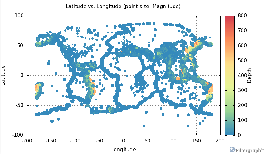
Here is an example of an intereactive graph for earthquakes at FilterGraph:

graph of earthquakes

You can share the results of analysis and allow others to change the analysis of large data sets, without sending the data.

From the homepage:

Developed by astronomers at Vanderbilt University, Filtergraph is used by over 200 people in 28 countries to empower large-scale projects such as the KELT-North and KELT-South ground-based telescopes, the Kepler, Spitzer and TESS space telescopes, and a soil collection project in Bangladesh.

Enjoy!

October 20, 2014

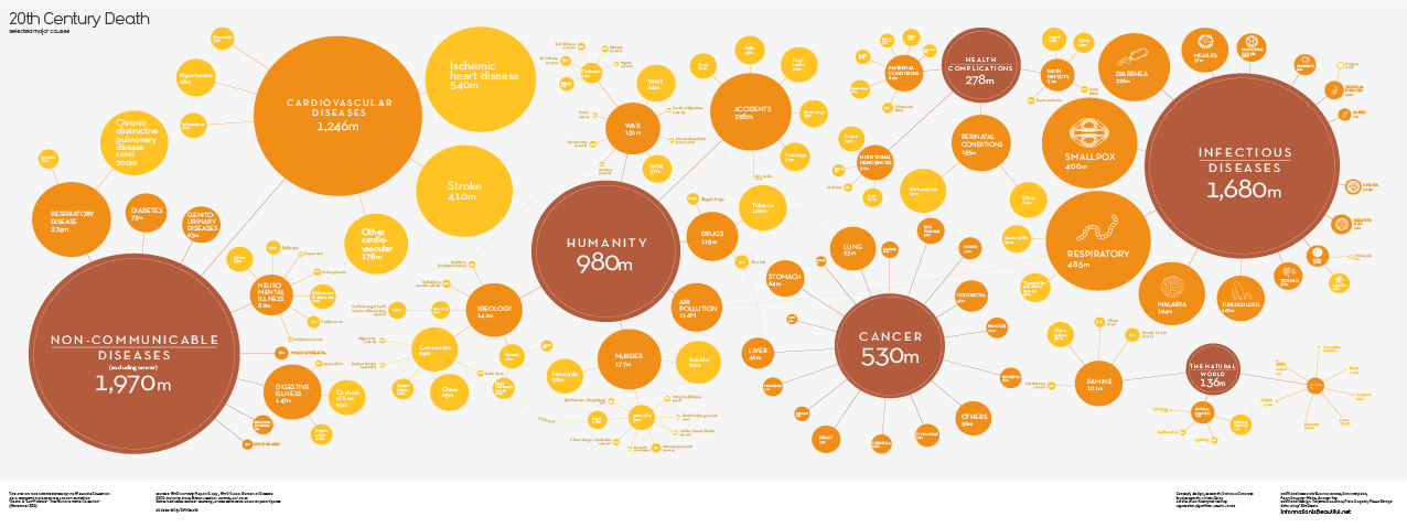
20th Century Death

Filed under: Graphics,History,Visualization — Patrick Durusau @ 3:42 pm

20th century death

I first saw this visualization reported by Randy Krum at 20th Century Death, who then pointed to Information is Beautiful, a blog by David McCandless, where the image originates under: 20th Century Death.

David has posted a high-resolution PDF version, the underlying data and requests your assistance in honing the data.

What is missing from this visualization?

Give up?

Terrorism!

I don’t think extending the chart into the 21st century would make any difference. The smallest death total I saw was in the 1.5 million range. Hard to attribute that kind of death total to terrorism.

The reason I mention the absence of terrorism is that a comparison of these causes of death, at least the preventable ones, to spending on their prevention could be instructive.

You could insert a pin head dot terrorism and point to it with an arrow. Then compare the spending on terrorisms versus infectious diseases.

Between 1993 and 2010, Al-Qaeda was responsible for 4,004 deaths.

As of October 12, 2014, the current confirmed Ebola death toll is 4493.

The CDC is predicting (curently) some 550K Ebola cases by January 2015. With a seventy (70%) mortality rate, well, you do the numbers.

What graphic would you use to persuade decision makers on spending funds in the future?

October 13, 2014

Making of: Introduction to A*

Filed under: Graphics,Visualization — Patrick Durusau @ 4:23 pm

Making of: Introduction to A* by Amit Patel.

From the post:

(Warning: these notes are rough – the main page is here and these are some notes I wrote for a few colleagues and then I kept adding to it until it became a longer page)

Several people have asked me how I make the diagrams on my tutorials.

I need to learn the algorithm and data structures I want to demonstrate. Sometimes I already know them. Sometimes I know nothing about them. It varies a lot. It can take 1 to 5 months to make a tutorial. It’s slow, but the more I make, the faster I am getting.

I need to figure out what I want to show. I start with what’s in the algorithm itself: inputs, outputs, internal variables. With A*, the input is (start, goal, graph), the output is (parent pointers, distances), and the internal variables are (open set, closed set, parent pointers, distances, current node, neighbors, child node). I’m looking for the main idea to visualize. With A* it’s the frontier, which is the open set. Sometimes the thing I want to visualize is one of the algorithm’s internal variables, but not always.

Pure gold on making diagrams for tutorials here. You may make different choices but it isn’t often that the process of making a choice is exposed.

Pass this along. We all benefit from better illustrations in tutorials!

The Big List of D3.js Examples (Approx. 2500 Examples)

Filed under: D3,Graphics,Visualization — Patrick Durusau @ 3:48 pm

The Big List of D3.js Examples by Christophe Viau.

The interactive version has 2523 examples, whereas the numbered list has 1897 examples, as of 13 October 2014.

There is a rudimentary index of the examples. That’s an observation, not a compliant. Effective indexing of the examples would be a real challenge to the art of indexing.

The current index uses chart type, a rather open ended category. The subject matter of the chart would be another way to index. Indexing by the D3 techniques used would be useful. Data that is being combined with other data?

Effective access to the techniques and data represented by this collection would be awesome!

Give it some thought.

I first saw this in a tweet by Michael McGuffin.

September 12, 2014

Bokeh 0.6 release

Filed under: Graphics,Python,Visualization — Patrick Durusau @ 10:30 am

Bokeh 0.6 release by Bryan Van de Ven.

From the post:

Bokeh is a Python library for visualizing large and realtime datasets on the web. Its goal is to provide to developers (and domain experts) with capabilities to easily create novel and powerful visualizations that extract insight from local or remote (possibly large) data sets, and to easily publish those visualization to the web for others to explore and interact with.

This release includes many bug fixes and improvements over our most recent 0.5.2 release:

  • Abstract Rendering recipes for large data sets: isocontour, heatmap
  • New charts in bokeh.charts: Time Series and Categorical Heatmap
  • Full Python 3 support for bokeh-server
  • Much expanded User and Dev Guides
  • Multiple axes and ranges capability
  • Plot object graph query interface
  • Hit-testing (hover tool support) for patch glyphs

See the CHANGELOG for full details.

I’d also like to announce a new Github Organization for Bokeh: https://github.com/bokeh. Currently it is home to Scala and and Julia language bindings for Bokeh, but the Bokeh project itself will be moved there before the next 0.7 release. Any implementors of new language bindings who are interested in hosting your project under this organization are encouraged to contact us.

In upcoming releases, you should expect to see more new layout capabilities (colorbar axes, better grid plots and improved annotations), additional tools, even more widgets and more charts, R language bindings, Blaze integration and cloud hosting for Bokeh apps.

Don’t forget to check out the full documentation, interactive gallery, and tutorial at

http://bokeh.pydata.org

as well as the Bokeh IPython notebook nbviewer index (including all the tutorials) at:

http://nbviewer.ipython.org/github/ContinuumIO/bokeh-notebooks/blob/master/index.ipynb

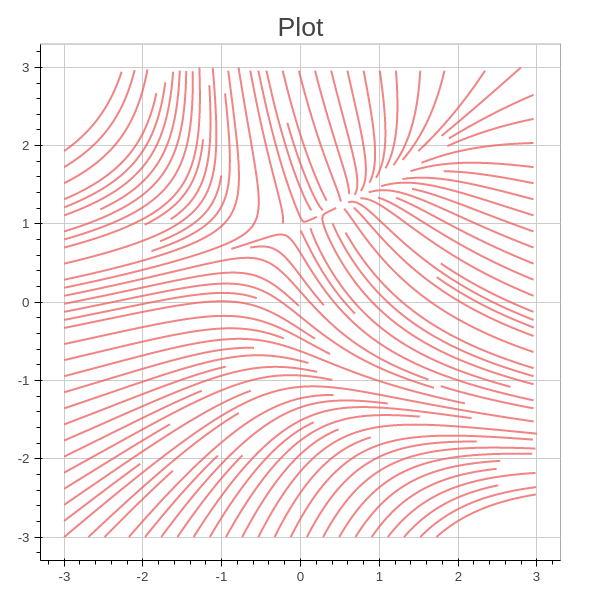
One of the examples from the gallery:

plot graphic

reminds me of U.S. foreign policy. The unseen attractors are defense contractors and other special interests.

September 8, 2014

Visualizing Website Pathing With Network Graphs

Filed under: Graphs,Networks,R,Visualization — Patrick Durusau @ 6:54 pm

Visualizing Website Pathing With Network Graphs by Randy Zwitch.

From the post:

Last week, version 1.4 of RSiteCatalyst was released, and now it’s possible to get site pathing information directly within R. Now, it’s easy to create impressive looking network graphs from your Adobe Analytics data using RSiteCatalyst and d3Network. In this blog post, I will cover simple and force-directed network graphs, which show the pairwise representation between pages. In a follow-up blog post, I will show how to visualize longer paths using Sankey diagrams, also from the d3Network package.

Great technical details and examples but also worth the read for:

I’m not going to lie, all three of these diagrams are hard to interpret. Like wordclouds, network graphs can often be visually interesting, yet difficult to ascertain any concrete information. Network graphs also have the tendency to reinforce what you already know (you or someone you know designed your website, you should already have a feel for its structure!).

Randy does spot some patterns but working out what those patterns “mean” remain for further investigation.

Hairball graph visualizations can be a starting point for the hard work that extracts actionable intelligence.

August 23, 2014

Data + Design

Filed under: Data,Design,Survey,Visualization — Patrick Durusau @ 2:17 pm

Data + Design: A simple introduction to preparing and visualizing information by Trina Chiasson, Dyanna Gregory and others.

From the webpage:

ABOUT

Information design is about understanding data.

Whether you’re writing an article for your newspaper, showing the results of a campaign, introducing your academic research, illustrating your team’s performance metrics, or shedding light on civic issues, you need to know how to present your data so that other people can understand it.

Regardless of what tools you use to collect data and build visualizations, as an author you need to make decisions around your subjects and datasets in order to tell a good story. And for that, you need to understand key topics in collecting, cleaning, and visualizing data.

This free, Creative Commons-licensed e-book explains important data concepts in simple language. Think of it as an in-depth data FAQ for graphic designers, content producers, and less-technical folks who want some extra help knowing where to begin, and what to watch out for when visualizing information.

As of today, the Data + Design is the product of fifty (50) volunteers from fourteen (14) countries. At eighteen (18) chapters and just shy of three-hundred (300) pages, this is a solid introduction to data and its visualization.

The source code is on GitHub, along with information on how you can contribute to this project.

A great starting place but my social science background is responsible for my caution concerning chapters 3 and 4 on survey design and questions.

All of the information and advice in those chapters is good, but it leaves the impression that you (the reader) can design an effective survey instrument. There is a big difference between an “effective” survey instrument and a series of questions pretending to be a survey instrument. Both will measure “something” but the question is whether a survey instrument provides you will actionable intelligence.

For a survey on any remotely mission critical, like user feedback on an interface or service, get as much professional help as you can afford.

When was the last time you heard of a candidate for political office or serious vendor using Survey Monkey? There’s a reason for that lack of reports. Can you guess that reason?

I first saw this in a tweet by Meta Brown.

August 21, 2014

CSV Fingerprints

Filed under: CSV,Visualization — Patrick Durusau @ 10:53 am

CSV Fingerprints by Victor Powell.

From the post:

CSV is a simple and common format for tabular data that uses commas to separate rows and columns. Nearly every spreadsheet and database program lets users import from and export to CSV. But until recently, these programs varied in how they treated special cases, like when the data itself has a comma in it.

It’s easy to make a mistake when you try to make a CSV file fit a particular format. To make it easier to spot mistakes, I’ve made a “CSV Fingerprint” viewer (named after the “Fashion Fingerprints” from The New York Times’s “Front Row to Fashion Week” interactive ). The idea is to provide a birdseye view of the file without too much distracting detail. The idea is similar to Tufte’s Image Quilts…a qualitative view, as opposed to a rendering of the data in the file themselves. In this sense, the CSV Fingerprint is a sort of meta visualization.

This is very clever. Not only can you test a CSV snippet on the webpage, but the source code is on Github. https://github.com/setosa/csv-fingerprint (source code)

Of course, it does rely on the most powerful image processing system known to date. Err, that would be you. 😉

Pass this along. I can imagine any number of data miners who will be glad you did.

August 15, 2014

Photoshopping The Weather

Filed under: Graphics,Visualization,Weather Data — Patrick Durusau @ 10:23 am

Photo editing algorithm changes weather, seasons automatically

From the post:

We may not be able control the weather outside, but thanks to a new algorithm being developed by Brown University computer scientists, we can control it in photographs.

The new program enables users to change a suite of “transient attributes” of outdoor photos — the weather, time of day, season, and other features — with simple, natural language commands. To make a sunny photo rainy, for example, just input a photo and type, “more rain.” A picture taken in July can be made to look a bit more January simply by typing “more winter.” All told, the algorithm can edit photos according to 40 commonly changing outdoor attributes.

The idea behind the program is to make photo editing easy for people who might not be familiar with the ins and outs of complex photo editing software.

“It’s been a longstanding interest on mine to make image editing easier for non-experts,” said James Hays, Manning Assistant Professor of Computer Science at Brown. “Programs like Photoshop are really powerful, but you basically need to be an artist to use them. We want anybody to be able to manipulate photographs as easily as you’d manipulate text.”

A paper describing the work will be presented next week at SIGGRAPH, the world’s premier computer graphics conference. The team is continuing to refine the program, and hopes to have a consumer version of the program soon. The paper is available at http://transattr.cs.brown.edu/. Hays’s coauthors on the paper were postdoctoral researcher Pierre-Yves Laffont, and Brown graduate students Zhile Ren, Xiaofeng Tao, and Chao Qian.

For all the talk about photoshopping models, soon the Weather Channel won’t send reporters to windy, rain soaked beaches, snow bound roads, or even chasing tornadoes.

With enough information, the reporters can have weather effects around them simulated and eliminate the travel cost for such assignments.

Something to keep in mind when people claim to have “photographic” evidence. Goes double for cellphone video. A cellphone only captures the context selected by its user. A non-photographic distortion that is hard to avoid.

I first saw this in a tweet by Gregory Piatetsky.

August 13, 2014

Creating Custom D3 Directives in AngularJS

Filed under: D3,Graphics,Visualization — Patrick Durusau @ 4:47 pm

Creating Custom D3 Directives in AngularJS by Steven Hall.

From the post:

Among the most popular frameworks for making interactive data visualizations with D3 is AngularJS. Along with some great tools for code organization, Angular’s use of directives can be a powerful way to implement interactive charts and keep your code clean and organized. Here we are going to look at a simple example that creates a service that pulls data from last.fm using their public API. The returned data will be used to update two interactive charts created using Angular directives.

As usual in these tutorials the code is kept to a minimum to keep things clear and to the point. The code written for this example weighs in at about 250 lines of JavaScript and the results are pretty cool. The example uses D3’s enter, update, and exit selections to illustrate how thinking about object constancy when transitioning from one state to another can be really powerful for communicating relationships in the data that may be hard to spot otherwise.

I think the example presented here is a good one because it brings up a lot of the common concerns when developing using AngularJS (and in JavaScript in general really) with just a short amount of code.    

We’ll touch on all the following concerns:

  • Avoiding global variables
  • Creating data services
  • Dependency injection
  • Broadcasting events
  • Scoping directives
  • Making responsive charts

In addition to making a basic service to retrieve data from an API that can be injected into your controllers and directives, this article will cover different ways to scope your directives and using the AngularJS eventing tools.  As we’ll see, one chart in the example shares the entire root scope while the other creates an isolated scope that only has access to certain properties.  Your ability to manage scopes for directives is one of the most powerful concepts to understand in working with Angular.  Finally, we’ll look at broadcasting and listening for events in making the charts responsive.

Data delivery. Despite the complexity of data structures, formalisms used to develop algorithms for data analysis, network architectures, and the other topics that fill technical discussions, data delivery drives user judgments about your application/service.

This tutorial, along with others you will find here, will move you towards effective data delivery.

August 7, 2014

Mapbox GL For The Web

Filed under: Graphics,Javascript,MapBox,Visualization — Patrick Durusau @ 4:37 pm

Mapbox GL For The Web: An open source JavaScript framework for client-side vector maps by Eric Gundersen.

From the post:

Announcing Mapbox GL JS — a fast and powerful new system for web maps. Mapbox GL JS is a client-side renderer, so it uses JavaScript and WebGL to dynamically draw data with the speed and smoothness of a video game. Instead of fixing styles and zoom levels at the server level, Mapbox GL puts power in JavaScript, allowing for dynamic styling and freeform interactivity. Vector maps are the next evolution, and we’re excited to see what developers build with this framework. Get started now.

This rocks!

I not going to try to reproduce the examples here so see the original post!

What high performance maps are you going to create?

August 5, 2014

Mapping Phone Calls

Filed under: Mapping,Maps,Visualization — Patrick Durusau @ 12:52 pm

Map: Every call Obama has made to a foreign leader in 2014 by Max Fisher.

From the post:

What foreign leaders has Obama spoken to this year? Reddit user nyshtick combed through official White House press releases to make this map showing every phone call Obama has made in 2014 to another head of state or head of government. The results are revealing, a great little window into the year in American foreign policy so far:

It’s a visual so you need to visit Max’s post to see the resulting world map.

I think you will be surprised.

There is another lesson lurking in the post.

The analysis did not require big data, distributed GPU compuations or category theory.

What it did require was:

  • An interesting question: “What foreign leaders has Obama spoken to this year?”
  • A likely data set: press releases
  • A user willing to dig through the data and to create a visualization.

Writing as much to myself as to anyone:

Don’t overlook smallish data with simple visualizations. (If you goal is impact and not the technology you used.)

August 2, 2014

Data Science Master

Open Source Data Science Master – The Plan by Fras and Sabine.

From the post:

Free!! education platforms have put some of the world’s most prestigious courses online in the last few years. This is our plan to use these and create our own custom open source data science Master.

Free online courses are selected to cover: Data Manipulation, Machine Learning & Algorithms, Programming, Statistics, and Visualization.

Be sure to take know of the pre-requisites the authors completed before embarking on their course work.

No particular project component is suggested because the course work will suggest ideas.

What other choices would you suggest? Either for broader basics or specialization?

July 30, 2014

Senator John Walsh plagiarism, color-coded

Filed under: News,Plagiarism,Reporting,Visualization — Patrick Durusau @ 4:43 pm

Senator John Walsh plagiarism, color-coded by Nathan Yau.

Nathan points to a New York Times’ visualization that makes a telling case for plagiarism against Senator John Walsh.

Best if you see it at Nathan’s site, his blog formats better than mine does.

Senator Walsh was rather obvious about it but I often wonder how much news copy, print or electronic, is really original?

Some is I am sure but when a story goes out over AP or UPI, how much of it is repeated verbatim in other outlets?

It’s not plagiarism because someone purchased a license to repeat the stories but it certainly isn’t original.

If an AP/UPI story is distributed and re-played in 500 news outlets, it remains one story. With no more credibility than it had at the outset.

Would color coding be as effective against faceless news sources as they have been against Sen. Walsh?

BTW, if you are interested in the sordid details: Pentagon Watchdog to review plagiarism probe of Sen. John Walsh. Incumbents need not worry, Sen. Walsh is an appointed senator and therefore is an easy throw-away in order to look tough on corruption.

Awesome Machine Learning

Filed under: Data Analysis,Machine Learning,Visualization — Patrick Durusau @ 3:30 pm

Awesome Machine Learning by Joseph Misiti.

From the webpage:

A curated list of awesome machine learning frameworks, libraries and software (by language). Inspired by awesome-php. Other awesome lists can be found in the awesome-awesomeness list.

If you want to contribute to this list (please do), send me a pull request or contact me @josephmisiti

Not strictly limited to “machine learning” as it offers resources on data analysis, visualization, etc.

With a list of 576 resources, I am sure you will find something new!

July 23, 2014

An A to Z of…D3 force layout

Filed under: D3,Graphics,Graphs,Visualization — Patrick Durusau @ 1:01 pm

An A to Z of extra features for the D3 force layout by Simon Raper.

From the post:

Since d3 can be a little inaccessible at times I thought I’d make things easier by starting with a basic skeleton force directed layout (Mike Bostock’s original example) and then giving you some blocks of code that can be plugged in to add various features that I have found useful.

The idea is that you can pick the features you want and slot in the code. In other words I’ve tried to make things sort of modular. The code I’ve taken from various places and adapted so thank you to everyone who has shared. I will try to provide the credits as far as I remember them!

A great read and an even greater bookmark for graph layouts.

In Simon’s alphabet:

A is for arrows.

B is for breaking links.

C is for collision detection.

F is for fisheye.

H is for highlighting.

L is for labels.

P is for pinning down nodes.

S is for search.

T is for tooltip.

Not only does Simon show the code, he also shows the result of the code.

A model of how to post useful information on D3.

July 21, 2014

Graffeine

Filed under: D3,Graphs,Neo4j,Visualization — Patrick Durusau @ 4:37 pm

Graffeine by Julian Browne

From the webpage:

Caffeinated Graph Exploration for Neo4J

Graffeine is both a useful interactive demonstrator of graph capability and a simple visual administration interface for small graph databases.

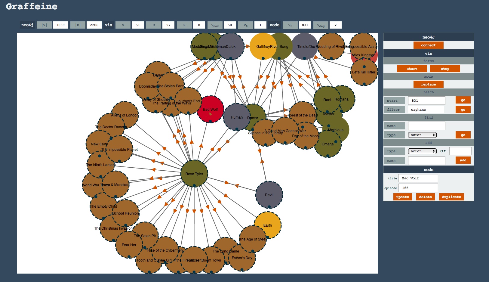
Here it is with the, now canonical, Dr Who graph loaded up:

Dr. Who graph

From the description:

Graffeine plugs into Neo4J and renders nodes and relationships as an interactive D3 SVG graph so you can add, edit, delete and connect nodes. It’s not quite as easy as a whiteboard and a pen, but it’s close, and all interactions are persisted in Neo4J.

You can either make a graph from scratch or browse an existing one using search and paging. You can even “fold” your graph to bring different aspects of it together on the same screen.

Nodes can be added, updated, and removed. New relationships can be made using drag and drop and existing relationships broken.

It’s by no means phpmyadmin for Neo4J, but one day it could be (maybe).

A great example of D3 making visual editing possible.

July 15, 2014

Visualizing ggplot2 internals…

Filed under: Ggplot2,Graphics,Visualization — Patrick Durusau @ 1:27 pm

Visualizing ggplot2 internals with shiny and D3 by Carson Sievert.

From the post:

As I started this project, I became frustrated trying to understand/navigate through the nested list-like structure of ggplot objects. As you can imagine, it isn’t an optimal approach to print out the structure everytime you want to checkout a particular element. Out of this frustration came an idea to build this tool to help interact with and visualize this structure. Thankfully, my wonderful GSoC mentor Toby Dylan Hocking agreed that this project could bring value to the ggplot2 community and encouraged me to pursue it.

By default, this tool presents a radial Reingold–Tilford Tree of this nested list structure, but also has options to use the collapsable or cartesian versions. It also leverages the shinyAce package which allows users to send arbitrary ggplot2 code to a shiny server thats evaluate the results and re-renders the visuals. I’m quite happy with the results as I think this tool is a great way to quickly grasp the internal building blocks of ggplot(s). Please share your thoughts below!

I started with the blog post about the visualization but seeing the visualization is more powerful:

Visualizing ggplot2 internals (demo)

I rather like the radial layout.

For either topic map design or analysis, this looks like a good technique to explore the properties we assign to subjects.

July 7, 2014

Data Visualization in Sociology

Filed under: Graphics,Social Sciences,Visualization — Patrick Durusau @ 6:32 pm

Data Visualization in Sociology by Kieran Healy and James Moody. (Annu. Rev. Sociol. 2014. 40:5.1–5.24, DOI: 10.1146/annurev-soc-071312-145551)

Abstract:

Visualizing data is central to social scientific work. Despite a promising early beginning, sociology has lagged in the use of visual tools. We review the history and current state of visualization in sociology. Using examples throughout, we discuss recent developments in ways of seeing raw data and presenting the results of statistical modeling. We make a general distinction between those methods and tools designed to help explore data sets and those designed to help present results to others. We argue that recent advances should be seen as part of a broader shift toward easier sharing of the code and data both between researchers and with wider publics, and we encourage practitioners and publishers to work toward a higher and more consistent standard for the graphical display of sociological insights.

A great review of data visualization in sociology. I was impressed by the author’s catching the context of John Maynard Keyes‘ remark about the “evils of the graphical method unsupported by tables of figures.”

In 1938, tables of figures reported actual data, not summaries. With a table of figures, another researcher could verify a graphic representation and/or re-use the data for their own work.

Perhaps journals could adopt a standing rule that no graphic representations are allowed in a publication unless and until the authors provide the data and processing steps necessary to reproduce the graphic. For public re-use.

The authors’ also make the point that for all the wealth of books on visualization and graphics, there is no cookbook that will enable a user to create a great graphic.

My suggestion in that regard is to collect visualizations that are widely thought to be “great” visualizations. Study the data and background of the visualization. Not so that you can copy the technique but in order to develop a sense for what “works” or doesn’t for visualization.

No guarantees but at a minimum, you will have experienced a large number of visualizations. That can’t hurt in your quest to create better visualizations.

I first saw this in a tweet by Christophe Lalanne.

July 6, 2014

Data Visualization Contest @ use!R 2014

Filed under: Graphics,R,Visualization — Patrick Durusau @ 4:34 pm

Data Visualization Contest @ use!R 2014

From the webpage:

The aim of the Data Visualization Contest @ use!R 2014 is to show the potential of R for analysis and visualization of large and complex data sets.

Submissions are welcomed in these two broad areas:

  • Track 1: Schools matter: the importance of school factors in explaining academic performance.
  • Track 2: Inequalities in academic achievement.

Really impressive visualizations but I would treat some of the conclusions with a great deal of caution.

One participant alleges that the absence of computers makes math scores fall. I am assuming that is literally what the data says but that doesn’t establish a causal relationship.

I say that because all of the architects of atomic bomb, to say nothing of the digital computer, learned mathematics without the aid of computers. Yes?

Graph Hairballs, Impressive but Not Informative

Filed under: Graphs,Visualization — Patrick Durusau @ 2:35 pm

Large-Scale Graph Visualization and Analytics by Kwan-Liu Ma and Chris W. Muelder. (Computer, June 2013)

Abstract:

Novel approaches to network visualization and analytics use sophisticated metrics that enable rich interactive network views and node grouping and filtering. A survey of graph layout and simplification methods reveals considerable progress in these new directions.

We have all seen large graph hairballs that are as impressive as they are informative. Impressive to someone who has recently discovered “…everything is a graph…” but not to anyone else.

Ma and Muelder do an excellent job of constrasting traditional visualizations that result in “…an unintelligible hairball—a tangled mess of lines” versus more informative techniques.

Among the methods touched upon are:

References at the end of the article should get you started towards useful visualizations of large scale graphs.

PS: I assume the article is based in part on C.W. Muelder’s “Advanced Visualization Techniques for Abstract Graphs and Computer Networks,” PhD dissertation, Dept. Computer Science, University of Calif., Davis, 2011. It is cited among the references. Published by ProQuest which means the 130 page dissertation runs $62.10 in paperback.

Let me know if you run across a more reasonably accessible copy.

I first saw this in a tweet by Paul Blaser.

July 2, 2014

circlize implements and enhances circular visualization in R

Filed under: Bioinformatics,Genomics,Multidimensional,R,Visualization — Patrick Durusau @ 6:03 pm

circlize implements and enhances circular visualization in R by Zuguang Gu, et al.

Abstract:

Summary: Circular layout is an efficient way for the visualization of huge amounts of genomic information. Here we present the circlize package, which provides an implementation of circular layout generation in R as well as an enhancement of available software. The flexibility of this package is based on the usage of low-level graphics functions such that self-defined high-level graphics can be easily implemented by users for specific purposes. Together with the seamless connection between the powerful computational and visual environment in R, circlize gives users more convenience and freedom to design figures for better understanding genomic patterns behind multi-dimensional data.

Availability and implementation: circlize is available at the Comprehensive R Archive Network (CRAN): http://cran.r-project.org/web/packages/circlize/

The article is behind a paywall but fortunately, the R code is not!

I suspect I know which one will get more “hits.” 😉

Useful for exploring multidimensional data as well as presenting multidimensional data encoded using a topic map.

Sometimes displaying information as nodes and edges isn’t the best display.

Remember the map of Napoleon’s invasion of Russia?

napoleon - russia

You could display the same information with nodes (topics) and associations (edges) but it would not be nearly as compelling.

Although, you could make the same map a “cover” for the topics (read people) associated with segments of the map, enabling a reader to take in the whole map and then drill down to the detail for any location or individual.

It would still be a topic map, even though its primary rendering would not be as nodes and edges.

Palladio

Filed under: Humanities,Visualization — Patrick Durusau @ 1:53 pm

Palladio – Humanities thinking about data visualization

From the webpage:

Palladio is a web-based platform for the visualization of complex, multi-dimensional data. It is a product of the "Networks in History" project that has its roots in another humanities research project based at Stanford: Mapping the Republic of Letters (MRofL). MRofL produced a number of unique visualizations tied to individual case studies and specific research questions. You can see the tools on this site and read about the case studies at republicofletters.stanford.edu.

With "Networks in History" we are taking the insights gained and lessons learned from MRofL and applying them to a set of visualizations that reflect humanistic thinking about data. Palladio is our first step toward opening data visualization to any researcher by making it possible to upload data and visualize within the browser without any barriers. There is no need to create an account and we do not store the data. On the visualization side, we have emphasized tools for filtering. There is a timeline filter that allows for filtering on discontinuous time periods. There is a facet filter based on Moritz Stefaner's Elastic Lists that is particularly useful when exploring multidimensional data sets.

The correspondence networks in the Mapping the Republic of Letters (MRofL) project will be of particular interest to humanists.

Quite challenging on their own but imagine the utility of exploding every letter into different subjects and statements about subjects, which automatically map to other identified subjects and statements about subjects in other correspondence.

Scholars already know about many such relationships in intellectual history but those associations are captured in journals, monographs, identified in various ways and lack in many cases, explicit labeling of roles. To say nothing of having to re-tread the path of an author to discover their recording of such associations in full text form.

If such paths were easy to follow, the next generation of scholars would develop new paths, as opposed to making known ones well-worn.

July 1, 2014

Visualizing Philosophers And Scientists

Filed under: D3,NLTK,Scikit-Learn,Visualization,Word Cloud — Patrick Durusau @ 10:31 am

Visualizing Philosophers And Scientists By The Words They Used With Python and d3.js by Sahand Saba.

From the post:

This is a rather short post on a little fun project I did a couple of weekends ago. The purpose was mostly to demonstrate how easy it is to process and visualize large amounts of data using Python and d3.js.

With the goal of visualizing the words that were most associated with a given scientist or philosopher, I downloaded a variety of science and philosophy books that are in the public domain (project Gutenberg, more specifically), and processed them using Python (scikit-learn and nltk), then used d3.js and d3.js cloud by Jason Davies (https://github.com/jasondavies/d3-cloud) to visualize the words most frequently used by the authors. To make it more interesting, only words that are somewhat unique to the author are displayed (i.e. if a word is used frequently by all authors then it is likely not that interesting and is dropped from the results). This can be easily achieved using the max_df parameter of the CountVectorizer class.

I pass by Copleston’s A History of Philosophy several times a day. It is a paperback edition from many years ago that I keep meaning to re-read.

At least for philosophers with enough surviving texts in machine readable format, perhaps Sahand’s post will provide the incentive to return to reading Copleston. A word cloud is one way to explore a text. Commentary, such as Copleston’s, is another.

What other tools would you use with philosophers and a commentary like Copleston?

I first saw this in a tweet by Christophe Viau.

« Newer PostsOlder Posts »

Powered by WordPress