Another Word For It Patrick Durusau on Topic Maps and Semantic Diversity

February 4, 2013

Large Scale Network Analysis

Filed under: Conferences,Graphs,Networks — Patrick Durusau @ 7:12 pm

2nd International Workshop on Large Scale Network Analysis (LSNA 2013)

Dates:

Submission Deadline: February 25, 2013

Acceptance Notification: March 13, 2013

Camera-Ready Submission: March 27, 2013

Workshop Date: May 14, 2013

From the website:

Large amounts of network data are being produced by various modern applications at an ever growing speed, ranging from social networks such as Facebook and Twitter, scientific citation networks such as CiteSeerX, to biological networks such as protein interaction networks. Network data analysis is crucial to exploit the wealth of information encoded in these network data. An effective analysis of these data must take into account the complex structure including social, temporal and sometimes spatial dimensions, and an efficient analysis of these data demands scalable solutions. As a result, there has been increasing research in developing scalable solutions for novel network analytics applications.

This workshop will provide a forum for researchers to share new ideas and techniques for large scale network analysis. We expect novel research works that address various aspects of large scale network analysis, including network data acquisition and integration, novel applications for network analysis in different problem domains, scalable and efficient network analytics algorithms, distributed network data management, novel platforms supporting network analytics, and so on.

Topics of Interest

Topics of interest for this workshop include but are not limited to the following:

  • Large scale network data acquisition, filtering, navigation, integration, search and analysis
  • Novel applications for network data with interesting analytics results
  • Exploring scalability issues in network analysis or modeling
  • Distributed network data management
  • Discussing the deficiency of current network analytics or modeling approaches and proposing new directions for research
  • Discovering unique features of emerging network datasets (e.g new linked data, new form of social networks)

This workshop will include invited talks as well as presentation of accepted papers.

Being held in conjunction with WWW 2013, Rio de Janeiro, Brazil.
Data Inte-Aggregration [Heads Up!]

Filed under: Data Aggregation — Patrick Durusau @ 4:00 pm

Data Inte-Aggregration by David Loshin.

From the post:

One of our clients is a government agency that, among many other directives, is tasked with collecting data from many sources, merging that data into a single asset and then making that collected data set available to the public. Interestingly, the source data sets themselves represent aggregations pulled from different collections of internal transactions between any particular company and a domain of individuals within a particular industry.

The agency must then collect the data from the many different companies and then link the records for each individual from each company, sum the totals for the sets of transactions and then present the collected totals for each individual.

This scenario poses a curious challenge: there is an integration, an aggregation, another integration, then another aggregation. But the first sets of integration and aggregation occur behind the corporate firewall while the second set is performed by a third party. That is the reason that I titled this blog post “Data Inte-Aggregation,” in reference to this dual-phased data consolidation that crosses administrative barriers.

David is starting a series of posts on aggregating data that crosses “administrative barriers.”

Looking forward to this series and so should you!

Arc Diagrams in R: Les Miserables

Filed under: Graphics,Visualization — Patrick Durusau @ 3:54 pm

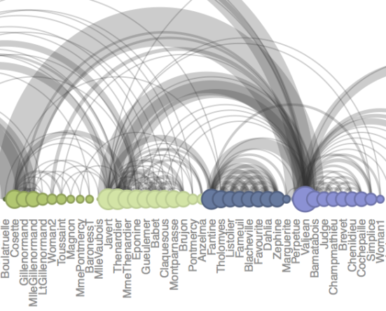
Arc Diagrams in R: Les Miserables by Gaston Sanchez.

In this post we will talk about the R package “arcdiagram” for plotting pretty arc diagrams like the one below:

arc diagram

Arc Diagrams

An arc diagram is a graphical display to visualize graphs or networks in a one-dimensional layout. The main idea is to display nodes along a single axis, while representing the edges or connections between nodes with arcs. One of the disadvantages of arc diagrams is that they may not provide the overall structure of the network as effectively as a two-dimensional layout; however, with a good ordering of nodes, better visualizations can be achieved making it easy to identify clusters and bridges. Further, annotations and multivariate data can easily be displayed alongside nodes.

For exploring a domain, exploring associations for declaration of types, this could be a very handy tool.

Introduction to: Triplestores [Perils of Inferencing]

Filed under: RDF,Triplestore — Patrick Durusau @ 3:19 pm

Introduction to: Triplestores Juan Sequeda.

From the post:

Triplestores are Database Management Systems (DBMS) for data modeled using RDF. Unlike Relational Database Management Systems (RDBMS), which store data in relations (or tables) and are queried using SQL, triplestores store RDF triples and are queried using SPARQL.

A key feature of many triplestores is the ability to do inference. It is important to note that a DBMS typically offers the capacity to deal with concurrency, security, logging, recovery, and updates, in addition to loading and storing data. Not all Triplestores offer all these capabilities (yet).

Unless you have been under a rock or in another dimension, triplestores are not news.

This is a short list of some of the more popular ones and illustrates one of the problems with “inferencing,” inside or outside of a triple store.

The inference in this article says that “full professors,” “assistant professors,” and “teachers” are all “professors.”

Suggest you drop by the local university to see if “full professors” think of instructors or “adjunct professors” as “professors.”

BTW, the “inferencing” is “correct” as far as the OWL ontology in the article goes. But that’s part of the problem.

Being “correct” in OWL may or may not have any relationship to the world as you experience it.


My wife reminded me at lunch that piano players in whore houses around the turn of the 19th century were also called “professor.”

Another inference not accounted for.

The Swipp API: Creating the World’s Social Intelligence

Filed under: Social Graphs,Social Media,Social Networks — Patrick Durusau @ 11:29 am

The Swipp API: Creating the World’s Social Intelligence by Greg Bates.

From the post:

The Swipp API allows developers to integrate Swipp’s “Social Intelligence” into their sites and applications. Public information is not available on the API; interested parties are asked to email info@swipp.com. Once available the APIs will “make it possible for people to interact around any topic imaginable.”

[graphic omitted]

Having operated in stealth mode for 2 years, Swipp founders Don Thorson and Charlie Costantini decided to go public after Facebook’s release of it’s somewhat different competitor, the social graph. The idea is to let users rate any topic they can comment on or anything they can photograph. Others can chime in, providing an average rating by users. One cool difference: you can dislike something as well as like it, giving a rating from -5 to +5. According to Darrell Etherington at Techcrunch, the company has a three-pronged strategy of a consumer app just described, a business component tailored around specific events like the Superbowl, that will help businesses target specific segments.

A fact that seems to be lost in most discussions of social media/sites is that social intelligence already exists.

Social media/sites may assist in the capturing/recording of social intelligence but that isn’t the same thing as creating social intelligence.

It is an important distinction because understanding the capture/recording role enables us to focus on what we want to capture and in what way?

What we decide to capture or record greatly influences the utility of the social intelligence we gather.

Such as capturing how users choose to identify particular subjects or relationships between subjects, for example.

PS: The goal of Swipp is to create a social network and ratings system (like Facebook) that is open for re-use elsewhere on the web. Adding semantic integration to that social networks and ratings system would be a plus I would imagine.

Core JSON: The Fat-Free Alternative to XML

Filed under: JSON — Patrick Durusau @ 9:40 am

Core JSON: The Fat-Free Alternative to XML by Tom Marrs.

From the webpage:

JSON (JavaScript Object Notation) is a standard text-based data interchange format that enables applications to exchange data over a computer network. This Refcard covers JSON syntax, validation, modeling, and JSON Schema, and includes tips and tricks for using JSON with various tools and programming languages.

I prefer XML over JSON and SGML over XML.

Having said that, I have to agree that JSON is a demonstration that complex protocols for the interchange of data are unnecessary.

At least if you only care about validation and not the documenting the semantics of the data being interchanged.

Put another way, semantics are never self-evident or documenting. With JSON, some other carrier has to delivery semantics, if at all.

Topic maps are great carriers of semantics, particularly if you use JSON schemas or data files from multiple sources.

BTW, you will note that JSON is based on those pesky tuples that Robert Barta makes so much of. 😉

DBA Reactions [Humor]

Filed under: Humor — Patrick Durusau @ 5:47 am

DBA Reactions [humor]

You may not like every post but several are keepers.

I have mixed feeling about the auto-replay. Once is enough for many of them.

Enjoy!

PS: One where the replay works is: When I see the developers using an ORM and it actually performs well.

February 3, 2013

G2 | Sensemaking – Two Years Old Today

Filed under: Context,G2 Sensemaking,Identity,Subject Identity — Patrick Durusau @ 6:59 pm

G2 | Sensemaking – Two Years Old Today by Jeff Jonas.

From the post:

What is G2?

When I speak about Context Accumulation, Data Finds Data and Relevance Finds You, and Sensemaking I am describing various aspects of G2.

In simple terms G2 software is designed to integrate diverse observations (data) as it arrives, in real-time.  G2 does this incrementally, piece by piece, much in the same way you would put a puzzle together at home.  And just like at home, the more puzzle pieces integrated into the puzzle, the more complete the picture.  The more complete the picture, the better the ability to make sense of what has happened in the past, what is happening now, and what may come next.  Users of G2 technology will be more efficient, deliver high quality outcomes, and ultimately will be more competitive.

Early adopters seem to be especially interested in one specific use case: Using G2 to help organizations better direct the attention of its finite workforce.  With the workforce now focusing on the most important things first, G2 is then used to improve the quality of analysis while at the same time reducing the amount of time such analysis takes.  The bigger the organization, the bigger the observation space, the more essential sensemaking is.

About Sensemaking

One of the things G2 can already do pretty darn well – considering she just turned two years old – is ”Sensemaking.”  Imagine a system capable of paying very close attention to every observation that comes its way.  Each observation incrementally improving upon the picture and using this emerging picture in real-time to make higher quality business decisions; for example, the selection of the perfect ad for a web page (in sub-200 milliseconds as the user navigates to the page) or raising an alarm to a human for inspection (an alarm sufficiently important to be placed top of the queue).  G2, when used this way, enables Enterprise Intelligence.

Of course there is no magic.  Sensemaking engines are limited by their available observation space.  If a sentient being would be unable to make sense of the situation based on the available observation space, neither would G2.  I am not talking about Fantasy Analytics here.

I would say “subject identity” instead of “sensemaking” and after reading Jeff’s post, consider them to be synonyms.

Read the section General Purpose Context Accumulation very carefully.

As well as “Privacy by Design (PbD).”

BTW, G2 uses Universal Message Format XML for input/output.

Not to argue from authority but Jeff is one of only 77 active IBM Research Fellows.

Someone to listen to, even if we may disagree on some of the finer points.

[Neo4j] FOSDEM 2013 summary

Filed under: Conferences,Graphs,Neo4j — Patrick Durusau @ 6:59 pm

FOSDEM 2013 summary by Peter Neubauer.

Peter mentions the following Neo4j related projects:

See his post for other details.

Text as Data:…

Filed under: Data Analysis,Text Analytics,Text Mining,Texts — Patrick Durusau @ 6:58 pm

Text as Data: The Promise and Pitfalls of Automatic Content Analysis Methods for Political Texts by Justin Grimmer and Brandon M. Stewart.

Abstract:

Politics and political conflict often occur in the written and spoken word. Scholars have long recognized this, but the massive costs of analyzing even moderately sized collections of texts have hindered their use in political science research. Here lies the promise of automated text analysis: it substantially reduces the costs of analyzing large collections of text. We provide a guide to this exciting new area of research and show how, in many instances, the methods have already obtained part of their promise. But there are pitfalls to using automated methods—they are no substitute for careful thought and close reading and require extensive and problem-specific validation. We survey a wide range of new methods, provide guidance on how to validate the output of the models, and clarify misconceptions and errors in the literature. To conclude, we argue that for automated text methods to become a standard tool for political scientists, methodologists must contribute new methods and new methods of validation.

As a former political science major, I had to stop to read this article.

A wide ranging survey of an “exciting new area of research” but I remember content/text analysis as an undergraduate, North of forty years ago now.

True, some of the measures are new, along with better visualization techniques.

On the other hand, many of the problems of textual analysis now were the problems in textual analysis then (and before).

Highly recommended as a survey of current techniques.

A history of the “problems” of textual analysis and their resistance to various techniques will have to await another day.

Case study: million songs dataset

Filed under: Data,Dataset,GraphChi,Graphs,Machine Learning — Patrick Durusau @ 6:58 pm

Case study: million songs dataset by Danny Bickson.

From the post:

A couple of days ago I wrote about the million songs dataset. Our man in London, Clive Cox from Rummble Labs, suggested we should implement rankings based on item similarity.

Thanks to Clive suggestion, we have now an implementation of Fabio Aiolli’s cost function as explained in the paper: A Preliminary Study for a Recommender System for the Million Songs Dataset, which is the winning method in this contest.

Following are detailed instructions on how to utilize GraphChi CF toolkit on the million songs dataset data, for computing user ratings out of item similarities. 

Just in case you need some data for practice with your GraphChi installation. 😉

Seriously, nice way to gain familiarity with the data set.

What value you extract from it is up to you.

Making Sense of Others’ Data Structures

Filed under: Data Mining,Data Structures,Identity,Subject Identity — Patrick Durusau @ 6:58 pm

Making Sense of Others’ Data Structures by Eruditio Loginquitas.

From the post:

Coming in as an outsider to others’ research always requires an investment of time and patience. After all, how others conceptualize their fields, and how they structure their questions and their probes, and how they collect information, and then how they represent their data all reflect their understandings, their theoretical and analytical approaches, their professional training, and their interests. When professionals collaborate, they will approach a confluence of understandings and move together in a semi-united way. Individual researchers—not so much. But either way, for an outsider, there will have to be some adjustment to understand the research and data. Professional researchers strive to control for error and noise at every stage of the research: the hypothesis, literature review, design, execution, publishing, and presentation.

Coming into a project after the data has been collected and stored in Excel spreadsheets means that the learning curve is high in yet another way: data structures. While the spreadsheet itself seems pretty constrained and defined, there is no foregone conclusion that people will necessarily represent their data a particular way.

Data structures as subjects. What a concept! 😉

Data structures, contrary to some, are not self-evident or self-documenting.

Not to mention that like ourselves, are in a constant state of evolution as our understanding or perception of data changes.

Mine is not the counsel of despair, but of encouragement to consider the costs/benefits of capturing data structure subject identities just as more traditional subjects.

It may be costs or other constraints prevent such capture but you may also miss benefits if you don’t ask.

How much did it cost for each transition in episodic data governance efforts to re-establish data structure subject identities?

Could be that more money spent now would get an enterprise off the perpetual cycle of data governance.

Need to discover, access, analyze and visualize big and broad data? Try F#.

Filed under: Data Analysis,Data Mining,F#,Microsoft — Patrick Durusau @ 6:58 pm

Need to discover, access, analyze and visualize big and broad data? Try F#. by Oliver Bloch.

From the post:

Microsoft Research just released a new iteration of Try F#, a set of tools designed to make it easy for anyone – not just developers – to learn F# and take advantage of its big data, cross-platform capabilities.

F# is the open-source, cross-platform programming language invented by Don Syme and his team at Microsoft Research to help reduce the time-to-deployment for analytical software components in the modern enterprise.

Big data definitively is big these days and we are excited about this new iteration of Try F#. Regardless of your favorite language, or if you’re on a Mac, a Windows PC, Linux or Android, if you need to deal with complex problems, you will want to take a look at F#!

Kerry Godes from Microsoft’s Openness Initiative connected with Evelyne Viegas, Director of Semantic Computing at Microsoft Research, to find out more about how you can use “Try F# to seamlessly discover, access, analyze and visualize big and broad data.” For the complete interview, go to the Openness blog or check out www.tryfsharp.org to get started “writing simple code for complex problems”.

Are you an F# user?

Curious how F# compares to other languages for “complexity?”

Visualization gurus: Does the complexity of languages go up or down with the complexity of licensing terms?

Inquiring minds want to know. 😉

DuckDuckGo Architecture…

Filed under: Search Engines,Search Interface,Search Requirements,Searching — Patrick Durusau @ 6:58 pm

DuckDuckGo Architecture – 1 Million Deep Searches A Day And Growing Interview with Gabriel Weinberg.

From the post:

This is an interview with Gabriel Weinberg, founder of Duck Duck Go and general all around startup guru, on what DDG’s architecture looks like in 2012.

Innovative search engine upstart DuckDuckGo had 30 million searches in February 2012 and averages over 1 million searches a day. It’s being positioned by super investor Fred Wilson as a clean, private, impartial and fast search engine. After talking with Gabriel I like what Fred Wilson said earlier, it seems closer to the heart of the matter: We invested in DuckDuckGo for the Reddit, Hacker News anarchists.
                  
Choosing DuckDuckGo can be thought of as not just a technical choice, but a vote for revolution. In an age when knowing your essence is not about about love or friendship, but about more effectively selling you to advertisers, DDG is positioning themselves as the do not track alternative, keepers of the privacy flame. You will still be monetized of course, but in a more civilized and anonymous way. 

Pushing privacy is a good way to carve out a competitive niche against Google et al, as by definition they can never compete on privacy. I get that. But what I found most compelling is DDG’s strong vision of a crowdsourced network of plugins giving broader search coverage by tying an army of vertical data suppliers into their search framework. For example, there’s a specialized Lego plugin for searching against a complete Lego database. Use the name of a spice in your search query, for example, and DDG will recognize it and may trigger a deeper search against a highly tuned recipe database. Many different plugins can be triggered on each search and it’s all handled in real-time.

Can’t searching the Open Web provide all this data? No really. This is structured data with semantics. Not an HTML page. You need a search engine that’s capable of categorizing, mapping, merging, filtering, prioritizing, searching, formatting, and disambiguating richer data sets and you can’t do that with a keyword search. You need the kind of smarts DDG has built into their search engine. One problem of course is now that data has become valuable many grown ups don’t want to share anymore.

Being ad supported puts DDG in a tricky position. Targeted ads are more lucrative, but ironically DDG’s do not track policies means they can’t gather targeting data. Yet that’s also a selling point for those interested in privacy. But as search is famously intent driven, DDG’s technology of categorizing queries and matching them against data sources is already a form of high value targeting.

It will be fascinating to see how these forces play out. But for now let’s see how DuckDuckGo implements their search engine magic…

Some topic map centric points from the post:

Dream is to appeal to more niche audiences to better serve people who care about a particular topic. For example: lego parts. There’s a database of Lego parts, for example. Pictures of parts and part numbers can be automatically displayed from a search.

  • Some people just use different words for things. Goal is not to rewrite the query, but give suggestions on how to do things better.
  • “phone reviews” for example, will replace phone with telephone. This happens through an NLP component that tries to figure out what phone you meant and if there are any synonyms that should be used in the query.

Those are the ones that caught my eye, there are no doubt others.

Not to mention a long list of DuckDuckGo references at the end of the post.

What place(s) would you suggest to DuckDuckGo where topic maps would make a compelling difference?

Scribl: an HTML5 Canvas-based graphics library…

Filed under: Genomics,Graphics,HTML5,Javascript,Visualization — Patrick Durusau @ 6:57 pm

Scribl: an HTML5 Canvas-based graphics library for visualizing genomic data over the web by Chase A. Miller, Jon Anthony, Michelle M. Meyer and Gabor Marth. (Bioinformatics (2013) 29 (3): 381-383. doi: 10.1093/bioinformatics/bts677)

Abstract:

Motivation: High-throughput biological research requires simultaneous visualization as well as analysis of genomic data, e.g. read alignments, variant calls and genomic annotations. Traditionally, such integrative analysis required desktop applications operating on locally stored data. Many current terabyte-size datasets generated by large public consortia projects, however, are already only feasibly stored at specialist genome analysis centers. As even small laboratories can afford very large datasets, local storage and analysis are becoming increasingly limiting, and it is likely that most such datasets will soon be stored remotely, e.g. in the cloud. These developments will require web-based tools that enable users to access, analyze and view vast remotely stored data with a level of sophistication and interactivity that approximates desktop applications. As rapidly dropping cost enables researchers to collect data intended to answer questions in very specialized contexts, developers must also provide software libraries that empower users to implement customized data analyses and data views for their particular application. Such specialized, yet lightweight, applications would empower scientists to better answer specific biological questions than possible with general-purpose genome browsers currently available.

Results: Using recent advances in core web technologies (HTML5), we developed Scribl, a flexible genomic visualization library specifically targeting coordinate-based data such as genomic features, DNA sequence and genetic variants. Scribl simplifies the development of sophisticated web-based graphical tools that approach the dynamism and interactivity of desktop applications.

Availability and implementation: Software is freely available online at http://chmille4.github.com/Scribl/ and is implemented in JavaScript with all modern browsers supported.

Contact: gabor.marth@bc.edu

A step towards the “virtual observatory” model of modern astronomy. Free remote access to data in astronomy has long been a fact. It was soon realized that access to data wasn’t enough, remote users needs the power of remote clusters to process large amounts of data.

The intermediate stage of remote access to data and even remote processing models are both going to require easy visualization capabilities.

Are you ready to move to remote access to topic map data?

ToxPi GUI [Data Recycling]

Filed under: Bioinformatics,Biomedical,Integration,Medical Informatics,Subject Identity — Patrick Durusau @ 6:57 pm

ToxPi GUI: an interactive visualization tool for transparent integration of data from diverse sources of evidence by David M. Reif, Myroslav Sypa, Eric F. Lock, Fred A. Wright, Ander Wilson, Tommy Cathey, Richard R. Judson and Ivan Rusyn. (Bioinformatics (2013) 29 (3): 402-403. doi: 10.1093/bioinformatics/bts686)

Abstract:

Motivation: Scientists and regulators are often faced with complex decisions, where use of scarce resources must be prioritized using collections of diverse information. The Toxicological Prioritization Index (ToxPi™) was developed to enable integration of multiple sources of evidence on exposure and/or safety, transformed into transparent visual rankings to facilitate decision making. The rankings and associated graphical profiles can be used to prioritize resources in various decision contexts, such as testing chemical toxicity or assessing similarity of predicted compound bioactivity profiles. The amount and types of information available to decision makers are increasing exponentially, while the complex decisions must rely on specialized domain knowledge across multiple criteria of varying importance. Thus, the ToxPi bridges a gap, combining rigorous aggregation of evidence with ease of communication to stakeholders.

Results: An interactive ToxPi graphical user interface (GUI) application has been implemented to allow straightforward decision support across a variety of decision-making contexts in environmental health. The GUI allows users to easily import and recombine data, then analyze, visualize, highlight, export and communicate ToxPi results. It also provides a statistical metric of stability for both individual ToxPi scores and relative prioritized ranks.

Availability: The ToxPi GUI application, complete user manual and example data files are freely available from http://comptox.unc.edu/toxpi.php.

Contact: reif.david@gmail.com

Very cool!

Although like having a Ford automobile in any color, so long as the color was black, you can integrate any data source, so long as the format is csv. And values are numbers. Subject to other restrictions as well.

That’s an observation, not a criticism.

The application serves a purpose within a domain and does not “integrate” information in the sense of a topic map.

But a topic map could recycle its data to add other identifications and properties. Without having to re-write this application or its data.

Once curated, data should be re-used, not re-created/curated.

Topic maps give you more bang for your data buck.

Content Based Image Retrieval (CBIR)

Filed under: Image Recognition,MapReduce — Patrick Durusau @ 6:57 pm

MapReduce Paves the Way for CBIR

From the post:

Recently, content based image retrieval (CBIR) has gained active research focus due to wide applications such as crime prevention, medicine, historical research and digital libraries.

As a research team from the School of Science, Information Technology and Engineering at theUniversity of Ballarat, Australia has suggested, image collections in databases in distributed locations over the Internet pose a challenge to retrieve images that are relevant to user queries efficiently and accurately.

The researchers say that with this in mind, it has become increasingly important to develop new CBIR techniques that are effective and scalable for real-time processing of very large image collections. To address this, the offer up a novel MapReduce neural network framework for CBIR from large data collection in a cloud environment.

Reference to the paper: MapReduce neural network framework for efficient content based image retrieval from large datasets in the cloud by Sitalakshmi Venkatraman. (In Hybrid Intelligent Systems (HIS), 2012 12th International Conference on)

Abstract:

Recently, content based image retrieval (CBIR) has gained active research focus due to wide applications such as crime prevention, medicine, historical research and digital libraries. With digital explosion, image collections in databases in distributed locations over the Internet pose a challenge to retrieve images that are relevant to user queries efficiently and accurately. It becomes increasingly important to develop new CBIR techniques that are effective and scalable for real-time processing of very large image collections. To address this, the paper proposes a novel MapReduce neural network framework for CBIR from large data collection in a cloud environment. We adopt natural language queries that use a fuzzy approach to classify the colour images based on their content and apply Map and Reduce functions that can operate in cloud clusters for arriving at accurate results in real-time. Preliminary experimental results for classifying and retrieving images from large data sets were quite convincing to carry out further experimental evaluations.

Sounds like the basis for a user-augmented index of visual content to me.

You?

February 2, 2013

Neo4j – Social Networking – QA – Scientific Communication

Filed under: Graphs,Neo4j,Social Networks — Patrick Durusau @ 3:10 pm

René Pickhardt’s blog post title was: Slides of Related work application presented in the Graphdevroom at FOSDEM, which is unlikely to catch your eye. The paper title is: A neo4j powered social networking and Question & Answer application to enhance scientific communication.

I took the liberty of crafting a shorter title for this post. 😉

The problems René addresses are shared by all academics:

  1. Finding new relevant publications
  2. Connecting people interested in the same topic

This project is the result of the merger of the Open Citation and Related Work project, on which see: Open Citations and Related Work projects merge.

The terminology for the project components:

  • Open Citations Corpus: data corpus
  • Open Citations Corpus Datastore (OCCD): infrastructure of the data corpus
  • Related Work: user-oriented services built on top of the citation data

Resources:

You need to take a long look at the project in general but the data in particular.

From the data webpage:

We downloaded the source files of all arxiv articles published until 2012-09-31, extracted the references and matched them against the metadata using these python scripts. The result is a 2.0Gb sized *.txt file with more than 16m lines representing the citaiton graph in the following format:

Document level linking so there is still topic map work to be done merging the same subjects identified differently but this data set is certainly a “leg up” on that task.

We should all encourage if not actively contribute to the Related Work project.

TCS online series- could this work?

Filed under: CS Lectures — Patrick Durusau @ 3:10 pm

TCS online series- could this work? by Bill Gasarch.

From the post:

Oded Regev, Anindya De and Thomas Vidick we are about to start an online TCS seminar series. See here for details, though I have the first few paragraphs below.

Its an interesting idea- we can’t all get to conferences so this is a good way to get information out there. Wave of the future? We’ll see how it goes.

Here is the first few paragraphs:

Ever wished you could attend that talk if only you didn’t have to hike the Rockies, or swim across the Atlantic, to get there; if only it could have been scheduled the following week, because this week is finals; if only you could watch it from your desk, or for that matter directly from your bed?

Starting this semester TCS+ will solve all your worries. We are delighted to announce the initiation of a new series of *online* seminars in theoretical computer science. The seminars will be run using the hangout feature of Google+. The speaker and slides will be broadcast live as well as recorded and made available online. Anyone with a computer (and a decent browser) can watch; anyone with a webcam can join the live audience and participate.

For updates, see the TCS webpage: https://sites.google.com/site/plustcs/

Keep a watch on this for ideas to stay ahead of your competition.

The Power of Visual Thinking?

Filed under: Integration,Visualization — Patrick Durusau @ 3:09 pm

The Power of Visual Thinking? by Chuck Hollis.

In describing an infographic about transformation of IT, Chuck says:

It’s an interesting representation of the “IT transformation journey”. Mark’s particular practice involves conducting workshops for transforming IT teams. He needed some better tools, and here you have it.

While there are those out there who might quibble on the details, there’s no argument about its communicative power.

In one simple graphic, it appears to be a very efficient tool to get a large number of stakeholders to conceptualize a shared set of concepts and sequences. And, when it comes to IT transformation, job #1 appears to be getting everyone on the same page on what lies ahead 🙂

Download the graphic here.

I must be one of those people who quibble about details.

A great graphic but such loaded categories that disagreement would be akin to voting against bacon.

Who wants to be plowing with oxen or attacked by tornadoes? Space ships and floating cities await those who adopt a transformed IT infrastructure.

Still, could be useful to give c-suite types as a summary of any technical presentation you make. Call it a “high level” view. 😉

Office 2013, Office 365 Editions and BI Features

Filed under: BI,Microsoft — Patrick Durusau @ 3:09 pm

Office 2013, Office 365 Editions and BI Features by Chris Webb.

From the post:

By now you’re probably aware that Office 2013 is in the process of being officially released, and that Office 365 is a very hot topic. You’ve probably also read lots of blog posts by me and other writers talking about the cool new BI functionality in Office 2013 and Office 365. But which editions of Office 2013 and Office 365 include the BI functionality, and how does Office 365 match up to plain old non-subscription Office 2013 for BI? It’s surprisingly hard to find out the answers…

For regular, non-subscription, Office 2013 on the desktop you need Office Professional Plus to use the PowerPivot addin or to use Power View in Excel. However there’s an important distinction to make: the xVelocity engine is now natively integrated into Excel 2013, and this functionality is called the Excel Data Model and is available in all desktop editions of Excel. You only need the PowerPivot addin, and therefore Professional Plus, if you want to use the PowerPivot Window to modify and extend your model (for example by adding calculated columns or KPIs). So even if you’re not using Professional Plus you can still do some quite impressive BI stuff with PivotTables etc. On the server, the only edition of Sharepoint 2013 that has any BI functionality is Enterprise Edition; there’s no BI functionality in Foundation or Standard Editions.

No matter what OS you are running, you are likely to be using some version of MS Office and if you are reading this blog, probably for BI purposes.

Chris does a great job at pointing to resources and generating resources to guide you through the feature/license thicket that surrounds MS Office in its various incarnations.

Complex licensing/feature matrices contribute to the size of department budgets that create such complexity. They don’t contribute to the bottom line at Microsoft. There is a deep and profound difference.

Big Data and Healthcare Infographic

Filed under: BigData,Health care,Medical Informatics — Patrick Durusau @ 3:09 pm

Big Data and Healthcare Infographic by Shar Steed.

From the post:

Big Data could revolutionize healthcare by replacing up to 80% of what doctors do while still maintaining over 91% accuracy. Please take a look at the infographic below to learn more.

An interesting graphic, even if I don’t buy the line that computers are better than doctors at:

Integrating and balancing considerations of patient symptoms, history, demeanor, environmental factors, and population management guidelines.

Noting that in the next graphic block, the 91% accuracy rate using a “diagnostic knowledge system” doesn’t say what sort of “clinical trials” were used.

Makes a difference if we are talking brain surgery or differential diagnosis versus seeing patients in an out-patient clinic.

Still, an interesting graphic.

Curious where you see semantic integration issues, large or small in this graphic?

Comment Visualization

Filed under: Text Mining,Texts,Visualization — Patrick Durusau @ 3:09 pm

New from Juice Labs: A visualization tool for exploring text data by Zach Gemignani.

From the post:

Today we are pleased to release another free tool on Juice Labs. The Comment visualization is the perfect way to exploring qualitative data like text survey responses, tweets, or product reviews. A few of the fun features:

  • Color comments based on a selected value
  • Filter comments using an interactive distribution chart at the top
  • Highlight the most interesting comments by selecting the flags in the upper right
  • Show the author and other contextual information about a comment

[skipping the lamest Wikipedia edits example]

Like our other free visualization tools in Juice Labs, the Comments visualization is designed for ease of use and sharing. Just drop in your own data, choose what fields you want to show as text and as values, and the visualization will immediately reflect your choices. The save button gives you a link that includes your data and settings.

Apparently the interface starts with the lamest Wikipedia edit data.

To change that, you have to scroll down to the Data window, Hover over Learn how.

I have reformatted the how-to content here:

Put any comma delimited data in this box. The first row needs to contain the column names. Then, give us some hints on how to use your data.

[Pre-set column names]

[*] Use this column as the question.

[a] Use this column as the author.

[cby] Use this column to color the comments. Should be a metric. By default, the comments will be sorted in ascending order.

[-] Sort the comments in descending order of the metric value. Can only be used with [cby]

[c] Use this column as a context.

Tip: you can combine the hints like: [c-cby]

Could be an interesting tool for quick and dirty exploration of textual content.

Semantic Search for Scala – Post 1

Filed under: Programming,Scala,Semantics — Patrick Durusau @ 3:08 pm

Semantic Search for Scala – Post 1 by Mads Hartmann Jensen.

From the post:

The goal of the project is to create a semantic search engine for Scala, in the form of a library, and integrate it with the Scala IDE plugin for Eclipse. Part of the solution will be to index all aspects of a Scala code, that is:

  • Definitions of the usual Scala elements: classes, traits, objects, methods, fields, etc.
  • References to the above elements. Some more challenging case to consider are self-types, type-aliases, code injected by the compiler, and implicits.

With this information the library should be able to

  • Find all occurrences of any type of Scala element
  • Create a call-hierarchy, this is list all in- and outgoing method invocations, for any Scala method.
  • Create a type-hierarchy, i.e. list all super- and subclasses, of a specific type (I won’t necessarily find time to implement this during my thesis but nothing is stopping me from working on the project even after I hand in the report)

Mads is working on his master’s thesis and Typesafe has agreed to collaborate with him.

For a longer description of the project (or to comment), see: Features and Trees

If you have suggestions on semantic search for programming languages, please contact Mads on Twitter, Twitter @Mads_Hartmann.

Alpha.data.gov: From Open Data Provider to Open Data Hub

Filed under: Government,Government Data,Open Data,Topic Maps — Patrick Durusau @ 3:08 pm

Alpha.data.gov: From Open Data Provider to Open Data Hub by Andrea Di Maio.

From the post:

Those who happen to read my blog know that I am rather cynical about many enthusiastic pronouncements around open data. One of the points I keep banging on is that the most common perspective is that open data is just something that governments ought to publish for businesses and citizens to use it. This perspective misses both the importance of open data created elsewhere – such as by businesses or by people in social networks – and the impact of its use inside government. Also, there is a basic confusion between open and public data: not all open data is public and not all public data may be open (although they should, in the long run).

In this respect the new experimental site alpha.data.gov is a breath of fresh air. Announced in a recent post on the White House blog, it does not contain data, but explains which categories of open data can be used for which sort of purposes.

A step in the right direction.

Simply gathering the relevant data sets for any given project is a project in and of itself.

Followed by documenting the semantics of the relevant data sets.

Data hubs are a precursor to collections of semantic documentation for data found at data hubs.

You know what should follow from collections of semantic documentation. 😉 (Can you say topic maps?)

Davy Suvee on FluxGraph – Towards a time aware graph built on Datomic

Filed under: Datomic,FluxGraph,Time — Patrick Durusau @ 3:08 pm

Davy Suvee on FluxGraph – Towards a time aware graph built on Datomic by René Pickhardt.

From the post:

Davy really nicely introduced the problem of looking at a snapshot of a data base. This problem obviously exists for any data base technology. You have a lot of timestamped records but running a query as if you fired it a couple of month ago is always a difficult challange.

With FluxGraph a solution to this is introduced.

How I understood him in the talk he introduces new versions of a vertex or an edge everytime it gets updated, added or removed. So far I am wondering about scaling and runtime. This approach seems like a lot of overhead to me. Later during Q & A I began to have the feeling that he has a more efficient way of storing this information so I really have to get in touch with davy to rediscuss the internals.

FluxGraph anyway provides a very clean API to access these temporal information.

FluxGraph at GitHub.

Time is an obvious issue in any business or medical context.

But also important when the news hounds ask: “Who knew what when?”

And there you may have personal relationships, meetings, communications, etc.

Simulating the European Commission

Filed under: Artificial Intelligence,EU — Patrick Durusau @ 3:07 pm

Did you see Gary Marcus’ “We are not yet ready to simulate the brain,” last Thursday’s Financial Times?

Gary writes:

The 10-year €1.19bn project to simulate the entire human brain, announced on Monday by the European Commission is, at about a sixth of the cost of the Large Hadron Collider, the biggest neuroscience project undertaken. It is an important, but flawed, step to a better understanding of the organ’s workings.

His analysis is telling but he misses the true goal of the project even as he writes:

Even so, it could foster a great deal of useful science. The crucial question is how the money will be spent. Much of the infrastructure developed will serve a vast number of projects, and the funding will support more than 250 scientists from more than 80 institutions, each with his or her own research agenda. A great many, such as Yadin Dudai (who specialises in memory), Seth Grant (who studies the genetics and evolution of neural function) and Stanislas Dehaene (who works on the brain basis of mathematics and consciousness), are stellar.

Supporting researchers, +1! Building the infrastructure of drones, managers, auditors, meeting coordinators and the like for this project, -1!

Every field of research could benefit from the funding that will now be diverted into “infrastructure” that exists only to be “infrastructure” (read employment).

My counter proposal is to simulate the EU commission using Steven Santy’s online “Magic Eight Ball.”

Put the question: Should project [name] be funded? to the Magic Eight Ball as many times as there are EU votes on projects and sum the answers.

Would avoid some of the “infrastructure” expenses and result in equivalent funding decisions.

If that sounds harsh, recall EU provincialism funds only EU-based research. As though scientific research and discovery depends upon nationality or geographic location. In that regard, the EU is like Alabama, only larger.

February 1, 2013

Sunlight Congress API [Shifting the Work for Transparency?]

Filed under: Government,Government Data,Transparency — Patrick Durusau @ 8:10 pm

Sunlight Congress API

From the webpage:

A live JSON API for the people and work of Congress, provided by the Sunlight Foundation.

Features

Lots of features and data for members of Congress:

  • Look up legislators by location or by zip code.
  • Official Twitter, YouTube, and Facebook accounts.
  • Committees and subcommittees in Congress, including memberships and rankings.

We also provide Congress' daily work:

  • All introduced bills in the House and Senate, and what occurs to them (updated daily).
  • Full text search over bills, with powerful Lucene-based query syntax.
  • Real time notice of votes, floor activity, and committee hearings, and when bills are scheduled for debate.

All data is served in JSON, and requires a Sunlight API key. An API key is free to register and has no usage limits.

We have an API mailing list, and can be found on Twitter at @sunlightlabs. Bugs and feature requests can be made on Github Issues.

Important not to confuse this effort with transparency.

As the late Aaron Swartz remarked in the O’Reilly “Open Government” text:

…When you create a regulatory agency, you put together a group of people whose job is to solve some problem. They’re given the power to investigate who’s breaking the law and the authority to punish them. Transparency, on the other hand, simply shifts the work from the government to the average citizen, who has neither the time nor the ability to investigate these questions in any detail, let alone do anything about it. It’s a farce: a way for Congress to look like it has done something on some pressing issue without actually endangering its corporate sponsors.

Here is an interface that:

…shifts the work from the [Sunlight Foundation] to the average citizen, who has neither the time nor the ability to investigate these questions in any detail, let alone do anything about it. It’s a farce: a way for [Sunlight Foundation] to look like it has done something on some pressing issue without actually endangering its corporate sponsors. (O’Reilly’s Open Government book [“…more equal than others” pigs]

Suggestions for ending the farce?

I first saw this at the Legal Informatics Blog, Mill: Sunlight Foundation releases Congress API.

Docket Wrench: Exposing Trends in Regulatory Comments [Apparent Transparency]

Filed under: Government,Government Data,Transparency — Patrick Durusau @ 8:10 pm

Docket Wrench: Exposing Trends in Regulatory Comments by Nicko Margolies.

From the post:

Today the Sunlight Foundation unveils Docket Wrench, an online research tool to dig into regulatory comments and uncover patterns among millions of documents. Docket Wrench offers a window into the rulemaking process where special interests and individuals can wield their influence without the level of scrutiny traditional lobbying activities receive.

Before an agency finalizes a proposed rule that Congress and the president have mandated that they enforce, there is a period of public commenting where the agency solicits feedback from those affected by the rule. The commenters can vary from company or industry representatives to citizens concerned about laws that impact their environment, schools, finances and much more. These comments and related documents are grouped into “dockets” where you can follow the actions related to each rule. Every rulemaking docket has its own page on Docket Wrench where you can get a graphical overview of the docket, drill down into the rules and notices it contains and read the comments on those rules. We’ve pulled all this information together into one spot so you can more easily research trends and extract interesting stories from the data. Sunlight’s Reporting Group has done just that, looking into regulatory comment trends and specific comments by the Chamber of Commerce and the NRA.

An “apparent” transparency offering from the Sunlight Foundation.

Imagine that you follow their advice and do discover “form letters,” horror, that have been submitted in a rule making process.

What are you going to do? Whistle up the agency’s former assistant director who is on your staff to call his buds at the agency to complain?

Get yourself a cardboard sign and march around your town square? Start a letter writing campaign of your own?

Rules are drafted, debated and approved in the dark recesses of agencies, former agency staff, lobbyists and law firms.

Want transparency? Real transparency?

That would require experts in law and policy who have equal access to the agency as its insiders and an obligation to report to the public who wins and who loses from particular rules.

An office like the public editor of the New York Times.

Might offend donors if you did that.

Best just to expose the public to a tiny part of the quagmire so you can claim people had an opportunity to participate.

Not a meaningful one, but an opportunity none the less.

I first saw this at the Legal Informatics Blog, Sunlight Foundation Releases Docket Wrench: Tool for Analyzing Comments to Proposed Regulations

REVIEW: Crawling social media and depicting social networks with NodeXL [in 3 parts]

Filed under: NodeXL,Social Graphs,Social Media,Social Networks — Patrick Durusau @ 8:08 pm

REVIEW: Crawling social media and depicting social networks with NodeXL by Eruditio Loginquitas.appears in three parts: Part 1 of 3, Part 2 of 3 and Part 3 of 3.

From part 1:

Surprisingly, given the complexity of the subject matter and the various potential uses by researchers from a range of fields, “Analyzing…” is a very coherent and highly readable text. The ideas are well illustrated throughout with full-color screenshots.

In the introduction, the authors explain that this is a spatially organized book—in the form of an organic tree. The early chapters are the roots which lay the groundwork of social media and social network analysis. Then, there is a mid-section that deals with how to use the NodeXL add-on to Excel. Finally, there are chapters that address particular social media platforms and how data is extracted and analyzed from each type. These descriptors include email, thread networks, Twitter, Facebook, WWW hyperlink networks, Flickr, YouTube, and wiki networks. The work is surprisingly succinct, clear, and practical.

Further, it is written with such range that it can serve as an introductory text for newcomers to social network analysis (me included) as well as those who have been using this approach for a while (but may need to review the social media and data crawling aspects). Taken in total, this work is highly informative, with clear depictions of the social and technical sides of social media platforms.

From part 2:

One of the strengths of “Analyzing Social Media Networks with NodeXL” is that it introduces a powerful research method and a tool that helps tap electronic media and non-electronic social network information intelligently, in a way that does not over-state what is knowable. The authors, Derek Hansen, Ben Schneiderman, and Marc A. Smith, are no strangers to research or academic publishing, and theirs is a fairly conservative approach in terms of what may be asserted.

To frame what may be researched, the authors use a range of resources: some generalized research questions, examples from real-world research, and step-by-step techniques for data extraction, analysis, visualization, and then further analysis.

From part 3:

What is most memorable about “Analyzing Social Media Networks with NodeXL” is the depth of information about the various social network sites that may be crawled using NodeXL. With so many evolving social network platforms, and each capturing and storing information differently, it helps to know what an actual data extractions mean.

I haven’t seen the book personally, but from this review it sounds like a good model for technical writing for a lay audience.

For that matter, a good model for writing about topic maps for a lay audience. (Many of the issues being similar.)

« Newer PostsOlder Posts »

Powered by WordPress