Another Word For It Patrick Durusau on Topic Maps and Semantic Diversity

July 1, 2014

Visualizing Philosophers And Scientists

Filed under: D3,NLTK,Scikit-Learn,Visualization,Word Cloud — Patrick Durusau @ 10:31 am

Visualizing Philosophers And Scientists By The Words They Used With Python and d3.js by Sahand Saba.

From the post:

This is a rather short post on a little fun project I did a couple of weekends ago. The purpose was mostly to demonstrate how easy it is to process and visualize large amounts of data using Python and d3.js.

With the goal of visualizing the words that were most associated with a given scientist or philosopher, I downloaded a variety of science and philosophy books that are in the public domain (project Gutenberg, more specifically), and processed them using Python (scikit-learn and nltk), then used d3.js and d3.js cloud by Jason Davies (https://github.com/jasondavies/d3-cloud) to visualize the words most frequently used by the authors. To make it more interesting, only words that are somewhat unique to the author are displayed (i.e. if a word is used frequently by all authors then it is likely not that interesting and is dropped from the results). This can be easily achieved using the max_df parameter of the CountVectorizer class.

I pass by Copleston’s A History of Philosophy several times a day. It is a paperback edition from many years ago that I keep meaning to re-read.

At least for philosophers with enough surviving texts in machine readable format, perhaps Sahand’s post will provide the incentive to return to reading Copleston. A word cloud is one way to explore a text. Commentary, such as Copleston’s, is another.

What other tools would you use with philosophers and a commentary like Copleston?

I first saw this in a tweet by Christophe Viau.

June 29, 2014

Snark Hunting: Force Directed Graphs in D3

Filed under: D3,Graphs,Visualization — Patrick Durusau @ 7:13 pm

Snark Hunting: Force Directed Graphs in D3 by Stephen Hall.

From the post:

Is it possible to write a blog post that combines d3.js, pseudo-classical JavaScript, graph theory, and Lewis Carroll? Yes, THAT Lewis Carroll. The one who wrote Alice in Wonderland. We are going to try it here. Graphs can be pretty boring so I thought I would mix in some fun historical trivia to keep it interesting as we check out force directed graphs in D3. In this post we are going to develop a tool to load up, display, and manipulate multiple graphs for exploration using the pseudo-classical pattern in JavaScript. We’ll add in some useful features, a bit of style, and some cool animations to make a finished product (see the examples below).

As usual, the demos presented here use a minimal amount of code. There’s only about 250 lines of JavaScript (if you exclude the comments) in these examples. So it’s enough to be a good template for your own project without requiring a ton of time to study and understand. The code includes some useful lines to keep the visualization responsive (without requiring JQuery) and methods that do things like remove or add links or nodes.

There’s also a fun “shake” method to help minimize tangles when the graph is displayed by agitating the nodes a little. I find it annoying when the graph doesn’t display correctly when it loads, so we’ll take care of that. Additionally, the examples incorporate a set of controls to help understand and explore the effect of the various D3 force layout parameters using the awesome dat.gui library from Google. You can see a picture of the controls above. We’ll cover the controls in depth below, but first I’ll introduce the examples and talk a little bit about the data.

I don’t think graphs are boring at all but must admit that adding Lewis Carroll to the mix doesn’t hurt a bit.

Great way to start off the week!

PS: The Hunting of the Snark (An Agony in 8 Fits) (PDF, 1876 edition)

May 20, 2014

Interactive Maps with D3.js, Three.js, and Mapbox

Filed under: D3,MapBox,Mapping,Maps — Patrick Durusau @ 7:05 pm

Interactive Maps with D3.js, Three.js, and Mapbox by Steven Hall.

From the post:

Over the past couple of weeks I have been experimenting with creating 2D maps that can be explored in three dimensional space using D3.js and Three.js.  The goal was to produce some highly polished prototypes with multiple choropleth maps that could be easily navigated on a single page.  Additionally, I wanted to make sure to address some of the common tasks that arise when presenting map data such as applying well-formatted titles, legends and elegantly handling mouse-over events. The two examples presented below use D3.js for for generating nested HTML elements that contain the maps, titles and labeling information and use Three.js to position the elements in 3D space using CSS 3D transforms.  Importantly, there is no WebGL used in these examples.  Everything is rendered in the DOM using CSS 3D transforms which, at the time of writing, has much wider browser support than WebGL.

This article is an extension of two of my previous articles on D3.js and Three.js that can be found here and here.   Below, I’ll go into more depth about how the examples are produced and some of the roadblocks I encountered in putting these demos together, but for more background on the general process it may be good to look at the first article in this series: D3.js, Three.js and CSS 3D Transforms.

The maps here are geographical maps but what Steve covers could be easily applied to other types of maps.

April 15, 2014

Enter, Update, Exit… [D3.js]

Filed under: D3,Graphics,Visualization — Patrick Durusau @ 7:49 pm

Enter, Update, Exit – An Introduction to D3.js, The Web’s Most Popular Visualization Toolkit by Christian Behrens.

From the webpage:

Over the past couple of years, D3, the groundbreaking JavaScript library for data-driven document manipulation developed by Mike Bostock, has become the Swiss Army knife of web-based data visualization. However, talking to other designers or developers who use D3 in their projects, I noticed that one of the core concepts of it remains somewhat obscure and is often referred to as »D3’s magic«: Data joins and selections.

Given a solid command of basic JavaScript, this article should help you to wrap your head around these two fundamental concepts and get you started using D3 for your dataviz projects.

If you encounter anyone not already using D3.js, pass this page along to them.

I first saw this in a tweet by Halftone.

March 21, 2014

D3.js, Three.js and CSS 3D Transforms

Filed under: CSS3,D3,Graphics,Three.js,Visualization — Patrick Durusau @ 9:28 am

D3.js, Three.js and CSS 3D Transforms by Steve Hall.

From the post:

This week I have been having some fun thinking about how you could use D3.js and Three.js together to do some data visualization work. We’ll have to put this one in the experimental column since there is a lot more work to be done, but I was pretty pleased with the results and thought I would blog about what I have done up to this point. While there are plenty of dramatic examples of three.js used to generate 3D globes with lines shooting everywhere, I was interested in a more subtle approach to complement work in D3. I would be curious to hear about other experiments going on along the same lines. A Google search didn’t turn up much.

The following example is using D3 to generate HTML elements and SVG charts and also to store coordinate information for transitions inside data properties. The objects created using D3 are then passed into a three.js scene and animated using CSS 3D transforms (no WebGL here, this is pure DOM).

You really need to run the full demo on a large, high-res monitor.

Wicked cool!

Definitely raises the bar for data visualization!

The only downside being you will be expected to find clever 3D ways to visualize data. Way more complicated than the visualization itself.

February 15, 2014

MPLD3…

Filed under: D3,Graphics,Python-Graph,Visualization — Patrick Durusau @ 11:33 am

MPLD3: Bringing Matplotlib to the Browser

From the webpage:

The mpld3 project brings together Matplotlib, the popular Python-based graphing library, and D3js, the popular Javascript library for creating data-driven web pages. The result is a simple API for exporting your matplotlib graphics to HTML code which can be used within the browser, within standard web pages, blogs, or tools such as the IPython notebook.

See the Example Gallery or Notebook Examples for some interactive demonstrations of mpld3 in action.

For a quick overview of the package, see the Quick Start Guide.

Being a “text” person, I have to confess a fondness for the HTML tooltip plugin.

Data is the best antidote for graphs with labeled axes but no metrics and arbitrary placement of competing software packages.

Some people call that marketing. I prefer the older term, “lying.”

February 14, 2014

Inline Visualization with D3.js

Filed under: D3,Graphics,Visualization — Patrick Durusau @ 4:42 pm

Inline Visualization with D3.js by Muyueh Lee.

From the post:

Sparkline is an inline visualization that fits nicely within the text. Tufte described it as “data-intense, design-simple, word-sized graphics.” It’s especially useful, so when you have to visualize a list of items, you can list them in a column, where it’s very easy to compare different data (small-multiple technique).

sparkline

I was wondering, however, if there is some other form of inline visualization?

The post walks through how to represent complex numeric import/export data using inline visualization. Quite good. http://muyueh.com/30/imexport/summary/

If you are seriously interested in D3, check out 30D of D3. You won’t be disappointed.

I first saw this in a tweet by DashingD3js.com.

February 10, 2014

Data visualization with Elasticsearch aggregations and D3

Filed under: D3,ElasticSearch,Visualization — Patrick Durusau @ 1:53 pm

Data visualization with Elasticsearch aggregations and D3 by Shelby Sturgis.

From the post:

For those of you familiar with Elasticsearch, you know that its an amazing modern, scalable, full-text search engine with Apache Lucene and the inverted index at its core. Elasticsearch allows users to query their data and provides efficient and blazingly fast look up of documents that make it perfect for creating real-time analytics dashboards.

Currently, Elasticsearch includes faceted search, a functionality that allows users to compute aggregations of their data. For example, a user with twitter data could create buckets for the number of tweets per year, quarter, month, day, week, hour, or minute using the date histogram facet, making it quite simple to create histograms.

Faceted search is a powerful tool for data visualization. Kibana is a great example of a front-end interface that makes good use of facets. However, there are some major restrictions to faceting. Facets do not retain information about which documents fall into which buckets, making complex querying difficult. Which is why, Elasticsearch is pleased to introduce the aggregations framework with the 1.0 release. Aggregations rips apart its faceting restraints and provides developers the potential to do much more with visualizations.

Aggregations (=Awesomeness!)

Aggregations is “faceting reborn”. Aggregations incorporate all of the faceting functionality while also providing much more powerful capabilities. Aggregations is a “generic” but “extremely powerful” framework for building any type of aggregation. There are several different types of aggregations, but they fall into two main categories: bucketing and metric. Bucketing aggregations produce a list of buckets, each one with a set of documents that belong to it (e.g., terms, range, date range, histogram, date histogram, geo distance). Metric aggregations keep track and compute metrics over a set of documents (e.g., min, max, sum, avg, stats, extended stats).

Using Aggregations for Data Visualization (with D3)

Lets dive right in and see the power that aggregations give us for data visualization. We will create a donut chart and a dendrogram using the Elasticsearch aggregations framework, the Elasticsearch javascript client, and D3.

If you are new to Elasticsearch, it is very easy to get started. Visit the Elasticsearch overview page to learn how to download, install, and run Elasticsearch version 1.0.

The dendrogram of football (U.S.) touchdowns is particularly impressive.

BTW, https://github.com/stormpython/Elasticsearch-datasets/archive/master.zip, returns Elasticsearch-datasets-master.zip on your local drive. Just to keep you from hunting for it.

January 30, 2014

Resources for learning D3.js

Filed under: D3,Graphics,Visualization — Patrick Durusau @ 11:45 am

Resources for learning D3.js

Nineteen “pinned” resources.

Capabilities of D3.js?

The TweetMap I mentioned yesterday uses D3.js.

Other questions about the capabilities of D3.js?

January 15, 2014

D3 – Cheatsheet (correction)

Filed under: D3,Graphics,Visualization — Patrick Durusau @ 7:31 pm

D3 – Cheatsheet

Scott Murray (@alignedleft) has corrected a typo in the Array.push() example.

You might want to grab a new copy.

January 8, 2014

Create Real-Time Graphs with PubNub and D3.js

Filed under: Charts,D3,Graphics — Patrick Durusau @ 8:19 pm

Create Real-Time Graphs with PubNub and D3.js by Dan Ristic.

From the post:

Graphs make data easier to understand for any user. Previously we created a simple graph using D3.js to show a way to Build a Real-Time Bitcoin Pricing and Trading Infrastructure. Now we are going to dive a bit deeper with the power of D3.js, showing how graphs on web pages can be interactive and display an array of time plot data using a standard Cartesian coordinate system in an easily understandable fashion.

Unfortunately, once a user has loaded a web graph, the data is already stale and the user would normally need to refresh the entire page to get the latest information. However, not having the most current, updated information can be extremely detrimental to a decision making process. Thus, the need for real-time charting! This blog post will show how you can fix this problem and use the PubNub Real-Time Network to enhance D3.js with Real-Time graphing without reloading the page or polling with AJAX requests for changes.

Want to see it in action? Check out our live, working bitcoin graph demo here.

Yes, I know, it is a chart, not a graph. 😉

Maybe that should be an early vocabulary to propose. A vocabulary that distinguishes graphic representations from data structures. It would make for much better search results.

Suggestions?

PS: Despite my quibbles about the terminology, the article has techniques you will find generally useful.

January 2, 2014

Over 2000 D3.js Examples and Demos

Filed under: D3,Graphics,Visualization — Patrick Durusau @ 2:06 pm

Over 2000 D3.js Examples and Demos

From the post:

Here is an update to my over 1000 D3 examples compilation and in addition to many more d3 examples, the list is now sorted alphabetically. Examples are really helpful when doing any kind of development so I am hoping that this big list of D3 examples will be a valuable resource. Bookmark and share with others. Here is the huge list of D3 demos:

An amazing collection that defies general characterization.

The demos run from an Analog Clock and Game of Life to Rotating Winkel Tripel and Spermatozoa.

That leaves you 1,999 more examples/demos to explore, plus the author’s d3 examples.

Sam Hunting, an old hand at topic maps, forwarded this link to me.

December 28, 2013

Visualization [Harvard/Python/D3]

Filed under: D3,Graphics,Python,Visualization — Patrick Durusau @ 4:51 pm

Visualization [Harvard/Python/D3]

From the webpage:

The amount and complexity of information produced in science, engineering, business, and everyday human activity is increasing at staggering rates. The goal of this course is to expose you to visual representation methods and techniques that increase the understanding of complex data. Good visualizations not only present a visual interpretation of data, but do so by improving comprehension, communication, and decision making.

In this course you will learn how the human visual system processes and perceives images, good design practices for visualization, tools for visualization of data from a variety of fields, collecting data from web sites with Python, and programming of interactive web-based visualizations using D3.

Twenty-two (22) lectures, nine (9) labs (for some unknown reason, “lab” becomes “section”) and three (3) bonus videos.

Just as a sample, I tried Lab 3 Sketching Workshop I.

I don’t know that I will learn how to draw a straight line but if I don’t, it won’t be the fault of the instructor!

This looks very good.

I first saw this in a tweet by Christophe Viau.
December 26, 2013

Topotime gallery & sandbox

Filed under: D3,Graphics,JSON,Time,Time Series,Timelines,Visualization — Patrick Durusau @ 8:31 pm

Topotime gallery & sandbox

From the website:

A pragmatic JSON data format, D3 timeline layout, and functions for representing and computing over complex temporal phenomena. It is under active development by its instigators, Elijah Meeks (emeeks) and Karl Grossner (kgeographer), who welcome forks, comments, suggestions, and reasonably polite brickbats.

Topotime currently permits the representation of:

  • Singular, multipart, cyclical, and duration-defined timespans in periods (tSpan in Period). A Period can be any discrete temporal thing, e.g. an historical period, an event, or a lifespan (of a person, group, country).
  • The tSpan elements start (s), latest start (ls), earliest end (ee), end (e) can be ISO-8601 (YYYY-MM-DD, YYYY-MM or YYYY), or pointers to other tSpans or their individual elements. For example, >23.s stands for ‘after the start of Period 23 in this collection.’
    • Uncertain temporal extents; operators for tSpan elements include: before (<), after (>), about (~), and equals (=).
  • Further articulated start and end ranges in sls and eee elements, respectively.
  • An estimated timespan when no tSpan is defined
  • Relations between events. So far, part-of, and participates-in. Further relations including has-location are in development.

Topotime currently permits the computation of:

  • Intersections (overlap) between between a query timespan and a collection of Periods, answering questions like “what periods overlapped with the timespan [-433, -344] (Plato’s lifespan possibilities)?” with an ordered list.

To learn more, check out these and other pages in the Wiki and the Topotime web page

I am currently reading the A Song of Fire and Ice (first volume, A Game of Thrones) and the uncertain temporal extents of Topotime may be useful for modeling some aspects of the narrative.

What will be more difficult to model will be facts known to some parties but not to others, at any point in the narrative.

Unlike graph models where every vertex is connected to every other vertex.

As I type that, I wonder if the edge connecting a vertex (representing a person) to some fact or event (another vertex), could have a property that represents the time in the novel’s narrative when the person in question knows a fact or event?

I need to plot out knowledge of a lineage. If you know the novel you can guess which one. 😉

December 25, 2013

Christmas tree with three.js

Filed under: D3,Graphics,Visualization — Patrick Durusau @ 8:37 pm

Christmas tree with three.js

From the webpage:

Today’s article refers to the Christmas and new year in the most direct manner. I prepared a remarkable and relevant demonstration of possibilities of three.js library in the form of an interactive Christmas card. This postcard has everything we need – the Christmas tree with toys, the star in the top, snow, snowflakes in the air – all to raise new year spirit of Christmas time. In this tutorial I will show you how to work with 3D scene, fog, cameras, textures, materials, basic objects (meshes), ground, lights, particles and so on.

Late for this year but a great demonstration of the power of visualization in a web browser.

Enjoy!

December 18, 2013

d3.js breakout clone

Filed under: D3,Graphics,Visualization — Patrick Durusau @ 7:28 pm

Data Visualization and D3.js Newsletter, Issue 57 has this description:

D3.js Breakout Clone
People always ask “Can I do ____ in d3?” The answer is generally always, yes. To prove that, I made a very simple clone of the classic arcade game breakout. If you die, click to restart the game.

I’m just glad it wasn’t Missile Command.

I might have missed the holidays. 😉

November 7, 2013

dagre – Graph layout for JavaScript

Filed under: D3,Graphs,Graphviz,Javascript,Visualization — Patrick Durusau @ 10:39 am

dagre – Graph layout for JavaScript by Chris Pettitt.

From the webpage:

Dagre is a JavaScript library that makes it easy to lay out directed graphs on the client-side.

Key priorities for this library are:

  1. Completely client-side computed layout. There are great, feature-rich alternatives, like graphviz, if client-side layout is not a requirement for you.

  2. Speed. Dagre must be able to draw medium sized graphs quickly, potentially at the cost of not being able to adopt more optimal or exact algorithms.

  3. Rendering agnostic. Dagre requires only very basic information to lay out graphs, such as the dimensions of nodes. You’re free to render the graph using whatever technology you prefer. We use D3 in some of our examples and highly recommend it if you plan to render using CSS and SVG.

Note that dagre is current a pre-1.0.0 library. We will do our best to maintain backwards compatibility for patch level increases (e.g. 0.0.1 to 0.0.2) but make no claim to backwards compatibility across minor releases (e.g. 0.0.1 to 0.1.0). Watch our CHANGELOG for details on changes.

You are delivering content to the client side, yes?

I don’t have a feel for what “medium sized graphs” are the target so would appreciate comments on your experiences with this library.

One of the better readmes I have seen on GitHub.

I first saw this in a tweet by Chris Diehl.

November 3, 2013

Interactive tool for creating directed graphs…

Filed under: D3,Graphs — Patrick Durusau @ 5:54 pm

Interactive tool for creating directed graphs using d3.js.

From the webpage:

directed-graph-creator

Interactive tool for creating directed graphs, created using d3.js.

Operation:

  • drag/scroll to translate/zoom the graph
  • shift-click on graph to create a node
  • shift-click on a node and then drag to another node to connect them with a directed edge
  • shift-click on a node to change its title
  • click on node or edge and press backspace/delete to delete

Run:

  • python -m SimpleHTTPServer 8000
  • navigate to http://127.0.0.1:8000

Github repo is at https://github.com/metacademy/directed-graph-creator

Not every useful tool is heavy weight.

October 21, 2013

Responsive maps with D3.js

Filed under: D3,Graphics,Visualization — Patrick Durusau @ 6:35 pm

Responsive maps with D3.js by Nathan Yau.

Nathan has uncovered three posts on creating responsive (to your device) maps, charts, and legends.

Chris Amico on using D3.js to create responsive maps, charts, and legends.

Cool!

October 9, 2013

Intro to D3 (Manu Kapoor)

Filed under: D3,Graphics,Visualization — Patrick Durusau @ 7:39 pm

Intro to D3 (Manu Kapoor)

Charles Iliya Krempeaux embeds a tutorial about D3 (visualization).

Not knowing D3 is a problem that can be corrected.

August 26, 2013

Kindred Britain

Filed under: D3,Genealogy,Geography,History,PHP,PostgreSQL — Patrick Durusau @ 12:48 pm

Kindred Britian by Nicholas Jenkins, Elijah Meeks and Scott Murray.

From the website:

Kindred Britain is a network of nearly 30,000 individuals — many of them iconic figures in British culture — connected through family relationships of blood, marriage, or affiliation. It is a vision of the nation’s history as a giant family affair.

A quite remarkable resource.

Family relationships connecting people, a person’s relationship to geographic locations and a host of other associated details for 30,000 people await you!

From the help page:

ESSAYS

Originating Kindred Britain by Nicholas Jenkins

Developing Kindred Britain by Elijah Meeks and Karl Grossner

Designing Kindred Britain by Scott Murray

Kindred Britain: Statistics by Elijah Meeks

GENERAL INFORMATION

User’s Guide by Hannah Abalos and Nicholas Jenkins

FAQs

Glossary by Hannah Abalos and Emma Townley-Smith

Acknowledgements

Terms of Use

If you notice a problem with the site or have a question or copyright concern, please contact us at kindredbritain@stanford.edu

An acronym that may puzzle you: ODNB – Oxford Dictionary of National Biography.

In Developing Kindred Britain you will learn Kindred Britain has no provision for reader annotation or contribution of content.

Given a choice between the rich presentation and capabilities of Kindred Britain, which required several technical innovations and less capabilities but reader annotation, I would always choose the former over the latter.

You should forward the link to Kindred Britain to anyone working on robust exploration and display of data, academic or otherwise.

July 25, 2013

Made with D3.js

Filed under: D3,Graphics,Visualization — Patrick Durusau @ 1:20 pm

Made with D3.js Curated by Scott Murray.

From the webpage:

This gallery showcases a range of projects made with D3, arguably the most powerful JavaScript library for making visualizations on the web. Unlike many other software packages, D3 has a broad, interdisciplinary appeal. Released officially only in 2011, D3 has quickly been adopted as a tool of choice by practitioners creating interactive visualizations to be published on the web. And since D3 uses only JavaScript and web standards built into every current browser, no plug-ins are needed, and projects will typically run well on mobile devices. It can be used for dry quantitative charts, of course, but D3 really shines for custom work. Here is a selection work that shows off some of D3’s strengths.

Examples of the capabilities of D3.js.

These images may not accurately reflect your level of artistic talent.

July 16, 2013

Congressional Network Analysis

Filed under: D3,Government,Graphics,Visualization — Patrick Durusau @ 5:07 pm

Congressional Network Analysis by Christopher Roach.

From the post:

This page started out as a bit of code that I wrote for my network science talk at PyData 2013 (Silicon Valley). It was meant to serve as a simple example of how to apply some social network analysis techniques to a real world dataset. After the talk, I decided to get the code cleaned up a bit so that I could release it for anyone who had seen the talk, or just for anyone who happens to have a general interest in the topic. As I worked at cleaning the code up, I started adding a few little features here and there and started to think about how I could make the visualization easier to execute since Matplotlib can sometimes be a bit burdensome to install. The solution was to display the visualization in the browser. This way it could be viewed without needing to install a bunch of third-party Python libraries.

Quick Overview

The script that I created for the talk shows a social network of one of the houses for a specific session of Congress. The network is created by linking each member of Congress to other members with which they have worked on a at least one bill. The more bills the two members have worked on, the more intense the link is between the two in the visualization. In the browser-based visualization, you can change the size of the nodes relative to some network measure, by selecting the desired measure from the dropdown in the upper right corner of the visualization. Finally, unlike the script, the graph above only shows one network for the Senate of the 112th Congress. I chose this session specifically simply because it can be considered the most dysfunctional session of congress in our nation’s history and so I thought it might be an interesting session for us to study.

I think the title for “most dysfunctional session” of congress is up for grabs, again. 😉

But this is a great introduction to visualization with D3.js, along with appropriate warnings to not take the data at face value. Yes, the graph may seem to indicate a number of things but it is just a view of a snippet of data.

Christopher should get high marks for advocating skepticism in data analysis.

June 12, 2013

For Example

Filed under: D3,Graphics,Visualization — Patrick Durusau @ 1:55 pm

For Example by Mike Bostock.

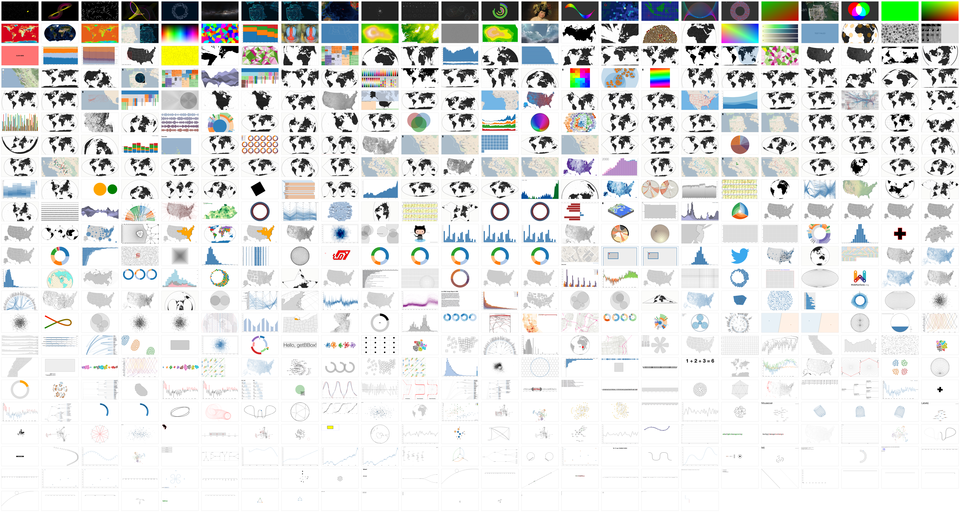
Montage

I am a big fan of examples. Not a surprise, right? If you follow me on Twitter, or my projects over the last few years (or asked D3 questions on Stack Overflow), you’ve likely seen some of my example visualizations, maps and explanations.

I use examples so often that I created bl.ocks.org to make it easier for me to share them. It lets you quickly post code and share examples with a short URL. Your code is displayed below; it’s view source by default. And it’s backed by GitHub Gist, so examples have a git repository for version control, and are forkable, cloneable and commentable.

I initially conceived this talk as an excuse to show all my examples. But with more than 600, I’d have only 4.5 seconds per slide. A bit overwhelming. So instead I’ve picked a few favorites that I hope you’ll enjoy. You should find this talk entertaining, even if it fails to be insightful.

This talk does have a point, though. Examples are lightweight and informal; they can often be made in a few minutes; they lack the ceremony of polished graphics or official tools. Yet examples are a powerful medium of communication that is capable of expressing big ideas with immediate impact. And Eyeo is a unique opportunity for me to talk directly to all of you that are doing amazing things with code, data and visualization. So, if I can accomplish one thing here, it should be to get you to share more examples. In short, to share my love of examples with you.

Mike’s post is full of excellent D3 graphics. You owe it to yourself to review all of them in full.

I first saw this at Nat Torkington’s Four short links: 11 June 2013.

May 14, 2013

Binify + D3 = Gorgeous honeycomb maps

Filed under: D3,Graphics,Maps,Visualization — Patrick Durusau @ 2:42 pm

Binify + D3 = Gorgeous honeycomb maps by Chris Wilson.

From the post:

Most Americans prefer to huddle together around urban areas, which raises all sorts of problems for map-based visualizations. Coloring regions according to a data value, known as a choropleth map, leaves the map maker beholden to arbitrary political boundaries and, at the county level, pixel-wide polygons in parts of the Northeast. Many publications prefer to place dots proportional in area to the data values over the center of each county, which inevitably produces overlapping circles in these same congested regions. Here’s a particularly atrocious example of that strategy I once made at Slate:

Slate map

Two weeks ago, Kevin Schaul released an exciting new command-line tool called binify that offers a brilliant alternative. Schaul’s tool takes a series of points and clusters them (or “bins” them) into hexagonal tiles. Check out the introductory blog post on his site.

Binify operates on .shp files, which can be a bit difficult to work with for those of us who aren’t GIS pros. I put together this tutorial to demonstrate how you can take a raw series of coordinates and end up with a binned hexagonal map rendered in the browser using d3js and topojson, both courtesy of the beautiful mind of Mike Bostock. All the source files we’ll need are on Github.

I think everyone will agree with Chris, that is truly an ugly map. 😉

Chris’ post takes you through how to make a much better one.

April 5, 2013

Lazy D3 on some astronomical data

Filed under: Astroinformatics,D3,Graphics,Ontology,Visualization — Patrick Durusau @ 6:03 am

Lazy D3 on some astronomical data by simonraper.

From the post:

I can’t claim to be anything near an expert on D3 (a JavaScript library for data visualisation) but being both greedy and lazy I wondered if I could get some nice results with minimum effort. In any case the hardest thing about D3 for a novice to the world of web design seems to be getting started at all so perhaps this post will be useful for getting people up and running.

astronomy ontology

The images above and below are visualisations using D3 of a classification hierarchy for astronomical objects provided by the IVOA (International Virtual Observatory Alliance). I take no credit for the layout. The designs are taken straight from the D3 examples gallery but I will show you how I got the environment set up and my data into the graphs. The process should be replicable for any hierarchical dataset stored in a similar fashion.

Even better than the static images are various interactive versions such as the rotating Reingold–Tilford Tree, the collapsible dendrogram and collapsible indented tree . These were all created fairly easily by substituting the astronomical object data for the data in the original examples. (I say fairly easily as you need to get the hierarchy into the right format but more on that later.)

Easier to start with visualization of standard information structures and then move onto more exotic ones.

April 4, 2013

Directed Graph Editor

Filed under: Authoring Topic Maps,D3,Graphs — Patrick Durusau @ 5:32 am

Directed Graph Editor

This is a live directed graph editor so you will need to follow the link.

The instructions:

Click in the open space to add a node, drag from one node to another to add an edge.
Ctrl-drag a node to move the graph layout.
Click a node or an edge to select it.

When a node is selected: R toggles reflexivity, Delete removes the node.
When an edge is selected: L(eft), R(ight), B(oth) change direction, Delete removes the edge.

To see this example as part of a larger project, check out Modal Logic Playground!

Just an example of what is possible with current web technology.

Add the ability to record properties, well, could be interesting.

One of the display issues with a graph representation of a topic map is the proliferation of links, which can make the display too “busy.”

What if edges only appeared when mousing over a node? Or you had the ability to toggle some class of edges on/off? Or types of nodes on/off?

Something to keep in mind.

I first saw this in a tweet by Carter Cole.

April 2, 2013

Force-Directed Graph

Filed under: D3,Graphics,Graphs,Visualization — Patrick Durusau @ 2:15 pm

Force-Directed Graph

From the post:

This simple force-directed graph shows character co-occurence in Les Misérables. A physical simulation of charged particles and springs places related characters in closer proximity, while unrelated characters are farther apart. Layout algorithm inspired by Tim Dwyer and Thomas Jakobsen. Data based on character coappearence in Victor Hugo’s Les Misérables, compiled by Donald Knuth.

Display of graphs (read topic maps) need not be limited to complex applications.

Sam Hunting suggested this link.

March 13, 2013

JSNetworkX

Filed under: D3,Graphs,Javascript,Networks,NetworkX — Patrick Durusau @ 12:39 pm

JSNetworkX

A port of the NetworkX graph library to JavaScript

SNetworkX is a port of the popular Python graph library NetworkX. Lets describe it with their words:

NetworkX is a Python language software package for the creation, manipulation, and study of the structure, dynamics, and function of complex networks.

With NetworkX you can load and store networks in standard and nonstandard data formats, generate many types of random and classic networks, analyze network structure, build network models, design new network algorithms, draw networks, and much more.

Github.

Wiki.

Looks like an easy way to include graph representations of topic maps in a web page.

I suspect you will be seeing more of this in the not too distant future.

I first saw this in a tweet by Christophe Viau.

D3 Alternative Documentation

Filed under: D3,Graphics,Visualization — Patrick Durusau @ 3:41 am

D3 Alternative Documentation

Documentation generated with a “TypeScript Ambient Source File Documentation Generator.”

dtsdoc is a documentation generator for TypeScript ambient source file(.d.ts). You can also use markdown to document your code.

dtsdoc runs on a Web browser or node.js.

I first saw this in a tweet by Christophe Viau.

« Newer PostsOlder Posts »

Powered by WordPress