Another Word For It Patrick Durusau on Topic Maps and Semantic Diversity

March 13, 2013

A map of worldwide email traffic, created with R

Filed under: Mapping,Maps,R — Patrick Durusau @ 1:00 pm

A map of worldwide email traffic, created with R by David Smith.

The Washing Post reports that by analyzing more than 10 million emails sent through the Yahoo! Mail service in 2012, a team of researchers used the R language to create a map of countries whose citizens email each other most frequently:

Worldwide Email traffic

Some discussion of Huntington’s Clash of Civilizations, but I have a different question:

If a map is a snapshot of a territory, can’t a later snapshot might show changes to the same territory?

Rather than debating Huntington and his money making but shallow view of the world and its history, why not intentionally broaden the communication network you see above?

A map, even a topic map, isn’t destiny, it’s a guide to finding a path to a new location or information.

eSpatial launches free edition of mapping software

Filed under: Geographic Data,GIS,Mapping,Maps — Patrick Durusau @ 12:22 pm

eSpatial launches free edition of mapping software

From the post:

eSpatial, leading provider of powerful mapping software today announced the launch of a free edition of their flagship mapping software, also called eSpatial.

eSpatial mapping software lets users convert spreadsheet data into map form, with just a few clicks. This visualization provides immediate insights into market trends and challenges.

The new free edition of eSpatial is available to anyone who signs up for an account at www.espatial.com. Once logged on, users can create maps from their existing data and then post them on websites as interactive maps.

Since it launched last year, eSpatial has made strong inroads into the sales mapping and territory mapping software market, especially in the United States.

Paid editions (including Basic, Pro and Team) of the application with greater functionality – including the ability to handle increased amounts of data, reporting and sharing options – start at $399 for an annual subscription.

www.espatial.com

Just starting playing with this but it could be radically cool!

For example, what if you mapped a particular congressional district and then mapped by zip codes the donations to their campaign?

I need to read the manual and find some data to import.

BTW, high marks for one of the easiest registrations I have ever encountered.

March 4, 2013

D3 World Maps: Tooltips, Zooming, and Queue

Filed under: D3,Graphics,Mapping,Maps,Visualization — Patrick Durusau @ 5:16 pm

D3 World Maps: Tooltips, Zooming, and Queue

From the post:

D3 has a lot of built in support (a powerful geographic projection system) for creating Maps from GeoJSON. If you have never used D3 for maps, I think you should take a look at this D3 Map Tutorial. It covers the essentials of making a map with D3 and TopoJSON, which I will use below in more advanced examples. TopoJson encodes topology and eliminates redundancy, resulting in a much smaller file and the GeoJSON to TopoJSON converter is built with NodeJS.

Thus, I encourage you all to start using TopoJSON and below, I will go over a couple examples of building a D3 World Map with colors, tooltips, different zooming options, plotting points from geo coordinates, and listening to click events to load new maps. I will also use Mike Bostock’s queue script to load the data asynchronously.

Creating geographic maps with D3? This is a must stop.

What I need to look for is a library not for geo-coordinates but one that supports arbitrary, user-defined coordinates.

The sort of thing that could map locations in library stacks.

Suggestions/pointers?

February 28, 2013

VFR MAP

Filed under: Mapping,Maps — Patrick Durusau @ 1:31 pm

VFR MAP

From the about:

Here you will find

  • Seamlessly stitched VFR and IFR aeronautical charts
  • A searchable Airport / Facility Directory
  • Terminal Procedure Publications
  • Real-time weather

VFR MAP is optimized for mobile devices. Try us on your Android phone, iPhone, or iPad (or click here to see some screenshots).

Plus Google maps for terrain, satellite and roads.

Quite a remarkable site.

What would you want to combine with these maps?

February 10, 2013

Mapping the census…

Filed under: Census Data,Mapping,Maps,R,Transparency — Patrick Durusau @ 4:20 pm

Mapping the census: how one man produced a library for all by Simon Rogers.

From the post:

The census is an amazing resource – so full of data it’s hard to know where to begin. And increasingly where to begin is by putting together web-based interactives – like this one on language and this on transport patterns that we produced this month.

But one academic is taking everything back to basics – using some pretty sophisticated techniques. Alex Singleton, a lecturer in geographic information science (GIS) at Liverpool University has used R to create the open atlas project.

Singleton has basically produced a detailed mapping report – as a PDF and vectored images – on every one of the local authorities of England & Wales. He automated the process and has provided the code for readers to correct and do something with. In each report there are 391 pages, each with a map. That means, for the 354 local authorities in England & Wales, he has produced 127,466 maps.

Check out Simon’s post to see why Singleton has undertaken such a task.

Question: Was the 2011 census more “transparent,” or “useful” after Singleton’s work or before?

I would say more “transparent” after Singleton’s work.

You?

January 27, 2013

Creating beautiful maps with R

Filed under: Maps,R — Patrick Durusau @ 5:40 pm

Creating beautiful maps with R by David Smith.

From the post:

Spanish R user and solar energy lecturer Oscar Perpiñán Lamigueiro has written a detailed three-part guide to creating beautiful maps and choropleths (maps color-coded with regional data) using the R language. Motivated by the desire to recreate this graphic from the New York Times, Oscar describes how he creates similar high-quality maps using R.

David summarizes the three part series by Oscar Perpiñán Lamigueiro with links to parts, software and data.

No guarantees you will produce maps as good as the New York Times but it won’t be from a lack of instruction. 😉

Maps in R: choropleth maps

Filed under: Maps,R — Patrick Durusau @ 5:40 pm

Maps in R: choropleth maps by Max Marchi.

From the post:

This is the third article of the Maps in R series. After having shown how to draw a map without placing data on it and how to plot point data on a map, in this installment the creation of a choropleth map will be presented.

A choropleth map is a thematic map featuring regions colored or shaded according to the value assumed by the variable of interest in that particular region.

Another step towards becoming a map maker with R!

January 23, 2013

Confluently Persistent Sets and Maps

Filed under: Functional Programming,Maps,Python,Sets — Patrick Durusau @ 7:42 pm

Confluently Persistent Sets and Maps by Olle Liljenzin.

Abstract:

Ordered sets and maps play important roles as index structures in relational data models. When a shared index in a multi-user system is modified concurrently, the current state of the index will diverge into multiple versions containing the local modifications performed in each work flow. The confluent persistence problem arises when versions should be melded in commit and refresh operations so that modifications performed by different users become merged.

Confluently Persistent Sets and Maps are functional binary search trees that support efficient set operations both when operands are disjoint and when they are overlapping. Treap properties with hash values as priorities are maintained and with hash-consing of nodes a unique representation is provided. Non-destructive set merge algorithms that skip inspection of equal subtrees and a conflict detecting meld algorithm based on set merges are presented. The meld algorithm is used in commit and refresh operations. With m modifications in one flow and n items in total, the expected cost of the operations is O(m log(n/m)).

Is this an avenue for coordination between distinct topic maps?

Or is consistency of distinct topic maps an application-based requirement?

January 22, 2013

User evaluation of automatically generated keywords and toponyms… [of semantic gaps]

User evaluation of automatically generated keywords and toponyms for geo-referenced images by Frank O. Ostermann, Martin Tomko, Ross Purves. (Ostermann, F. O., Tomko, M. and Purves, R. (2013), User evaluation of automatically generated keywords and toponyms for geo-referenced images. J. Am. Soc. Inf. Sci.. doi: 10.1002/asi.22738)

Abstract:

This article presents the results of a user evaluation of automatically generated concept keywords and place names (toponyms) for geo-referenced images. Automatically annotating images is becoming indispensable for effective information retrieval, since the number of geo-referenced images available online is growing, yet many images are insufficiently tagged or captioned to be efficiently searchable by standard information retrieval procedures. The Tripod project developed original methods for automatically annotating geo-referenced images by generating representations of the likely visible footprint of a geo-referenced image, and using this footprint to query spatial databases and web resources. These queries return raw lists of potential keywords and toponyms, which are subsequently filtered and ranked. This article reports on user experiments designed to evaluate the quality of the generated annotations. The experiments combined quantitative and qualitative approaches: To retrieve a large number of responses, participants rated the annotations in standardized online questionnaires that showed an image and its corresponding keywords. In addition, several focus groups provided rich qualitative information in open discussions. The results of the evaluation show that currently the annotation method performs better on rural images than on urban ones. Further, for each image at least one suitable keyword could be generated. The integration of heterogeneous data sources resulted in some images having a high level of noise in the form of obviously wrong or spurious keywords. The article discusses the evaluation itself and methods to improve the automatic generation of annotations.

An echo of Steve Newcomb’s semantic impedance appears at:

Despite many advances since Smeulders et al.’s (2002) classic paper that set out challenges in content-based image retrieval, the quality of both nonspecialist text-based and content-based image retrieval still appears to lag behind the quality of specialist text retrieval, and the semantic gap, identified by Smeulders et al. as a fundamental issue in content-based image retrieval, remains to be bridged. Smeulders defined the semantic gap as

the lack of coincidence between the information that one can extract from the visual data and the interpretation that the same data have for a user in a given situation. (p. 1353)

In fact, text-based systems that attempt to index images based on text thought to be relevant to an image, for example, by using image captions, tags, or text found near an image in a document, suffer from an identical problem. Since text is being used as a proxy by an individual in annotating image content, those querying a system may or may not have similar worldviews or conceptualizations as the annotator. (emphasis added)

That last sentence could have come out of a topic map book.

Curious what you make of the author’s claim that spatial locations provide an “external context” that bridges the “semantic gap?”

If we all use the same map of spatial locations, are you surprised by the lack of a “semantic gap?”
January 15, 2013

Maps in R: Plotting data points on a map

Filed under: Geographic Data,Geography,Mapping,Maps,R — Patrick Durusau @ 8:30 pm

Maps in R: Plotting data points on a map by Max Marchi.

From the post:

In the introductory post of this series I showed how to plot empty maps in R.

Today I’ll begin to show how to add data to R maps. The topic of this post is the visualization of data points on a map.

Max continues this series with datasets from airports in Europe and demonstrates how to map the airports to geographic locations. He also represents the airports with icons that correspond to their traffic statistics.

Useful principles for any data set with events that can be plotted against geographic locations.

Parades, patrols, convoys, that sort of thing.

January 6, 2013

CartoDB makes D3 maps a breeze

Filed under: CartoDB,D3,Geographic Data,Mapping,Maps — Patrick Durusau @ 9:59 pm

CartoDB makes D3 maps a breeze

From the post:

Anybody who loves maps and data can’t help but notice all the beautiful visualizations people are making with D3 right now. Huge thanks to Mike Bostock for such a cool technology.

We have done a lot of client-side rendering expirements over the past year or so and have to say, D3 is totally awesome. This is why we felt it might be helpful to show you how easy it is to use D3 with CartoDB. In the near future, we’ll be adding a few tutorials for D3 to our developer pages, but for now, let’s have a look.

Very impressive.

But populating a map with data isn’t the same as creating a useful map with data.

Take a look at the earthquake example.

What data would you add to it to make the information actionable?

January 5, 2013

Map Projections

Filed under: Cartography,D3,Graphics,Mapping,Maps — Patrick Durusau @ 7:36 am

Map Projections by Jason Davies.

If you are interested in map projections or D3, this page is a real delight!

Jason has draggable examples of:

Along with various demonstrations:

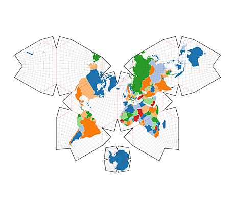
OK, one image to whet your appetite!

Waterman Butterfly Map

Follow the image to its homepage, then drag the image. I think you will be pleased.

December 31, 2012

Let’s Make a Map

Filed under: Mapping,Maps — Patrick Durusau @ 4:31 pm

Let’s Make a Map by Mike Bostock.

From the post:

In this tutorial, I’ll cover how to make a modest map from scratch using D3 and TopoJSON. I’ll show you a few places where you can find free geographic data online, and how to convert it into a format that is both efficient and convenient for display. I won’t cover thematic mapping, but the map we’ll make includes labels for populated places and you can extend this technique to geographic visualizations such as graduated symbol maps and choropleths.

Excellent introduction!

December 30, 2012

TopoJSON

Filed under: Geographic Data,Geography,Mapping,Maps — Patrick Durusau @ 8:34 pm

TopoJSON

From the webpage:

TopoJSON is an extension of GeoJSON that encodes topology. Rather than representing geometries discretely, geometries in TopoJSON files are stitched together from shared line segments called arcs. TopoJSON eliminates redundancy, offering much more compact representations of geometry than with GeoJSON; typical TopoJSON files are 80% smaller than their GeoJSON equivalents. In addition, TopoJSON facilitates applications that use topology, such as topology-preserving shape simplification, automatic map coloring, and cartograms.

I stumbled on this by viewing TopoJSON Points.

Displaying airports in the example but could be any geographic feature.

See the wiki for more details.

December 27, 2012

Majuro.JS [Useful Open Data]

Filed under: Mapping,Maps,Open Data,Visualization — Patrick Durusau @ 11:13 am

Majuro.JS by Nick Doiron.

From the homepage:

Majuro.JS helps you make detailed, interactive maps with open buildings data.

Great examples on the homepage but I prefer the explanation at Github.

This is wicked cool!

This type of open data I can see as the basis for “innovation.”

Resulting in a target for rich annotation by a topic map based application.

Outing Gun Owners?

Filed under: Mapping,Maps — Patrick Durusau @ 5:45 am

Map: Where are the gun permits in your neighborhood?

From the post:

The map indicates the addresses of all pistol permit holders in Westchester and Rockland counties. Each dot represents an individual permit holder licensed to own a handgun — a pistol or revolver. The data does not include owners of long guns — rifles or shotguns — which can be purchased without a permit. Being included in this map does not mean the individual at a specific location owns a weapon, just that they are licensed to do so.

Data for all permit categories, unrestricted carry, premises, business, employment, target and hunting, is included, but permit information is not available on an individual basis.

To create the map, The Journal News submitted Freedom of Information requests for the names and addresses of all pistol permit holders in Westchester, Rockland and Putnam. By state law, the information is public record.

The mapping has provoked considerable discussion (35,153 Facebook recommendations as of December 27, 2012).

Several additional or alternative mappings come to mind:

  • Mapping the addresses of people arrested for gun related violence and intersecting those addresses with the gun permit addresses.
  • Mapping the addresses of people arrested for drug offenses and intersecting those addresses with the gun violence addresses.
  • Or using a topic map to create more detailed maps of associations (political contributions?) and other data.

Who do you want to “out” and on what basis?


I found this following this post by Ed Chi, which in turn lead to a post by Jeremiah Owyang here, who remarks: “Perhaps one of the most controversial things I’ve seen in tech.”

I fail to see the “controversy.” The permit owners did in fact give their addresses as part of public records.

What part of not disclosing information you want to remain private seems unclear?

December 20, 2012

Maps in R: Introduction – Drawing the map of Europe

Filed under: Mapping,Maps,R — Patrick Durusau @ 7:36 pm

Maps in R: Introduction – Drawing the map of Europe by Max Marchi.

How many lines of R code to draw a map of Europe?

Write down your answer.

Now follow the link to the original post.

Close? Far away?

December 16, 2012

Asterank: an Accurate 3D Model of the Asteroids in our Solar System

Filed under: Astroinformatics,Mapping,Maps — Patrick Durusau @ 9:02 pm

Asterank: an Accurate 3D Model of the Asteroids in our Solar System by Andrew Vande Moere.

From the post:

Asterank 3D Asteroid Orbit Space Simulation [asterank.com], developed by software engineer Ian Webster, is a 3D WebGL-based model of the first 5 planets and the 30 most valuable asteroids, together with their respective orbits in our inner solar system.

Asterank’s database contains the astronomically accurate locations, as well as some economic and scientific information, of over 580,000 asteroids in our solar system. Each asteroid is accompanied by its “Value of Materials”, in terms of the metals, volatile compounds, or water it seem to contain. The “Cost of Operations” provides a financial estimation of how much it would cost to travel to the asteroid and move the materials back to Earth.

Will you be ready as semantic diversity spreads from the Earth out into the Solar System?

December 14, 2012

OpenTopography Project

Filed under: LiDAR,Mapping,Maps,Topography — Patrick Durusau @ 10:19 am

OpenTopograpy: A Portal to High-Resolution Topography Data and Tools

Which ironically has its “spotlight” on:

Discover Lidar Data Hosted by NCALM and USGS from OpenTopography

Which is summarized in the “spotlight” as:

The OpenTopography Find Data page is updated to display not only OpenTopography hosted-data, but also provides linkages to data hosted at the NCALM Data Distribution Center and USGS Center for Lidar Coordination and Knowledge (CLICK). The goal of this collaboration is to make it easier for lidar users to discover and link to online sources of data regardless of host.

Non-self referential and/or paid links that lead to additional content of interest to the reader.

If enough people did that, why we would have a useful WWW.

PS: Introduction to LiDAR video by the Idaho State University Geoscience Department

December 6, 2012

50 years of Rolling Stones tours

Filed under: Mapping,Maps — Patrick Durusau @ 11:38 am

50 years of Rolling Stones tours by Nathan Yau.

From the post:

CartoDB mapped every Rolling Stones tour from 1963 to 2007.

This is awesome.

More to follow.

December 3, 2012

“I Have Been Everywhere” by Johnny Cash

Filed under: Humor,Mapping,Maps,Music — Patrick Durusau @ 3:31 pm

A Real-Time Map of the Song “I Have Been Everywhere” by Johnny Cash

From the post:

Freelance web developer Iain Mullan has developed a map mashup titled “Johnny Cash Has Been EVERYWHERE (Man)!” [iainmullan.com].

The concept is simple yet funny: using a combination of an on-demand music service, an online lyrics catalog and some Google Maps programming magic, all the cities mentioned in the song are displayed simultaneously as they are mentioned during the song, as performed by Johnny Cash.

Some maps are meant to amuse.

BTW, Johnny prefers Safari or Chrome (as in won’t work with FireFox and I suspect IE as well).

December 2, 2012

Grow up, use Mindmaps [Or, Grow confident and use what works for you.]

Filed under: Mapping,Maps,Mind Maps — Patrick Durusau @ 3:59 pm

Grow up, use Mindmaps by Anne Balke.

From the post:

No matter what the industry, there is one thing that all business owners have in common. We need to find ways to best utilize our time and to stay organized. Whether you’re just starting out or have had a successful business for years, in order to grow you need to plan for the future. The trick is finding a way to organize all the information that you gather along the way so that you can effectively develop a plan of action. You also need to be able to share your ideas and vision with others in a way that is concise and easy to follow.

The Solution – Mind Mapping

For small-business owners, mind maps are a useful tool for everything from brainstorming to strategic planning. Mind mapping is a way to visualize what you need to do and helps to organize information the same way that your brain does. NovaMind explains it quite well:

Our brains like thinking in pictures…The left half thinks linearly following direct linkages to related ideas. Our right brain likes to see the whole picture with colors and flow. A Mind Map caters to both sides of the brain… [making] it a very good way of storing and recalling information, presenting things to other people, and brainstorming new ideas.

I wasn’t aware the mind map folks had solved the problem of how brains work. Someone needs to call MIT to let them in on the news. 😉

Mind maps can be useful and may even be an authoring step prior to creation of a topic map. But a universal panacea, their not.

I won’t ever make a very good software zealot. What software is best for you depends on your requirements and resources.

It is dishonest, intellectually and morally to pretend otherwise.

If you are organizing a Christmas play for the approaching holidays, a topic map would do the job. But a spiral notebook and #2 pencil (with a pennalet for storage) has a shallower learning curve.

I would rephrase the title just a bit: Grow confident, use software that meets your needs, not what’s “hot” or popular.

November 28, 2012

iFinder (Knowledge Maps)

Filed under: iFinder,Mapping,Maps — Patrick Durusau @ 6:06 am

iFinder (Knowledge Maps)

From the webpage:

Knowledge Maps

Search from a different angle

As we know from current studies and user data analyses of search engine providers, most users enter max. two terms to start their search. By using the Knowledge Map, it is no longer necessary to enter even a single search term – just by a few mouse clicks the user can targetedly and comprehensibly reach the desired search result.

Your corporate knowledge at a glance

The IntraFind solution “Knowledge Map” offers a user-friendly surface for doing research in company internal data sources.

All available data are clearly visualized in a “360 degree view” and can be quickly and easily narrowed to the desired hit document just by mouse click without the need to enter one single search term.

The product guide for IntraFind’s Knowlege Map enhancement for iFinder has several riffs adaptable to promoting topic maps.

Difficult to tell from the product literature, which was sparser than most, what lies under the hood. Appears to be a metadata harvesting/navigation solution.

Did not see any signs of the ability to share/combine mappings together.

If you took this as a baseline, the value of mapping, then topic maps are a value-add to traditional mapping.

November 20, 2012

Gaza-Israel crisis 2012: every verified incident mapped

Filed under: Government,Mapping,Maps — Patrick Durusau @ 7:42 pm

Gaza-Israel crisis 2012: every verified incident mapped by Ami Sedghi, John Burn-Murdoch and Simon Rogers.

What has happened in Gaza and Israel since the assassination of Hamas leader Ahmed al-Jabari last week? This map shows all the verified incidents reported by news sources and wires across the region since then. Click on a dot to see an event – or download data for yourself. Search an address or share view to get the precise url

How can you help?

If you know of an event we’ve missed, help us add it to the map by giving us the details below at this Google Form or email us data@guardian.co.uk. We’re also looking for your photos and videos

Nice to know someone trusts us with the real data. Instead of sound bite summaries.

November 19, 2012

Georeferencer: Crowdsourced Georeferencing for Map Library Collections

Georeferencer: Crowdsourced Georeferencing for Map Library Collections by Christopher Fleet, Kimberly C. Kowal and Petr Přidal.

Abstract:

Georeferencing of historical maps offers a number of important advantages for libraries: improved retrieval and user interfaces, better understanding of maps, and comparison/overlay with other maps and spatial data. Until recently, georeferencing has involved various relatively time-consuming and costly processes using conventional geographic information system software, and has been infrequently employed by map libraries. The Georeferencer application is a collaborative online project allowing crowdsourced georeferencing of map images. It builds upon a number of related technologies that use existing zoomable images from library web servers. Following a brief review of other approaches and georeferencing software, we describe Georeferencer through its five separate implementations to date: the Moravian Library (Brno), the Nationaal Archief (The Hague), the National Library of Scotland (Edinburgh), the British Library (London), and the Institut Cartografic de Catalunya (Barcelona). The key success factors behind crowdsourcing georeferencing are presented. We then describe future developments and improvements to the Georeferencer technology.

If your institution has a map collection or if you are interested in maps at all, you need to read this article.

There is an introduction video if you prefer: http://www.klokantech.com/georeferencer/.

Either way, you will be deeply impressed by this project.

And wondering: Can the same lessons be applied to crowd source the creation of topic maps?

November 16, 2012

Maps before maps

Filed under: Mapping,Maps — Patrick Durusau @ 6:08 am

Maps before maps by Nathan Yau.

From the post:

Amanda Uren has a fun collection of map-like scans from the 11th century. Some of them are geographic, but most of them are more like rough sketches of how the individual saw the area the image represents. It’s like those stereotype maps that people like to make, except no one’s trying to be funny.

I recognized a few of the maps but not enough to be useful. Annotations with names and bibliographic information would greatly improve the usefulness of these maps, at least to me.

And they are maps. Not “maps before maps.” Maps always represent a point of view.

Modernity’s obsession with “correct” maps is a symptom of its imperialist ideology and its need to exclude alternative viewpoints.

November 13, 2012

Mapping Racist Tweets

Filed under: Mapping,Maps,Tweets — Patrick Durusau @ 2:54 pm

Where America’s Racist Tweets Come From by Megan Garber.

WARNING: The cited article has very racist and offensive tweets. They are reproduced to illustrate the technique, not to promote racism.

Megan reports on the work of Floating Sheep, geography academics.

Surprising thing about the geographic distribution (it’s pretty much all over the nation) is the lack of racist tweets from Montana. Where all the survivalist types have bunkered up.

Then I remembered, they don’t have Internet access in log and dirt bunkers. Probably no electricity or running water as well. Some politics are their own reward. 😉

You may also appreciate the longer original post at Floating Sheep: Mapping Racist Tweets in Response to President Obama’s Re-election.

Illustrates mapping of tweets by geo-locations.

Mapping against other characteristics of geo-locations could be interesting as well.

I first saw this in a tweet by Ed Chi.

November 9, 2012

Cartograms for Topic Maps?

Filed under: Cartogram,Cartography,Mapping,Maps — Patrick Durusau @ 7:18 am

Simon St. Laurent tweeted a link to: Maps of the 2012 US presidential election results by M. E. J. Newman.

Newman used cartograms to create presentations of the 2012 U.S. presidential election results. (Cartograms substitute another variable for land area in the presentation.)

Newman’s maps correct the distortion that has most of the U.S. colored “red,” when in fact the “blue” candidate, Obama, carried both the popular and electorial vote.

I don’t recall any topic map display that I would call cartograms. You?

Leaving aside a cartogram applied to a geographic map as an interface to a topic map, how else to apply cartograms to a topic map?

Depends on the characteristics of the topics but are there general principles? Even for classes of characteristics?

October 30, 2012

The one million tweet map

Filed under: Geography,Mapping,Maps,Tweets — Patrick Durusau @ 2:43 pm

The one million tweet map

Displays the last one million tweets by geographic location, plus the top five (5) hashtags.

So tweets are not just 140 or less character strings, they are locations as well. Wondering how far you can take re-purposing of a tweet?

Powered by Maptimize.

I first saw this at Mashable.com.

BTW, I don’t find the Adobe Social ad (part of the video at Mashable) all that convincing.

You?

October 25, 2012

Insisting on beautiful maps

Filed under: Cartography,Mapping,Maps — Patrick Durusau @ 3:00 pm

Insisting on beautiful maps by Nathan Yau.

Nathan calls our attention to the publication of:

the Atlas of Design, published by the North American Cartographic Information Society,….

Definitely be on the short list of books for the holiday season!

« Newer PostsOlder Posts »

Powered by WordPress