Another Word For It Patrick Durusau on Topic Maps and Semantic Diversity

June 21, 2014

What’s On Your Desktop?

Filed under: Data Analysis,Data Mining — Patrick Durusau @ 7:55 pm

The Analyst’s Toolbox by Simon Raper.

From the post:

There are hundreds, maybe thousands, of open source/free/online tools out there that form part of the analyst’s toolbox. Here’s what I have on my mac for day to day work. Click on the leaf node labels to be redirected to the relevant sites. Visualisation in D3.

Tools in day to day use by a live data analyst. Nice presentation as well.

What’s on your desktop?

May 24, 2014

…Data Analytics Hackathon

Filed under: Analytics,Data Analysis,ElasticSearch — Patrick Durusau @ 4:27 pm

Elasticsearch Teams up with MIT Sloan for Data Analytics Hackathon by Sejal Korenromp.

From the post:

Following from the success and popularity of the Hopper Hackathon we participated in late last year, last week we sponsored the MIT Sloan Data Analytics Club Hackathon for our latest offering to Elasticsearch aficionados. More than 50 software engineers, business students and other open source software enthusiasts signed up to participate, and on a Saturday to boot! The full day’s festivities included access to a huge storage and computing cluster, and everyone was set free to create something awesome using Elasticsearch.

Hacks from the finalists:

  • Quimbly – A Digital Library
  • Brand Sentiment Analysis
  • Conference Data
  • Twitter based sentiment analyzer
  • Statistics on Movies and Wikipedia

See Sejal’s post for the details of each hack and the winner.

I noticed several very good ideas in these hacks, no doubt you will notice even more.

Enjoy!

May 23, 2014

Data Analytics Handbook

Filed under: Analytics,BigData,Data Analysis — Patrick Durusau @ 3:58 pm

Data Analytics Handbook

The “handbook” appears in three parts, the first of which you download, while links to parts 2 and 3 are emailed to you for participating in a short survey. The survey collects your name, email address, educational background (STEM or not), and whether you are interested in a new resource that is being created to teach data analysis.

Let’s be clear up front that this is NOT a technical handbook.

Rather all three parts are interviews with:

Part 1: Data Analysts + Data Scientists

Part 2: CEO’s + Managers

Part 3: Researchers + Academics

Technical handbooks abound but this is one of the few (only?) books that covers the “soft” side of data analytics. By the “soft” side I mean the people and personal relationships that make up the data analytics industry. Technical knowledge is a must but being able to work well with others is as if not more important.

The interviews are wide ranging and don’t attempt to provide cut-n-dried answers. Readers will need to be inspired by and adapt the reported experiences to their own circumstances.

Of all the features of the books, I suspect I liked the “Top 5 Take Aways” the best.

In the interest of full disclosure, that maybe because part 1 reported:

2. The biggest challenge for a data analyst isn’t modeling, it’s cleaning and collecting

Data analysts spend most of their time collecting and cleaning the data required for analysis. Answering questions like “where do you collect the data?”, “how do you collect the data?”, and “how should you clean the data?”, require much more time than the actual analysis itself.

Well, when someone puts your favorite hobby horse at #2, see how you react. 😉

I first saw this in a tweet by Marin Dimitrov.

May 12, 2014

Facebook teaches you exploratory data analysis with R

Filed under: Data Analysis,Exploratory Data Analysis,Facebook,R — Patrick Durusau @ 6:44 pm

Facebook teaches you exploratory data analysis with R by David Smith.

From the post:

Facebook is a company that deals with a lot of data — more than 500 terabytes a day — and R is widely used at Facebook to visualize and analyze that data. Applications of R at Facebook include user behaviour, content trends, human resources and even graphics for the IPO prospectus. Now, four R users at Facebook (Moira Burke, Chris Saden, Dean Eckles and Solomon Messing) share their experiences using R at Facebook in a new Udacity on-line course, Exploratory Data Analysis.

The more data you explore, the better data explorer you will be!

Enjoy!

I first saw this in a post by David Smith.

April 28, 2014

Humanitarian Data Exchange

Filed under: Data,Data Analysis — Patrick Durusau @ 7:06 pm

Humanitarian Data Exchange

From the webpage:

A project by the United Nations Office for the Coordination of Humanitarian Affairs to make humanitarian data easy to find and use for analysis.

HDX will include a dataset repository, based on open-source software, where partners can share their data spreadsheets and make it easy for others to find and use that data.

HDX brings together a Common Humanitarian Dataset that can be compared across countries and crises, with tools for analysis and visualization.

HDX promotes community data standards (e.g. the Humanitarian Exchange Language) for sharing operational data across a network of actors.

Data from diverse sources always creates opportunities to use topic maps.

The pilot countries include Columbia, Kenya and Yemen so semantic diversity is a reasonable expectation.

BTW, they are looking for volunteers. Opportunities range from data science, development, visualization to the creation of data standards.

April 13, 2014

Will Computers Take Your Job?

Filed under: Data Analysis,Humor,Semantics — Patrick Durusau @ 10:42 am

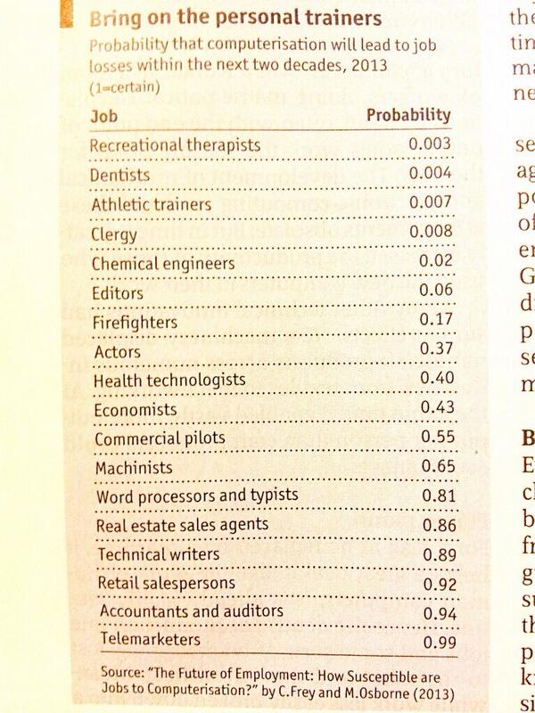
Probability that computers will take away your job posted by Jure Leskovec.

jobs taken by computers

For your further amusement, I recommend the full study, “The Future of Employment: How Susceptible are Jobs to Computerisation?” by C. Frey and M. Osborne (2013).

The lower the number, the less likely for computer replacement:

  • Logisticians – #55, more replaceable than Rehabilitation Counselors at #47.
  • Computer and Information Research Scientists – #69, more replaceable than Public Relations and Fundraising Managers at #67. (Sorry Don.)
  • Astronomers – #128, more replaceable than Credit Counselors at #126.
  • Dancers – #179? I’m not sure the authors have even seen Paula Abdul dance.
  • Computer Programmers – #293, more replaceable than Historians at #283.
  • Bartenders – #422. Have you ever told a sad story to a coin-operated vending machine?
  • Barbers – #439. Admittedly I only see barbers at a distance but if I wanted one, I would prefer human one.
  • Technical Writers – #526. The #1 reason why technical documentation is so poor. Technical writers are under appreciated and treated like crap. Good technical writing should be less replaceable by computers than Lodging Managers at #12.
  • Tax Examiners and Collectors, and Revenue Agents – #586. Stop cheering so loudly. You are frightening other cube dwellers.
  • Umpires, Referees, and Other Sports Officials – 684. Now cheer loudly! 😉

If the results strike you as odd, consider this partial description of the approach taken to determine if a job could be taken over by a computer:

First, together with a group of ML researchers, we subjectively hand-labelled 70 occupations, assigning 1 if automatable, and 0 if not. For our subjective assessments, we draw upon a workshop held at the Oxford University Engineering Sciences Department, examining the automatability of a wide range of tasks. Our label assignments were based on eyeballing the O∗NET tasks and job description of each occupation. This information is particular to each occupation, as opposed to standardised across different jobs. The hand-labelling of the occupations was made by answering the question “Can the tasks of this job be sufficiently specified, conditional on the availability of big data, to be performed by state of the art computer-controlled equipment”. Thus, we only assigned a 1 to fully automatable occupations, where we considered all tasks to be automatable. To the best of our knowledge, we considered the possibility of task simplification, possibly allowing some currently non-automatable tasks to be automated. Labels were assigned only to the occupations about which we were most confident. (at page 30)

Not to mention that occupations were considered for automation on the basis of nine (9) variables.

Would you believe that semantics isn’t mentioned once in this paper? So now you know why I have issues with its methodology and conclusions. What do you think?

March 19, 2014

Podcast: Thinking with Data

Filed under: Data,Data Analysis,Data Science — Patrick Durusau @ 1:39 pm

Podcast: Thinking with Data: Data tools are less important than the way you frame your questions by Jon Bruner.

From the description:

Max Shron and Jake Porway spoke with me at Strata a few weeks ago about frameworks for making reasoned arguments with data. Max’s recent O’Reilly book, Thinking with Data, outlines the crucial process of developing good questions and creating a plan to answer them. Jake’s nonprofit, DataKind, connects data scientists with worthy causes where they can apply their skills.

Curious if you agree with Max that data tools are “mature?”

Certainly better than they were when I was an undergraduate in political science but measuring sentiment was a current topic even then. 😉

And the controversy of tools versus good questions isn’t a new one either.

To his credit, Max does credit decades of discussion of rhetoric and thinking as helpful in this area.

For you research buffs, any pointers to prior tools versus good questions debates? (Think sociology/political science in the 1970s to date. It’s a recurring theme.)

I first saw this in a tweet by Mike Loukides.

March 7, 2014

Data Scientist Solution Kit

Filed under: Cloudera,Data Analysis,Training,Web Analytics — Patrick Durusau @ 3:57 pm

Data Scientist Solution Kit

From the post:

The explosion of data is leading to new business opportunities that draw on advanced analytics and require a broader, more sophisticated skills set, including software development, data engineering, math and statistics, subject matter expertise, and fluency in a variety of analytics tools. Brought together by data scientists, these capabilities can lead to deeper market insights, more focused product innovation, faster anomaly detection, and more effective customer engagement for the business.

The Data Science Challenge Solution Kit is your best resource to get hands-on experience with a real-world data science challenge in a self-paced, learner-centric environment. The free solution kit includes a live data set, a step-by-step tutorial, and a detailed explanation of the processes required to arrive at the correct outcomes.

Data Science at Your Desk

The Web Analytics Challenge includes five sections that simulate the experience of exploring, then cleaning, and ultimately analyzing web log data. First, you will work through some of the common issues a data scientist encounters with log data and data in JSON format. Second, you will clean and prepare the data for modeling. Third, you will develop an alternate approach to building a classifier, with a focus on data structure and accuracy. Fourth, you will learn how to use tools like Cloudera ML to discover clusters within a data set. Finally, you will select an optimal recommender algorithm and extract ratings predictions using Apache Mahout.

With the ongoing confusion about what it means to be a “data scientist,” having a certification or two isn’t going to hurt your chances for employment.

And you may learn something in the bargain. 😉

February 23, 2014

Data Analysis for Genomics MOOC

Filed under: Data Analysis,Genomics,R — Patrick Durusau @ 2:48 pm

Data Analysis for Genomics MOOC by Stephen Turner.

HarvardX: Data Analysis for Genomics
April 7, 2014.

From the post:

Last month I told you about Coursera’s specializations in data science, systems biology, and computing. Today I was reading Jeff Leek’s blog post defending p-values and found a link to HarvardX’s Data Analysis for Genomics course, taught by Rafael Irizarry and Mike Love. Here’s the course description:

If you’ve ever wanted to get started with data analysis in genomics and you’d learn R along the way, this looks like a great place to start. The course is set to start April 7, 2014.

A threefer: genomics, R and noticing what subjects are unidentified in current genomics practices. Are those subjects important?

If you are worried about the PH207x prerequisite, take a look at: PH207x Health in Numbers: Quantitative Methods in Clinical & Public Health Research. It’s an archived course but still accessible for self-study.

A slow walk through Ph207x will give you a broad exposure to methods in clinical and public health research.

is t

February 22, 2014

Simple Ain’t Easy

Filed under: Data Analysis,Mathematics,Statistics — Patrick Durusau @ 2:27 pm

Simple Ain’t Easy: Real-World Problems with Basic Summary Statistics by John Myles White.

From the webpage:

In applied statistical work, the use of even the most basic summary statistics, like means, medians and modes, can be seriously problematic. When forced to choose a single summary statistic, many considerations come into practice.

This repo attempts to describe some of the non-obvious properties possessed by standard statistical methods so that users can make informed choices about methods.

Contributing

The reason I chose to announce a book of examples isn’t just pedagogical: by writing fully independent examples, it’s possible to write a book as a community working in parallel. If 30 people each contributed 10 examples over the next month, we’d have a full-length book containing 300 examples in our hands. In practice, things are complicated by the need to make sure that examples aren’t redundant or low quality, but it’s still possible to make this book a large-scale community project.

As such, I hope you’ll consider contributing. To contribute, just submit a new example. If your example only requires text, you only need to write a short LaTeX-flavored Markdown document. If you need images, please include R code that generates your images.

A great project for several reasons.

First, you can contribute to a public resource that may improve the use of summary statistics.

Second, you have the opportunity to search the literature for examples you want to use on summary statistics. That will improve your searching skills and data skepticism. The first from finding the examples and the second from seeing how statistics are used in the “wild.”

Not to bang on statistics too harshly, I review standards where authors have forgotten how to use quotes and footnotes. Sixth grade type stuff.

Third, and to me the most important reason, as you review the work of others, you will become more conscious of similar mistakes in your own writing.

Think of contributions to Simple Ain’t Easy as exercises in self-improvement that benefit others.

February 18, 2014

Data Analysis: The Hard Parts

Filed under: Data Analysis,Data Mining — Patrick Durusau @ 11:51 am

Data Analysis: The Hard Parts by Milo Braun.

Milo has cautions about data tools that promise quick and easy data analysis:

  1. data analysis is so easy to get wrong
  2. it’s too easy to lie to yourself about it working
  3. it’s very hard to tell whether it could work if it doesn’t
  4. there is no free lunch

You will find yourself nodding along as you read Milo’s analysis.

I particularly liked:

So in essence, there is no way around properly learning data analysis skills. Just like you wouldn’t just give a blowtorch to anyone, you need proper training so that you know what you’re doing and produce robust and reliable results which deliver in the real-world. Unfortunately, this training is hard, as it requires familiarity with at least linear algebra and concepts of statistics and probability theory, stuff which classical coders are not that well trained in.

I agree on the blowtorch question but then I am not in corporate management.

The corporate management answer is yes, just about anyone can have a data blowtorch. “Who is more likely to provide a desired answer?,” is the management question for blowtorch assignments.

I recommend Milo’s post and the resources he points to in order for you to become a competent data scientist.

Competence may give you an advantage in a blowtorch war.

I first saw this in a tweet by Peter Skomoroch.

February 3, 2014

Big Data’s Dangerous New Era of Discrimination

Filed under: BigData,Data Analysis — Patrick Durusau @ 3:16 pm

Big Data’s Dangerous New Era of Discrimination by Michael Schrage.

From the post:

Congratulations. You bought into Big Data and it’s paying off Big Time. You slice, dice, parse and process every screen-stroke, clickstream, Like, tweet and touch point that matters to your enterprise. You now know exactly who your best — and worst — customers, clients, employees and partners are. Knowledge is power. But what kind of power does all that knowledge buy?

Big Data creates Big Dilemmas. Greater knowledge of customers creates new potential and power to discriminate. Big Data — and its associated analytics — dramatically increase both the dimensionality and degrees of freedom for detailed discrimination. So where, in your corporate culture and strategy, does value-added personalization and segmentation end and harmful discrimination begin?

If you credit Robert Jackall’s Moral mazes : the world of corporate managers, Oxford, 1988, moral issues are bracketed in favor of pragmatism and group loyalty.

There was no shortage of government or corporate scandals running up to 1988 and there has been no shortage since then that fit well into Jackdall’s framework.

An evil doer may start a wrongful act but a mass scandal requires non-objection if not active assistance from a multitude that knows wrong doing is afoot.

Unlike Michael, I don’t think management will be interested in “fairly transparent” and/or “transparently fair” algorithms and analytics. Unless that serves some other goal or purpose of the organization.

January 25, 2014

How Many Years a Slave?

Filed under: Data Analysis,Data Integration,Palantir — Patrick Durusau @ 10:51 am

How Many Years a Slave? by Karin Knox.

From the post:

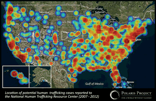
Each year, human traffickers reap an estimated $32 billion in profits from the enslavement of 21 million people worldwide. And yet, for most of us, modern slavery remains invisible. Its victims, many of them living in the shadows of our own communities, pass by unnoticed. Polaris Project, which has been working to end modern slavery for over a decade, recently released a report on trafficking trends in the U.S. that draws on five years of its data. The conclusion? Modern slavery is rampant in our communities.

slavery in US

January is National Slavery and Human Trafficking Prevention Month, and President Obama has called upon “businesses, national and community organizations, faith-based groups, families, and all Americans to recognize the vital role we can play in ending all forms of slavery.” The Polaris Project report, Human Trafficking Trends in the United States, reveals insights into how anti-trafficking organizations can fight back against this global tragedy.

….

Bradley Myles, CEO of the Polaris Project, makes a compelling case for data analysis in the fight against human trafficking. The post has an interview with Bradley and a presentation he made as part of the Palantir Night Live series.

Using Palantir software, the Polaris Project is able to rapidly connect survivors with responders across the United States. Their use of the data analytics aspect of the software is also allowing the project to find common patterns and connections.

The Polaris Project is using modern technology to recreate a modern underground railroad but at the same time, appears to be building a modern data silo as well. Or as Bradley puts it in his Palantir presentation, every report is “…one more data point that we have….”

I’m sure that’s true and helpful, to a degree. But going beyond the survivors of human trafficking, to reach the sources of human trafficking, will require the integration of data sets across many domains and languages.

Police sex crime units have data points, federal (U.S.) prosecutors have data points, social welfare agencies have data points, foreign governments and NGOs have data points, all related to human trafficking. I don’t think anyone believes a uniform solution is possible across all those domains and interests.

One way to solve that data integration problem is to disregard data points from anyone unable or unwilling to use some declared common solution or format. I don’t recommend that one.

Another way to attempt to solve the data integration problem is to have endless meetings to derive a common format, while human trafficking continues unhindered by data integration. I don’t recommend that approach either.

What I would recommend is creating maps between data systems, declaring and identifying the implicit subjects that support those mappings, so that disparate data systems can both export and import shared data across systems. Imports and exports that are robust, verifiable and maintainable.

Topic maps anyone?

January 22, 2014

Want to win $1,000,000,000 (yes, that’s one billion dollars)?

Want to win $1,000,000,000 (yes, that’s one billion dollars)? by Ann Drobnis.

The offer is one billion dollars for picking the winners of every game in the NCAA men’s basketball tournament in the Spring of 2014.

Unfortunately, none of the news stories I saw had links back to any authentic information from Quicken Loans and Berkshire Hathaway about the offer.

After some searching I found: Win a Billion Bucks with the Quicken Loans Billion Dollar Bracket Challenge by Clayton Closson, on January 21, 2014 on the Quicken Loans blog. (As far as I can tell it is an authentic post on the QL website.)

From that post:

You could be America’s next billionaire if you’re the grand prize winner of the Quicken Loans Billion Dollar Bracket Challenge. You read that right: one billion. Not one million. Not one hundred million. Not five hundred million. One billion U.S. dollars.

All you have to do is pick a perfect tournament bracket for the upcoming 2014 tournament. That’s it. Guess all the winners of all the games correctly, and Quicken Loans, along with Berkshire Hathaway, will make you a billionaire. The official press release is below. The contest starts March 3, 2014, so we’ll soon have all the info on how and when to enter your perfect bracket.

Good luck, my friends. This is your chance to play in perhaps the biggest sweepstakes in U.S. history. It’s your chance for a billion.

Oh, and by the way, the 20 closest imperfect brackets will win a cool hundred grand to put toward their home (or new home). Plus, in conjunction with the sweepstakes, Quicken Loans will donate $1 million to Detroit and Cleveland nonprofits to help with education of inner city youth.

So, to recap: If you’re perfect, you’ll win a billion. If you’re not perfect, you could win $100,000. The entry period begins Monday, March 3, 2014 and runs until Wednesday, March 19, 2014. Stay tuned on how to enter.

Contest updates at: Facebook.com/QuickenLoans.

The odds against winning are absurd but this has all the markings of a big data project. Historical data, current data on the teams and players, models, prior outcomes to test your models, etc.

I wonder if Watson likes basketball?

January 20, 2014

Lap Dancing With Big Data

Filed under: BigData,Data,Data Analysis — Patrick Durusau @ 4:27 pm

Real scientists make their own data by Sean J. Taylor.

From the first list in the post:

4. If you are the creator of your data set, then you are likely to have a great understanding the data generating process. Blindly downloading someone’s CSV file means you are much more likely to make assumptions which do not hold in the data.

A good point among many good points.

Sean provides guidance on how you can collect data, not just have it dumped on you.

Or as Kaiser Fung says in the post that lead me to Sean’s:

In theory, the availability of data should improve our ability to measure performance. In reality, the measurement revolution has not taken place. It turns out that measuring performance requires careful design and deliberate collection of the right types of data — while Big Data is the processing and analysis of whatever data drops onto our laps. Ergo, we are far from fulfilling the promise.

So, do you make your own data?

Or do you lap dance with data?

I know which one I aspire to.

You?

January 18, 2014

DataCamp (R & Data Analysis)

Filed under: Data Analysis,R — Patrick Durusau @ 7:43 pm

DataCamp Learn R & Become a Data Analyst.

From the overview:

Like english is the language spoken by the inhabitants of the United States, R is the language spoken by millions of statisticians and data analysts around the globe.

In this interactive R tutorial for beginners you will learn the basics of R. By the end of the summer you will be able to analyze data with R and create some very good looking graphs. This course is targeted at real beginners who are just getting started with R.

Opportunities for experts as well! Teach a course!

The homepage has this statistic:

“By 2018 there will be a shortage of 200.000 Data Analysts and 1,5 million data savvy managers, in the US alone.” Mc Kinsey & Company

It doesn’t say how many of the 200,000 jobs will be with the NSA. 😉

Seriously, a site and delivery methodology that may well take off in 2014.

I first saw this at Learn Data Science Online with DataCamp by Ryan Swanstrom.

January 15, 2014

XDATA@Kitware

Filed under: BigData,Data Analysis,Graphs,Vega,Virtualization,XDATA — Patrick Durusau @ 4:21 pm

XDATA@Kitware Big data unlocked, with the power of the Web.

From the webpage:

XDATA@Kitware is the engineering and research effort of a DARPA XDATA visualization team consisting of expertise from Kitware, Inc., Harvard University, University of Utah, Stanford University, Georgia Tech, and KnowledgeVis, LLC. XDATA is a DARPA-funded project to develop big data analysis and visualization solutions through utilizing and expanding open-source frameworks.

We are in the process of developing the Visualization Design Environment (VDE), a powerful yet intuitive user interface that will enable rapid development of visualization solutions with no programming required, using the Vega visualization grammar. The following index of web apps, hosted on the modular and flexible Tangelo web server framework, demonstrates some of the capabilities these tools will provide to solve a wide range of big data problems.

Examples:

Document Entity Relationships: Discover the network of named entities hidden within text documents

SSCI Predictive Database: Explore the progression of table partitioning in a predictive database.

Enron: Enron email visualization.

Flickr Metadata Maps: Explore the locations where millions of Flickr photos were taken

Biofabric Graph Visualization: An implementation of the Biofabric algorithm for visualizing large graphs.

SFC (Safe for c-suite) if you are there to explain them.

Related:

Vega (Trifacta, Inc.) – A visualization grammar, based on JSON, for specifying and representing visualizations.

January 4, 2014

How NetFlix Reverse Engineered Hollywood [+ Perry Mason Mystery]

Filed under: BigData,Data Analysis,Data Mining,Web Scrapers — Patrick Durusau @ 4:47 pm

How NetFlix Reverse Engineered Hollywood by Alexis C. Madrigal.

From the post:

If you use Netflix, you’ve probably wondered about the specific genres that it suggests to you. Some of them just seem so specific that it’s absurd. Emotional Fight-the-System Documentaries? Period Pieces About Royalty Based on Real Life? Foreign Satanic Stories from the 1980s?

If Netflix can show such tiny slices of cinema to any given user, and they have 40 million users, how vast did their set of “personalized genres” need to be to describe the entire Hollywood universe?

This idle wonder turned to rabid fascination when I realized that I could capture each and every microgenre that Netflix’s algorithm has ever created.

Through a combination of elbow grease and spam-level repetition, we discovered that Netflix possesses not several hundred genres, or even several thousand, but 76,897 unique ways to describe types of movies.

There are so many that just loading, copying, and pasting all of them took the little script I wrote more than 20 hours.

We’ve now spent several weeks understanding, analyzing, and reverse-engineering how Netflix’s vocabulary and grammar work. We’ve broken down its most popular descriptions, and counted its most popular actors and directors.

To my (and Netflix’s) knowledge, no one outside the company has ever assembled this data before.

What emerged from the work is this conclusion: Netflix has meticulously analyzed and tagged every movie and TV show imaginable. They possess a stockpile of data about Hollywood entertainment that is absolutely unprecedented. The genres that I scraped and that we caricature above are just the surface manifestation of this deeper database.

If you like data mining war stories in detail, then you will love this post by Alexis.

Along the way you will learn about:

  • Ubot Studio – Web scraping.
  • AntConc – Linguistic software.
  • Exploring other information to infer tagging practices.
  • More details about Netflix genres in general terms.

Be sure to read to the end to pick up on the Perry Mason mystery.

The Perry Mason mystery:

Netflix’s Favorite Actors (by number of genres)

  1. Raymond Burr (who played Perry Mason)
  2. Bruce Willis
  3. George Carlin
  4. Jackie Chan
  5. Andy Lau
  6. Robert De Niro
  7. Barbara Hale (also on Perry Mason)
  8. Clint Eastwood
  9. Elvis Presley
  10. Gene Autry

Question: Why is Raymond Burr in more genres than any other actor?

Some additional reading for this post: Sellling Blue Elephants

Just as a preview, the “Blue Elephants” book/site is about selling what consumers want to buy. Not about selling what you think is a world saving idea. Those are different. Sometimes very different.

I first saw this in a tweet by Gregory Piatetsky.

January 3, 2014

Data Without Meaning? [Dark Data]

Filed under: Data,Data Analysis,Data Mining,Data Quality,Data Silos — Patrick Durusau @ 5:47 pm

I was reading IDC: Tons of Customer Data Going to Waste by Beth Schultz when I saw:

As much as companies understand the need for data and analytics and are evolving their relationships with both, they’re really not moving quickly enough, Schaub suggested during an IDC webinar earlier this week about the firm’s top 10 predictions for CMOs in 2014. “The aspiration is know that customer, and know what the customer wants at every single touch point. This is going to be impossible in today’s siloed, channel orientation.”

Companies must use analytics to help take today’s multichannel reality and recreate “the intimacy of the corner store,” she added.

Yes, great idea. But as IDC pointed out in the prediction I found most disturbing — especially with how much we hear about customer analytics — gobs of data go unused. In 2014, IDC predicted, “80% of customer data will be wasted due to immature enterprise data ‘value chains.’ ” That has to set CMOs to shivering, and certainly IDC found it surprising, according to Schaub.

That’s not all that surprising, either the 80% and/or the cause being “immature enterprise data ‘value chains.'”

What did surprise me was:

IDC’s data group researchers say that some 80% of data collected has no meaning whatsoever, Schaub said.

I’m willing to bet the wasted 80% of consumer data and the “no meaning” 80% of consumer data, is the same 80%.

Think about it.

If your information chain isn’t associating meaning with the data you collect, the data may as well be streaming to /dev/null.

The data isn’t without meaning, you just failed to capture it. Not the same thing as having “no meaning.”

Failing to capture meaning along with data is one way to produce what I call “dark data.”

I first saw this in a tweet by Gregory Piatetsky.

December 29, 2013

Sanity Checks

Filed under: Data,Data Analysis — Patrick Durusau @ 3:11 pm

Being paranoid about data accuracy! by Kunal Jain.

Kunal knew a long meeting was developing after this exchange at its beginning:

Kunal: How many rows do you have in the data set?

Analyst 1: (After going through the data set) X rows

Kunal: How many rows do you expect?

Analyst 1 & 2: Blank look at their faces

Kunal: How many events / data points do you expect in the period / every month?

Analyst 1 & 2: …. (None of them had a clue)
The number of rows in the data set looked higher to me. The analysts had missed it clearly, because they did not benchmark it against business expectation (or did not have it in the first place). On digging deeper, we found that some events had multiple rows in the data sets and hence the higher number of rows.
….

You have probably seen them before but Kunal has seven (7) sanity check rules that should be applied to every data set.

Unless, of course, the inability to answer to simple questions about your data sets* is tolerated by your employer.

*Data sets become “yours” when you are asked to analyze them. Better to spot and report problems before they become evident in your results.

December 3, 2013

Of Algebirds, Monoids, Monads, …

Filed under: BigData,Data Analysis,Functional Programming,Hadoop,Scala,Storm — Patrick Durusau @ 2:50 pm

Of Algebirds, Monoids, Monads, and Other Bestiary for Large-Scale Data Analytics by Michael G. Noll.

From the post:

Have you ever asked yourself what monoids and monads are, and particularly why they seem to be so attractive in the field of large-scale data processing? Twitter recently open-sourced Algebird, which provides you with a JVM library to work with such algebraic data structures. Algebird is already being used in Big Data tools such as Scalding and SummingBird, which means you can use Algebird as a mechanism to plug your own data structures – e.g. Bloom filters, HyperLogLog – directly into large-scale data processing platforms such as Hadoop and Storm. In this post I will show you how to get started with Algebird, introduce you to monoids and monads, and address the question why you get interested in those in the first place.

Goal of this article

The main goal of this is article is to spark your curiosity and motivation for Algebird and the concepts of monoid, monads, and category theory in general. In other words, I want to address the questions “What’s the big deal? Why should I care? And how can these theoretical concepts help me in my daily work?”

You can call this a “blog post” but I rarely see blog posts with a table of contents! 😉

The post should come with a warning: May require substantial time to read, digest, understand.

Just so you know, I was hooked by this paragraph early on:

So let me use a different example because adding Int values is indeed trivial. Imagine that you are working on large-scale data analytics that make heavy use of Bloom filters. Your applications are based on highly-parallel tools such as Hadoop or Storm, and they create and work with many such Bloom filters in parallel. Now the money question is: How do you combine or add two Bloom filters in an easy way?

Are you motivated?

I first saw this in a tweet by CompSciFact.

November 13, 2013

Computational Topology and Data Analysis

Filed under: Data Analysis,Topological Data Analysis,Topology — Patrick Durusau @ 3:06 pm

Computational Topology and Data Analysis by Tamal K Dey.

Course syllabus:

Computational topology has played a synergistic role in bringing together research work from computational geometry, algebraic topology, data analysis, and many other related scientific areas. In recent years, the field has undergone particular growth in the area of data analysis. The application of topological techniques to traditional data analysis, which before has mostly developed on a statistical setting, has opened up new opportunities. This course is intended to cover this aspect of computational topology along with the developments of generic techniques for various topology-centered problems.

A course outline on computational topology with a short reading list, papers and notes on various topics.

I found this while looking up references on Tackling some really tough problems….

October 4, 2013

The Mathematical Shape of Things to Come

Filed under: Data Analysis,Mathematics,Modeling — Patrick Durusau @ 4:27 pm

The Mathematical Shape of Things to Come by Jennifer Ouellette.

From the post:

Simon DeDeo, a research fellow in applied mathematics and complex systems at the Santa Fe Institute, had a problem. He was collaborating on a new project analyzing 300 years’ worth of data from the archives of London’s Old Bailey, the central criminal court of England and Wales. Granted, there was clean data in the usual straightforward Excel spreadsheet format, including such variables as indictment, verdict, and sentence for each case. But there were also full court transcripts, containing some 10 million words recorded during just under 200,000 trials.

“How the hell do you analyze that data?” DeDeo wondered. It wasn’t the size of the data set that was daunting; by big data standards, the size was quite manageable. It was the sheer complexity and lack of formal structure that posed a problem. This “big data” looked nothing like the kinds of traditional data sets the former physicist would have encountered earlier in his career, when the research paradigm involved forming a hypothesis, deciding precisely what one wished to measure, then building an apparatus to make that measurement as accurately as possible.

From further in the post:

Today’s big data is noisy, unstructured, and dynamic rather than static. It may also be corrupted or incomplete. “We think of data as being comprised of vectors – a string of numbers and coordinates,” said Jesse Johnson, a mathematician at Oklahoma State University. But data from Twitter or Facebook, or the trial archives of the Old Bailey, look nothing like that, which means researchers need new mathematical tools in order to glean useful information from the data sets. “Either you need a more sophisticated way to translate it into vectors, or you need to come up with a more generalized way of analyzing it,” Johnson said.

All true but vectors expect a precision that is missing from any natural language semantic.

A semantic that varies from listener to listener. See: Is there a text in this class? : The authority of interpretive communities by Stanley Fish.

It is a delightful article, so long as one bears in mind that all representations of semantics are from a point of view.

The most we can say for any point of view is that it is useful for some stated purpose.

September 17, 2013

Havalo [NoSQL for Small Data]

Filed under: Data Analysis,NoSQL — Patrick Durusau @ 6:33 pm

Havalo

From the webpage:

A zero configuration, non-distributed NoSQL key-value store that runs in any Servlet 3.0 compatible container.

Sometimes you just need fast NoSQL storage, but don’t need full redundancy and scalability (that’s right, localhost will do just fine). With Havalo, simply drop havalo.war into your favorite Servlet 3.0 compatible container and with almost no configuration you’ll have access to a fast and lightweight K,V store backed by any local mount point for persistent storage. And, Havalo has a pleasantly simple RESTful API for your added enjoyment.

Havalo is perfect for testing, maintaining fast indexes of data stored “elsewhere”, and almost any other deployment scenario where relational databases are just too heavy.

The latest stable version of Havalo is 1.4.

Interesting move toward the shallow end of the data pool for NoSQL.

I don’t know of any reason why small data could not benefit from NoSQL flexibility.

Lowering the overhead of NoSQL for small data may introduce more people to NoSQL earlier in their data careers.

Which means when they move up the ladder to “big data,” they won’t be easily impressed.

Are there other “small data” friendly NoSQL solutions you would recommend?

Data Mining and Analysis Textbook

Filed under: Data Analysis,Data Mining — Patrick Durusau @ 4:40 pm

Data Mining and Analysis Textbook by Ryan Swanstrom.

Ryan points out: Data Mining and Analysis: Fundamental Concepts and Algorithms by Mohammed J. Zaki and Wagner Meira, Jr. is available for PDF download.

Due out from Cambridge Press in 2014.

If you want to encourage Cambridge Press and others to continue releasing pre-publication PDFs, please recommend this text over less available ones for classroom adoption.

Or for that matter, read the PDF version and submit comments and corrections, also pre-publication.

Good behavior reinforces good behavior. You know what the reverse brings.

September 12, 2013

Why Most Published Research Findings Are False [As Are Terrorist Warnings]

Filed under: Data Analysis,Statistics — Patrick Durusau @ 5:57 pm

Why Most Published Research Findings Are False by John Baez.

John’s post is based on John P. A. Ioannidis, Why most published research findings are false, PLoS Medicine 2 (2005), e124, and is very much worth your time to read carefully.

Here is a cartoon that illustrates one problem with research findings (John uses it and it appears in the original paper):
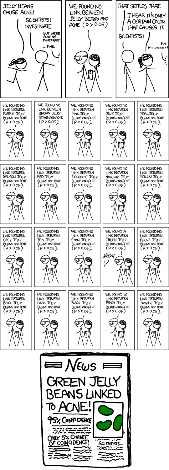
significant

The danger of attributing false significance isn’t limited to statistical data.

Consider Vinson Cerf’s Freedom and the Social Contract in the most recent issue of CACM.

Vinson writes in discussing privacy versus the need for security:

In today’s world, threats to our safety and threats to national security come from many directions and not all or even many of them originate from state actors. If I can use the term “cyber-safety” to suggest safety while making use of the content and tools of the Internet, World Wide Web, and computing devices in general, it seems fair to say the expansion of these services and systems has been accompanied by a growth in their abuse. Moreover, it has been frequently observed that there is an asymmetry in the degree of abuse and harm that individuals can perpetrate on citizens, and on the varied infrastructure of our society. Vast harm and damage may be inflicted with only modest investment in resources. Whether we speak of damage and harm using computer-based tools or damage from lethal, homemade explosives, the asymmetry is apparent. While there remain serious potential threats to the well-being of citizens from entities we call nation- states, there are similarly serious potential threats originating with individuals and small groups.

None of which is false and the reader with a vague sense that some “we” is in danger from known and unknown actors.

To what degree? Unknown. Of what harm? Unknown. Chances of success? Unknown. Personal level of danger? Unknown.

What we do know is that on September 11, 2001, approximately 3,000 people died. Twelve years ago.

Deaths from medical misadventure are estimated to be 98,000 per year.

12 X 98,000 = 1,176,000 or 392 9/11 attack death totals.

Deaths due to medical misadventure are not known accurately but the overall comparison is a valid one.

Your odds of dying from medical misadventure are far higher than dying from a terrorist attack.

But, Vinson doesn’t warn you against death by medical misadventure. Instead you are warned there is some vague, even nebulous individuals or groups that seek to do you harm.

An unknown degree of harm. With some unknown rate of incidence.

And that position is to be taken seriously in a debate over privacy?

Most terrorism warnings are too vague for meaningful policy debate.
September 11, 2013

Twitter Data Analytics

Filed under: Data Analysis,Social Media,Tweets — Patrick Durusau @ 5:13 pm

Twitter Data Analytics by Shamanth Kumar, Fred Morstatter, and Huan Liu.

From the webpage:

Social media has become a major platform for information sharing. Due to its openness in sharing data, Twitter is a prime example of social media in which researchers can verify their hypotheses, and practitioners can mine interesting patterns and build realworld applications. This book takes a reader through the process of harnessing Twitter data to find answers to intriguing questions. We begin with an introduction to the process of collecting data through Twitter’s APIs and proceed to discuss strategies for curating large datasets. We then guide the reader through the process of visualizing Twitter data with realworld examples, present challenges and complexities of building visual analytic tools, and provide strategies to address these issues. We show by example how some powerful measures can be computed using various Twitter data sources. This book is designed to provide researchers, practitioners, project managers, and graduate students new to the field with an entry point to jump start their endeavors. It also serves as a convenient reference for readers seasoned in Twitter data analysis.

Preprint with data set on analyzing Twitter data.

Although running a scant seventy-nine (79) pages, including an index, Twitter Data Analytics (TDA) covers:

Each chapter end with suggestions for further reading and references.

In addition to learning more about Twitter and its APIs, the reader will be introduced to MondoDB, JUNG and D3.

No mean accomplishment for seventy-nine (79) pages!

July 20, 2013

Python for Data Analysis: The Landscape of Tutorials

Filed under: Data Analysis,Python — Patrick Durusau @ 12:59 pm

Python for Data Analysis: The Landscape of Tutorials by Abhijit Dasgupta.

From the post:

Python has been one of the premier general scripting languages, and a major web development language. Numerical and data analysis and scientific programming developed through the packages Numpy and Scipy, which, along with the visualization package Matplotlib formed the basis for an open-source alternative to Matlab. Numpy provided array objects, cross-language integration, linear algebra and other functionalities. Scipy adds to this and provides optimization, linear algebra, optimization, statistics and basic image analysis capabilities. Matplotlib provides sophisticated 2-D and basic 3-D graphics capabilities with Matlab-like syntax.

Python

Further recent development has resulted in a rather complete stack for data manipulation and analysis, that includes Sympy for symbolic mathematics, pandas for data structures and analysis, and IPython as an enhanced console and HTML notebook that also facilitates parallel computation.

An even richer data analysis ecosystem is quickly evolving in Python, led by Enthought and Continuum Analytics and several other independent and associated efforts. We have described this ecosystem here. [“ecosystem” and “here” are two distinct links.]

(…)

A very impressive listing of tutorials on Python packages for data analysis.

June 28, 2013

Basic Interactive Unix for Data Processing

Filed under: Data Analysis — Patrick Durusau @ 2:25 pm

Basic Interactive Unix for Data Processing

Abstract:

For most types of “conversational” data analysis problems, using Unix tools interactively is a superior alternative to downloading data files into a spreadsheet application (e.g. Excel) or writing one-shot custom scripts. The technique is to use combinations of standard Unix tools (and a very small number of general purpose Python scripts). This allows one to accomplish much more than might seem possible, especially with tabular data.

A reminder that not all data analysis requires you to pull out an app.

June 17, 2013

ADA* – Astronomical Data Analysis

Filed under: Astroinformatics,BigData,Data Analysis — Patrick Durusau @ 2:27 pm

From the conference page:

Held regularly since 2001, the ADA conference series is focused on algorithms and information extraction from astrophysics data sets. The program includes keynote, invited and contributed talks, as well as posters. This conference series has been characterized by a range of innovative themes, including curvelet transforms, compressed sensing and clustering in cosmology, while at the same time remaining closely linked to front-line open problems and issues in astrophysics and cosmology.

ADA6 2010

ADA7 2011

Online presentations, papers, proposals, etc.

Astronomy – Home of really big data!

« Newer PostsOlder Posts »

Powered by WordPress