Another Word For It Patrick Durusau on Topic Maps and Semantic Diversity

June 15, 2013

Upcoming Data Viz Contests, Summer 2013

Filed under: Graphics,Visualization — Patrick Durusau @ 12:54 pm

Upcoming Data Viz Contests, Summer 2013 by Ben Jones.

Ben has a list of five (5) data visualization contests for the summer, with prizes ranging from TBA/registration to $9,000.00.

Would be good PR and some summer cash!

Visit Ben’s post for the details.

June 13, 2013

Visual Data Web

Filed under: Graphics,Semantic Web,Visualization — Patrick Durusau @ 12:37 pm

Visual Data Web

From the website:

This website provides an overview of our attempts to a more visual Data Web.

The term Data Web refers to the evolution of a mainly document-centric Web toward a more data-oriented Web. In its narrow sense, the term describes pragmatic approaches of the Semantic Web, such as RDF and Linked Data. In a broader sense, it also includes less formal data structures, such as microformats, microdata, tagging, and folksonomies.

The term Visual Data Web reflects our goal of making the Data Web visually more experienceable, also for average Web users with little to no knowledge about the underlying technologies. This website presents developments, related publications, and current activities to generate new ideas, methods, and tools that help making the Data Web easier accessible, more visible, and thus more attractive.

The recent NSA scandal underlined the smallness of “web scale.” The NSA data was orders of magnitude greater than “web scale.”

Still, experimenting with visualization, even on “web scale” data, may lead to important lessons on visualization.

I first saw this in a tweet by Stian Danenbarger.

June 12, 2013

For Example

Filed under: D3,Graphics,Visualization — Patrick Durusau @ 1:55 pm

For Example by Mike Bostock.

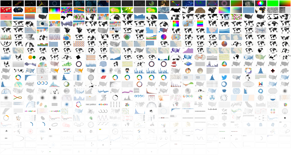
Montage

I am a big fan of examples. Not a surprise, right? If you follow me on Twitter, or my projects over the last few years (or asked D3 questions on Stack Overflow), you’ve likely seen some of my example visualizations, maps and explanations.

I use examples so often that I created bl.ocks.org to make it easier for me to share them. It lets you quickly post code and share examples with a short URL. Your code is displayed below; it’s view source by default. And it’s backed by GitHub Gist, so examples have a git repository for version control, and are forkable, cloneable and commentable.

I initially conceived this talk as an excuse to show all my examples. But with more than 600, I’d have only 4.5 seconds per slide. A bit overwhelming. So instead I’ve picked a few favorites that I hope you’ll enjoy. You should find this talk entertaining, even if it fails to be insightful.

This talk does have a point, though. Examples are lightweight and informal; they can often be made in a few minutes; they lack the ceremony of polished graphics or official tools. Yet examples are a powerful medium of communication that is capable of expressing big ideas with immediate impact. And Eyeo is a unique opportunity for me to talk directly to all of you that are doing amazing things with code, data and visualization. So, if I can accomplish one thing here, it should be to get you to share more examples. In short, to share my love of examples with you.

Mike’s post is full of excellent D3 graphics. You owe it to yourself to review all of them in full.

I first saw this at Nat Torkington’s Four short links: 11 June 2013.

June 9, 2013

OpenVis Conf 2013 [Videos]

Filed under: Graphics,Visualization — Patrick Durusau @ 4:32 pm

OpenVis Conf 2013

Videos of the presentations at OpenVis 2013.

From the YouTube playlist:

We don’t have a Senator like Sam Ervin now so I am laying in a supply of course lectures and conference videos.

Pointers to other conference videos or lectures appreciated.

June 6, 2013

Population Growth and Climate Change (Hans Rosling)

Filed under: Graphics,Visualization — Patrick Durusau @ 2:12 pm

A good dose of Hans Rosling always inspires me to use clearer explanations.

Note: “Inspires,” I didn’t say I achieve clearer explanations.

I first saw this at Making Data tell a Story.

June 3, 2013

The 3 Vs of Big Data revisited: Venn diagrams and visualization

Filed under: Graphics,Venn Diagrams,Visualization — Patrick Durusau @ 1:21 pm

The 3 Vs of Big Data revisited: Venn diagrams and visualization by Vincent Granville.

From the post:

This discussion is about visualization. The three Vs of big data (volume, velocity, variety) or the three skills that make a data scientist (hacking, statistics, domain expertise) are typically visualized using a Venn diagram, representing all the potential 8 combinations through set intersections. In the case of big data, I believe (visualization, veracity, value) are more important than (volume, velocity, variety), but that’s another issue. Except that one of my Vs is visualization and all these Venn diagrams are visually wrong: the color at the intersection of two sets should be the blending of both colors of the parent sets, for easy interpretation and easy generalization to 4 or more sets. For instance, if we have three sets A, B, C painted respectively in red, green, blue, the intersection of A and B should be yellow, the intersection of the three should be white.

Sorry to disappoint fans of the “3 Vs of Big Data,” as Vincent points out there are at least six (6). (Probably more. Post your suggestions.)

It is a helpful review on Venn diagrams until Vincent says:

For most people, the brain has a hard time quickly processing more than 4 dimensions at once, and this should be kept in mind when producing visualizations. Beyond 5 dimensions, any additional dimension probably makes your visual less and less useful for value extraction, unless you are a real artist!

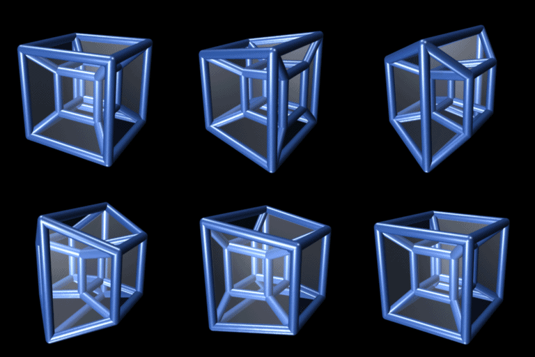
I don’t think four dimensions is going to be easy:

4dimension

3D projection of a tesseract undergoing a simple rotation in four dimensional space.

June 2, 2013

UK Income Tax and National Insurance

Filed under: Graphics,Marketing,Visualization — Patrick Durusau @ 8:53 am

http://www.youtube.com/watch?feature=player_embedded&v=C9ZMgG9NiUs

Now if I could just come up with the equivalent of this video for semantic diversity.

Suggestions?

I first saw this at Randy Krum’s Cool Infographics.

Stadtbilder — mapping the digital shape of cities [Dynamic Crime Maps?]

Filed under: Graphics,Visualization — Patrick Durusau @ 8:45 am

Stadtbilder — mapping the digital shape of cities by Moritz Stefaner.

From the post:

Stadtbilder (“city images”) is a new little side project of mine — an attempt to map the digital shape of cities. I am increasingly fascinated by the idea of mapping the “real world” — life and culture as opposed to just physical infrastructure — and when I learned about the really deep datasets Georgi from Uberblic had been collecting, I just had to work with the data.

The maps show an overlay of all the digitally marked “hotspots” in a city, such as restaurant, hotels, clubs, etc. collected from different service like yelp, or foursquare. What they don’t show are the streets, the railroads, the buildings. I wanted to to portray the living parts of the cities as opposed to the technical/physical infrastructure you usually see on maps.The only exception are the rivers and lakes, because I felt they help a lot in orienting on these fairly abstract maps.

Great graphics!

An idea with lots of possibilities!

The only mention of crime in Wikipedia for Atlanta, GA is:

Northwest Atlanta, marked by Atlanta’s poorest and most crime-ridden neighborhoods, has been the target of community outreach programs and economic development initiatives. (article with map)

As a matter of strict geographic description, that’s true, but not much help to a visitor.

More helpful would be a heat map of crime (by crime?) that changes color by the hour of the day on the local transit system (MARTA).

Is there an iPhone app for that?

I don’t have an iPhone so don’t keep up with it.

If you wanted to take that a step further, offer pictures of people wanted for crimes in particular areas.
May 28, 2013

The Charm of Being Small (4K)

Filed under: Graphics,Programming,Visualization — Patrick Durusau @ 10:51 am

white one – Making of

From the post:

white one is my first 4k intro and my first serious demoscene production (as far as something like that can be serious). I’m new to C coding and to sizecoding in particular, so there were a lot of things to be learned which I’ll try to summarize here. Download and run the executable (nvidia only, sorry) or watch the video capture first:

A 4k intro is a executable file of at most 4 kilobytes (4096 bytes) that generates video and audio. That is, it puts something moving on your screen and something audible on your speakers. The finished product runs for a few minutes, has some coherent theme and design and ideally, sound and visual effects complement each other. On top of that, it’s a technical challenge: It’s impossible to store 3D models, textures or sound samples in 4 kilobytes, so you have to generate these things at runtime if you need them.

Overwhelmed by the impossibility of all this I started messing around.

I had been lurking on a few demoparties, but never released anything nontrivial – i do know some OpenGL, but i am normally coding Lisp which tends to produce executables that are measured in megabytes. Obviously, that had to change if i wanted to contribute a small intro. Playing with the GL Shading Language had always been fun for me, so it was clear that something shader-heavy was the only option. And I had some experience with C from microcontroller hacking.

(…)

While researching visualizations I encountered this jewel.

Good summer fun and perhaps an incentive to have coding catch up with hardware.

Lots of hardware can make even poor code run acceptably, but imagine good code with lots of hardware.

BTW, as an additional resource, see: demoscene.info.

May 25, 2013

Data Visualization: Exploring Biodiversity

Filed under: Biodiversity,Biology,Graphics,Visualization — Patrick Durusau @ 4:42 pm

Data Visualization: Exploring Biodiversity by Sean Gonzalez.

From the post:

When you have a few hundred years worth of data on biological records, as the Smithsonian does, from journals to preserved specimens to field notes to sensor data, even the most diligently kept records don’t perfectly align over the years, and in some cases there is outright conflicting information. This data is important, it is our civilization’s best minds giving their all to capture and record the biological diversity of our planet. Unfortunately, as it stands today, if you or I were to decide we wanted to learn more, or if we wanted to research a specific species or subject, accessing and making sense of that data effectively becomes a career. Earlier this year an executive order was given which generally stated that federally funded research had to comply with certain data management rules, and the Smithsonian took that order to heart, event though it didn’t necessarily directly apply to them, and has embarked to make their treasure of information more easily accessible. This is a laudable goal, but how do we actually go about accomplishing this? Starting with digitized information, which is a challenge in and of itself, we have a real Big Data challenge, setting the stage for data visualization.

The Smithsonian has already gone a long way in curating their biodiversity data on the Biodiversity Heritage Library (BHL) website, where you can find ever increasing sources. However, we know this curation challenge can not be met by simply wrapping the data with a single structure or taxonomy. When we search and explore the BHL data we may not know precisely what we’re looking for, and we don’t want a scavenger hunt to ensue where we’re forced to find clues and hidden secrets in hopes of reaching our national treasure; maybe the Gates family can help us out…

People see relationships in the data differently, so when we go exploring one person may do better with a tree structure, others prefer a classic title/subject style search, or we may be interested in reference types and frequencies. Why we don’t think about it as one monolithic system is akin to discussing the number of Angels that fit on the head of a pin, we’ll never be able to test our theories. Our best course is to accept that we all dive into data from different perspectives, and we must therefore make available different methods of exploration.

What would you do beyond visualization?

May 22, 2013

Subway Maps and Visualising Social Equality

Filed under: Graphics,Mapping,Maps,Visualization — Patrick Durusau @ 6:45 pm

Subway Maps and Visualising Social Equality by James Chesire.

From the post:

Most government statistics are mapped according to official geographical units. Whilst such units are essential for data analysis and making decisions about, for example, government spending, they are hard for many people to relate to and they don’t particularly stand out on a map. This is why I tried a new method back in July 2012 to show life expectancy statistics in a fresh light by mapping them on to London Tube stations. The resulting ”Lives on the Line” map has been really popular with many people surprised at the extent of the variations in the data across London and also grateful for the way that it makes seemingly abstract statistics more easily accessible. To find out how I did it (and read some of the feedback) you can see here.

James gives a number of examples of the use of transportation lines making “abstract statistics more easily accessible.”

Worth a close look if you are interested in making dry municipal statistics part of the basis for social change.

May 21, 2013

The Art of Data Visualization

Filed under: Graphics,Visualization — Patrick Durusau @ 7:25 am

Series of short clips on data visualization.

Quite good even if very broad and general.

Tufte closes with the thought that we “see to confirm,” as less taxing on the brain. (Cf. Kahneman, “Thinking, Fast and Slow”)

Suggests that we need to “see to learn.”

I first saw this at spatial.ly.

May 19, 2013

Visual Storytelling – a thing of the past

Filed under: Graphics,Interface Research/Design,Visualization — Patrick Durusau @ 6:46 pm

Visual Storytelling – a thing of the past by Michel Guillet.

From the post:

I spent quite a few summer vacations as a kid getting dragged around Europe visiting castles and churches. It is definitely an experience that I’m more thankful for now than I was at the time. One of the things that I loved most, even as a child, was seeing the stained glass windows. I have strong memories of being in Notre Dame in Paris and watching the light come in at dawn or staring at the Chartres Cathedral windows for minutes without moving.

Chartres

As a boy, it wasn’t the history, the architecture or an admiration of the faith involved to build these churches. Those were concepts beyond my ability, knowledge or frankly interest at the time. What I have come to realize only in the past couple of years is that the windows were meant for me. At the base level, I needed something that could grab my attention and hold it. What I have discovered is that from this standpoint, I am no different than the illiterate masses of the Middle Ages or Renaissance. (emphasis in original)

Michel proceeds to make the art of Chartres Cathedral a lesson in data visualization and graphic presentation.

A very powerful lesson.

Does your interface treat communication with users as important?

6 Golden Rules to Successful Dashboard Design

Filed under: Dashboard,Graphics,Interface Research/Design,Visualization — Patrick Durusau @ 3:40 pm

6 Golden Rules to Successful Dashboard Design

From the article:

Dashboards are often created on-the-fly with data being added simply because there is some white space not being used. Different people in the company ask for different data to be displayed and soon the dashboard becomes hard to read and full of meaningless non-related information. When this happens, the dashboard is no longer useful.

This article discusses the steps that need to be taken during the design phase in order to create a useful and actionable dashboard.

Topic maps can be expressed as dashboards as well as other types of interfaces.

Whatever your interface, it needs to be driven by good design principles.

Visualizing your LinkedIn graph using Gephi (Parts 1 & 2)

Filed under: Gephi,Graphics,Networks,Social Networks,Visualization — Patrick Durusau @ 1:41 pm

Visualizing your LinkedIn graph using Gephi – Part 1

&

Visualizing your LinkedIn graph using Gephi – Part 2

by Thomas Cabrol.

From part 1:

Graph analysis becomes a key component of data science. A lot of things can be modeled as graphs, but social networks are really one of the most obvious examples.

In this post, I am going to show how one could visualize its own LinkedIn graph, using the LinkedIn API and Gephi, a very nice software for working on this type of data. If you don’t have it yet, just go to http://gephi.org/ and download it now !

My objective is to simply look at my connections (the “nodes” or “vertices” of the graph), see how they relate to each other (the “edges”) and find clusters of strongly connected users (“communities”). This is somewhat emulating what is available already in the InMaps data product, but, hey, this is cool to do it by ourselves, no ?

The first thing to do for running this graph analysis is to be able to query LinkedIn via its API. You really don’t want to get the data by hand… The API uses the oauth authentification protocol, which will let an application make queries on behalf of a user. So go to https://www.linkedin.com/secure/developer and register a new application. Fill the form as required, and in the OAuth part, use this redirect URL for instance:

Great introduction to Gephi!

As a bonus, reinforces the lesson that ETL isn’t required to re-use data.

ETL may be required in some cases but in a world of data APIs those are getting fewer and fewer.

Think of it this way: Non-ETL data access means someone else is paying for maintenance, backups, hardware, etc.

How much of your IT budget is supporting duplicated data?

May 18, 2013

Dumb Jocks?

Filed under: Graphics,Visualization — Patrick Durusau @ 10:46 am

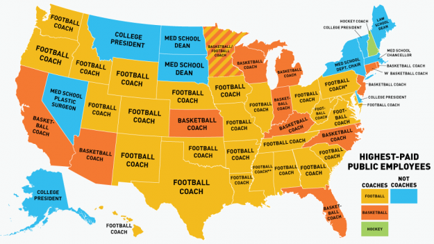
Coaches are highest paid public employees by Nathan Yau.

Coach payments

Nathan makes another amazing find!

The topic map lesson here is effective presentation of information.

For the same data, the Obama Administration would list all U.S. public employees in order by internal department names and separately list positions with salaries, in a PDF file.

I know which strategy I prefer.

You?

May 14, 2013

Binify + D3 = Gorgeous honeycomb maps

Filed under: D3,Graphics,Maps,Visualization — Patrick Durusau @ 2:42 pm

Binify + D3 = Gorgeous honeycomb maps by Chris Wilson.

From the post:

Most Americans prefer to huddle together around urban areas, which raises all sorts of problems for map-based visualizations. Coloring regions according to a data value, known as a choropleth map, leaves the map maker beholden to arbitrary political boundaries and, at the county level, pixel-wide polygons in parts of the Northeast. Many publications prefer to place dots proportional in area to the data values over the center of each county, which inevitably produces overlapping circles in these same congested regions. Here’s a particularly atrocious example of that strategy I once made at Slate:

Slate map

Two weeks ago, Kevin Schaul released an exciting new command-line tool called binify that offers a brilliant alternative. Schaul’s tool takes a series of points and clusters them (or “bins” them) into hexagonal tiles. Check out the introductory blog post on his site.

Binify operates on .shp files, which can be a bit difficult to work with for those of us who aren’t GIS pros. I put together this tutorial to demonstrate how you can take a raw series of coordinates and end up with a binned hexagonal map rendered in the browser using d3js and topojson, both courtesy of the beautiful mind of Mike Bostock. All the source files we’ll need are on Github.

I think everyone will agree with Chris, that is truly an ugly map. 😉

Chris’ post takes you through how to make a much better one.

May 13, 2013

Motif Simplification…[Simplifying Graphs]

Filed under: Graphics,Graphs,Interface Research/Design,Networks,Visualization — Patrick Durusau @ 3:22 pm

Motif Simplification: Improving Network Visualization Readability with Fan, Connector, and Clique Glyphs by Cody Dunne and Ben Shneiderman.

Abstract:

Analyzing networks involves understanding the complex relationships between entities, as well as any attributes they may have. The widely used node-link diagrams excel at this task, but many are difficult to extract meaning from because of the inherent complexity of the relationships and limited screen space. To help address this problem we introduce a technique called motif simplification, in which common patterns of nodes and links are replaced with compact and meaningful glyphs. Well-designed glyphs have several benefits: they (1) require less screen space and layout effort, (2) are easier to understand in the context of the network, (3) can reveal otherwise hidden relationships, and (4) preserve as much underlying information as possible. We tackle three frequently occurring and high-payoff motifs: fans of nodes with a single neighbor, connectors that link a set of anchor nodes, and cliques of completely connected nodes. We contribute design guidelines for motif glyphs; example glyphs for the fan, connector, and clique motifs; algorithms for detecting these motifs; a free and open source reference implementation; and results from a controlled study of 36 participants that demonstrates the effectiveness of motif simplification.

When I read “replace,” “aggregation,” etc., I automatically think about merging in topic maps. 😉

After replacing “common patterns of nodes and links” I may still be interested in the original content of those nodes and links.

Or I may wish to partially unpack them based on some property in the original content.

Definitely a paper for a slow, deep read.

Not to mention research on the motifs in graph representations of your topic maps.

I first saw this in Visualization Papers at CHI 2013 by Enrico Bertini.

May 12, 2013

Visualization – HCIL – University of Maryland

Filed under: Graphics,Interface Research/Design,Visualization — Patrick Durusau @ 3:00 pm

Visualization – Human-Computer Interaction Lab – University of Maryland

From the webpage:

We believe that the future of user interfaces is in the direction of larger, information-abundant displays. With such designs, the worrisome flood of information can be turned into a productive river of knowledge. Our experience during the past eight years has been that visual query formulation and visual display of results can be combined with the successful strategies of direct manipulation. Human perceptual skills are are quite remarkable and largely underutilized in current information and computing systems. Based on this insight, we developed dynamic queries, starfield displays, treemaps, treebrowsers, zoomable user interfaces, and a variety of widgets to present, search, browse, filter, and compare rich information spaces.

There are many visual alternatives but the basic principle for browsing and searching might be summarized as the Visual Information Seeking Mantra: Overview first, zoom and filter, then details-on-demand. In several projects we rediscovered this principle and therefore wrote it down and highlighted it as a continuing reminder. If we can design systems with effective visual displays, direct manipulation interfaces, and dynamic queries then users will be able to responsibly and confidently take on even more ambitious tasks.

Projects and summaries of projects too numerous to list.

Working my way through them now.

Thought you might enjoy perusing the list for yourself.

Lots of very excellent work!

Evaluating the Efficiency of Physical Visualizations

Filed under: Graphics,Interface Research/Design,Visualization — Patrick Durusau @ 2:52 pm

Evaluating the Efficiency of Physical Visualizations by Yvonne Jansen, Pierre Dragicevic and Jean-Daniel Fekete.

Abstract:

Data sculptures are an increasingly popular form of physical visualization whose purposes are essentially artistic, communicative or educational. But can physical visualizations help carry out actual information visualization tasks? We present the first infovis study comparing physical to on-screen visualizations. We focus on 3D visualizations, as these are common among physical visualizations but known to be problematic on computers. Taking 3D bar charts as an example, we show that moving visualizations to the physical world can improve users’ efficiency at information retrieval tasks. In contrast, augmenting on-screen visualizations with stereoscopic rendering alone or with prop-based manipulation was of limited help. The efficiency of physical visualizations seems to stem from features that are unique to physical objects, such as their ability to be touched and their perfect visual realism. These findings provide empirical motivation for current research on fast digital fabrication and self-reconfiguring interfaces.

My first thought on reading this paper was a comparison of looking at a topographic map of an area and seeing it from the actual location.

May explain some of the disconnect between military planners looking at maps and troops looking at terrain.

I’m not current on the latest feedback research to simulate the sense of touch in VR.

Curious how good the simulation would need to be to approach the efficiency of physical visualizations?

While others struggle to deliver content to a 3″ to 5″ inch screen, you can work on the next generation of interfaces, which are as large as you can “see.”

I first saw this at: Visualization Papers at CHI 2013 by Enrico Bertini.

May 11, 2013

Weighted Graph Comparison Techniques…

Filed under: Graphics,Graphs,Interface Research/Design,Visualization — Patrick Durusau @ 4:23 pm

Weighted Graph Comparison Techniques for Brain Connectivity Analysis by Basak Alper, Benjamin Bach, Nathalie Henry Riche.

Abstract:

The analysis of brain connectivity is a vast field in neuroscience with a frequent use of visual representations and an increasing need for visual analysis tools. Based on an in-depth literature review and interviews with neuroscientists, we explore high-level brain connectivity analysis tasks that need to be supported by dedicated visual analysis tools. A significant example of such a task is the comparison of different connectivity data in the form of weighted graphs. Several approaches have been suggested for graph comparison within information visualization, but the comparison of weighted graphs has not been addressed. We explored the design space of applicable visual representations and present augmented adjacency matrix and node-link visualizations. To assess which representation best support weighted graph comparison tasks, we performed a controlled experiment. Our findings suggest that matrices support these tasks well, outperforming node-link diagrams. These results have significant implications for the design of brain connectivity analysis tools that require weighted graph comparisons. They can also inform the design of visual analysis tools in other domains, e.g. comparison of weighted social networks or biological pathways.

The study used only eleven (11) participants on tasks that are domain dependent, but the authors are to be lauded for noticing:

While weighted graphs are present in a plethora of domains: computer networks, social networks, biological pathways networks, air traffic networks, commercial trade net-works; very few tools currently exist to represent and compare them. As we used generic comparison tasks during the study, our results can also inform the design of general weighted graph comparison tools.

Rather than inventing yet another weighted graph comparison tool, the authors compared some of the options for visualizing a weighted graph with users.

Evidence based interface design?

I first saw this at: Visualization Papers at CHI 2013 by Enrico Bertini.

May 8, 2013

Spatially Visualize and Analyze Vast Data Stores…

Filed under: GIS,Graphics,Hadoop,Visualization — Patrick Durusau @ 2:39 pm

Spatially Visualize and Analyze Vast Data Stores with Esri’s GIS Tools for Hadoop

From the post:

Perhaps the greatest untapped IT resource available today is the ability to spatially analyze and visualize Big Data. As part of its continuing effort to expand the use of geographic information system (GIS) technology among web, mobile, and other developers, Esri has launched GIS Tools for Hadoop. The toolkit removes the obstacles of building map applications for developers to truly capitalize on geoenabling Big Data within Hadoop—the popular open source data management framework. Developers now will be able to answer the where questions in their large data stores.

“Hadoop’s method of processing volumes of information directly addresses the most significant challenge facing IT today,” says Marwa Mabrouk, product manager at Esri. “Enabling Hadoop with spatial capabilities is part of Esri’s continued effort to derive more value from Big Data through spatial analysis.”

Processing and displaying Big Data on maps requires functionality that core Hadoop lacks. GIS Tools for Hadoop extends the Hadoop platform with a series of libraries and utilities that connect Esri ArcGIS to the Hadoop environment. It allows ArcGIS users to export map data in HDFS format—Hadoop’s native file system—and intersect it with billions of records stored in Hadoop. Results can be either directly saved to the Hadoop database or reimported back to ArcGIS for higher-level geoprocessing and visualization.

GIS Tools for Hadoop includes the following:

  • Sample tools and templates that demonstrate the power of GIS
  • Spatial querying inside Hadoop using Hive—Hadoop’s ad hoc querying module
  • Geometry Library to build spatial applications in Hadoop

“GIS Tools for Hadoop not only introduces spatial analysis to Hadoop but creates a looping workflow that pulls Big Data into the ArcGIS environment,” says Mansour Raad, senior software architect at Esri. “It provides tools for Hadoop users who need to visualize Big Data on maps.”

Esri recognizes Big Data as a challenge that community-level involvement can help solve. As such, Esri provides GIS Tools for Hadoop as an open source product available on GitHub. Esri encourages users to download the toolkit, report issues, and actively contribute to improving the tools through the GitHub system.

To download GIS Tools for Hadoop, visit http://esri.github.com/gis-tools-for-hadoop.

Once you have where, your topic map can merge in who, what, why and how.

May 7, 2013

Filtergraph: A Web-based Data Visualization Application

Filed under: Graphics,Visualization — Patrick Durusau @ 3:31 pm

Filtergraph: A Web-based Data Visualization Application by Dan Burger.

From the post:

Datasets.

If you work in astronomy, chances are you have them.

They are hardly the romantic vision that you had when you decided to go into astronomy: staring through a telescope in the middle of nowhere, surrounded by the stillness of the night sky and the sound of crickets in every direction, and updating your status on Facebook every time you find a new exoplanet.

They are the kind that arrive in your inbox as an ASCII file with thousands of lines of data. How are you going to visualize and make sense of it? Sure, you could fire up IDL, read in the data, and issue some plotting commands. But what if you wanted to quickly filter the data according to various criteria across multiple variables? What if you need to do some transformations on the data and then visualize the result? What if you want to share these data with your collaborators for on-the-fly visualization and discussion, and not just keep forwarding that big ASCII file around?

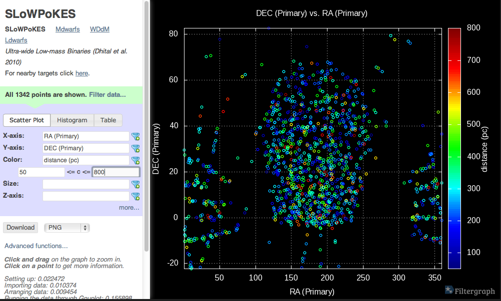
Filtergraph image

Fortunately for you there’s Filtergraph: a web application that allows you to upload data from your project and instantly generate a web portal that can build graphs and tables on-the-fly based on your dataset. Filtergraph can handle datasets of up to 3 million lines and is flexible enough to build sophisticated graphs from such large datasets in seconds. If you want to create a scatter plot of Teff versus flux, Filtergraph can do that. If you wanted something more complex, say, a scatter plot of Teff vs. log(flux), color-coded by [Fe/H] and symbol size scaled to the distance, for the stars that are between 8 and 18 hrs in RA. Filtergraph can do that as well, with just a few clicks. There is no need to write many lines of IDL code full of where commands.

I know you would have to hunt for an ASCII file of less than 3 million lines but they do exist. 😉

This could be a very “lite” way to share a dataset for visualization.

May 2, 2013

Why the Obsession with Tables?

Filed under: Census Data,Graphics,Tables,Visualization — Patrick Durusau @ 5:21 am

Why the Obsession with Tables? by Robert Kosara.

From the post:

Lots of data are still presented and released as tables. But why, when we know that visual representations are so much easier to read and understand? Eric Newburger from the U.S. Census Bureau has an interesting theory.

In a short talk on visualization at the Census Bureau, he describes how in the 1880s, the Census published maps and charts. Many of those are actually amazingly well done, even by today’s standards. But starting with 1890 census, they were replaced with tables.

This, according to Newburger, was due to an important innovation: the Hollerith Tabulating Machine. The new machines were much faster and could slice and dice the data in a lot of new ways, but their output ended up in tables. Throughout the 20th century, the Census created enormous amount of tables, with only a small fraction of the data shown as maps or charts.

Newburger argues that people don’t bother trying to read tables, whereas visualizations are much more likely to catch their attention and get them interested in the underlying data. We clearly have the means to create any visualization we want today, and there is plenty of data available, so why keep publishing tables? It’s a matter of the attitudes towards data, and these can be hard to change after more than 100 years:

Suggestions of images from maps and charts from the Census in the 1880s?

If the Hollerith Tabulating Machine is responsible for the default to tables, it is also responsible for spreadsheets?

Quicker for a machine to produce but less useful to an end user.

April 30, 2013

MindMup MapJs

Filed under: Graphics,JQuery,Mind Maps,Visualization — Patrick Durusau @ 10:53 am

MindMup MapJs

From the webpage:

MindMup is a zero-friction mind map canvas. Our aim is to create the most productive mind mapping environment out there, removing all the distractions and providing powerful editing shortcuts.

This git project is the JavaScript visualisation portion of MindMup. It provides a canvas for users to create and edit mind maps in a browser. You can see an example of this live on http://www.mindmup.com.

This project is relatively stand alone and you can use it to create a nice mind map visualisation separate from the MindMup Server.

Do see the live demo at: http://www.mindmup.com.

It may not fit your needs but it is a great demo of thoughful UI design. (At least to me.)

Could be quite useful if you like The Back of the Napkin : Solving Problems and Selling Ideas with Pictures by Dan Roam.

I recently started reading “The Back of the Napkin,” and will have more to report on it in a future post. So far, it has been quite a delight to read.

I first saw this at JQuery Rain under: MindMup MapJs : Zero Friction Mind Map Canvas with jQuery.

April 29, 2013

Atlas of Design

Filed under: Design,Graphics,Interface Research/Design,Mapping,Maps,Visualization — Patrick Durusau @ 2:01 pm

Atlas of Design by Caitlin Dempsey.

From the post:

Do you love beautiful maps? The Atlas of Design has been reprinted and is now available for purchase. Published by the North American Cartographic Information Society (NACIS), this compendium showcases cartography at some of its finest. The atlas was originally published in 2012 and features the work of 27 cartographers. In early 2012, a call for contributions was sent out and 140 entries from 90 different individuals and groups submitted their work. A panel of eight volunteer judges plus the book’s editors evaluated the entries and selected the finalists.

The focus of the Atlas of Design is on the aesthetics and design involved in mapmaking. Tim Wallace and Daniel Huffman, the editors of Atlas of Design explain the book’s introduction about the focus of the book:

Aesthetics separate workable maps from elegant ones.

This book is about the latter category.

My personal suspicion is that aesthetics separate legible topic maps from those that attract repeat users.

The only way to teach aesthetics (which varies by culture and social group) is by experience.

This is a great starting point for your aesthetics education.

April 24, 2013

So you want to look at a graph

Filed under: Graphics,Graphs,Visualization — Patrick Durusau @ 1:54 pm

So you want to look at a graph by email: Carlos Scheidegger.

From the post:

Say you are given a graph and are told: “Tell me everything that is interesting about this graph”. What do you do? We visualization folks like to believe that good pictures show much of what is interesting about data; this series of posts will carve a path from graph data to good graph plots. The path will take us mostly through well-known research results and techniques; the trick here is I will try to motivate the choices from first principles, or at least as close to it as I can manage.

One of the ideas I hope to get across is that, when designing a visualization, it pays to systematically consider the design space. Jock MacKinlay’s 1986 real breakthrough was not the technique for turning a relational schema into a drawing specification. It was the realization that this systematization was possible and desirable. That his technique was formal enough to be encoded in a computer program is great gravy, but the basic insight is deeper.

Of course, the theory and practice of visualization in general is not ready for a complete systematization, but there are portions ripe for the picking. In this series, I want to see what I can do about graph visualization.

If you like this introduction, be sure to follow the series to:

So you want to look at a graph, part 1

This series of posts is a tour through of the design space of graph visualization. As I promised, I will do my best to objectively justify as many visualization decisions as I can. This means we will have to go slow; I won’t even draw anything today! In this post, I will only take the very first step: all we will do is think about graphs, and what might be interesting about them.

So you want to look at a graph, part 2

This series of posts is a thorough examination of the design space of graph visualization (Intro, part 1). In the previous post, we talked about graphs and their properties. We will now talk about constraints arising from the process of transforming our data into a visualization.

So you want to look at a graph, part 3

This series of posts is a tour of the design space of graph visualization. I’ve written about graphs and their properties, and how the encoding of data into a visual representation is crucial. In this post, I will use those ideas to justify the choices behind a classic algorithm for laying out directed, mostly-acyclic graphs.

More posts are coming!

April 21, 2013

Abstract Maps For Powerful Impact

Filed under: Graphics,Maps,Visualization — Patrick Durusau @ 2:03 pm

Abstract Maps For Powerful Impact by Jim Vallandingham.

You can follow the abstraction, even from the bare slides.

Still, it is a slide deck that makes you wish for the video.

April 20, 2013

NodeXL HowTo

Filed under: Excel,Graphics,NodeXL,Visualization — Patrick Durusau @ 1:18 pm

Rolling out a “How-To” Software Series

A long preface that ends with a list of posts on “how to” use NodeXL.

Looks very good!

Enjoy!

April 14, 2013

Nozzle R Package

Filed under: Documentation,Graphics,R,Visualization — Patrick Durusau @ 3:29 pm

Nozzle R Package

From the webpage:

Nozzle is an R package for generation of reports in high-throughput data analysis pipelines. Nozzle reports are implemented in HTML, JavaScript, and Cascading Style Sheets (CSS), but developers do not need any knowledge of these technologies to work with Nozzle. Instead they can use a simple R API to design and implement powerful reports with advanced features such as foldable sections, zoomable figures, sortable tables, and supplementary information. Please cite our Bioinformatics paper if you are using Nozzle in your work.

I have only looked at the demo reports but this looks quite handy.

It doesn’t hurt to have extensive documentation to justify a conclusion that took you only moments to reach.

« Newer PostsOlder Posts »

Powered by WordPress