Another Word For It Patrick Durusau on Topic Maps and Semantic Diversity

October 10, 2013

Raw, a tool to turn spreadsheets to vector graphics

Filed under: Graphics,Spreadsheets,Visualization — Patrick Durusau @ 4:35 pm

Raw, a tool to turn spreadsheets to vector graphics by Nathan Yau.

From the post:

Sometimes it can be a challenge to produce data graphics in vector format, which is useful for high-resolution prints. Raw, an alpha-version tool by Density Design, helps make the process smoother.

As the description Nathan quotes says:

…it is a sketch tool, useful for quick and preliminary data explorations as well as for generating editable visualizations.

I’m comfortable with the idea of data explorations.

Makes it clear that no visualization is inherent in data but is a matter of choice.

October 9, 2013

Intro to D3 (Manu Kapoor)

Filed under: D3,Graphics,Visualization — Patrick Durusau @ 7:39 pm

Intro to D3 (Manu Kapoor)

Charles Iliya Krempeaux embeds a tutorial about D3 (visualization).

Not knowing D3 is a problem that can be corrected.

October 7, 2013

A DataViz Book Trifecta

Filed under: Graphics,Visualization — Patrick Durusau @ 2:58 pm

A DataViz Book Trifecta by Ben Jones.

Ben gives a quick overview of (and reason to read):

Creating More Effective Graphs – Naomi Robbins (2013)

The Functional Art – Alberto Cairo (2012)

Beautiful Visualization – Edited by Steele and Iliinsky (2010)

It’s never too early to start adding to your gift list. 😉

October 6, 2013

If it doesn’t work on mobile, it doesn’t work

Filed under: Graphics,Interface Research/Design,Topic Maps,Visualization — Patrick Durusau @ 7:30 pm

If it doesn’t work on mobile, it doesn’t work by Brian Boyer.

Brian’s notes from a presentation at Hacks/Hackers Buenos Aires last August.

The presentation is full of user survey results and statistics that are important for topic map interface designers.

At least if you want to be a successful topic map interface designer.

Curious, do you think consuming topic map based information will require a different interface from generic information consumption?

Reasoning that a consumer of information may not know or even care what technology underlies the presentation of desired information.

Would your response differ if I asked about authoring topic map content?

To simplify that question, let’s assume that we aren’t talking about a generic topic map authoring interface.

Say a baseball topic map authoring interface that accepts player’s name, positions, actions in games, etc., without exposing topic map machinery.

September 24, 2013

Data Visualization at IRSA

Filed under: Astroinformatics,Graphics,Visualization — Patrick Durusau @ 4:40 pm

Data Visualization at IRSA by Vandana Desai.

From the post:

The Infrared Science Archive (IRSA) is part of the Infrared Processing and Analysis Center (IPAC) at Caltech. We curate the science products of NASA’s infrared and submillimeter missions, including Spitzer, WISE, Planck, 2MASS, and IRAS. In total, IRSA provides access to more than 20 billion astronomical measurements, including all-sky coverage in 20 bands, spanning wavelengths from 1 micron to 10 mm.

One of our core goals is to enable optimal scientific exploitation of these data sets by astronomers. Many of you already use IRSA; approximately 10% of all refereed astronomical journal articles cite data sets curated by IRSA. However, you may be unaware of our most recent visualization tools. We provide some of the highlights below. Whether you are a new or experienced user, we encourage you to try them out at irsa.ipac.caltech.edu.

Vandana reviews a number of new visualization features and points out additional education resources.

Even if you aren’t an astronomy buff, the tools and techniques here may inspire a new approach to your data.

Not to mention being a good example of data that is too large to move. Astronomers have been developing answers to that problem for more than a decade.

Might have some lessons for dealing with big data sets.

September 12, 2013

Essential Collection of Visualisation Resources

Filed under: Data Mining,Graphics,Visualization — Patrick Durusau @ 3:27 pm

Essential Collection of Visualisation Resources by Andy Kirk.

The categories are:

Some of the resources you will have seen before but this site comes as close to being “essential” as any I have seen for visualization resources.

If you discover new or improved visualization resources, do us all a favor and send Andy a note.

September 10, 2013

Paperscape

Filed under: Bibliography,Graphics,Interface Research/Design,Visualization — Patrick Durusau @ 2:55 am

Paperscape

A mapping of papers from arXiv.

I had to “zoom in” a fair amount to get a useful view of the map. Choosing any paper displays its bibliographic information with links to that paper.

Quite clever but I can’t help but think of what a more granular map might offer.

More “granular” in the sense of going below the document level to terms/concepts in each paper and locating them in a stream of discussion by different authors.

Akin to the typical “review” article that traces particular ideas through a series of publications.

But in any event, I commend Paperscape to you as a very clever bit of work.

I first saw this in Nat Torkington’s Four short links: 9 September 2013.

August 31, 2013

The PieMaster

Filed under: Graphics,Humor — Patrick Durusau @ 4:08 pm

pie chart

Just too bizarre to pass on re-posting.

I found this and other material suitable for training students what not to do, at: WTF Visualizations.

August 28, 2013

A Set of Hadoop-related Icons

Filed under: Graphics,Hadoop — Patrick Durusau @ 6:56 pm

A Set of Hadoop-related Icons by Marc Holmes.

From the post:

The best architecture diagrams are those that impart the intended knowledge with maximum efficiency and minimum ambiguity. But sometimes there’s a need to add a little pizazz, and maybe even draw a picture or two for those Powerpoint moments.

Marc introduces a small set of Hadoop-related icons.

It will be interesting to see if these icons catch on as the defaults for Hadoop-related presentations.

Would be nice to have something similar for topic maps, if there are any artistic topic mappers in the audience.

August 16, 2013

BirdWatch v0.2…

Filed under: Graphics,Tweets,Visualization — Patrick Durusau @ 4:17 pm

BirdWatch v0.2: Tweet Stream Analysis with AngularJS, ElasticSearch and Play Framework by Matthias Nehlsen.

From the post:

I am happy to get a huge update of the BirdWatch application out of the way. The changes are much more than what I would normally want to work on for a single article, but then again there is enough interesting stuff going on in this new version for multiple blog articles to come. Initially this application was only meant to be an exercise in streaming information to web clients. But in the meantime I have noticed that this application can be useful and interesting beyond being a mere learning exercise. Let me explain what it has evolved to:

BirdWatch is an open-source real-time tweet search engine for a defined area of interest. I am running a public instance of this for software engineering related tweets. The application subscribes to all Tweets containing at least one out of a set of terms (such as AngularJS, Java, JavaScript, MongoDB, Python, Scala, …). The application receives all those tweets immediately through the Twitter Streaming API. The limitation here is that the delivery is capped to one percent of all Tweets. This is plenty for a well defined area of interest, considering that Twitter processes more than 400 million tweets per day.

Just watching the public feed is amusing.

As Matthias says, there is a lot more that could be done with the incoming feed.

For some well defined area, you could be streaming the latest tweets on particular subjects or even who to follow, after you have harvested enough tweets.

See the project at GIthub.

Dynamic Simplification

Filed under: Graphics,Subject Identity,Topic Maps,Visualization — Patrick Durusau @ 3:18 pm

Dynamic Simplification by Mike Bostock.

From the post:

A combination of the map zooming and dynamic simplification demonstrations: as the map zooms in and out, the simplification area threshold is adjusted so that it is always appropriate to the current scale. Thus, the map looks good and renders quickly at all points during the animation.

While d3.js is the secret sauce here, I am posting this for the notion of “dynamic simplification.”

What if the presentation of a topic map were to use “dynamic simplification?”

Say that I have a topic map with topics for all the tweets on some major event. (Lady Gaga’s latest video (NSFW) for example.

The number of tweets for some locations would display as a mass of dots. Not terribly informative.

If on the other hand, from say a country wide perspective, the tweets were displayed as a solid form and only on zooming in did they become distinguished (looking to see if Dick Cheney tweeted about it), that would be more useful.

Or at least more useful for some use cases.

The Dynamic Simplification demo is part of a large collection of amazing visuals you will find at: http://bl.ocks.org/mbostock.

August 12, 2013

Photographic Proof of a Subject?

Filed under: Graphics,Image Processing — Patrick Durusau @ 2:36 pm

Digitial photography brought photo manipulation within the reach of anyone with a computer. Not to mention lots of free publicity for Adobe’s Photoshop, as in the term photoshopping.

New ways to detect photoshopping are being developed.

Abstract:

We describe a geometric technique to detect physically inconsistent arrangements of shadows in an image. This technique combines multiple constraints from cast and attached shadows to constrain the projected location of a point light source. The consistency of the shadows is posed as a linear programming problem. A feasible solution indicates that the collection of shadows is physically plausible, while a failure to find a solution provides evidence of photo tampering. (Eric Kee, James F. O’Brien, and Hany Farid. “Exposing Photo Manipulation with Inconsistent Shadows“. ACM Transactions on Graphics, 32(4):28:1–12, September 2013. Presented at SIGGRAPH 2013.)

If your experience has been with “photoshopped” images of political candidates and obvious “gag” photos, consider that photo manipulation has a darker side:

Recent advances in computational photography, computer vision, and computer graphics allow for the creation of visually compelling photographic fakes. The resulting undermining of trust in photographs impacts law enforcement, national security, the media, advertising, e-commerce, and more. The nascent field of photo forensics has emerged to help restore some trust in digital photographs [Farid 2009] (from the introduction)

Beyond simple provenance, it could be useful to establish and associate with a photograph, analysis that supports its authenticity.

Exposing Photo Manipulation with Inconsistent Shadows. Webpage with extra resources.

Paper.

In case you had doubts, the technique is used by the authors to prove the Apollo lunar landing photo is not a fake.

PS: If images are now easy to use to misrepresent information, how much easier is it for textual data to be manipulated?

Thinking of those click-boxes, “yes, I agree to the terms of ….” on most websites.

August 11, 2013

Freely Available Images

Filed under: Graphics — Patrick Durusau @ 6:56 pm

A brief guide to the best sites for finding freely available images online

From the post:

I’m currently running a 23 Things self-directed learning programme at my University. One of the Things we just covered is Creative Commons images, and the best places to find them. I have a whole bunch of useful sites I draw people’s attentions to in the Presentations Skills course I run, so shared them all via the 23 Things blog – it got a lot of RTs when I tweeted about it, so as people found it so useful I thought I’d share it here. Finding good quality images is absolutely critical to pretty much all forms of marketing, after all!

If you want to avoid Death by PowerPoint presentations or to spruce up your blog posts, images are a necessity.

But searching the web randomly for safe (legally speaking) images to use may take more than a little time and effort.

The resources listed here are good sources for freely available images.

Don’t depend on obscurity to avoid image permission problems. That could be real embarrassing with a former prospective client.

I first saw this in Christophe Lalanne’s A bag of tweets / July 2013.

August 9, 2013

Counting Citations in U.S. Law

Filed under: Graphics,Law,Law - Sources,Visualization — Patrick Durusau @ 3:17 pm

Counting Citations in U.S. Law by Gary Sieling.

From the post:

The U.S. Congress recently released a series of XML documents containing U.S. Laws. The structure of these documents allow us to find which sections of the law are most commonly cited. Examining which citations occur most frequently allows us to see what Congress has spent the most time thinking about.

Citations occur for many reasons: a justification for addition or omission in subsequent laws, clarifications, or amendments, or repeals. As we might expect, the most commonly cited sections involve the IRS (Income Taxes, specifically), Social Security, and Military Procurement.

To arrive at this result, we must first see how U.S. Code is laid out. The laws are divided into a hierarchy of units, which allows anything from an entire title to individual sentences to cited. These sections have an ID and an identifier – “identifier” is used an an citation reference within the XML documents, and has a different form from the citations used by the legal community, comes in a form like “25 USC Chapter 21 § 1901″.

If you are interested in some moderate XML data processing, this is the project for you!

Gary has posted the code for developing a citation index to the U.S. Laws in XML.

If you want to skip to one great result of this effort, see: Visualizing Citations in U.S. Law, also by Gary, which is based on d3.js and Uber Data visualization.

In the “Visualizing” post Gary enables the reader to see what laws (by title) cite other titles in U.S. law.

More interesting that you would think.

Take Title 26, Internal Revenue Code (IRC).

Among others, the IRC does not cite:

Title 30 – MINERAL LANDS AND MINING
Title 31 – MONEY AND FINANCE
Title 32 – NATIONAL GUARD

I can understand not citing the NATIONAL GUARD but MONEY AND FINANCE?

Looking forward to more ways to explore the U.S. Laws.

Tying legislative history of laws to say New York Times stories on the subject matter of a law could prove to be very interesting.

I started to suggest tracking donations to particular sponsors and then to legislation that benefits the donors.

But that level of detail is just a distraction. Most elected officials have no shame at selling their offices. Documenting their behavior may regularize pricing of senators and representatives but not have much other impact.

I suggest you find a button other than truth to influence their actions.
August 4, 2013

Server-side clustering of geo-points…

Server-side clustering of geo-points on a map using Elasticsearch by Gianluca Ortelli.

From the post:

Plotting markers on a map is easy using the tooling that is readily available. However, what if you want to add a large number of markers to a map when building a search interface? The problem is that things start to clutter and it’s hard to view the results. The solution is to group results together into one marker. You can do that on the client using client-side scripting, but as the number of results grows, this might not be the best option from a performance perspective.

This blog post describes how to do server-side clustering of those markers, combining them into one marker (preferably with a counter indicating the number of grouped results). It provides a solution to the “too many markers” problem with an Elasticsearch facet.

The Problem

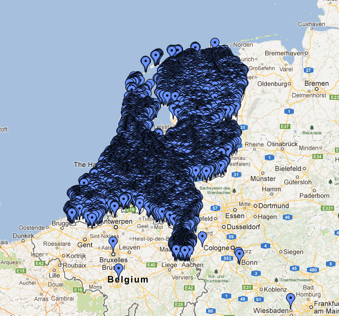
The image below renders quite well the problem we were facing in a project:

clustering

The mass of markers is so dense that it replicates the shape of the Netherlands! These items represent monuments and other things of general interest in the Netherlands; for an application we developed for a customer we need to manage about 200,000 of them and they are especially concentrated in the cities, as you can see in this case in Amsterdam: The “draw everything” strategy doesn’t help much here.

Server-side clustering of geo-points will be useful for representing dense geo-points.

Such as an Interactive Surveillance Map.

Or if you were building a map of police and security force sightings over multiple days to build up a pattern database.

July 28, 2013

Death & Taxes 2014 Poster and Interview

Filed under: Graphics,Visualization — Patrick Durusau @ 2:44 pm

Death and Taxes by Randy Krum.

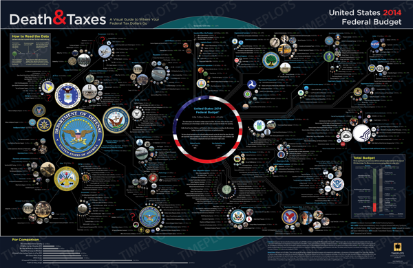
The new 2014 Death & Taxes poster has been released, and it is fantastic! Visualizing the President’s proposed budget for next year, each department and major expense item is represented with proportionally sized circles so the viewer can understand how big they are in comparison to the rest of the budget.

You can purchase the 24” x 36” printed poster for $24.95.

Great poster, even if I disagree with some of the arrangement of agencies. Homeland Security, for example, should be grouped with the military on the left side of the poster.

If you are an interactive graphics type, it would be really cool to have sliders for the agency budgets and display the agency results for changes.

Say we took 30 $Billion from the Department of Homeland Security and gave it to NASA. What space projects, funding for scientific research, rebuilding of higher education would that shift fund?

I’m not sure how you would graphically represent fewer delays at airports, no groping of children (no TSA), etc.

Also interesting from a subject identity perspective.

Identifying specific programs can be done by budget numbers, for example.

But here the question would be: How much funding results in program N being included in the “potentially” funded set of programs?

Unless every request is funded, there would have to be a ranking of requests against some fixed budget allocation.

Another aspect of Steve Pepper’s question concerning types being a binary choice in the current topic map model.

Very few real world choices, or should I say the basis for real world choices, are ever that clear.

July 25, 2013

Made with D3.js

Filed under: D3,Graphics,Visualization — Patrick Durusau @ 1:20 pm

Made with D3.js Curated by Scott Murray.

From the webpage:

This gallery showcases a range of projects made with D3, arguably the most powerful JavaScript library for making visualizations on the web. Unlike many other software packages, D3 has a broad, interdisciplinary appeal. Released officially only in 2011, D3 has quickly been adopted as a tool of choice by practitioners creating interactive visualizations to be published on the web. And since D3 uses only JavaScript and web standards built into every current browser, no plug-ins are needed, and projects will typically run well on mobile devices. It can be used for dry quantitative charts, of course, but D3 really shines for custom work. Here is a selection work that shows off some of D3’s strengths.

Examples of the capabilities of D3.js.

These images may not accurately reflect your level of artistic talent.

July 23, 2013

imMens:… [pre-computed data projections/data tiles]

Filed under: BigData,Graphics,Visualization — Patrick Durusau @ 1:50 pm

imMens: Real-Time Interactive Visual Exploration of Big Data by Zhicheng Liu.

From the post:

Interactive visualization of large datasets is key in making big data technologies accessible to a wide range of data users. However, as datasets expand in size, they challenge traditional methods of interactive visual analysis, forcing data analysts and enthusiasts to spend more time on “data munging” and less time on analysis. Or to abandon certain analyses altogether.

At the Stanford Visualization Group, as part of the Intel Science and Technology Center for Big Data, we are developing imMens, a system that enables real-time interaction of billion+ element databases by using scalable visual summaries. The scalable visual representations are based on binned aggregation and support a variety of data types: ordinal, numeric, temporal and geographic. To achieve interactive brushing & linking between the visualizations, imMens precomputes multivariate data projections and stores these as data tiles. The browser-based front-end dynamically loads appropriate data tiles and uses WebGL to perform data processing and rendering on the GPU.

The first challenge we faced in designing imMens was how to make visualizations with a huge number of data points interpretable. Over-plotting is a typical problem even with thousands of data points. We considered various data reduction techniques. Sampling, for example, picks a subset of the data, but is still prone to visual cluttering. More importantly, sampling can miss interesting patterns and outliers. Another idea is binned aggregation: we define bins over each dimension, count the number of data points falling within each bin, and then visualize the density of data distribution using histograms or heatmaps. Binned aggregation can give a complete overview of the data without omitting local features such as outliers.

(…)

If you want to know more about imMens, we encourage you to visit the project website, which showcases our EuroVis ’13 paper, video and online demos.

imMens will be released on Github soon. Stay tuned!

Bearing in mind these are pre-computed data tiles along only a few projections, the video is still a rocking demonstration of interactivity.

Or to put it another way, the interactivity is “real-time” but the data processing to support the interactivity is not.

Not a criticism but an observation. An observation that should make you ask which data projections have been computed and which one have not been computed.

The answers you get and their reliability will depend upon choices that were made and data that was omitted and so not displayed by the interface.

Still, the video makes me wonder about interactive merging would be like, along a similar number of axes?

Are pre-computed data projections in your topic map future?

July 19, 2013

Designing Topic Map Languages

Filed under: Crowd Sourcing,Graphics,Visualization — Patrick Durusau @ 2:00 pm

A graphical language for explaining, discussing, planning topic maps has come up before. But no proposal has ever caught on.

I encountered a paper today that describes how to author a notation language with a 300% increase in semantic transparency for novices and a reduction of interpretation errors by a factor of 5.

Interested?

Visual Notation Design 2.0: Designing UserComprehensible Diagramming Notations by Daniel L. Moody, Nicolas Genon, Patrick Heymans, Patrice Caire.

Designing notations that business stakeholders can understand is one of the most difficult practical problems and greatest research challenges in the IS field. The success of IS development depends critically on effective communication between developers and end users, yet empirical studies show that business stakeholders understand IS models very poorly. This paper proposes a radical new approach to designing diagramming notations that actively involves end users in the process. We use i*, one of the leading requirements engineering notations, to demonstrate the approach, but the same approach could be applied to any notation intended for communicating with non-experts. We present the results of 6 related empirical studies (4 experiments and 2 nonreactive studies) that conclusively show that novices consistently outperform experts in designing symbols that are comprehensible to novices. The differences are both statistically significant and practically meaningful, so have implications for IS theory and practice. Symbols designed by novices increased semantic transparency (their ability to be spontaneously interpreted by other novices) by almost 300% compared to the existing i* diagramming notation and reduced interpretation errors by a factor of 5. The results challenge the conventional wisdom about visual notation design, which has been accepted since the beginning of the IS field and is followed unquestioningly today by groups such as OMG: that it should be conducted by a small team of technical experts. Our research suggests that instead it should be conducted by large numbers of novices (members of the target audience). This approach is consistent with principles of Web 2.0, in that it harnesses the collective intelligence of end users and actively involves them as codevelopers (“prosumers”) in the notation design process rather than as passive consumers of the end product. The theoretical contribution of this paper is that it provides a way of empirically measuring the user comprehensibility of IS notations, which is quantitative and practical to apply. The practical contribution is that it describes (and empirically tests) a novel approach to developing user comprehensible IS notations, which is generalised and repeatable. We believe this approach has the potential to revolutionise the practice of IS diagramming notation design and change the way that groups like OMG operate in the future. It also has potential interdisciplinary implications, as diagramming notations are used in almost all disciplines.

This is a very exciting paper!

I thought the sliding scale from semantic transparency (mnemonic) to semantic opacity (conventional) to semantic perversity (false mnemonic) was particularly good.

Not to mention that their process is described in enough detail for others to use the same process.

For designing a Topic Map Graphical Language?

What about designing the next Topic Map Syntax?

We are going to be asking “novices” to author topic maps. Why not ask them to author the language?

And not just one language. A language for each major domain.

Talk about stealing the march on competing technologies!

July 16, 2013

Congressional Network Analysis

Filed under: D3,Government,Graphics,Visualization — Patrick Durusau @ 5:07 pm

Congressional Network Analysis by Christopher Roach.

From the post:

This page started out as a bit of code that I wrote for my network science talk at PyData 2013 (Silicon Valley). It was meant to serve as a simple example of how to apply some social network analysis techniques to a real world dataset. After the talk, I decided to get the code cleaned up a bit so that I could release it for anyone who had seen the talk, or just for anyone who happens to have a general interest in the topic. As I worked at cleaning the code up, I started adding a few little features here and there and started to think about how I could make the visualization easier to execute since Matplotlib can sometimes be a bit burdensome to install. The solution was to display the visualization in the browser. This way it could be viewed without needing to install a bunch of third-party Python libraries.

Quick Overview

The script that I created for the talk shows a social network of one of the houses for a specific session of Congress. The network is created by linking each member of Congress to other members with which they have worked on a at least one bill. The more bills the two members have worked on, the more intense the link is between the two in the visualization. In the browser-based visualization, you can change the size of the nodes relative to some network measure, by selecting the desired measure from the dropdown in the upper right corner of the visualization. Finally, unlike the script, the graph above only shows one network for the Senate of the 112th Congress. I chose this session specifically simply because it can be considered the most dysfunctional session of congress in our nation’s history and so I thought it might be an interesting session for us to study.

I think the title for “most dysfunctional session” of congress is up for grabs, again. 😉

But this is a great introduction to visualization with D3.js, along with appropriate warnings to not take the data at face value. Yes, the graph may seem to indicate a number of things but it is just a view of a snippet of data.

Christopher should get high marks for advocating skepticism in data analysis.

What is wrong with these charts?

Filed under: Charts,Graphics,Humor — Patrick Durusau @ 3:28 pm

What is wrong with these charts? by Nathan Yau.

If you pride yourself on spotting mistakes, Nathan Yau has a chart for you!

Pair up and visit Nathan’s post. See if you and a friend spot the same errors.

Suggest you repeat the exercise with your next presentation but tell the contestants the slides are from someone else. 😉

July 10, 2013

Visualizing Web Scale Geographic Data…

Filed under: Geographic Data,Geography,Graphics,Visualization — Patrick Durusau @ 2:22 pm

Visualizing Web Scale Geographic Data in the Browser in Real Time: A Meta Tutorial by Sean Murphy.

From the post:

Visualizing geographic data is a task many of us face in our jobs as data scientists. Often, we must visualize vast amounts of data (tens of thousands to millions of data points) and we need to do so in the browser in real time to ensure the widest-possible audience for our efforts and we often want to do this leveraging free and/or open software.

Luckily for us, Google offered a series of fascinating talks at this year’s (2013) IO that show one particular way of solving this problem. Even better, Google discusses all aspects of this problem: from cleaning the data at scale using legacy C++ code to providing low latency yet web-scale data storage and, finally, to rendering efficiently in the browser. Not surprisingly, Google’s approach highly leverages **alot** of Google’s technology stack but we won’t hold that against them.

(…)

Sean sets the background for two presentations:

All the Ships in the World: Visualizing Data with Google Cloud and Maps (36 minutes)

and,

Google Maps + HTML5 + Spatial Data Visualization: A Love Story (60 minutes) (source code: https://github.com/brendankenny)

Both are well worth your time.

July 7, 2013

wxHaskell

Filed under: Functional Programming,Graphics,Haskell — Patrick Durusau @ 3:21 pm

wxHaskell: A Portable and Concise GUI Library for Haskell by Daan Leijen.

Abstract:

wxHaskell is a graphical user interface (GUI) library for Haskell that is built on wxWidgets: a free industrial strength GUI library for C++ that has been ported to all major platforms, including Windows, Gtk, and MacOS X. In contrast with many other libraries, wxWidgets retains the native look-and-feel of each particular platform. We show how distinctive features of Haskell, like parametric polymorphism, higher-order functions, and first-class computations, can be used to present a concise and elegant monadic interface for portable GUI programs.

Complete your Haskell topic map app with a Haskell based GUI!

July 2, 2013

Data Visualization from Data to Discovery:…

Filed under: Graphics,Visualization — Patrick Durusau @ 10:56 am

Data Visualization from Data to Discovery: A One Day Symposium by Bruce Berriman.

From the post:

On May 23, 2o13, Caltech, JPL and the Art Center College of Design held a one-day symposium on Data Visualization from Data to Discovery, and the talks have recently been posted on YouTube. The thrust of this multidisciplinary conference was how to use new visualization techniques to mine massive data sets and extract maximal technical content from them.

See Bruce’s post for links to the videos on YouTube.

About what you would expect from Caltech and JPL….excellence!

Enjoy!

June 30, 2013

Nearest Stars to Earth (infographic)

Filed under: Astroinformatics,Graphics,Visualization — Patrick Durusau @ 1:30 pm

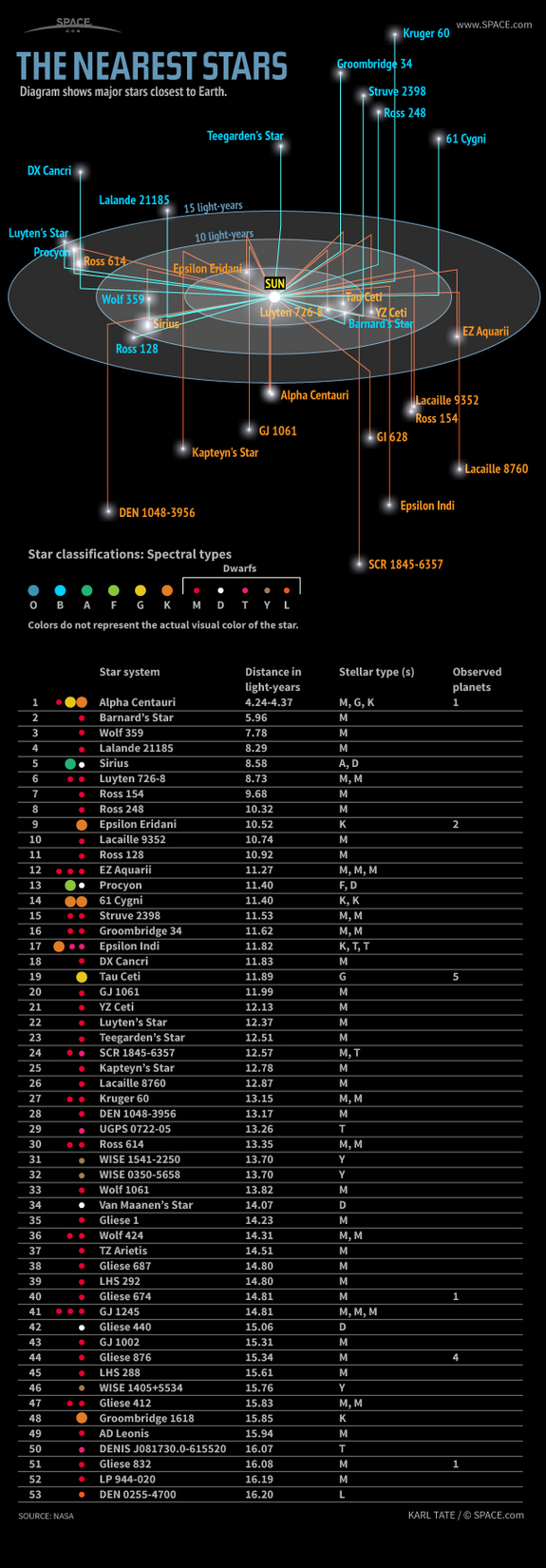
Learn about the nearest stars, their distances in light-years, spectral types and known planets, in this SPACE.com infographic.
Source SPACE.com: All about our solar system, outer space and exploration

I first saw this at The Nearest Stars by Randy Krum.

Curious if you see the same issues with the graphic that Randy does?

This type of display isn’t uncommon in amateur astronomy zines.

How would you change it?

My first thought was to lose the light year rings.

Why? Because I can’t rotate them visually with any degree of accuracy.

For example, how far do you think Kruger 60 is from Earth? More than 15 light years or less? (Follow the Kruger 60 link for the correct answer.)

If it makes you feel better, my answer to that question was wrong. 😉

Take another chance, what about SCR 1845-6357? (I got that one wrong as well.)

The information is correctly reported but I mis-read the graphic. How did you do?

June 24, 2013

Mapping Metaphor with the Historical Thesaurus

Filed under: Graphics,Metaphors,Thesaurus,Visualization — Patrick Durusau @ 9:36 am

Mapping Metaphor with the Historical Thesaurus: Visualization of Links

From the post:

By the end of the Mapping Metaphor with the Historical Thesaurus project we will have a web resource which allows the user to find pathways into our data. It will show a map of the conceptual metaphors of English over the last thousand years, showing links between each semantic area where we find evidence of metaphorical overlap. Unsurprisingly, given the visual and spatial metaphors which we are necessarily already using to describe our data and the analysis of it (e.g pathways and maps), this will be represented graphically as well as in more traditional forms.

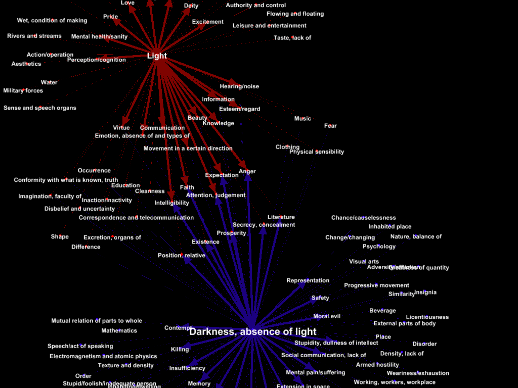
Below is a very early (in the project) example of a visualisation of the semantic domains of ‘Light’ and ‘Darkness, absence of light’, showing their metaphorical links with other semantic areas in the Historical Thesaurus data. We produced this using the program Gephi, which allows links between nodes to be shown using different colours, thickness of lines, etc.

Light and Darkness

From the project description at University of Glasgow, School of Critical Studies:

Over the past 30 years, it has become clear that metaphor is not simply a literary phenomenon; metaphorical thinking underlies the way we make sense of the world conceptually. When we talk about ‘a healthy economy’ or ‘a clear argument’ we are using expressions that imply the mapping of one domain of experience (e.g. medicine, sight) onto another (e.g. finance, perception). When we describe an argument in terms of warfare or destruction (‘he demolished my case’), we may be saying something about the society we live in. The study of metaphor is therefore of vital interest to scholars in many fields, including linguists and psychologists, as well as to scholars of literature.

Key questions about metaphor remain to be answered; for example, how did metaphors arise? Which domains of experience are most prominent in metaphorical expressions? How have the metaphors available in English developed over the centuries in response to social changes? With the completion of the Historical Thesaurus, published as the Historical Thesaurus of the Oxford English Dictionary by OUP (Kay, Roberts, Samuels, Wotherspoon eds, 2009), we can begin to address these questions comprehensively and in detail for the first time. We now have the opportunity to track how metaphorical ways of thinking and expressing ourselves have changed over more than a millennium.

Almost half a century in the making, the Historical Thesaurus is the first source in the world to offer a comprehensive semantic classification of the words forming the written record of a language. In the case of English, this record covers thirteen centuries of change and development, in metaphor as in other areas. We will use the Historical Thesaurus evidence base to investigate how the language of one domain of experience (e.g. medicine) contributes to others (e.g. finance). As we proceed, we will be able to see innovations in metaphorical thinking at particular periods or in particular areas of experience, such as the Renaissance, the scientific revolution, and the early days of psychoanalysis.

To achieve our goals, we will devise tools for the analysis of metaphor historically, beginning with a systematic identification of instances where words extend their meanings from one domain into another. An annotated ‘Metaphor Map’, which will be freely available online, will allow us to demonstrate when and how significant shifts in meaning took place. On the basis of this evidence, the team will produce series of case studies and a book examining key domains of metaphorical meaning.

Conference papers from the project.

What a wickedly topic map-like idea!

June 23, 2013

Magnify Digital Images – 700 times faster

Filed under: Graphics,Visualization — Patrick Durusau @ 6:57 pm

A new method that is 700 times faster than the norm is developed to magnify digital images

From the post:

Aránzazu Jurío-Munárriz, a graduate in computer engineering from the NUP/UPNA-Public University of Navarre, has in her PhD thesis presented new methods for improving two of the most widespread means used in digital image processing: magnification and thresholding. Her algorithm to magnify images stands out not only due to the quality obtained but also due to the time it takes to execute, which is 700 times less than other existing methods that obtain the same quality.

Image processing consists of a set of techniques that are applied to images to solve two problems: to improve the visual quality and to process the information contained in the image so that a computer can understand it on its own.

Nowadays, image thresholding is used to resolve many problems. Some of them include remote sensing where it is necessary to locate specific objects like rivers, forests or crops in aerial images; the analysis of medical tests to locate different structures (organs, tumours, etc.), to measure the volumes of tissue and even to carry out computer-guided surgery; or the recognition of patterns, for example to identify a vehicle registration plate at the entrance to a car park or for personal identification by means of fingerprints. “Image thresholding separates out each of the objects that comprise the image,” explains Aránzazu Jurío. To do this, each of the pixels is analysed so that all the ones sharing the same features are considered to form part of the same object.”

The thesis entitled “Numerical measures for image processing. Magnification and Thresholding” has produced six papers, which have been published in the most highly rated journals in the field.

Sounds great but I wasn’t able to quickly find any accessible references to point out.

Mapping Twitter demographics

Filed under: Graphics,Tweets,Visualization — Patrick Durusau @ 2:04 pm

Mapping Twitter demographics by Nathan Yau.

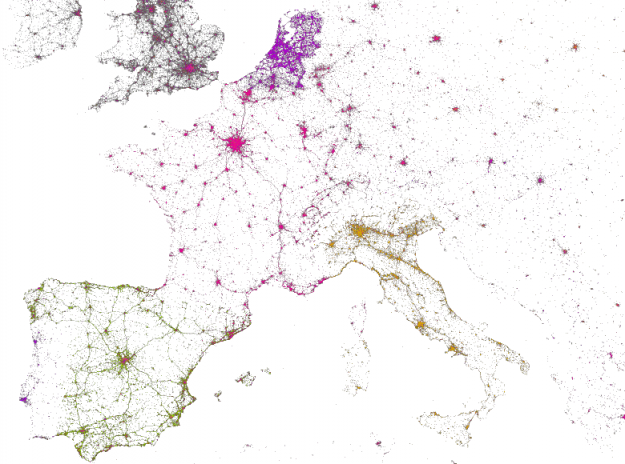
languages of twitter

Nathan has uncovered an interactive map of over 3 billion tweets by MapBox, along with Gnip and Eric Fischer.

See Nathan’s post for details.

Nanocubes: Fast Visualization of Large Spatiotemporal Datasets

Filed under: Graphics,Visualization — Patrick Durusau @ 12:35 pm

Nanocubes: Fast Visualization of Large Spatiotemporal Datasets

From the webpage:

Nanocubes are a fast datastructure for in-memory data cubes developed at the Information Visualization department at AT&T Labs – Research. Nanocubes can be used to explore datasets with billions of elements at interactive rates in a web browser, and in some cases it uses sufficiently little memory that you can run a nanocube in a modern-day laptop.

Live Demos

You will need a web browser that supports WebGL. We have tested it on Chrome and Firefox, but ourselves use Chrome for development.

People

Nanocubes were developed by Lauro Lins, Jim Klosowski and Carlos Scheidegger.

Paper

The research paper describing nanocubes has been conditionally accepted to VIS 2013. The manuscript is available for download.

Software

Currently, all nanocubes above are running on a single machine with 16GB of ram.

The main software component is an HTTP server written in C++ 11 that answers queries about the dataset it processed. We plan to release nanocubes as open-source software before the publication of the paper at IEEE VIS 2013. Stay tuned!

Important Data: VIS 2013 is 13 – 18 of October, 2013. Another 112 days according to the conference webpage. 😉

Run one or more of the demos.

Then start reading the paper.

Can subject sameness values be treated to the same aggregation within an error of margin technique? (Assuming you have subject sameness values that are not subject to Boolean tests.)

I first saw this in Nat Torkington’s Four short links: 20 June 2013.

June 22, 2013

insight3d

Filed under: Graphics,Visualization — Patrick Durusau @ 6:29 pm

insight3d (Tutorial, pdf)

Website: http://insight3d.sourceforge.net

From the tutorial:

insight3d lets you create 3D models from photographs. You give it a series of photos of a real scene (e.g., of a building), it automatically matches them and then calculates positions in space from which each photo has been taken (plus camera’s optical parameters) along with a 3D pointcloud of the scene. You can then use insight3d ‘s modeling tools to create textured polygonal model.

I thought folks still traveling to conferences would find this interesting.

No more flat shots but 3D ones!

Enjoy!

« Newer PostsOlder Posts »

Powered by WordPress