Another Word For It Patrick Durusau on Topic Maps and Semantic Diversity

June 30, 2014

12 JavaScript Libraries for Data Visualization

Filed under: Javascript,Visualization — Patrick Durusau @ 7:02 pm

12 JavaScript Libraries for Data Visualization by Thomas Greco.

Thomas gives quick summaries and links for:

  • Dygraphs.js
  • D3.js
  • InfoVis
  • The Google Visualization API
  • Springy.js
  • Polymaps.js
  • Dimple
  • Sigma.js
  • Raphael.js
  • gRaphëaut;l
  • Leaflet
  • Ember Charts

Do you see any old friends? See any you don’t yet know?

Enjoy!

June 29, 2014

Snark Hunting: Force Directed Graphs in D3

Filed under: D3,Graphs,Visualization — Patrick Durusau @ 7:13 pm

Snark Hunting: Force Directed Graphs in D3 by Stephen Hall.

From the post:

Is it possible to write a blog post that combines d3.js, pseudo-classical JavaScript, graph theory, and Lewis Carroll? Yes, THAT Lewis Carroll. The one who wrote Alice in Wonderland. We are going to try it here. Graphs can be pretty boring so I thought I would mix in some fun historical trivia to keep it interesting as we check out force directed graphs in D3. In this post we are going to develop a tool to load up, display, and manipulate multiple graphs for exploration using the pseudo-classical pattern in JavaScript. We’ll add in some useful features, a bit of style, and some cool animations to make a finished product (see the examples below).

As usual, the demos presented here use a minimal amount of code. There’s only about 250 lines of JavaScript (if you exclude the comments) in these examples. So it’s enough to be a good template for your own project without requiring a ton of time to study and understand. The code includes some useful lines to keep the visualization responsive (without requiring JQuery) and methods that do things like remove or add links or nodes.

There’s also a fun “shake” method to help minimize tangles when the graph is displayed by agitating the nodes a little. I find it annoying when the graph doesn’t display correctly when it loads, so we’ll take care of that. Additionally, the examples incorporate a set of controls to help understand and explore the effect of the various D3 force layout parameters using the awesome dat.gui library from Google. You can see a picture of the controls above. We’ll cover the controls in depth below, but first I’ll introduce the examples and talk a little bit about the data.

I don’t think graphs are boring at all but must admit that adding Lewis Carroll to the mix doesn’t hurt a bit.

Great way to start off the week!

PS: The Hunting of the Snark (An Agony in 8 Fits) (PDF, 1876 edition)

June 26, 2014

Visualizing Algorithms

Filed under: Algorithms,Visualization — Patrick Durusau @ 4:03 pm

Visualizing Algorithms by Mike Bostock.

From the post:

Algorithms are a fascinating use case for visualization. To visualize an algorithm, we don’t merely fit data to a chart; there is no primary dataset. Instead there are logical rules that describe behavior. This may be why algorithm visualizations are so unusual, as designers experiment with novel forms to better communicate. This is reason enough to study them.

But algorithms are also a reminder that visualization is more than a tool for finding patterns in data. Visualization leverages the human visual system to augment human intellect: we can use it to better understand these important abstract processes, and perhaps other things, too.

Better start with fresh pot of coffee when you read Mike’s post. Mike covers visualization of sampling algorithms using Van Gogh’s The Starry Night, sorting and maze generation (2-D). It is well written and illustrated but it is a lot of material to cover in one read.

The post finishes up with numerous references to other algorithm visualization efforts.

Put on your “must read” list for this weekend!

June 24, 2014

Isochronic Passage Chart for Travelers

Filed under: Mapping,MARC,Visualization — Patrick Durusau @ 4:10 pm

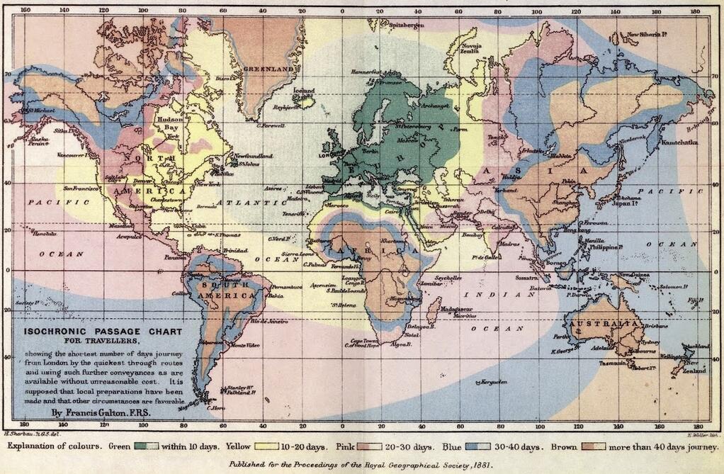
isochronic map

From the blog of Arthur Charpentier, Somewhere Else, part 142

(departing from London, ht http://mapsontheweb.zoom-maps.com/ ) by Francis Galton, 1881

A much larger image that is easier to read.

Although not on such a grand scale, an isochronic passage map for data could be interesting for your enterprise.

How much time does elapse from your request until a response from another department or team?

Presented visually, with this map as a reference for the technique, your evidence of data bottlenecks could be persuasive!

June 21, 2014

Storing and visualizing LinkedIn…

Filed under: Intelligence,Neo4j,Social Networks,Visualization — Patrick Durusau @ 4:42 pm

Storing and visualizing LinkedIn with Neo4j and sigma.js by Bob Briody.

From the post:

In this post I am going to present a way to:

  • load a linkedin networkvia the linkedIn developer API into neo4j using python
  • serve the network from neo4j using node.js, express.js, and cypher
  • display the network in the browser using sigma.js

Great post but it means one (1) down and two hundred and five (205) more to go, if you are a member of the social networks listed on List of social networking websites at Wikipedia, and that excludes dating sites and includes only “notable, well-known sites.”

I would be willing to bet that your social network of friends, members of your religious organization, people where you work, etc. would start to swell the number of other social networks that number you as a member.

Hmmm, so one off social network visualizations are just that, one off social network visualizations. You can been seen as part of one group and not say two or three intersecting groups.

Moreover, an update to one visualized network isn’t going to percolate into another visualized network.

There is the “normalize your graph” solution to integrate such resources but what if you aren’t the one to realize the need for “normalization?”

You have two separate actors in your graph visualization after doing the best you can. Another person encounters information indicating these “two” people are in fact one person. They update their data. But that updated knowledge has no impact on your visualization, unless you simply happen across it.

Seems like a poor way to run intelligence gathering doesn’t it?

June 18, 2014

Finding correlations in complex datasets

Filed under: Interface Research/Design,Visualization — Patrick Durusau @ 3:02 pm

Finding correlations in complex datasets by Andrés Colubri.

From the post:

It is now almost three years since I moved to Boston to start working at Fathom Information Design and the Sabeti Lab at Harvard. As I noted back then, one of the goals of this work was to create new tools for exploring complex datasets -mainly of epidemiological and health data- which could potentially contain up to thousands of different variables. After a process that went from researching visual metaphors suitable to explore these kind of datasets interactively, learning statistical techniques that can be used to quantify general correlations (not necessarily linear or between numerical quantities), and going over several iterations of internal prototypes, we finally released the 1.0 version of a tool called “Mirador” (spanish word for lookout), which attempts to bridge the space between raw data and statistical modeling. Please jump to the Mirador’s homepage to access the software and its user manual, and continue reading below for some more details about the development and design process.

The first step to build a narrative out of data is arguably finding correlations between different magnitudes or variables in the data. For instance, the placement of roads is highly correlated with the anthropogenic and geographical features of a territory. A new, unexpected, intuition-defying, or polemic correlation would probably result in an appealing narrative. Furthermore, a visual representation (of the correlation) that succeeds in its aesthetic language or conceptual clarity is also part of an appealing “data-driven” narrative. Within the scientific domains, these narratives are typically expressed in the form of a model that can be used by the researchers to make predictions. Although fields like Machine Learning and Bayesian Statistics have grown enormously in the past decades and offer techniques that allows the computer to infer predictive models from data, these techniques require careful calibration and overall supervision from the expert users who run these learning and inference algorithms. A key consideration is what variables to include in the inference process, since too few variables might result in a highly-biased model, while too many of them would lead to overfitting and large variance on new data (what is called the bias-variance dilemma.)

Leaving aside model building, an exploratory overview of the correlations in a dataset is also important in situations where one needs to quickly survey association patterns in order to understand ongoing processes, for example, the spread of an infectious disease or the relationship between individual behaviors and health indicators. The early identification of (statistically significant) associations can inform decision making and eventually help to save lives and improve public policy.

With this background in mind, three years ago we embarked in the task of creating a tool that could assist data exploration and model building by providing a visual interface to find and inspect correlations in general datasets, while having a focus on public health and epidemiological data. The thesis work from David Reshef with his tool VisuaLyzer was our starting point. Once we were handed over the initial VisuaLyzer prototype, we carried out a number of development and design iterations at Fathom, which redefined the overall workspace in VisuaLyzer but kept its main visual metaphor for data representation intact. Within this metaphor, the data is presented in “stand-alone” views such scatter plots, histograms, and maps where several “encodings” can be defined at once. An encoding is a mapping between the values of a variable in the dataset and a visual parameter, for example X and Y coordinates, size, color and opacity of the circles representing data instances, etc. This approach of defining multiple encodings in a single “large” data view is similar to what the Gapminder World visualization does.

Mirador self-describes at its homepage:

Mirador is a tool for visual exploration of complex datasets which enables users to infer new hypotheses from the data and discover correlation patterns.

Whether you call them “correlations” or “association patterns” (note the small “a” in associations), in relationships could in fact be modeled by Associations (note the capital “A” in Associations) with a topic map.

An important point for several reasons:

  • In this use case, there may be thousands of variables that contribute to an association pattern.
  • Associations can be discovered in data as opposed to being composed in an authored artifact.
  • Associations give us to the tools to talk about not just the role players identified by data analysis but also potential roles and how they compose an association.

Happy hunting!

June 14, 2014

Capturing Illogical Relationships

Filed under: Government,Graphics,Visualization — Patrick Durusau @ 12:48 pm

Syrian Conflict

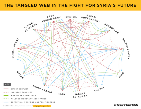
This graphic from ISIS Against The World is described as:

More Iraqi towns fell to “worse-than-al-Qaeda” overnight. The above chart from Hayes Brown and Adam Peck illustrates how ISIS is really at war with everybody:

A great illustration of the routine complexity of relationships between governments and other parties. (Is NGO the correct term for ISIS and al-Qaeda? Neither one is a government, yet.)

And it illustrates the lack of logic, first order or otherwise, in important events and relationships.

For example, the “indirect conflict” line between the United States and Iran may remain but in the near term, it will be supplemented with a lines showing monetary and weapons assistance, so long as Iran opposes ISIS. And other lines could change and/or be supplemented depending on the shifting fortunes of war and policy.

While this great graphic will get your attention, it doesn’t help navigate the vast stores of information on any of these parties or on relationships between individuals working for these parties.

For example, there were discussions with Qatar recently that resulted in the release of a prisoner held by al-Qaeda. Who were those discussions with and what could be done to enlist al-Qaeda to assist in taking down the leadership of ISIS?

Such details would not be in a public topic map, but as it is, I rather doubt the actual decisions makers know if that information is available or not.

The point being that mission critical information is no doubt siloed in Defense, State, NSA, CIA, and various other groups within the United States, if we are talking about a topic map from a U.S. perspective.

Not that we need another data dump facility like that maintained by Edward Snowden, but a topic map could point to holder of relevant information without disclosing its full content. Enabling someone with a “need to know” to be able to approach the holder with a request for the details.

Something to think about as the situation in the “Middle East” becomes more complicated.

PS: The graphic doesn’t encompass the “Middle East” as usually defined. Wikipedia in Middle East gives the following list of countries:

Can you think of a reason to use a smaller definition of “Middle East?”
June 13, 2014

Images Can Be Persuasive!

Filed under: Graphics,Visualization — Patrick Durusau @ 3:00 pm

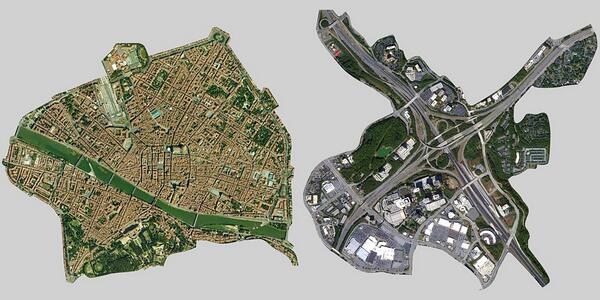
Florence, Italy vs. Atlanta, GA

Florence Italy and hwy interchange Atlanta, same scale.

Just the image and identifying the locations is all that need be said!

What images would you contrast for topic maps and why?

I saw this in a tweet by Janek Hellqvist.

June 11, 2014

SIGGRAPHITTI Issue 3 – June 2014

Filed under: Graphics,Interface Research/Design,Visualization — Patrick Durusau @ 6:43 pm

SIGGRAPHITTI Issue 3 – June 2014

News for SIGGRAPH2014!

As you already know:

Conference 10-14 August 2014
Exhibition 12-14 August 2014
Vancouver Convention Center

What you may not know:

Should be easy to make the Balisage Conference, August 4-8, 2014, Washington, DC and then hop a flight to Vancouver. 😉

June 10, 2014

The Invasion of America

Filed under: Graphics,History,Mapping,Maps,Visualization — Patrick Durusau @ 3:30 pm

The Invasion of America

A dynamic map with a timeline of United States history and its “acquisition” of land from the inhabitants already present.

The continued power of American exceptionalism, the force that drove that conquest, makes the map all the more frightening.

I first saw this in a tweet by Lincoln Mullen.

June 4, 2014

RenderMan/RIS

Filed under: Graphics,Visualization — Patrick Durusau @ 6:28 pm

RenderMan/RIS and the start of next 25 years by Mike Seymour.

From the post:

At SIGGRAPH last July, Pixar celebrated 25 years of RenderMan (see our story here). Today the company has announced new breakthrough technology, a new commitment to R&D and massive pricing changes including free access to RenderMan for non-commercial use. Ed Catmull, President, Walt Disney and Pixar Animation Studios, along with Dana Batali, VP of RenderMan Products, Chris Ford, RenderMan’s Business Director and the Pixar RenderMan team have introduced sweeping changes to the way RenderMan will be developed, sold and the very latest technology that will ship before SIGGRAPH 2014 in Vancouver. This is clearly the start of the next 25 years.

The new product is a combination of RenderMan Pro Server and RenderMan Studio. There will now be one product, used by artists or on the farm, and movable between the two. The new RenderMan has a powerful bi-directional path tracer and serious new technology from Disney Animation, which underlines a new unified approach to rendering from the House of Mouse – the amazing powerhouse that is Disney today.
….

If you appreciate high-end graphics, you owe it to yourself to read Mike’s post and watch the videos.

And if you want to try the software, you have to appreciate the simplicity of their license:

There is only one RenderMan and the free non-commercial RenderMan is exactly the same as the commercial version. There are no watermarks, no time limits, and no reduced functionality. The only limitation is that upon acceptance of the EULA at initial installation, the software is to be only used for non-commercial purposes. We want to keep it very simple, and as importantly, RenderMan highly accessible.

Enjoy!

Health Intelligence

Filed under: Data Mining,Intelligence,Visualization — Patrick Durusau @ 4:55 pm

Health Intelligence: Analyzing health data, generating and communicating evidence to improve population health. by Ramon Martinez.

I was following a link to Ramon’s Data Sources page when I discovered his site. The list of data resources is long and impressive.

But there is so much more under Resources!

  • Data Tools
  • Database (DB) Blogs
  • Data Visualization Tools
  • Data Viz Blogs
  • Reading for Data Visualizations
  • Best of the Web…
  • Tableau Training
  • Going to School
  • Reading for Health Analysis

You will probably like the rest of the site as well!

Data tools/visualization are very ecumenical.

June 3, 2014

A first-person engine in 265 lines

Filed under: Games,Graphics,Interface Research/Design,Visualization — Patrick Durusau @ 6:18 pm

A first-person engine in 265 lines

From the post:

Today, let’s drop into a world you can reach out and touch. In this article, we’ll compose a first-person exploration from scratch, quickly and without difficult math, using a technique called raycasting. You may have seen it before in games like Daggerfall and Duke Nukem 3D, or more recently in Notch Persson’s ludum dare entries. If it’s good enough for Notch, it’s good enough for me!

Not a short exercise but I like the idea of quick to develop interfaces.

Do you know if in practice it makes it easier to change/discard interfaces?

Thanks!

I first saw this in a tweet by Hunter Loftis.

May 31, 2014

Subtleties of Color

Filed under: Visualization — Patrick Durusau @ 2:31 pm

Simmon is an expert on Earth visualizations for NASA, although he starts off with a great story about an early Mariner image of Mars.

Great quote:

Color has an objective reality, but the colors we see are tricks of the imagination, and there is no perfectly objective view of color.

Interesting comments on use of the rainbow palette.

While searching for an identifier for the “rainbow palette, I found a blog entry to accompany this video: Subtleties of Color: The “Perfect” Palette.

In the video, pay particular attention to the impact of surrounding color on our perception of color.

Great introduction to the nuances of color! And it’s impact on the representation of your data.

Very useful if you want “details” you want to elide or “details” that you want to highlight.

I first saw this in a tweet by James Lane Conkling.

May 27, 2014

OpenVis Conf (videos 2014)

Filed under: Graphics,Visualization — Patrick Durusau @ 7:35 pm

OpenVis Conf

Eighteen (18) great videos are up for your viewing pleasure!

I will have to limit myself to one video per day so I won’t have too many new ideas. 😉

Enjoy!

I first saw this in a tweet by Rob Simon.

3D Printed Hypercube of Monkeys

Filed under: Graphics,Hyperspace,Visualization — Patrick Durusau @ 4:25 pm

Nothing is more fun than a 3D printed hypercube of monkeys

From the post:

The quaternion group {1,i,j,k,-1,-i,-j,-k} is a beautiful group of order eight. It didn’t have a physical representation because the object should be 4-dimensional. But has the quaternion group ever appeared as the symmetry group of an object? The answer is yes. In order to visualize the symmetries of the quaternion group, mathematician Henry Segerman, sculptor Will Segerman and mathemusician Vi Hart have designed a four-dimensional object, a hypercube, and put a monkey at the center of each of the eight cubes.

If that doesn’t sound interesting enough, the post also has an animated image of the monkeys emerging from the 4th dimension, a video on “…how to make sculptures of 4D things,” and a pointer to: The Quaternion Group as a Symmetry Group.

Displaying countries in different perspectives impacts your perception of a map. Imagine the impact of emerging from the 4th dimension.

I first saw this in a tweet by Stefano Bertolo.

May 20, 2014

Elm 0.12.3

Filed under: Elm,Graphics,Visualization — Patrick Durusau @ 3:06 pm

Elm 0.12.3: Hardware accelerated 3D rendering with WebGL

From the post:

Elm now supports 3D rendering with WebGL! Huge thank you to John P. Mayer for designing and implementing such a simple API for this. It has been really fun to work with so far and we are excited to see what people can do with it!

This is the first public exploration of using alternate renders with Elm. Our goal is to be great for all kinds of UI tasks, so 3D is just the first step on the road to more traditional renderers such as the D3 backend for Elm. Future exploration will focus on more traditional kinds of UI, all super easy to embed as a component in an existing JS app.

This release also comes with some changes to the Color library, making it easier to create colors programmatically. The initial motivation was to make Color play nice with WebGL, but the library came out a lot friendlier to use in general.

If you want to become a functional programming shop, use Elm to experiment with 3D UI components. Or UIs in general for that matter.

I first saw this in a tweet by Paul Smith.

May 11, 2014

brat rapid annotation tool

Filed under: Annotation,Natural Language Processing,Visualization — Patrick Durusau @ 3:20 pm

brat rapid annotation tool

From the introduction:

brat is a web-based tool for text annotation; that is, for adding notes to existing text documents.

brat is designed in particular for structured annotation, where the notes are not free form text but have a fixed form that can be automatically processed and interpreted by a computer.

The examples page has examples of:

  • Entity mention detection
  • Event extraction
  • Coreference resolution
  • Normalization
  • Chunking
  • Dependency syntax
  • Meta-knowledge
  • Information extraction
  • Bottom-up Metaphor annotation
  • Visualization
  • Information Extraction system evaluation

I haven’t installed the local version but it is on my to-do list.

I first saw this in a tweet by Steven Bird.

April 19, 2014

Visual Programming Languages – Snapshots

Filed under: Graphics,Programming,Visualization — Patrick Durusau @ 2:03 pm

Visual Programming Languages – Snapshots by Eric Hosick.

If you are interested in symbolic topic map authoring or symbolic authoring for other purposes, this a a must-see site for you!

Eric has collected (as of today) one-hundred and forty (140) examples of visual programming languages.

I am sure there are some visualization techniques that were not used in these examples but offhand, I can’t say which ones. 😉

Definitely a starting point for any new visual interfaces.

Streamtools – Update

Filed under: News,Reporting,Stream Analytics,Visualization — Patrick Durusau @ 1:50 pm

streamtools 0.2.4

From the webpage:

This release contains:

  • toEmail and fromEmail blocks: use streamtools to receive and create emails!
  • linear modelling blocks: use streamtools to perform linear and logistic regression using stochastic gradient descent.
  • GUI updates : a new block reference/creation panel.
  • a kullback leibler block for comparing distributions.
  • added a tutorials section to streamtools available at /tutorials in your streamtools server.
  • many small bug fixes and tweaks.

See also: Introducing Streamtools.

+1 on news input becoming more stream-like. But streams, of water and news, can both become polluted.

Filtering water is a well-known science.

Filtering information is doable but with less certain results.

How do you filter your input? (Not necessarily automatically, algorithmic, etc. You have to define the filter first, then choose the means implement it.)

I first saw this in a tweet by Micahael Dewar.

April 18, 2014

VOWL: Visual Notation for OWL Ontologies

Filed under: Ontology,OWL,Visualization — Patrick Durusau @ 2:08 pm

VOWL: Visual Notation for OWL Ontologies

Abstract:

The Visual Notation for OWL Ontologies (VOWL) defines a visual language for the user-oriented representation of ontologies. It provides graphical depictions for elements of the Web Ontology Language (OWL) that are combined to a force-directed graph layout visualizing the ontology.

This specification focuses on the visualization of the ontology schema (i.e. the classes, properties and datatypes, sometimes called TBox), while it also includes recommendations on how to depict individuals and data values (the ABox). Familiarity with OWL and other Semantic Web technologies is required to understand this specification.

At the end of the specification there is an interesting example but as a “force-directed graph layout” it captures one of the difficulties I have with that approach.

I have this unreasonable notion that a node I select and place in the display should stay where I have placed it, not shift about because I have moved some other node. Quite annoying and I don’t find it helpful at all.

I first saw this at: VOWL: Visual Notation for OWL Ontologies

Precision from Disaggregation

Filed under: Census Data,Maps,Visualization — Patrick Durusau @ 1:06 pm

Building Precise Maps with Disser by Brandon Martin-Anderson.

From the post:

Spatially aggregated statistics are pretty great, but what if you want more precision? Here at Conveyal we built a utility to help with that: aggregate-disser. Let me tell you how it works.

Let’s start with a classic aggregated data set – the block-level population counts from the US Census. Here’s a choropleth map of total population for blocks around lower Manhattan and Brooklyn. The darkest shapes contain about five thousand people.

Brandon combines census data with other data sets to go from 5,000 person census blocks to locating every job and bed in Manhattan into individual buildings.

Very cool!

Not to mention instructive when you encounter group subjects that need to be disaggregated before being combined with other data.

I first saw this in a tweet by The O.C.R.

April 15, 2014

Enter, Update, Exit… [D3.js]

Filed under: D3,Graphics,Visualization — Patrick Durusau @ 7:49 pm

Enter, Update, Exit – An Introduction to D3.js, The Web’s Most Popular Visualization Toolkit by Christian Behrens.

From the webpage:

Over the past couple of years, D3, the groundbreaking JavaScript library for data-driven document manipulation developed by Mike Bostock, has become the Swiss Army knife of web-based data visualization. However, talking to other designers or developers who use D3 in their projects, I noticed that one of the core concepts of it remains somewhat obscure and is often referred to as »D3’s magic«: Data joins and selections.

Given a solid command of basic JavaScript, this article should help you to wrap your head around these two fundamental concepts and get you started using D3 for your dataviz projects.

If you encounter anyone not already using D3.js, pass this page along to them.

I first saw this in a tweet by Halftone.

April 13, 2014

Online Python Tutor (update)

Filed under: Programming,Python,Visualization — Patrick Durusau @ 1:27 pm

Online Python Tutor by Philip Guo.

From the webpage:

Online Python Tutor is a free educational tool created by Philip Guo that helps students overcome a fundamental barrier to learning programming: understanding what happens as the computer executes each line of a program’s source code. Using this tool, a teacher or student can write a Python program in the Web browser and visualize what the computer is doing step-by-step as it executes the program.

As of Dec 2013, over 500,000 people in over 165 countries have used Online Python Tutor to understand and debug their programs, often as a supplement to textbooks, lecture notes, and online programming tutorials. Over 6,000 pieces of Python code are executed and visualized every day.

Users include self-directed learners, students taking online courses from Coursera, edX, and Udacity, and professors in dozens of universities such as MIT, UC Berkeley, and the University of Washington.

If you believe in crowd wisdom, 500,000 users is a vote of confidence in the Online Python Tutor.

I first mentioned the Online Python Tutor in LEARN programming by visualizing code execution

Philip points to similar online tutors for Java, Ruby and Javascript.

Enjoy!

April 5, 2014

GeoCanvas

Filed under: Geographic Data,Geography,Maps,Visualization — Patrick Durusau @ 7:34 pm

Synthicity Releases 3D Spatial Data Visualization Tool, GeoCanvas by Dean Meyers.

From the post:

Synthicity has released a free public beta version of GeoCanvas, its 3D spatial data visualization tool. The software provides a streamlined toolset for exploring geographic data, lowering the barrier to learning and using geographic information systems.

GeoCanvas is not limited to visualizing parcels in cities. By supporting data formats such as the widely available shapefile for spatial geometry and text files for attribute data, it opens the possibility of rapid 3D spatial data visualization for a wide range of uses and users. The software is expected to be a great addition to the toolkits of students, researchers, and practitioners in fields as diverse as data science, geography, planning, real estate analysis, and market research. A set of video tutorials explaining the basic concepts and a range of examples have been made available to showcase the possibilities.

The public beta version of GeoCanvas is available as a free download from www.synthicity.com.

Well, rats! I haven’t installed a VM with Windows 7/8 or Max OS X 10.8 or later.

Sounds great!

Comments from actual experience?

Formatting Affects Perception?

Filed under: Graphics,Visualization — Patrick Durusau @ 7:08 pm

Before you jump to this link by Ed H. Chi, how would you answer the question:

Does table formatting affect your perception of a table?

The equivalent of “data is data” I suppose.

This is not a one-off example. The same answer is true for any other data set.

How’s your presentation of data?

April 1, 2014

…Browser History as a Favicon Tapestry (NSFW?)

Filed under: Graphics,Visualization — Patrick Durusau @ 2:47 pm

Browser Plugin Maps Your Browser History as a Favicon Tapestry by Andrew Vande Moere.

From the post:

iconic history

Iconic History [shan-huang.com] by Carnegie Mellon University interaction design student Shan Huang is as simple as it is beautifully revealing.

See Andrew’s post for more details.

Depending on the websites you visit and their favicons, this may or may not be safe for work.

As a visualization it makes me curious, what if you could track the “focus” of applications in use so a similar display could be generated for the apps you use in a day, a week, etc.?

Would bring new meaning to the question: What have you been working on today? 😉

March 25, 2014

Shadow DOM

Filed under: CSS3,Graphics,HTML,Visualization,XML — Patrick Durusau @ 3:15 pm

Shadow DOM by Steven Wittens.

From the post:

For a while now I’ve been working on MathBox 2. I want to have an environment where you take a bunch of mathematical legos, bind them to data models, draw them, and modify them interactively at scale. Preferably in a web browser.

Unfortunately HTML is crufty, CSS is annoying and the DOM’s unwieldy. Hence we now have libraries like React. It creates its own virtual DOM just to be able to manipulate the real one—the Agile Bureaucracy design pattern.

The more we can avoid the DOM, the better. But why? And can we fix it?
….

One of the better posts on markup that I have read in a very long time.

Also of interest, Steven’s heavy interest in graphics and visualization.

His MathBox project for example.

March 21, 2014

D3.js, Three.js and CSS 3D Transforms

Filed under: CSS3,D3,Graphics,Three.js,Visualization — Patrick Durusau @ 9:28 am

D3.js, Three.js and CSS 3D Transforms by Steve Hall.

From the post:

This week I have been having some fun thinking about how you could use D3.js and Three.js together to do some data visualization work. We’ll have to put this one in the experimental column since there is a lot more work to be done, but I was pretty pleased with the results and thought I would blog about what I have done up to this point. While there are plenty of dramatic examples of three.js used to generate 3D globes with lines shooting everywhere, I was interested in a more subtle approach to complement work in D3. I would be curious to hear about other experiments going on along the same lines. A Google search didn’t turn up much.

The following example is using D3 to generate HTML elements and SVG charts and also to store coordinate information for transitions inside data properties. The objects created using D3 are then passed into a three.js scene and animated using CSS 3D transforms (no WebGL here, this is pure DOM).

You really need to run the full demo on a large, high-res monitor.

Wicked cool!

Definitely raises the bar for data visualization!

The only downside being you will be expected to find clever 3D ways to visualize data. Way more complicated than the visualization itself.

March 14, 2014

Introducing Streamtools:…

Filed under: News,Reporting,Visualization — Patrick Durusau @ 7:46 pm

Introducing Streamtools: A Graphical Tool for Working with Streams of Data by Mike Dewar.

From the post:

We see a moment coming when the collection of endless streams of data is commonplace. As this transition accelerates it is becoming increasingly apparent that our existing toolset for dealing with streams of data is lacking. Over the last 20 years we have invested heavily in tools that deal with tabulated data, from Excel, MySQL, and MATLAB to Hadoop, R, and Python+Numpy. These tools, when faced with a stream of never-ending data, fall short and diminish our creative potential.

In response to this shortfall we have created streamtools—a new, open source project by the New York Times R&D Lab which provides a general purpose, graphical tool for dealing with streams of data. It offers a vocabulary of operations that can be connected together to create live data processing systems without the need for programming or complicated infrastructure. These systems are assembled using a visual interface that affords both immediate understanding and live manipulation of the system.

I’m quite excited about this tool, although I would not go so far as to say it will “encourage new forms of reasoning. (emphasis in original)” 😉

Still, this is an exciting new tool and I commend both the post and the tool to you.

« Newer PostsOlder Posts »

Powered by WordPress