Another Word For It Patrick Durusau on Topic Maps and Semantic Diversity

December 16, 2015

O’Reilly Web Design Site

Filed under: CSS3,Graphics,Interface Research/Design,Visualization — Patrick Durusau @ 9:37 pm

O’Reilly Web Design Site

O’Reilly has launched a new website devoted to website design.

Organized by paths, what I have encountered so far is “free” for the price of registration.

I have long ignored web design much the same way others ignore the need for documentation. Perhaps there is more similarity there than I would care to admit.

It’s never too late to learn so I am going to start pursuing some of the paths at the O’Reilly Web Design site.

Suggestions or comments concerning your experience with this site welcome.

Enjoy!

December 15, 2015

A Day in the Life of Americans

Filed under: Graphics,Visualization — Patrick Durusau @ 3:38 pm

A Day in the Life of Americans – This is how America runs by Nathan Yau.

You are accustomed to seeing complex graphs which are proclaimed to hold startling insights:

day-in-the-life

Nathan’s post starts off that way but you are quickly draw into one a visual presentation of daily activities of Americans as the clock runs from 4:00 AM.

Nathan has produced a number of stunning visualizations over the years but well, here’s his introduction:

From two angles so far, we’ve seen how Americans spend their days, but the views are wideout and limited in what you can see.

I can tell you that about 40 percent of people age 25 to 34 are working on an average day at three in the afternoon. I can tell you similar numbers for housework, leisure, travel, and other things. It’s an overview.

What I really want to see is closer to the individual and a more granular sense of how each person contributes to the patterns. I want to see how a person’s entire day plays out. (As someone who works from home, I’m always interested in what’s on the other side.)

So again I looked at microdata from the American Time Use Survey from 2014, which asked thousands of people what they did during a 24-hour period. I used the data to simulate a single day for 1,000 Americans representative of the population — to the minute.

More specifically, I tabulated transition probabilities for one activity to the other, such as from work to traveling, for every minute of the day. That provided 1,440 transition matrices, which let me model a day as a time-varying Markov chain. The simulations below come from this model, and it’s kind of mesmerizing.

Not only is it “mesmerizing,” its informative as well. To a degree.

Did you know that 74% of 1,000 average Americans are asleep when Jimmy Fallon comes on at 11:30 EST? 😉

What you find here and elsewhere on Nathan’s site is the result of a very talented person who practices data visualization ever day.

For me, the phrase, “a day in the life,” will always be associated with:

How does your average day compare to the average day? Or the average day in your office to the average day?

December 11, 2015

d3.compose [Charts as Devices of Persuasion]

Filed under: Charts,D3,Graphics,Visualization — Patrick Durusau @ 10:17 pm

d3.compose

Another essential but low-level data science skill, data-driven visualizations!

From the webpage:

Composable

Create small and sharp charts/components that do one thing one well (e.g. Bars, Lines, Legend, Axis, etc.) and compose them to create complex visualizations.

d3.compose works great with your existing charts (even those from other libraries) and it is simple to extend/customize the built-in charts and components.

Automatic Layout

When creating complex charts with D3.js and d3.chart, laying out and sizing parts of the chart are often manual processes.
With d3.compose, this process is automatic:

  • Automatically size and position components
  • Layer components and charts by z-index
  • Responsive by default, with automatic scaling

Why d3.compose?

  • Customizable: d3.compose makes it easy to extend, layout, and refine charts/components
  • Reusable: By breaking down visualizations into focused charts and components, you can quickly reconfigure and reuse your code
  • Integrated: It’s straightforward to use your existing charts or charts from other libraries with d3.compose to create just the chart you’re looking for

Don’t ask me why but users/executives are impressed by even simple charts.

(shrugs) I have always assumed that people use charts to avoid revealing the underlying data and what they did to it before making the chart.

That’s not very charitable but I have never been disappointed in assuming either incompetence and/or malice in chart preparation.

People prepare charts because they are selling you a point of view. It may be a “truthful” point of view, at least in their minds but it is still an instrument of persuasion.

Use well-constructed charts to persuade others to your point of view and be on guard for the use of charts to persuade you. Both of those principles will serve you well as a data scientist.

December 10, 2015

The Preservation of Favoured Traces [Multiple Editions of Darwin]

Filed under: Books,Graphics,Text Encoding Initiative (TEI),Visualization,XQuery — Patrick Durusau @ 1:19 pm

The Preservation of Favoured Traces

From the webpage:

Charles Darwin first published On the Origin of Species in 1859, and continued revising it for several years. As a result, his final work reads as a composite, containing more than a decade’s worth of shifting approaches to his theory of evolution. In fact, it wasn’t until his fifth edition that he introduced the concept of “survival of the fittest,” a phrase that actually came from philosopher Herbert Spencer. By color-coding each word of Darwin’s final text by the edition in which it first appeared, our latest book and poster of his work trace his thoughts and revisions, demonstrating how scientific theories undergo adaptation before their widespread acceptance.

The original interactive version was built in tandem with exploratory and teaching tools, enabling users to see changes at both the macro level, and word-by-word. The printed poster allows you to see the patterns where edits and additions were made and—for those with good vision—you can read all 190,000 words on one page. For those interested in curling up and reading at a more reasonable type size, we’ve also created a book.

The poster and book are available for purchase below. All proceeds are donated to charity.

For textual history fans this is an impressive visualization of the various editions of On the Origin of Species.

To help students get away from the notion of texts as static creations, plus to gain some experience with markup, consider choosing a well known work that has multiple editions that is available in TEI.

Then have the students write XQuery expressions to transform a chapter of such a work into a later (or earlier) edition.

Depending on the quality of the work, that could be a means of contributing to the number of TEI encoded texts and your students would gain experience with both TEI and XQuery.

December 8, 2015

Order of Requirements Matter

Filed under: Computer Science,Cybersecurity,Visualization — Patrick Durusau @ 7:03 pm

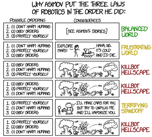
Sam Lightstone posted a great illustration of why the order of requirements can matter to Twitter:

asimov-robotics

Visualizations rarely get much clearer.

You could argue that Minard’s map of Napoleon’s invasion of Russia is equally clear:

600px-Minard

But Minard drew with the benefit of hindsight, not foresight.

The Laws of Robotics, on the other hand, have predictive value for the different orders of requirements.

I don’t know how many requirements Honeywell had for the Midas and Midas Black Gas Detectors but you can bet IP security was near the end of the list, if explicit at all.

IP security should be #1 with a bullet, especially for devices that detect Ammonia (caustic, hazarous), Arsine (highly toxic, flammable), Chlorine (extremely dangerous, poisonous for all living organisms), Hydrogen cyanide, and Hydrogen flouride (“Hydrogen fluoride is a highly dangerous gas, forming corrosive and penetrating hydrofluoric acid upon contact with living tissue. The gas can also cause blindness by rapid destruction of the corneas.”)

When IP security is not the first requirement, it’s not hard to foresee the outcome, an Insecure Internet of Things.

Is that what we want?

November 18, 2015

A Timeline of Terrorism Warning: Incomplete Data

Filed under: Data Analysis,Graphics,Skepticism,Visualization — Patrick Durusau @ 2:41 pm

A Timeline of Terrorism by Trevor Martin.

From the post:

The recent terrorist attacks in Paris have unfortunately once again brought terrorism to the front of many people’s minds. While thinking about these attacks and what they mean in a broad historical context I’ve been curious about if terrorism really is more prevalent today (as it feels), and if data on terrorism throughout history can offer us perspective on the terrorism of today.

In particular:

  • Have incidents of terrorism been increasing over time?
  • Does the amount of attacks vary with the time of year?
  • What type of attack and what type of target are most common?
  • Are the terrorist groups committing attacks the same over decades long time scales?

In order to perform this analysis I’m using a comprehensive data set on 141,070 terrorist attacks from 1970-2014 compiled by START.

Trevor writes a very good post and the visualizations are ones that you will find useful for this and other date.

However, there is a major incompleteness in Trevor’s data. If you follow the link for “comprehensive data set” and the FAQ you find there, you will find excluded from this data set:

Criterion III: The action must be outside the context of legitimate warfare activities.

So that excludes the equivalent of five Hiroshimas dropped on rural Cambodia (1969-1973), the first and second Iraq wars, the invasion of Afghanistan, numerous other acts of terrorism using cruise missiles and drones, all by the United States, to say nothing of the atrocities committed by Russia against a variety of opponents and other governments since 1970.

Depending on how you count separate acts, I would say the comprehensive data set is short by several orders of magnitude in accounting for all the acts of terrorism between 1970 to 2014.

If that additional data were added to the data set, I suspect (don’t know because the data set is incomplete) that who is responsible for more deaths and more terror would have a quite different result from that offered by Trevor.

So I don’t just idly complain, I will contact the United States Air Force to see if there are public records on how many bombing missions and how many bombs were dropped on Cambodia and in subsequent campaigns. That could be a very interesting data set all on its own.

November 13, 2015

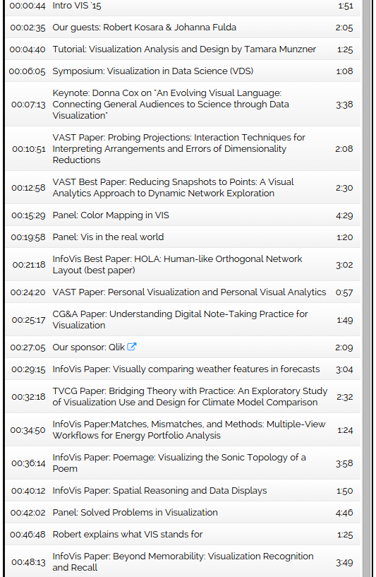
VIS’15 Recap with Robert Kosara and Johanna Fulda (DS #63)

Filed under: Conferences,Visualization — Patrick Durusau @ 5:32 pm

VIS’15 Recap with Robert Kosara and Johanna Fulda (DS #63)

data-story-podcast

And that’s not the entire agenda for the podcast!

So say nothing of the fourteen links to papers, videos and pre-views that follow the podcast agenda.

A recap of the 2015 IEEE Visualization Conference (VIS) (25 Oct – 30 Oct 2015).

If you missed the conference or just want a great weekend activity, consider the podcast and related resources.

November 9, 2015

Vintage Infodesign [138] Old Map, Charts and Graphics

Filed under: Graphics,Maps,Visualization — Patrick Durusau @ 11:50 am

Vintage Infodesign [138] Old Map, Charts and Graphics by Tiago Veloso

From the post:

Those who follow these weekly updates with vintage examples of information design know how maps fill a good portion of our posts. Cartography has been having a crucial role in our lives for centuries and two recent books help understand this influence throughout the ages: The Art of Illustrated Maps by John Roman, and Map: Exploring The World, featuring some of the most influential mapmakers and institutions in history, like Gerardus Mercator, Abraham Ortelius, Phyllis Pearson, Heinrich Berann, Bill Rankin, Ordnance Survey and Google Earth.

Gretchen Peterson reviewed the first one in this article, with a few questions answered by the author. As for the second book recommendation, you can learn more about it in this interview conducted by Mark Byrnes with John Hessler, a cartography expert at the Library of Congress and one of the people behind the book, published in CityLab. Both publications seem quite a treat for map lovers and additions to

All delightful and instructive but I think my favorite is How Many Will Die Flying the Atlantic This Season? (Aug, 1931).

The cover is a must see graphic/map.

It reminds me of the over-the-top government reports on terrorism which are dutifully parroted by both traditional and online media.

Any sane person who looks at the statistics for causes of death in Canada, the United States and Europe, will conclude that “terrorism” is a government-fueled and media-driven non-event. Terrorist events should qualify as Trivial Pursuit questions.

The infrequent victims of terrorism and their families deserve all the support and care we can provide. But the same is true of traffic accident victims and they are far more common than victims of terrorism.

November 6, 2015

Introduction to Infographics and Data Visualization

Filed under: Infographics,Journalism,News,Reporting,Visualization — Patrick Durusau @ 11:08 am

Introduction to Infographics and Data Visualization by Alberto Cairo.

MOOC: Time: November 16 – December 13, 2015

From the webpage:

This is Massive Open Online Course (MOOC) is offered by the Journalism and Media Studies Centre (JMSC) at the University of Hong Kong and the Knight Center at the University of Texas at Austin. This MOOC is hosted on JournalismCourses.org, the Knight Center’s distance-learning platform. It is designed primarily for journalists and the public in Asia, but is open to people from other parts of the world as well. The Knight Center’s MOOCs are free. Other online courses, with a limited number of students, have a small fee.

Goal

This course is an introduction to the basics of the visual representation of data. In this class you will learn how to design successful charts and maps, and how to arrange them to compose cohesive storytelling pieces. We will also discuss ethical issues when designing graphics, and how the principles of Graphic Design and of Interaction Design apply to the visualization of information.

The course will have a theoretical component, as we will cover the main rules of the discipline, and also a practical one: to design basic infographics and mock ups for interactive visualizations.

One hopes that given a primarily Asian audience, that successful infographics from Asian markets will be prominent in the study materials.

Thinking that discussion among the students may identify why some infographics succeed while other fail in that context. Reasoning that all cultures have preferences or dispositions that aren’t readily apparent to outsiders.

November 5, 2015

Information Visualization MOOC 2015

Filed under: Computer Science,Graphics,Visualization — Patrick Durusau @ 2:39 pm

Information Visualization MOOC 2015 by Katy Börner.

From the webpage:

This course provides an overview about the state of the art in information visualization. It teaches the process of producing effective visualizations that take the needs of users into account.

Among other topics, the course covers:

  • Data analysis algorithms that enable extraction of patterns and trends in data
  • Major temporal, geospatial, topical, and network visualization techniques
  • Discussions of systems that drive research and development.

The MOOC ended in April of 2015 but you can still register for a self-paced version of the course.

A quick look at 2013 client projects or the current list of clients and projects, with who students can collaborate, will leave no doubt this is a top-rank visualization course.

I first saw this in a tweet by Kirk Borne.

November 4, 2015

We Put 700 Red Dots On A Map

Filed under: Humor,Maps,Visualization — Patrick Durusau @ 4:04 pm

We Put 700 Red Dots On A Map

dots

Some statistics can be so unbelievable, or deal with concepts so vast, that it’s impossible to wrap our heads around them. The human mind can only do so much to visualize an abstract idea, and often misses much of its impact in the translation. Sometimes you just need to step back and take a good, long look for yourself.

That’s why we just put 700 red dots on a map.

The dots don’t represent anything in particular, nor is their number and placement indicative of any kind of data. But when you’re looking at them, all spread out on a map of the United States like that—it’s hard not to be a little blown away.

Enjoy!

PS: Also follow ClickHole on Twitter.

Governments will still comfort the comfortable, afflict the afflicted and lie to the rest of us about their activities, but this may keep you from becoming a humorless fanatic.

The benefits of being a humorous fanatic aren’t clear but surely it is better than being humorless.

I first saw this in a tweet by Matt Boggie.

November 2, 2015

Exploring and Visualizing Pre-Topic Map Data

Filed under: Aggregation,Data Aggregation,Sets,Topic Maps,Visualization — Patrick Durusau @ 3:06 pm

AggreSet: Rich and Scalable Set Exploration using Visualizations of Element Aggregations by M. Adil Yalçın, Niklas Elmqvist, and Benjamin B. Bederson.

Abstract:

Datasets commonly include multi-value (set-typed) attributes that describe set memberships over elements, such as genres per movie or courses taken per student. Set-typed attributes describe rich relations across elements, sets, and the set intersections. Increasing the number of sets results in a combinatorial growth of relations and creates scalability challenges. Exploratory tasks (e.g. selection, comparison) have commonly been designed in separation for set-typed attributes, which reduces interface consistency. To improve on scalability and to support rich, contextual exploration of set-typed data, we present AggreSet. AggreSet creates aggregations for each data dimension: sets, set-degrees, set-pair intersections, and other attributes. It visualizes the element count per aggregate using a matrix plot for set-pair intersections, and histograms for set lists, set-degrees and other attributes. Its non-overlapping visual design is scalable to numerous and large sets. AggreSet supports selection, filtering, and comparison as core exploratory tasks. It allows analysis of set relations inluding subsets, disjoint sets and set intersection strength, and also features perceptual set ordering for detecting patterns in set matrices. Its interaction is designed for rich and rapid data exploration. We demonstrate results on a wide range of datasets from different domains with varying characteristics, and report on expert reviews and a case study using student enrollment and degree data with assistant deans at a major public university.

These two videos will give you a better overview of AggreSet than I can. The first one is about 30 seconds and the second one about 5 minutes.

The visualization of characters from Les Misérables (the second video) is a dynamite demonstration of how you could explore pre-topic map data with an eye towards creating roles and associations between characters as well as with the text.

First use case that pops to mind would be harvesting the fan posts on Harry Potter and crossing them with a similar listing of characters from the Harry Potter book series. With author, date, book, character, etc., relationships.

While you are at the GitHub site: https://github.com/adilyalcin/Keshif/tree/master/AggreSet, be sure to bounce up a level to Keshif:

Keshif is a web-based tool that lets you browse and understand datasets easily.

To start using Keshif:

  • Get the source code from github,
  • Explore the existing datasets and their source codes, and
  • Check out the wiki.

Or just go directly to the Keshif site, with 110 datasets (as of today)>

For the impatient, see Loading Data.

For the even more impatient:

You can load data to Keshif from :

  • Google Sheets
  • Text File
    • On Google Drive
    • On Dropbox
    • File on your webserver

Text File Types

Keshif can be used with the following data file types:

  • CSV / TSV
  • JSON
  • XML
  • Any other file type that you can load and parse in JavaScript. See Custom Data Loading

Hint: The dataset explorer at the frontpage indexes demos by file type and resource. Filter by data source to find example source code on how to apply a specific file loading approach.

The critical factor, in addition to its obvious usefulness, is that it works in a web browser. You don’t have to install software, set Java paths, download additional libraries, etc.

Are you using the modern web browser as your target for user facing topic map applications?

I first saw this in a tweet by Christophe Lalanne.

Visualizing Chess Data With ggplot

Filed under: Games,Ggplot2,R,Visualization — Patrick Durusau @ 11:33 am

Visualizing Chess Data With ggplot by Joshua Kunst.

Sales of traditional chess sets peak during the holiday season. The following graphic does not include sales of chess gadgets, chess software, or chess computers:

trends-081414-weeklydollar

(Source: Terapeak Trends: Which Tabletop Games Sell Best on eBay? by Aron Hsiao.)

Joshua’s post is a guide to using and visualizing chess data under the following topics:

  1. The Data
  2. Piece Movements
  3. Survival rates
  4. Square usage by player
  5. Distributions for the first movement
  6. Who captures whom

Joshua is using public chess data but it’s just a short step to using data from your own chess games or those of friends from your local chess club. 😉

Visualize the play of openings, defenses, players + openings/defenses, you are limited only by your imagination.

Give a chess friend a visualization they can’t buy in any store!

PS: Check out: rchess a Chess Package for R also by Joshua Kunst.

I first saw this in a tweet by Christophe Lalanne.

Interactive visual machine learning in spreadsheets

Filed under: Interface Research/Design,Machine Learning,Spreadsheets,Visualization — Patrick Durusau @ 7:59 am

Interactive visual machine learning in spreadsheets by Advait Sarkar, Mateja Jamnik, Alan F. Blackwell, Martin Spott.

Abstract:

BrainCel is an interactive visual system for performing general-purpose machine learning in spreadsheets, building on end-user programming and interactive machine learning. BrainCel features multiple coordinated views of the model being built, explaining its current confidence in predictions as well as its coverage of the input domain, thus helping the user to evolve the model and select training examples. Through a study investigating users’ learning barriers while building models using BrainCel, we found that our approach successfully complements the Teach and Try system [1] to facilitate more complex modelling activities.

To assist users in building machine learning models in spreadsheets:

The user should be able to critically evaluate the quality, capabilities, and outputs of the model. We present “BrainCel,” an interface designed to facilitate this. BrainCel enables the end-user to understand:

  1. How their actions modify the model, through visualisations of the model’s evolution.
  2. How to identify good training examples, through a colour-based interface which “nudges” the user to attend to data where the model has low confidence.
  3. Why and how the model makes certain predictions, through a network visualisation of the k-nearest neighbours algorithm; a simple, consistent way of displaying decisions in an arbitrarily high-dimensional space.

A great example of going where users are spending their time, spreadsheets, as opposed to originating new approaches to data they already possess.

To get a deeper understanding of the Sarkar’s approach to users via spreadsheets as an interface, see also:

Spreadsheet interfaces for usable machine learning by Advait Sarkar.

Abstract:

In the 21st century, it is common for people of many professions to have interesting datasets to which machine learning models may be usefully applied. However, they are often unable to do so due to the lack of usable tools for statistical non-experts. We present a line of research into using the spreadsheet — already familiar to end-users as a paradigm for data manipulation — as a usable interface which lowers the statistical and computing knowledge barriers to building and using these models.

Teach and Try: A simple interaction technique for exploratory data modelling by end users by Advait Sarkar, Alan F Blackwell, Mateja Jamnik, Martin Spott.

Abstract:

The modern economy increasingly relies on exploratory data analysis. Much of this is dependent on data scientists – expert statisticians who process data using statistical tools and programming languages. Our goal is to offer some of this analytical power to end-users who have no statistical training through simple interaction techniques and metaphors. We describe a spreadsheet-based interaction technique that can be used to build and apply sophisticated statistical models such as neural networks, decision trees, support vector machines and linear regression. We present the results of an experiment demonstrating that our prototype can be understood and successfully applied by users having no professional training in statistics or computing, and that the experience of interacting with the system leads them to acquire some understanding of the concepts underlying exploratory statistical modelling.

Sarkar doesn’t mention it but while non-expert users lack skills with machine learning tools, they do have expertise with their own data and domain. Data/domain expertise that is more difficult to communicate to an expert user than machine learning techniques to the non-expert.

Comparison of machine learning expert vs. domain data expert analysis lies in the not too distant and interesting future.

I first saw this in a tweet by Felienne Hermans.

Announcing Gephi 0.9 release date

Filed under: Gephi,Graphs,Visualization — Patrick Durusau @ 7:02 am

Announcing Gephi 0.9 release date by Mathieu Bastian.

From the post:

Gephi has an amazing community of passionate users and developers. In the past few years, they have been very dedicated creating tutorials, developing new plugins or helping out on GitHub. They also have been patiently waiting for a new Gephi release! Today we’re happy to share with you that the wait will come to an end December 20th with the release of Gephi 0.9 for Windows, MacOS X and Linux.

We’re very excited about this upcoming release and developers are hard at work to deliver its roadmap before the end of 2015. This release will resolve a serie of compatibility issues as well as improve features and performance.

Our vision for Gephi remains focused on a few fundamentals, which were already outlined in our Manifesto back in 2009. Gephi should be a software for everyone, powerful yet easy to learn. In many ways, we still have the impression that we’ve only scratched the surface and want to continue to focus on making each module of Gephi better. As part of this release, we’ve undertaken one of the most difficult project we’ve worked on and completely rewrote the core of Gephi. Although not very visible for the end-user, this brings new capabilities, better performance and a level of code quality we can be proud of. This ensure a very solid foundation for the future of this software and paves the way for a future 1.0 version.

Below is an overview of the new features and improvements the 0.9 version will bring.

The list of highlights includes:

  • Java and MacOS compatibility
  • New redeveloped core
  • New Appearance module
  • Timestamp support
  • GEXF 1.3 support
  • Multiple files import
  • Multi-graph support (visualization n a future release)
  • New workspace selection UI
  • Giphi Toolkit release (soon after 0.9)

Enough new features to keep you busy over the long holiday season!

Enjoy!

October 31, 2015

A Cartoon Guide to Flux

Filed under: Graphics,Visualization — Patrick Durusau @ 2:09 pm

A Cartoon Guide to Flux by Lin Clark.

From the webpage:

Flux is both one of the most popular and one of the least understood topics in current web development. This guide is an attempt to explain it in a way everyone can understand.

Lin uses cartoons to explain Flux (and in a separate posting Redux).

For more formal documentation, Flux and Redux.

BTW, in our semantically uncertain times, searching for Redux Facebook will not give you useful results for Redux as it is used in this post.

Successful use of cartoons as explanation is harder than more technical and precise explanations. In part because you have to abandon the shortcuts that technical jargon make available to the writer. Technical jargon that imposes a burden on the reader.

What technology would you want to explain using cartoons?

October 30, 2015

Time Curves

Filed under: Temporal Data,Temporal Semantic Analysis,Time,Time Series,Visualization — Patrick Durusau @ 4:33 pm

Time Curves by Benjamin Bach, Conglei Shi, Nicolas Heulot, Tara Madhyastha, Tom Grabowski, Pierre Dragicevic.

From What are time curves?:

Time curves are a general approach to visualize patterns of evolution in temporal data, such as:

  • Progression and stagantion,
  • sudden changes,
  • regularity and irregularity,
  • reversals to previous states,
  • temporal states and transitions,
  • reversals to previous states,
  • etc..

Time curves are based on the metaphor of folding a timeline visualization into itself so as to bring similar time points close to each other. This metaphor can be applied to any dataset where a similarity metric between temporal snapshots can be defined, thus it is largely datatype-agnostic. We illustrate how time curves can visually reveal informative patterns in a range of different datasets.

A website to accompany:

Time Curves: Folding Time to Visualize Patterns of Temporal Evolution in Data

Abstract:

We introduce time curves as a general approach for visualizing patterns of evolution in temporal data. Examples of such patterns include slow and regular progressions, large sudden changes, and reversals to previous states. These patterns can be of interest in a range of domains, such as collaborative document editing, dynamic network analysis, and video analysis. Time curves employ the metaphor of folding a timeline visualization into itself so as to bring similar time points close to each other. This metaphor can be applied to any dataset where a similarity metric between temporal snapshots can be defined, thus it is largely datatype-agnostic. We illustrate how time curves can visually reveal informative patterns in a range of different datasets.

From the introduction:


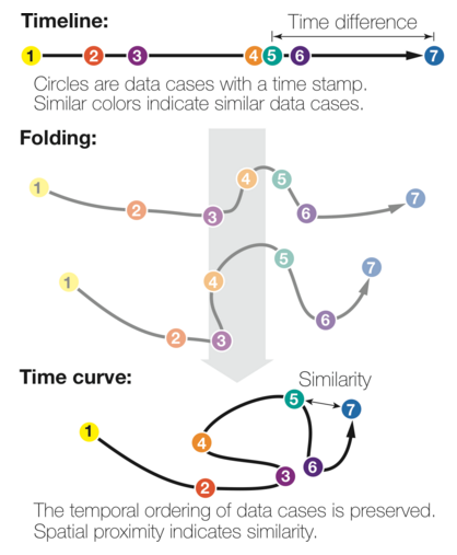
The time curve technique is a generic approach for visualizing temporal data based on self-similarity. It only assumes that the underlying information artefact can be broken down into discrete time points, and that the similarity between any two time points can be quantified through a meaningful metric. For example, a Wikipedia article can be broken down into revisions, and the edit distance can be used to quantify the similarity between any two revisions. A time curve can be seen as a timeline that has been folded into itself to reflect self-similarity (see Figure 1(a)). On the initial timeline, each dot is a time point, and position encodes time. The timeline is then stretched and folded into itself so that similar time points are brought close to each other (bottom). Quantitative temporal information is discarded as spacing now reflects similarity, but the temporal ordering is preserved.

Figure 1(a) also appears on the webpage as:

benjamin-bach01

Obviously a great visualization tool for temporal data but the treatment of self-similarity is greatly encouraging:

that the similarity between any two time points can be quantified through a meaningful metric.

Time curves don’t dictate to users what “meaningful metric” to use for similarity.

BTW, as a bonus, you can upload your data (JSON format) to generate time curves from your own data.

Users/analysts of temporal data need to take a long look at time curves. A very long look.

I first saw this in a tweet by Moritz Stefaner.

October 20, 2015

Pixar Online Library

Filed under: Graphics,Visualization — Patrick Durusau @ 9:52 pm

Pixar Online Library

The five most recent titles:

  • Vector Field Processing on Triangle Meshes
  • Convolutional Wasserstein Distances: Efficient Optimal Transportation on Geometric Domains
  • Approximate Reflectance Profiles for Efficient Subsurface Scattering
  • Subspace Condensation: Full Space Adaptivity for Subspace Deformations
  • A Data-Driven Light Scattering Model for Hair

Even with help from PIXAR, your app isn’t going to be compelling enough to make users forego breaks, etc.

But, on the other hand, you won’t know until you try. 😉

I was surprised that a list of Pixar films didn’t have an edgy one in the bunch.

The techniques valid for G-rated fare can be amped up for your app.

What graphics or sounds would you program for bank apps?

I first saw this in a tweet by Ozge Ozcakir.

October 15, 2015

Visual Information Theory

Filed under: Information Theory,Shannon,Visualization — Patrick Durusau @ 2:47 pm

Visual Information Theory by Christopher Olah.

From the post:

I love the feeling of having a new way to think about the world. I especially love when there’s some vague idea that gets formalized into a concrete concept. Information theory is a prime example of this.

Information theory gives us precise language for describing a lot of things. How uncertain am I? How much does knowing the answer to question A tell me about the answer to question B? How similar is one set of beliefs to another? I’ve had informal versions of these ideas since I was a young child, but information theory crystallizes them into precise, powerful ideas. These ideas have an enormous variety of applications, from the compression of data, to quantum physics, to machine learning, and vast fields in between.

Unfortunately, information theory can seem kind of intimidating. I don’t think there’s any reason it should be. In fact, many core ideas can be explained completely visually!

Great visualization of the central themes of information theory!

Plus an interesting aside at the end of the post:

Claude Shannon’s original paper on information theory, A Mathematical Theory of Computation, is remarkably accessible. (This seems to be a recurring pattern in early information theory papers. Was it the era? A lack of page limits? A culture emanating from from Bell Labs?)

Cover & Thomas’ Elements of Information Theory seems to be the standard reference. I found it helpful.

Cover & Thomas’ Elements of Information Theory

I don’t find Shannon’s “accessibility” all that remarkable, he was trying to be understood. Once a field matures and develops an insider jargon, trying to be understood is no longer “professional.” Witness the lack of academic credit for textbooks and other explanatory material as opposed to jargon-laden articles that may or may not be read by anyone other than proof readers.

September 8, 2015

Investigation of Sound

Filed under: Infographics,Visualization — Patrick Durusau @ 6:52 pm

Investigation of Sound by Dorthy Lei.

From the post:

The word “infographics” has become a cliché nowadays. Whether you are a company trying to present marketing data or innovations to clients; charity that needs to effectively show the way you will spend donations; or, a lecturer sharing information to your peers and students. The question is still the same. How do you show your information in a simple and interesting way to your audience?

The answer is – Infographics

The definition of infographics according to the Design Handbook by Jenn and Ken Visocky O’Grady is: “Information design is about the clear and effective presentation of information. It involves a multi and interdisciplinary approach to communication, combining skills from graphic design, technical and non-technical authoring, psychology, communication theory and cultural studies.” [Thissen, 2004]

We need infographics in many different situations. Presenting survey data, simplifying a complicated idea, explaining how something works and comparing information. This is especially true in today’s world where information is becoming increasing prominent in our daily lives. We can use infographics to make this clearer.

Looking back to six years ago, I was unsure what the word meant. I remember my tutors’ guidance in helping me to explore the concept for myself. I thoroughly enjoyed discovering the many ways in which information can be presented visually.

In one exercise, we were asked to work with a partner and choose a space approximately three meters square. It was here that we would spend time on two occasions, and three hours on each occasion a few weeks apart.

The closing paragraph crystallizes why you should read this post:

An easy-to-read infographic makes information presentable and digestible to its audience. We have different types of infographics. Some are static, while other are interactive, allowing the user to explore and filter information as they please. I am glad I am able to tell the story of things which cannot be seen or touched. I believe this will help us to understand our lives for the better.

What “…things which cannot be seen or touched…” do you want to tell stories about?

September 3, 2015

Scheduling Tasks and Drawing Graphs…

Filed under: Graphs,Visualization — Patrick Durusau @ 8:47 pm

Scheduling Tasks and Drawing Graphs — The Coffman-Graham Algorithm by Borislav Iordanov.

From the post:

When an algorithm developed for one problem domain applies almost verbatim to another, completely unrelated domain, that is the type of insight, beauty and depth that makes computer science a science on its own, and not a branch of something else, namely mathematics, like many professionals educated in the field mistakenly believe. For example, one of the common algorithmic problems during the 60s was the scheduling of tasks on multiprocessor machines. The problem is, you are given a large set of tasks, some of which depend on others, that have to be scheduled for processing on N number of processors in such a way as to maximize processor use. A well-known algorithm for this problem is the Coffman-Graham algorithm. It assumes that there are no circular dependencies between the tasks, as is usually the case when it comes to real world tasks, except in catch 22 situations at some bureaucracies run amok! To do that, the tasks and their dependencies are modeled as a DAG (a directed acyclic graph). In mathematics, this is also known as a partial order: if a tasks T1 depends on T2, we say that T2 preceeds T1, and we write T2 < T1. The ordering is called partial because not all tasks are related in this precedence relation, some are simply independent of each other and can be safely carried out in parallel.

The post is a 5 minute read and ends beautifully. I promise.

August 31, 2015

Rendering big geodata on the fly with GeoJSON-VT

Filed under: Geospatial Data,MapBox,Topic Maps,Visualization — Patrick Durusau @ 8:33 pm

Rendering big geodata on the fly with GeoJSON-VT by Vladimir Agafonkin.

From the post:

Despite the amazing advancements of computing technologies in recent years, processing and displaying large amounts of data dynamically is still a daunting, complex task. However, a smart approach with a good algorithmic foundation can enable things that were considered impossible before.

Let’s see if Mapbox GL JS can handle loading a 106 MB GeoJSON dataset of US ZIP code areas with 33,000+ features shaped by 5.4+ million points directly in the browser (without server support):

An observation from the post:


It isn’t possible to render such a crazy amount of data in its entirety at 60 frames per second, but luckily, we don’t have to:

  • at lower zoom levels, shapes don’t need to be as detailed
  • at higher zoom levels, a lot of data is off-screen

The best way to optimize the data for all zoom levels and screens is to cut it into vector tiles. Traditionally, this is done on the server, using tools like Mapnik and PostGIS.

Could we create vector tiles on the fly, in the browser? Specifically for this purpose, I wrote a new JavaScript library — geojson-vt.

It turned out to be crazy fast, with its usefulness going way beyond the browser:

In addition to being a great demonstration of the visualization of geodata, I mention this post because it offers insights into the visualization of topic maps.

When you read:

  • at lower zoom levels, shapes don’t need to be as detailed
  • at higher zoom levels, a lot of data is off-screen

What do you think the equivalents would be for topic map navigation?

If we think of “shapes don’t need to be as detailed” for a crime topic map, could it be that all offenders, men, women, various ages, races and religions are lumped into an “offender” topic?

And if we think of “a lot of data is off-screen,” is that when we have narrowed a suspect pool down by gender, age, race, etc.?

Those dimensions would vary by the subject of the topic map and would require considering “merging” as a function of the “zoom” into a set of subjects.

Suggestions?

PS: BTW, do work through the post. For geodata this looks very good.

August 30, 2015

The 27 Worst Charts Of All Time

Filed under: Graphics,Visualization — Patrick Durusau @ 6:58 pm

The 27 Worst Charts Of All Time by Walter Hickey.

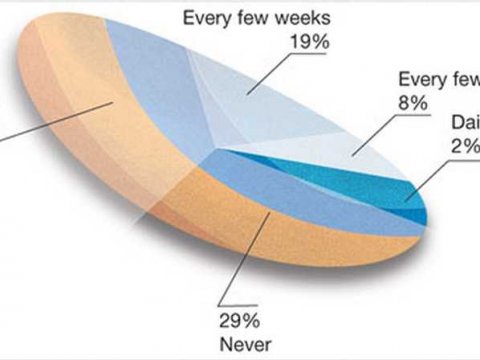
Walter starts his post with:

pie-chart.png

Impressively bad. Yes?

See Walter’s post for twenty-six (26) other examples of what not to do.

August 9, 2015

Birth of Music Visualization (Apr, 1924)

Filed under: Music,Visualization — Patrick Durusau @ 10:25 am

Birth of Music Visualization (Apr, 1924)

xlg_light_show_0

The date’s correct. Article in Popular Mechanics, April 1924.

From the article:

The clavilux has three manuals and a triple light chamber, corresponding respectively to the keyboard and wind chest of the pipe organ. Disk keys appear on the manual, moving to and from the operator and playing color and form almost as the pipe organ plays sound.

There are 100 positions for each key, making possible almost infinite combinations of color and form. The “music,” or notation, is printed in figures upon a five-lined staff, three staves joined, as treble and bass clefs are joined for piano, to provide a “clef” for each of the three manuals. A color chord is represented by three figures as, for example, “40-35-60″; and movement of the prescribed keys to the designated positions on the numbered scale of the keyboard produces the desired figure.

The artist sits at the keyboard with the notation book before him. He releases the light by means of switches. By playing upon the keys he projects it upon the screen, molds it into form, makes the form move and change in rhythm, introduces texture and depth, and finally injects color of perfect purity in any degree of intensity.

When you have the time, check out the archives of Popular Mechanics and Popular Electronics for that matter at Google Books.

I don’t know if a topic map of the “hands-on” projects from those zines would have a market or not. The zines covering that sort of thing have died, or at least that is my impression.

Modern equivalents to Popular Mechanics/Electronics that you can point out?

August 2, 2015

Mapping the world of Mark Twain (subject confusion)

Filed under: Literature,Mapping,Maps,Visualization — Patrick Durusau @ 8:58 pm

Mapping the world of Mark Twain by Andrew Hill.

From the post:

Mapping Mark Twain

This weekend I was looking through Project Gutenberg and found something even better than a single book, I found the complete works of Mark Twain. I remembered how geographic the stories of Twain are and so knew immediately I had found a treasure chest. For the last few days, I’ve been parsing the books line-by-line and trying to find the localities that make up the world of Mark Twain. In the end, the data has over 20,000 localities. Even counting the cases where sir names are mistaken for places, it is a really cool dataset. What I’ll show you here is only the tip of the iceberg. I put the results together as an interactive map that maybe will inspire you to take a journey with Twain on your own, extend your life a little.

Sounds great!

Warning: Subject Confusion

Mapping the world of Mark Twain (the map)!

The blog entry: http://andrewxhill.com/blog/2014/01/26/Mapping-the-world-of-Mark-Twain/ has the same name as the map: http://andrewxhill.com/maps/writers/twain/index.html.

Both are excellent and the blog entry includes details on how you can construct similar maps.

Topic maps disambiguate names that would otherwise lead to confusion!

What names do you need to disambiguate?

Or do you need to avoid subject confusion with names used by others? (Unknown to you.)

July 18, 2015

intermediate-d3

Filed under: D3,Graphics,Visualization — Patrick Durusau @ 6:21 pm

intermediate-d3

From the webpage:

These code examples accompany the O’Reilly video course “Intermediate d3.js: Charts, Layouts, and Maps”.

This video is preceded by the introductory video course “An Introduction to d3.js: From Scattered to Scatterplot”. I recommend watching and working through that course before attempting this one.

Some of these examples are adapted from the sample code files for Interactive Data Visualization for the Web (O’Reilly, March 2013).

If you have been looking to step up your d3 skills, here’s the opportunity to do so!

Enjoy!

July 4, 2015

Our World in Data

Filed under: History,Visualization — Patrick Durusau @ 4:03 pm

Our World in Data by Mike Roser.

Visualizations of War & Violence, Global Health, Africa, World Poverty and World Hunger & Food Provision.

An author chooses their time period but I find limiting the discussion of world poverty to the last 2,000 years problematic. Obtaining even projected data would be problematic but we know there were civilizations, particularly in the Ancient Near East and in Pre-Columbian America that had rather high standards of living. For that matter, for the time period given, the poverty map skips over the Roman Empire at its height, saying “we know that every country was extremely poor compared to modern living standards.”

The Romans had public bath houses, running water, roads that we still use today, public entertainment, libraries, etc. I am not sure how they were “extremely poor compared to modern living conditions.”

It is also problematic (slide 12) when Max says that:

Before modern economic growth the huge majority lived in extreme poverty and only a tiny elite enjoyed a better standard of living.

There are elites in every society that live better than most but that doesn’t automatically imply that over 84% to 94% of the world population was living in poverty. You don’t sustain a society such as the Aztecs or the Incas with only 6 to 16% of the population living outside poverty.

I am deeply doubtful of Max’s conclusion that in terms of poverty the world is becoming more “equal.”

Part of that skepticism is from being aware of statistics like:

“With less than 5 percent of world population, the U.S. uses one-third of the world’s paper, a quarter of the world’s oil, 23 percent of the coal, 27 percent of the aluminum, and 19 percent of the copper,” he reports. “Our per capita use of energy, metals, minerals, forest products, fish, grains, meat, and even fresh water dwarfs that of people living in the developing world.”
Use It and Lose It: The Outsize Effect of U.S. Consumption on the Environment

Considering that many of those resources are not renewable, there is a natural limit to how much improvement can or will take place outside of the United States. When renewable resources become more practical than they are today, they will only supplement the growing consumption of energy in the United States, not replace it.

Max provides access to his data sets if you are interested in exploring the data further. I would be extremely careful with his World Bank data because the World Bank does have an agenda to show the benefits of development across the world.

Considering the impact of consumption on the environment, the World Bank’s pursuit of a global consumption economy may be one of the more ill-fated schemes of all time.

If you are interested in this type of issue, the National Geographic’s Greendex may be of interest.
June 30, 2015

The Chaos Ladder

Filed under: Interface Research/Design,Visualization — Patrick Durusau @ 8:46 pm

The Chaos Ladder – A visualization of Game of Thrones character appearences by Patrick Gillespie

From the webpage:

What is this?

A visualization of character appearences on HBO’s Game of Thrones TV series.

  • Hover over a character to get more information.
  • Slide the timeline to see how things have changed over time. You can do this with your mouse or the arrow keys on your keyboard.

If you prefer something a bit more entertaining for the long holiday weekend, check out this visualization of characters from the Game of Thrones. on HBO. (Personally I prefer the book version.)

There are a number of modeling challenges in this tale. For example, how would you model the various relationships of Cersei Lannister and who knew about which relationships when?

Anyone modeling intelligence data should find that a warm up exercise. 😉

Enjoy!

Interactive Data Visualization…

Filed under: Interface Research/Design,Visualization — Patrick Durusau @ 4:30 pm

Interactive Data Visualization using D3.js, DC.js, Nodejs and MongoDB by Anmol Koul.

From the post:

The aim behind this blog post is to introduce open source business intelligence technologies and explore data using open source technologies like D3.js, DC.js, Nodejs and MongoDB.

Over the span of this post we will see the importance of the various components that we are using and we will do some code based customization as well.

The Need for Visualization:

Visualization is the so called front-end of modern business intelligence systems. I have been around in quite a few big data architecture discussions and to my surprise i found that most of the discussions are focused on the backend components: the repository, the ingestion framework, the data mart, the ETL engine, the data pipelines and then some visualization.

I might be biased in favor of the visualization technologies as i have been working on them for a long time. Needless to say visualization is as important as any other component of a system. I hope most of you will agree with me on that. Visualization is instrumental in inferring the trends from the data, spotting outliers and making sense of the data-points.

What they say is right, A picture is indeed worth a thousand words.

The components of our analysis and their function:

D3.js: A javascript based visualization engine which will render interactive charts and graphs based on the data.

Dc.js: A javascript based wrapper library for D3.js which makes plotting the charts a lot easier.

Crossfilter.js: A javascript based data manipulation library. Works splendid with dc.js. Enables two way data binding.

Node JS: Our powerful server which serves data to the visualization engine and also hosts the webpages and javascript libraries.

Mongo DB: The resident No-SQL database which will serve as a fantastic data repository for our project.

[I added links to the components.]

A very useful walk through of interactive data visualization using open source tools.

It does require a time investment on your part but you will be richly rewarded with skills, ideas and new ways of thinking about visualizing your data.

Enjoy!

June 28, 2015

The Week’s Most Popular Data Journalism Links [June 22nd]

Filed under: Journalism,News,Reporting,Visualization — Patrick Durusau @ 2:49 pm

Top Ten #ddj: The Week’s Most Popular Data Journalism Links by GIJN Staff and Connected Action.

From the post:

What’s the data-driven journalism crowd tweeting? Here are the Top Ten links for Jun 11-18: mapping global tax evasion (@grandjeanmartin), vote for best data journalism site (@GENinnovate); data viz examples (@visualoop, @OKFN), data retention (@Frontal21) and more.

A number of compelling visualizations and in particular: SwissLeaks: the map of the globalized tax evasion. Imaginative visualization of countries but not with the typical global map.

A great first step but I don’t find country level visualizations (or agency level accountability) all that compelling. There is $X amount of tax avoidance in country Y but that lacks the impact of naming the people who are evading the taxes, perhaps along with a photo for the society pages and their current location.

BTW, you should start following #ddj on Twitter.

« Newer PostsOlder Posts »

Powered by WordPress