This interactive map shows how ‘wrong’ other maps are by Adam Taylor.
From the post:
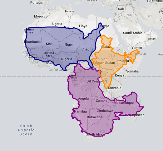
Given how popular the Mercator projection is, it’s wise to question how it makes us view the world. Many have noted, for example, how the distortion around the poles makes Africa look smaller than Greenland, when in reality Africa is about 14.5 times as big. In 2010, graphic artist Kai Krause made a map to illustrate just how big the African continent is. He found that he was able to fit the United States, India and much of Europe inside the outline of the African continent.
Inspired by Krause’s map, James Talmage, and Damon Maneice, two computer developers based out of Detroit, created an interactive graphic that really puts the distortion caused by the Mercator map into perspective. The tool, dubbed “The True Size” allows you to type in the name of any country and move the outline around to see how the scale of the country gets distorted the closer it gets to the poles.
Of course, one thing the map shows well is the sheer size of Africa. Here it is compared with the United States, China and India.
…
This is a great resource for anyone who wants to learn more about the physical size of countries, but it is also an illustration that no map is “wrong,” some display the information you seek better than others.
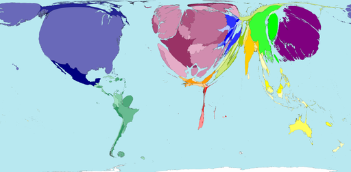
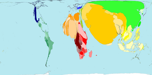
For another interesting take on world maps, see WorldMapper where you will find gems like:
GDP Wealth
Absolute Poverty
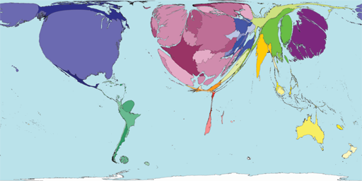
Or you can rank countries by their contributions to science:
Science Research
None of these maps is more “true” than the others.
Which one you choose depends on the cause you want to advance.