Telling your data’s story: How storytelling can enhance the effectiveness of your visualizations by Michael Freeman.
From the post:
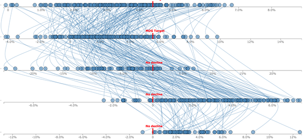
Visualizing complex relationships in big data often requires involved graphical displays that can be intimidating to users. As the volume and complexity of data collection and storage scale exponentially, creating clear, communicative, and approachable visual representations of that data is an increasing challenge. As a data visualization specialist, I frightened one of my first sets of collaborators when I suggested using this display:
What I had failed to communicate was that we would use a story structure to introduce audiences to the complex layout (you can see how I did it here).
Michael tackles big data visualizations that are unclear, present too much information and too many variables.
Most of us can produce visualizations that frighten and confuse, but how many of us can construct visualizations that inform and persuade?
There isn’t a cookie cutter solution to the problem of effectively visualizing data but this post will gently move you in the direction of better visualizations.
Enjoy!
PS: Not that anyone has ever seen a topic map visualization that frightened rather than informed. 😉