Another Word For It Patrick Durusau on Topic Maps and Semantic Diversity

January 14, 2015

Cool Interactive experiments of 2014

Filed under: Graphics,Interface Research/Design,Visualization — Patrick Durusau @ 7:21 pm

Cool Interactive experiments of 2014

From the post:

As we continue to look back at 2014, in search of the most interesting, coolest and useful pieces of content that came to our attention throughout the year, it’s only natural that we find projects that, despite being much less known and spoken of by the data visualization community than the ones of “The New York Times” or “The Washington Post”, have a certain “je ne sais quoi” to it, either it’s the project’s overall aesthetics, or the type of the data visualized.

Most of all, these projects show how wide the range of what visualization can be used for, outside the pressure of a client, a deadline or a predetermined tool to use. Self-promoting pieces, despite the low general value they might have, still play a determinant role in helping information designers test and expand their skills. Experimentation is at the core of this exciting time we are living in, so we gathered a couple of dozens of visual experiments that we had the opportunity to feature in our weekly “Interactive Inspiration” round ups, published every Friday.

Very impressive! I will just list the titles for you here:

  • The Hobbit | Natalia Bilenko, Asako Miyakawa
  • Periodic Table of Storytelling | James Harris
  • Graph TV | Kevin Wu
  • Beer Viz | Divya Anand, Sonali Sharma, Evie Phan, Shreyas
  • One Human Heartbeat | Jen Lowe
  • We can do better | Ri Liu
  • F1 Scope | Michal Switala
  • F1 Timeline | Peter Cook
  • The Largest Vocabulary in Hip hop | Matt Daniels
  • History of Rock in 100 Songs | Silicon Valley Data Science
  • When sparks fly | Lam Thuy Vo
  • The Colors of Motion | Charlie Clark
  • World Food Clock | Luke Twyman
  • Score to Chart | Davide Oliveri
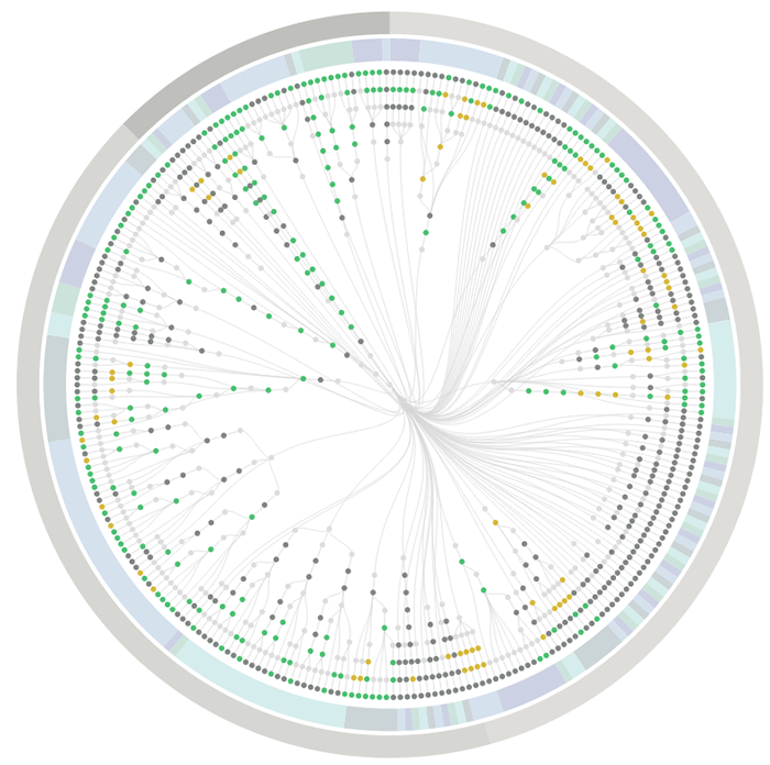
  • Culturegraphy | Kim Albrecht
  • The Big Picture | Giulio Fagiolini
  • Commonwealth War Dead: First World War Visualised | James Offer
  • The Pianogram | Joey Cloud
  • Faces per second in episodes of House of Cards TV Series | Virostatiq
  • History Words Flow | Santiago Ortiz
  • Global Weirding | Cicero Bengler

If they have this sort of eye candy every Friday, mark me down as a regular visitor to VisualLoop.

BTW, I could have used XSLT to scrape the titles from the HTML but since there weren’t any odd line breaks, a regex in Emacs did the same thing with far fewer keystrokes.

I sometimes wonder if “interactive visualization” focuses too much on the visualization reacting to our input? After all, we are already interacting with visual stimuli in ways I haven’t seen duplicated on the image side. In that sense, reading books is an interactive experience, just on the user side.

January 3, 2015

PhantomFlow

Filed under: Graphics,Interface Research/Design,Usability,UX,Workflow — Patrick Durusau @ 4:12 pm

PhantomFlow

From the webpage:

PhantomFlow

UI testing with decision trees. An experimental approach to UI testing, based on Decision Trees. A NodeJS wrapper for PhantomJS, CasperJS and PhantomCSS, PhantomFlow enables a fluent way of describing user flows in code whilst generating structured tree data for visualisation.

PhantomFlow Report: Test suite overview with radial Dendrogram and pie visualisation

The above visualisation is a real-world example, showing the complexity of visual testing at Huddle.

Aims

  • Enable a more expressive way of describing user interaction paths within tests
  • Fluently communicate UI complexity to stakeholders and team members through generated visualisations
  • Support TDD and BDD for web applications and responsive web sites
  • Provide a fast feedback loop for UI testing
  • Raise profile of visual regression testing
  • Support misual regression workflows, quick inspection & rebasing via UI.

If you are planning on being more user focused (translation: successful in gaining users) this year, PhantomFlow may be the tool for you!

It strikes me as a tool that can present the workflow differently than you are accustomed to seeing it. I find that helpful because I will overlook potential difficulties because I already know how some function works.

The red button labeled STOP! may mean to a user that the application stops. Not that the decryption key on the hard drive is trashed to prevent decryption even if I give up the key under torture. That may not occur to them. If that happens on their hard drive, they may be rather miffed.

January 2, 2015

Augmented Reality or Same Old Sh*t (just closer)

ODG just set the new bar for augmented reality by Signe Brewster.

From the post:

Back in the fall of 2014, a little-known San Francisco company called ODG released two pairs of augmented reality glasses. While the industry’s software companies were busy hawking Epson’s respectable BT-200 glasses, developers were telling me something different: It’s all about ODG.

Now, ODG is expanding into the consumer space with a new headset it will announce at the CES conference. The yet-to-be named glasses will be designed similarly to Wayfarer sunglasses (every consumer augmented reality company’s choice these days) and weigh a relatively light 125 grams. They run on an integrated battery and work with ODG’s series of input devices, plus anything else that relies on Bluetooth. They will cost less than $1,000 and are scheduled to be released by the end of the year. ODG will debut a new software platform next week to complement the glasses. It all runs on Android.

Signe’s post isn’t long on details but she does have direct experience using the ODG headsets. Most of the rest of us will have to wait until the end of 2015. Rats!

In the meantime, however, I suspect you are going to be more interested in the developer resources:

Developer Resources

ODG supports Developers through it’s ReticleOS™ SDK and Developer Support Site with API documentation, tutorials, sample code, UI/UX guide, and forums that will allow developers to program new applications and modify existing ones. You can also apply for a 25% discount for glasses, up to 2 sets.

In Q4, we will offer a hardware development kit consisting of same board, sensors, controls, and camera as in the glasses with an HDMI out and serial port.

Reticle OS Marketplace

Follow our UI/UX suggestions and your app can have a home in the future ODG App Marketplace to be launched shortly. For app and in-app products that you sell on the ODG marketplace, the transaction fee will be equivalent to 25% of the price.

My primary interest is in the authoring of data that could then be used by applications for ODG headsets.

For example, (speculation follows) you ask the interface for the latest news on your congressional representative, Rep. Scalise. Assume it has been discovered they are known associates with a former leader of the KKK. Do you really want every link to every story on Rep. Scalise?

Wouldn’t you prefer a de-duped news feed that gave you one link? To the most complete story on that issue and suppressed the rest? When you have time to waste you can return to the story and pursue the endless repetition without new information just like on CNN.

Is your augmented reality going to be better than your everyday reality or is it going to be the same old sh*t, just closer to your eyes?

December 16, 2014

UX Newsletter

Filed under: Interface Research/Design,UX — Patrick Durusau @ 3:32 pm

Our New Ebook: The UX Reader

From the post:

This week, MailChimp published its first ebook, The UX Reader. I could just tell you that it features revised and updated pieces from our UX Newsletter, that you can download it here for $5, and that all proceeds go to RailsBridge. But instead, I’m hearing the voice of Mrs. McLogan, my high school physics teacher:

“Look, I know you’ve figured out the answer, but I want you to show your work.”

Just typing those words makes me sweat—I still get nervous when I’m asked to show how to solve a problem, even if I’m confident in the solution. But I always learn new things and get valuable feedback whenever I do.

So today I want to show you the work of putting together The UX Reader and talk more about the problem it helped us solve.

After you read this post, you too will be a subscriber to the UX Newsletter. Not to mention having a copy of the updated book, The UX Reader.

Worth the time to read and put in to practice what it reports.

Or as I told an old friend earlier today:

The greatest technology/paradigm without use is only interesting, not compelling or game changing.

December 14, 2014

What Is the Relationship Between HCI Research and UX Practice?

Filed under: HCIR,Interface Research/Design,UX — Patrick Durusau @ 5:01 pm

What Is the Relationship Between HCI Research and UX Practice? by Stuart Reeves

From the post:

Human-computer interaction (HCI) is a rapidly expanding academic research domain. Academic institutions conduct most HCI research—in the US, UK, Europe, Australasia, and Japan, with growth in Southeast Asia and China. HCI research often occurs in Computer Science departments, but retains its historically strong relationship to Psychology and Human Factors. Plus, there are several large, prominent corporations that both conduct HCI research themselves and engage with the academic research community—for example, Microsoft Research, PARC, and Google.

If you aren’t concerned with the relationship between HCI research and UX practice you should be.

I was in a meeting discussing the addition of RDFa to ODF when a W3C expert commented that the difficulty users have with RDFa syntax was a “user problem.”

Not to pick on RDFa, I think many of us in the topic map camp felt that users weren’t putting enough effort into learning topic maps. (I will only confess that for myself. Others can speak for themselves.)

Anytime an advocate and/or developer takes the view that syntax, interfaces or interaction with a program is a “user problem,” they pointing the wrong way with the stick.

They should be pointing at the developers, designers, advocates who have not made interaction with their program/software intuitive for the “targeted audience.”

If your program is a LaTeX macro targeted at physicists who eat LaTeX for breakfast, lunch and dinner, that’s one audience.

If your program is an editing application is targeted at users crippled by the typical office suite menus, then you had best make different choices.

That is assuming that use of your application is your measure of success.

Otherwise you can strive to be the second longest running non-profitable software project (Xandu, started in 1960 has first place) in history.

Rather than being right, or saving the world, or any of the other …ologies, I would prefer to have software that users find useful and do in fact use.

Use is pre-condition to any software or paradigm changing the world.

Yes?

PS: Don’t get me wrong, Xandu is a great project but its adoption of web browsers as means of delivery is a mistake. True, they are everywhere but also subject to the crippled design of web security which prevents transclusion. Which ties you to a server where the NSA can more conveniently scoop up your content.

Better would be a document browser that uses web protocols and ignores web security rules, thus enabling client-side transclusion. Fork one of the open source browsers and be done with it. Only use digitally signed PDFs or from particular sources. Once utility is demonstrated in a PDF-only universe, the demand will grow for extending it to other sources as well.

True, some EU/US trade delegates and others will get caught in phishing schemes but I consider that grounds for dismissal and forfeiture of all retirement benefits. (Yes, I retain a certain degree of users be damned but not about UI/UX experiences. 😉 )

My method of avoiding phishing schemes is to never follow links in emails. If there is an offer I want to look at, I log directly into the site from my browser and not via email. Even for valid messages, which they rarely are.

I first saw this in a tweet by Raffaele Boiano.

November 24, 2014

Friedrich Nietzsche and his typewriter – a Malling-Hansen Writing Ball

Filed under: Interface Research/Design,Philosophy — Patrick Durusau @ 5:01 pm

Friedrich Nietzsche and his typewriter – a Malling-Hansen Writing Ball

keyboard of typing ball

typing ball, full shot

From the webpage:

The most prominent owner of a writing ball was probably the German philosopher, Friedrich Nietzsche (1844-1900). In 1881, when he was almost blind, Nietzsche wanted to buy a typewriter to enable him to continue his writing, and from letters to his sister we know that he personally was in contact with “the inventor of the typewriter, Mr Malling-Hansen from Copenhagen”. He mentioned to his sister that he had received letters and also a typewritten postcard as an example.

Nietzsche received his writing ball in 1882. It was the newest model, the portable tall one with a colour ribbon, serial number 125, and several typescripts are known to have been written by him on this writing ball. We know that Nietzsche was also familiar with the newest Remington typewriter (model 2), but as he wanted to buy a portable typewriter, he chose to buy the Malling-Hansen writing ball, as this model was lightweight and easy to carry — one might say that it was the “laptop” of that time.

Unfortunately Nietzsche wasn’t totally satisfied with his purchase and never really mastered the use of the instrument. Until now, many people have tried to understand why Nietzsche did not make more use of it, and a number of theories have been suggested such as that it was an outdated and poor model, that it was possible to write only upper case letters, etc. Today we can say for certain that all this is only speculation without foundation.

The writing ball was a solidly constructed instrument, made by hand and equipped with all the features one would expect of a modern typewriter.

You can now read the details about the Nietzsche writing ball in a book, “Nietzches Schreibkigel”, by Dieter Eberwein, vice-president of the International Rasmus Malling-Hansen Society, published by “Typoscript Verlag”. In it, Eberwein tells the true story about Nietzche’s writing ball based upon thorough investigation and restoration of the damaged machine.

If you think of Nietzsche‘s typing ball as an interface, it is certainly different from the keyboards of today.

I am not sure I could re-learn the “home” position for my fingers but certainly would be willing to give it a try.

Not as far fetched as you might think, a typing ball. Matt Adereth posted this image of a prototype typing ball:

proto-type typing ball

Where would you put the “nub” and “buttons” for a pointing device? Curious about the ergonomics. If anyone decides to make prototypes, put my name down as definitely interested.

I saw this earlier today in a tweet by Vincent Zimmer although I already aware of
Nietzsche’s typing ball.

November 18, 2014

When Information Design is a Matter of Life or Death

Filed under: Design,Interface Research/Design,Medical Informatics — Patrick Durusau @ 4:43 pm

When Information Design is a Matter of Life or Death by Thomas Bohm.

From the post:

In 2008, Lloyds Pharmacy conducted 20 minute interviews1 with 1,961 UK adults. Almost one in five people admitted to having taken prescription medicines incorrectly; more than eight million adults have either misread medicine labels or misunderstood the instructions, resulting in them taking the wrong dose or taking medication at the wrong time of day. In addition, the overall problem seemed to be more acute among older patients.

Almost one in five people admitted to having taken prescription medicines incorrectly; more than eight million adults have either misread medicine labels or misunderstood the instructions.

Medicine or patient information leaflets refer to the document included inside medicine packaging and are typically printed on thin paper (see figures 1.1–1.4). They are essential for the safe use of medicines and help answer people’s questions when taking the medicine.

If the leaflet works well, it can lead to people taking the medicine correctly, hopefully improving their health and wellness. If it works poorly, it can lead to adverse side effects, harm, or even death. Subsequently, leaflets are heavily regulated in the way they need to be designed, written, and produced. European2 and individual national legislation sets out the information to be provided, in a specific order, within a medicine information leaflet.

A good reminder that failure to communicate in some information systems has more severe penalties than others.

I was reminded while reading the “thin paper” example:

Medicine information leaflets are often printed on thin paper and folded many times to fit into the medicine package. There is a lot of show-through from the information printed on the back of the leaflet, which decreases readability. When the leaflet is unfolded, the paper crease marks affect the readability of the text (see figures 1.3 and 1.4). A possible improvement would be to print the leaflet on a thicker paper.

of a information leaflet that unfolded to be 18 inches wide and 24 inches long. A real tribute to the folding art. The typeface was challenging even with glasses and a magnifying glass. Too tiring to read much of it.

I don’t think thicker paper would have helped, unless the information leaflet became an information booklet.

What are the consequences if someone misreads your interface?

October 29, 2014

UX Directory

Filed under: Interface Research/Design,Users,UX — Patrick Durusau @ 11:05 am

UX Directory

Two Hundred and six (206) resources listed under the following categories:

  • A/B Testing
  • Blogroll
  • Design Evaluation Tools
  • Dummy Text Generators
  • Find Users to Test
  • Gamification Companies
  • Heatmaps / Mouse Tracking Tools
  • Information Architecture Creation Tools
  • Information Architecture Evaluation Tools
  • Live Chat Support Tools
  • Marketing Automation Tools
  • Mobile Prototyping
  • Mockup User Testing
  • Multi-Use UX Tools
  • Screen Capture Tools
  • Synthetic Eye-Tracking Tools
  • User Testing Companies
  • UX Agencies / Consultants
  • UX Survey Tools
  • Web Analytics Tools
  • Webinar / Web Conference Platforms
  • Wirefram/Mockup Tools

If you have a new resource that should be on this list, contact abetteruserexperience@gmail.com

I first saw this in Nat Torkington’s Four short links: 28 October 2014.

October 14, 2014

How designers prototype at GDS

Filed under: Design,Interface Research/Design — Patrick Durusau @ 10:53 am

How designers prototype at GDS by Rebecca Cottrell.

From the post:

All of the designers at GDS can code or are learning to code. If you’re a designer who has used prototyping tools like Axure for a large part of your professional career, the idea of prototyping in code might be intimidating. Terrifying, even.

I’m a good example of that. When I joined GDS I felt intimidated by the idea of using Terminal and things like Git and GitHub, and just the perceived slowness of coding in HTML.

At first I felt my workflow had slowed down significantly, but the reason for that was the learning curve involved – I soon adapted and got much faster.

GDS has lots of tools (design patterns, code snippets, front-end toolkit) to speed things up. Sharing what I learned in the process felt like a good idea to help new designers get to grips with how we work.

Not a rigid set of prescriptions but experience at prototyping and pointers to other resources. Whether you have a current system of prototyping or not, you are very likely to gain a tip or two from this post.

I first saw this in a tweet by Ben Terrett.

October 3, 2014

Beyond Light Table

Filed under: Computer Science,Interface Research/Design,Programming,Transparency — Patrick Durusau @ 10:38 am

Beyond Light Table by Chris Granger.

From the post:

I have three big announcements to make today. The first is the official announcement of our next project. We’ve been quietly talking about it over the past few months, but today we want to tell you a bit more about it and finally reveal its name:

eve

Eve is our way of bringing the power of computation to everyone, not by making everyone a programmer but by finding a better way for us to interact with computers. On the surface, Eve is an environment a little like Excel that allows you to “program” simply by moving columns and rows around in tables. Under the covers it’s a powerful database, a temporal logic language, and a flexible IDE that allows you to build anything from a simple website to complex algorithms. Instead of poring over text files full of abstract symbols, you interact with domain editors that are parameterized by grids of data. To build a UI you don’t open a text editor, you just draw it on the screen and drag data to it. It’s much closer to the ideal we’ve always had of just describing what we want and letting the machine do the rest. Eve makes the computer a real tool again – one that doesn’t require decades of training to use.

Imagine a world where everyone has access to computation without having to become a professional programmer – where a scientist doesn’t have to rely on the one person in the lab who knows python, where a child could come up with an idea for a game and build it in a couple of weekends, where your computer can help you organize and plan your wedding/vacation/business. A world where programmers could focus on solving the hard problems without being weighed down by the plumbing. That is the world we want to live in. That is the world we want to help create with Eve.

We’ve found our way to that future by studying the past and revisiting some of the foundational ideas of computing. In those ideas we discovered a simpler way to think about computation and have used modern research to start making it into reality. That reality will be an open source platform upon which anyone can explore and contribute their own ideas.

Chris goes onto announce that they have raised more money and they are looking to make one or more new hires.

Exciting news and I applaud viewing computers as tools, not as oracles that perform operations on data beyond our ken and deliver answers.

Except easy access to computation doesn’t guarantee useful results. Consider the case of automobiles. Easy access to complex machines results in 37,000 deaths and 2.35 million injuries each year.

Easy access to computers for word processing, email, blogging, webpages, Facebook, etc., hasn’t resulted in a single Shakespearean sonnet, much less the complete works of Shakespeare.

Just as practically, how do I distinguish between success on the iris dataset and a data set with missing values, which can make a significant difference in results when I am dragging and dropping?

I am not a supporter of using artificial barriers to exclude people from making use of computation but on the other hand, what weight should be given to their “results?”

As “computation” spreads will “verification of results” become a new discipline in CS?

October 1, 2014

The Missing Piece in Complex Analytics: Low Latency, Scalable Model Management and Serving with Velox

Filed under: HPC,Interface Research/Design,Machine Learning,Modeling,Velox — Patrick Durusau @ 8:25 pm

The Missing Piece in Complex Analytics: Low Latency, Scalable Model Management and Serving with Velox by Daniel Crankshaw, et al.

Abstract:

To support complex data-intensive applications such as personalized recommendations, targeted advertising, and intelligent services, the data management community has focused heavily on the design of systems to support training complex models on large datasets. Unfortunately, the design of these systems largely ignores a critical component of the overall analytics process: the deployment and serving of models at scale. In this work, we present Velox, a new component of the Berkeley Data Analytics Stack. Velox is a data management system for facilitating the next steps in real-world, large-scale analytics pipelines: online model management, maintenance, and serving. Velox provides end-user applications and services with a low-latency, intuitive interface to models, transforming the raw statistical models currently trained using existing offline large-scale compute frameworks into full-blown, end-to-end data products capable of recommending products, targeting advertisements, and personalizing web content. To provide up-to-date results for these complex models, Velox also facilitates lightweight online model maintenance and selection (i.e., dynamic weighting). In this paper, we describe the challenges and architectural considerations required to achieve this functionality, including the abilities to span online and offline systems, to adaptively adjust model materialization strategies, and to exploit inherent statistical properties such as model error tolerance, all while operating at “Big Data” scale.

Early Warning: Alpha code drop expected December 2014.

If you want to get ahead of the curve I suggest you start reading this paper soon. Very soon.

Written from the perspective of end-user facing applications but applicable to author-facing applications for real time interaction with subject identification.

September 19, 2014

Digital Dashboards: Strategic & Tactical: Best Practices, Tips, Examples

Filed under: Interface Research/Design,Topic Map Software — Patrick Durusau @ 3:38 pm

Digital Dashboards: Strategic & Tactical: Best Practices, Tips, Examples by Avinash Kaushik.

From the post:

The Core Problem: The Failure of Just Summarizing Performance.

I humbly believe the challenge is that in a world of too much data, with lots more on the way, there is a deep desire amongst executives to get “summarize data,” to get “just a snapshot,” or to get the “top-line view.” This is understandable of course.

But this summarization, snapshoting and toplining on your part does not actually change the business because of one foundational problem:

People who are closest to the data, the complexity, who’ve actually done lots of great analysis, are only providing data. They don’t provide insights and recommendations.

People who are receiving the summarized snapshot top-lined have zero capacity to understand the complexity, will never actually do analysis and hence are in no position to know what to do with the summarized snapshot they see.

The end result? Nothing.

Standstill. Gut based decision making. No real appreciation of the delicious opportunity in front of every single company on the planet right now to have a huger impact with data.

So what’s missing from this picture that will transform numbers into action?

I believe the solution is multi-fold (and when is it not? : )). We need to stop calling everything a dashboard. We need to create two categories of dashboards. For both categories, especially the valuable second kind of dashboards, we need words – lots of words and way fewer numbers.

Be aware that the implication of that last part I’m recommending is that you are going to become a lot more influential, and indispensable, to your organization. Not everyone is ready for that, but if you are this is going to be a fun ride!

A long post on “dashboards” but I find it relevant to the design of interfaces.

In particular the advice:

This will be controversial but let me say it anyway. The primary purpose of a dashboard is not to inform, and it is not to educate. The primary purpose is to drive action!

Hence: List the next steps. Assign responsibility for action items to people. Prioritize, prioritize, prioritize. Never forget to compute business impact.

Curious how exploration using a topic map could feed into an action process? Would you represent actors in the map and enable the creation of associations that represent assigned tasks? Other ideas?

I found this in a post, Don’t data puke, says Avinash Kaushik by Kaiser Fung and followed it to the original post.

September 16, 2014

User Onboarding

Filed under: Interface Research/Design,Usability,Users,UX — Patrick Durusau @ 4:27 pm

User Onboarding by Samuel Hulick.

From the webpage:

Want to see how popular web apps handle their signup experiences? Here’s every one I’ve ever reviewed, in one handy list.

I have substantially altered Samuel’s presentation to fit the list onto one screen and to open new tabs, enabling quick comparison of onboarding experiences.

Asana iOS Instagram OkCupid Slingshot
Basecamp InVision Optimizely Snapchat
Buffer LessAccounting Pinterest Trello
Evernote LiveChat Pocket Tumblr
Foursquare Mailbox for Mac Quora Twitter
GetResponse Meetup Shopify Vimeo
Gmail Netflix Slack WhatsApp

Writers become better by reading good writers.

Non-random good onboarding comes from studying previous good onboarding.

Enjoy!

I first saw this in a tweet by Jason Ziccardi.

August 27, 2014

Digital or Paper?

Filed under: Interface Research/Design — Patrick Durusau @ 4:13 pm

Readers absorb less on Kindles than on paper, study finds by Alison Flood.

From the post:

A new study which found that readers using a Kindle were “significantly” worse than paperback readers at recalling when events occurred in a mystery story is part of major new Europe-wide research looking at the impact of digitisation on the reading experience.

The study, presented in Italy at a conference last month and set to be published as a paper, gave 50 readers the same short story by Elizabeth George to read. Half read the 28-page story on a Kindle, and half in a paperback, with readers then tested on aspects of the story including objects, characters and settings.

Anne Mangen of Norway’s Stavanger University, a lead researcher on the study, thought academics might “find differences in the immersion facilitated by the device, in emotional responses” to the story. Her predictions were based on an earlier study comparing reading an upsetting short story on paper and on iPad. “In this study, we found that paper readers did report higher on measures having to do with empathy and transportation and immersion, and narrative coherence, than iPad readers,” said Mangen.

But instead, the performance was largely similar, except when it came to the timing of events in the story. “The Kindle readers performed significantly worse on the plot reconstruction measure, ie, when they were asked to place 14 events in the correct order.”

Don’t panic! The choices aren’t digital vs. paper. I have any number of titles in both forms. One for searching and the other for reading.

This report is about one data point in a largely unexplored area. Not to say there haven’t been other studies, papers, etc., but on very small groups over short periods of time.

Think of it as family snapshots of a few families versus the bulk of humanity. Useful, but not the full story.

We need to keep taking these family snapshots in hopes of building up a more comprehensive picture of our interaction with interfaces.

August 15, 2014

John Chambers: Interfaces, Efficiency and Big Data

Filed under: BigData,Interface Research/Design,R — Patrick Durusau @ 10:07 am

John Chambers: Interfaces, Efficiency and Big Data

From the description:

At useR! 2014, John Chambers was generous enough to provide us with insight into the very early stages of user-centric interactive data exploration. He explains, step by step, how his insight to provide an interface into algorithms, putting the user first has placed us on the fruitful path which analysts, statisticians, and data scientists enjoy to this day. In his talk, John Chambers also does a fantastic job of highlighting a number of active projects, new and vibrant in the R ecosystem, which are helping to continue this legacy of “a software interface into the best algorithms.” The future is bright, and new and dynamic ideas are building off these thoughtful, well measured, solid foundations of the past.

To understand why this past is so important, I’d like to provide a brief view of the historical context that underpins these breakthroughs. In 1976, John Chambers was concerned with making software supported interactive numerical analysis a reality. Let’s talk about what other advances were happening in 1976 in the field of software and computing:

You should read the rest of the back story before watching the keynote by Chambers.

Will your next interface build upon the collective experience with interfaces or will it repeat some earlier experience?

I first saw this in John Chambers: Interfaces, Efficiency and Big Data by David Smith.

August 4, 2014

User Experience Research at Scale

Filed under: Interface Research/Design,Users,UX — Patrick Durusau @ 7:14 pm

User Experience Research at Scale by Nick Cawthon.

From the post:

An important part of any user experience department should be a consistent outreach effort to users both familiar and unfamiliar. Yet, it is hard to both establish and sustain a continued voice amongst the business of our schedules.

Recruiting, screening, and scheduling daily or weekly one-on-one walkthroughs can be daunting for someone in a small department having more than just user research responsibilities, and the investment of time eventually outweighs the returns as both the number of participants and size of the company grow.

This article is targeted at user experience practitioners at small- to mid-size companies who want to incorporate a component of user research into their workflow.

It first outlines a point of advocacy around why it is important to build user research into a company’s ethos from the very start and states why relying upon standard analytics packages are not enough. The article then addresses some of the challenges around being able to automate, scale, document, and share these efforts as your user base (hopefully) increases.

Finally, the article goes on to propose a methodology that allows for an adjustable balance between a department’s user research and product design and highlights the evolution of trends, best practices, and common avoidances found within the user research industry, especially as they relate to SaaS-based products.

If you have an interest in producing products/services that meet users’ needs, i.e., the kind of products or services that sell, this is an article for you.

Guessing user needs doesn’t work.

Filed under: Interface Research/Design,UX — Patrick Durusau @ 3:49 pm

Why governments need hack days by Amy Whitney.

Amy describes a hackathon at the DVLA (Driver and Vehicle Licensing Agency) and it includes this jewel on user input:

First they went to talk to others into the DVLA to fully understand the problem. Then they went out onto the street to talk to real users about their needs. In some cases the results were eye-opening and unexpected. User research is a team sport, and users are a crucial part of that team. Guessing user needs doesn’t work. (emphasis in original)

I would emphasize: Guessing user needs doesn’t work.

Are you guessing user needs or do you have some other method to establish their needs?

I first saw this in a tweet by Mark Hurrell.

PS: Would “Guessing user needs doesn’t work.” also apply to FOL? 😉

August 2, 2014

User Interfaces

Filed under: Interface Research/Design,Marketing,UX — Patrick Durusau @ 4:20 pm

user interface

My future response to all interface statements that begin:

  • users must understand
  • users don’t know what they are missing
  • users have been seduced by search
  • users need training
  • etc.

These statements and others mean that “users,” those folks who are going to pay money for services/products, aren’t going to be happy.

Making a potential customer unhappy is a very poor sales technique.

I saw this in a tweet by Startup Vitamins.

July 24, 2014

New Testament Transcription

Filed under: Bible,Interface Research/Design — Patrick Durusau @ 10:53 am

There is an excellent example of a transcription interface at: http://ancientlives.org/tutorial/transcribe. A screen shot won’t display well but I can sketch the general form of the interface:

transcription interface

A user selects a character in the papyrus by “clicking” on its center point. That point can be moved if need be. The character will be highlighted and you then select the matching character on the keyboard.

There are examples of the instructions that can be played if you are uncertain at any point.

I can’t imagine a more intuitive transcription interface.

I have suggested crowd sourcing transcription of the New Testament (and Old Testament/Hebrew Bible as well) before to groups concerned with those texts. The response has always been that there are cases that require expertise to transcribe. Fair enough, that’s very true.

But, with crowd transcription, we would be able to use the results of hundreds if not thousands of transcribers to identify the characters or symbols that have no consistent transcription. Those particular cases could be “kicked up stairs” to the experts.

The end result, assuming access to all the extant manuscripts, would be a traceable transcription of all the sources for the New Testament back to particular manuscripts or papyri. With all the witnesses to a particular character or word being at the reader’s fingertips. (Ditto for the Old Testament/Hebrew Bible.)

We have the technology to bring the witnesses to the biblical text to everyone who is interested. The only remaining question is whether funders can overcome the reluctance of the usual suspects to granting everyone that level of access.

Personally I have no fear of free and open access to the witnesses to the biblical text. As a text the Bible has resisted efforts to pervert it meaning for more than two (2) thousand years. It can take care of itself.

July 22, 2014

Interactive Documents with R

Filed under: Interface Research/Design,R — Patrick Durusau @ 3:55 pm

Interactive Documents with R by Ramnath Vaidyanathan.

From the webpage:

The main goal of this tutorial is to provide a comprehensive overview of the workflow required to create, customize and share interactive web-friendly documents from R. We will cover a range of topics from how to create interactive visualizations and dashboards, to web pages and applications, straight from R. At the end of this tutorial, attendees will be able to apply these learnings to turn their own analyses and reports into interactive, web-friendly content.

Ramnath gave this tutorial at UseR2014. The slides have now been posted at: http://ramnathv.github.io/user2014-idocs-slides

The tutorial is listed as six (6) separate tutorials:

  1. Interactive Documents
  2. Slidify
  3. Frameworks
  4. Layouts
  5. Widgets
  6. How Slidify Works

I am always impressed by useful interactive web pages. Leaving aside the one that jump, pop and whizz with no discernible purpose, interactive documents add value to their content for readers.

Enjoy!

I first saw this in a tweet by Gregory Piatetsky.

July 19, 2014

…Ad-hoc Contextual Inquiry

Filed under: Design,Interface Research/Design,UX — Patrick Durusau @ 6:24 pm

Honing Your Research Skills Through Ad-hoc Contextual Inquiry by Will Hacker.

From the post:

It’s common in our field to hear that we don’t get enough time to regularly practice all the types of research available to us, and that’s often true, given tight project deadlines and limited resources. But one form of user research–contextual inquiry–can be practiced regularly just by watching people use the things around them and asking a few questions.

I started thinking about this after a recent experience returning a rental car to a national brand at the Phoenix, Arizona, airport.

My experience was something like this: I pulled into the appropriate lane and an attendant came up to get the rental papers and send me on my way. But, as soon as he started, someone farther up the lane called loudly to him saying he’d been waiting longer. The attendant looked at me, said “sorry,” and ran ahead to attend to the other customer.

A few seconds later a second attendant came up, took my papers, and jumped into the car to check it in. She was using an app on an tablet that was attached to a large case with a battery pack, which she carried over her shoulder. She started quickly tapping buttons, but I noticed she kept navigating back to the previous screen to tap another button.

Curious being that I am, I asked her if she had to go back and forth like that a lot. She said “yes, I keep hitting the wrong thing and have to go back.”

Will expands his story into why and how to explore random user interactions with technology.

If you want to become better at contextual inquiry and observation, Will has the agenda for you.

He concludes:

Although exercises like this won’t tell us the things we’d like to know about the products we work on, they do let us practice the techniques of contextual inquiry and observation and make us more sensitive to various design issues. These experiences may also help us build the case in more companies for scheduling time and resources for in-field research with our actual customers.

Government Software Design Questions

Filed under: Design,Interface Research/Design,Use Cases,UX — Patrick Durusau @ 3:49 pm

10 questions to ask when reviewing design work by Ben Terrett.

Ben and a colleague reduced a list of design review questions by Jason Fried down to ten:

10 questions to ask when reviewing design work

1. What is the user need?

2. Is what it says and what it means the same thing?

3. What’s the take away after 3 seconds? (We thought 8 seconds was a bit long.)

4. Who needs to know that?

5. What does someone know now that they didn’t know before?

6. Why is that worth a click?

7. Are we assuming too much?

8. Why that order?

9. What would happen if we got rid of that?

10. How can we make this more obvious?


I’m Ben, Director of Design at GDS. You can follow me on twitter @benterrett

A great list for reviewing any design!

Where design doesn’t just mean an interface but presentation of data as well.

I am now following @benterrett and you should too.

It is a healthy reminder that not everyone in government wants to harm their own citizens and others. A minority do but let’s not forget true public servants while opposing tyrants.

I first saw the ten questions post in Nat Torkington’s Four short links: 18 July 2014.

June 24, 2014

Onboarding

Filed under: Interface Research/Design,Usability,UX — Patrick Durusau @ 1:20 pm

10 Tips to Immediately Improve User Onboarding by Pieter Walraven.

From the post:

User onboarding is an art. It can be deceivingly simple, but anyone that has ever designed a new user journey knows it’s incredibly hard.

For starters, there’s some tough questions to answer. What main value does my product offer? Who am I talking to? What is the one most important thing new users need to see? What does my product do? Why do we even exist?!

Luckily, there’s many great products out there with tested and optimized onboarding flows to get inspiration from (read: steal).

To make your life easier, I’ve analyzed some of the web’s most popular onboarding flows. I’ve also included some gaming-inspired learnings from my time as Product Manager at social games developer Playfish as well as insights from the onboarding design of Pie, the smart team chat app I’m currently working on.

Let’s dive in!

See Pieter’s post for the details but the highlights are:

  1. Don’t have a tutorial
  2. Let the user do it
  3. Don’t teach me all at once
  4. Let me experience the ‘wow!’
  5. Repeat to create a habit
  6. Use fewer words
  7. Don’t break flow
  8. Be adaptive
  9. Remove noise
  10. Use conventions

In terms of training/education, very little of this is new. For #6 “Use fewer words,” remember Strunk & White’s – “#13 Omit needless words.” Or compare #9 “remove noise” with Strunk & White #14 “Avoid a succession of loose sentences.”

Any decent UI/UX guide is going to give these rules in one form or another.

But it is important that they are repeated by different people and in various forms. Why? Open five applications at random on your phone or computer. How many out of those five have an interface that is immediately usable by a new user?

The message of what is required for good UI design is well known. Where that message fails is in the application of those principles.

At least to judge from current UIs. Yes?

Any “intuitive” UIs you would like to suggest as examples?

June 21, 2014

How To Design A Great User Interface

Filed under: Interface Research/Design,Usability,Users,UX — Patrick Durusau @ 7:50 pm

How To Design A Great User Interface

From the post:

The goal and only purpose of a user interface (UI), as the name implies, is to create an experience for the user.

Many automated solutions exist to make UI design simpler and faster; however, the designer must understand some basic rules of how to design a user interface. Because the focus is centered on the potential user, the user’s needs must primarily drive all design choices.

What are the needs of the user?

  • To accomplish the task with relative ease
  • To complete the task quickly
  • To enjoy the experience

The single most important characteristic of the UI is that it has to work well and work consistently. Secondly, the UI must carry out commands and respond quickly and intuitively. Lastly, but still very important the user interface should be visually appealing to the user.

Projects like Egas may give you a boost in the right direction for a topic map authoring/navigation interface but you are going to be ultimately responsible for your own design.

This post and the related ones will give you an opportunity to understand some of the primary issues you will face in creating a great user interface.

If you have no other take away from this post, notice that “impressing the user with how you view the paradigm” isn’t one of the goals of a great user interface.

June 18, 2014

Finding correlations in complex datasets

Filed under: Interface Research/Design,Visualization — Patrick Durusau @ 3:02 pm

Finding correlations in complex datasets by Andrés Colubri.

From the post:

It is now almost three years since I moved to Boston to start working at Fathom Information Design and the Sabeti Lab at Harvard. As I noted back then, one of the goals of this work was to create new tools for exploring complex datasets -mainly of epidemiological and health data- which could potentially contain up to thousands of different variables. After a process that went from researching visual metaphors suitable to explore these kind of datasets interactively, learning statistical techniques that can be used to quantify general correlations (not necessarily linear or between numerical quantities), and going over several iterations of internal prototypes, we finally released the 1.0 version of a tool called “Mirador” (spanish word for lookout), which attempts to bridge the space between raw data and statistical modeling. Please jump to the Mirador’s homepage to access the software and its user manual, and continue reading below for some more details about the development and design process.

The first step to build a narrative out of data is arguably finding correlations between different magnitudes or variables in the data. For instance, the placement of roads is highly correlated with the anthropogenic and geographical features of a territory. A new, unexpected, intuition-defying, or polemic correlation would probably result in an appealing narrative. Furthermore, a visual representation (of the correlation) that succeeds in its aesthetic language or conceptual clarity is also part of an appealing “data-driven” narrative. Within the scientific domains, these narratives are typically expressed in the form of a model that can be used by the researchers to make predictions. Although fields like Machine Learning and Bayesian Statistics have grown enormously in the past decades and offer techniques that allows the computer to infer predictive models from data, these techniques require careful calibration and overall supervision from the expert users who run these learning and inference algorithms. A key consideration is what variables to include in the inference process, since too few variables might result in a highly-biased model, while too many of them would lead to overfitting and large variance on new data (what is called the bias-variance dilemma.)

Leaving aside model building, an exploratory overview of the correlations in a dataset is also important in situations where one needs to quickly survey association patterns in order to understand ongoing processes, for example, the spread of an infectious disease or the relationship between individual behaviors and health indicators. The early identification of (statistically significant) associations can inform decision making and eventually help to save lives and improve public policy.

With this background in mind, three years ago we embarked in the task of creating a tool that could assist data exploration and model building by providing a visual interface to find and inspect correlations in general datasets, while having a focus on public health and epidemiological data. The thesis work from David Reshef with his tool VisuaLyzer was our starting point. Once we were handed over the initial VisuaLyzer prototype, we carried out a number of development and design iterations at Fathom, which redefined the overall workspace in VisuaLyzer but kept its main visual metaphor for data representation intact. Within this metaphor, the data is presented in “stand-alone” views such scatter plots, histograms, and maps where several “encodings” can be defined at once. An encoding is a mapping between the values of a variable in the dataset and a visual parameter, for example X and Y coordinates, size, color and opacity of the circles representing data instances, etc. This approach of defining multiple encodings in a single “large” data view is similar to what the Gapminder World visualization does.

Mirador self-describes at its homepage:

Mirador is a tool for visual exploration of complex datasets which enables users to infer new hypotheses from the data and discover correlation patterns.

Whether you call them “correlations” or “association patterns” (note the small “a” in associations), in relationships could in fact be modeled by Associations (note the capital “A” in Associations) with a topic map.

An important point for several reasons:

  • In this use case, there may be thousands of variables that contribute to an association pattern.
  • Associations can be discovered in data as opposed to being composed in an authored artifact.
  • Associations give us to the tools to talk about not just the role players identified by data analysis but also potential roles and how they compose an association.

Happy hunting!

June 11, 2014

SIGGRAPHITTI Issue 3 – June 2014

Filed under: Graphics,Interface Research/Design,Visualization — Patrick Durusau @ 6:43 pm

SIGGRAPHITTI Issue 3 – June 2014

News for SIGGRAPH2014!

As you already know:

Conference 10-14 August 2014
Exhibition 12-14 August 2014
Vancouver Convention Center

What you may not know:

Should be easy to make the Balisage Conference, August 4-8, 2014, Washington, DC and then hop a flight to Vancouver. 😉

June 3, 2014

A first-person engine in 265 lines

Filed under: Games,Graphics,Interface Research/Design,Visualization — Patrick Durusau @ 6:18 pm

A first-person engine in 265 lines

From the post:

Today, let’s drop into a world you can reach out and touch. In this article, we’ll compose a first-person exploration from scratch, quickly and without difficult math, using a technique called raycasting. You may have seen it before in games like Daggerfall and Duke Nukem 3D, or more recently in Notch Persson’s ludum dare entries. If it’s good enough for Notch, it’s good enough for me!

Not a short exercise but I like the idea of quick to develop interfaces.

Do you know if in practice it makes it easier to change/discard interfaces?

Thanks!

I first saw this in a tweet by Hunter Loftis.

June 1, 2014

Pen vs. Keyboard: Choose Wisely

Filed under: Education,Interface Research/Design — Patrick Durusau @ 6:12 pm

Students retain information better with pens than laptops by Laura Sanders.

From the post:

When it comes to taking notes, the old-fashioned way might be best. Students who jotted down notes by hand remembered lecture material better than their laptop-wielding peers did, researchers report April 23 in Psychological Science.

People taking notes on laptops have a shallower grasp of a subject than people writing with their hands, and not just because laptops distract users with other activities such as web surfing, the new study suggests.
….

The study in question: P.A. Mueller and D.M. Oppenheimer. The pen is mightier than the keyboard: advantages of longhand over laptop note taking. Psychological Science. Published online April 23, 2014. doi: 10.1177/0956797614524581.

Laura lists some resources for further reading.

What do you think this study means for the design of UIs?

I ask because some topic map UIs will be for information retrieval, where conceptual understanding isn’t at issue and others will be for imparting conceptual understandings.

What would you do differently in UI terms for those cases and just as importantly, why?

I first saw this in a tweet by Carl Anderson.

May 21, 2014

How we built interactive heatmaps…

Filed under: Design,Heatmaps,Interface Research/Design — Patrick Durusau @ 2:22 pm

How we built interactive heatmaps using Solr and Heatmap.js by Chris Becker.

From the post:

One of the things we obsess over at Shutterstock is the customer experience. We’re always aiming to better understand how customers interact with our site in their day to day work. One crucial piece of information we wanted to know was which elements of our site customers were engaging with the most. Although we could get that by running a one-off report, we wanted to be able to dig into that data for different segments of customers based on their language, country, purchase decisions, or a/b test variations they were viewing in various periods of time.

To do this we built an interactive heatmap tool to easily show us where the “hot” and “cold” parts of our pages were — where customers clicked the most, and where they clicked the least. The tool we built overlaid this heatmap on top of the live site, so we could see the site the way users saw it, and understand where most of our customer’s clicks took place. Since customers are viewing our site in many different screen resolutions we wanted the heatmap tool to also account for the dynamic nature of web layouts and show us heatmaps for any size viewport that our site is used in.

If you are offering a web interface to topic map (or other information services) this is a great way to capture user feedback on your UI.

PS: shutterstock-heatmap-toolkit (GitHub)

May 14, 2014

CrossClj

Filed under: Clojure,Indexing,Interface Research/Design,Programming — Patrick Durusau @ 7:38 pm

CrossClj: cross-referencing the clojure ecosystem

From the webpage:

CrossClj is a tool to explore the interconnected Clojure universe. As an example, you can find all the usages of the reduce function across all projects, or find all the functions called map. Or you can list all the projects using ring. You can also walk the source code across different projects.

Interesting search interface. You could lose some serious time just reading the project names. 😉

Makes me curious about the potential of listing functions and treating other functions/operators in their scope as facets?

Enjoy!

« Newer PostsOlder Posts »

Powered by WordPress