Another Word For It Patrick Durusau on Topic Maps and Semantic Diversity

August 5, 2016

Google Deletes Palestine Or Does It?

Filed under: Mapping,Maps,Politics — Patrick Durusau @ 7:52 pm

Have you heard that Google removed Palestine from Google Maps on 25 July 2016?

At first blush (warning, spoiler to this story coming):

Searching for Israel:

israel-google-map-460

Searching for Palestine:

palestine-google-460

Do you see a label for Palestine? Despite the side border in Google Maps reporting:

The State of Palestine, also known simply as Palestine, is a de jure sovereign state in the Middle East that is recognized by 136 UN members and since 2012 has a status of a non-member observer state…

Searching further I found more discussions about Google removing Palestine from Google Maps, but with conflicting dates.

That sent me to the Internet Archive WayBack Machine where I found Google Maps for Israel as follows:

2010:

google-maps-11-15-2010-israel-460

2012:

google-maps-11-15-2012-israel-460

2014:

google-maps-10-01-2014-israel-460

Some observations:

West Bank appears in 2010 but not thereafter.

Gaza is labeled if you search for Palestine but unlabeled if you search for Israel (first two images).

Curious, is there another state, recognized by 136 UN members that does not appear by name in Google Maps?

The coverage of Google Maps gets spotty the further back you go in the Internet Archive. Unfortunate because it is likely the only trusted witness to ever changing digital content.

On the whole, reports of Google deleting Palestine from Google Maps are false. Google never identified Palestine at all.

That’s not a defense to Google’s failure to identify Palestine but an attempt to illustrate Google’s historical failure to identify Palestine.

July 20, 2016

The History of Cartography

Filed under: Cartography,History,Mapping,Maps — Patrick Durusau @ 8:02 pm

The History of Cartography

From the webpage:

The first volume of the History of Cartography was published in 1987 and the three books that constitute Volume Two appeared over the following eleven years. In 1987 the worldwide web did not exist, and since 1998 book publishing has gone through a revolution in the production and dissemination of work. Although the large format and high quality image reproduction of the printed books (see right column) are still well-suited to the requirements for the publishing of maps, the online availability of material is a boon to scholars and map enthusiasts.

On this site the University of Chicago Press is pleased to present the first three volumes of the History of Cartography in PDF format. Navigate to the PDFs from the left column. Each chapter of each book is a single PDF. The search box on the left allows searching across the content of all the PDFs that make up the first six books.

Links to the parts, which are then divided into separate PDF files of each chapter:

Volume One: Cartography in Prehistoric, Ancient, and Medieval Europe and the Mediterranean

Volume Two: Book 1: Cartography in the Traditional Islamic and South Asian Societies

Volume Two: Book 2: Cartography in the Traditional East and Southeast Asian Societies

Volume Two: Book 3: Cartography in the Traditional African, American, Arctic, Australian, and Pacific Societies

Volume Three: Cartography in the European Renaissance, Part 1

Volume Three: Cartography in the European Renaissance, Part 2

Unless you want to index the parts for yourself, remember the search box at this site that searches across all six volumes.

This can be a real time sink, deeply educational but a time sink none the less.

July 17, 2016

RNC 2016 – Cleveland, OH (aka, “The Mistake on The Lake”)

Filed under: Mapping,Maps,Politics — Patrick Durusau @ 4:50 pm

The Mistake on The Lake” as a nickname for Cleveland, Ohio was new to me. I remember news of the Burning River rather clearly. Polluting a river until it can burn takes effort. An impressive amount of effort.

“The Mistake on The Lake” is also a fitting nickname for the RNC convention this week in Cleveland. Some mapping resources to help as stories develop:

RNC Homepage with schedule: Despite reports to the contrary, I don’t see Lucifer on the speaking schedule. Perhaps a late addition?

Google Maps, centered on the Quicken Loans Arena: easily switching between views, although the images are static. I assume you will update those with drone/helicopter imagery. Either your own or pirated off of others.

MapQuest: To give you a non-Google alternative.

Cuyahoga County Geographical Information Systems: Yeah, I could not have called the name of the county for Cleveland either. Lots of downloadable GIS data, including ownership, Lidar, contours (think noxious substances running away from you), etc. Plus they host interactive software if you don’t have your own GIS software.

Don’t forget geo-located tweets as an information source for real time updates on locations and events.

Enjoy!

June 15, 2016

Mis-Direction: Possible What3Words App

Filed under: Mapping,Maps,Security — Patrick Durusau @ 12:24 pm

Take a minute to visit https://map.what3words.com/ or my post Wrigley Field: 1060 W Addison St, Chicago, IL or digits.bucked.talent? (3-Word Addresses), or this post won’t be as useful as it could be.

In a nutshell, https://map.what3words.com/ has created a 3 by 3 meter grid on the Earth’s surface and assigned each block a three-word name. For the convenience of people accustomed to more conventional addresses, where available, you can submit an address and get the three-word name for that block back.

Excellent potential for a project name “Mis-Direction,” that needs an innocent name as a smartphone app.

You send someone a three-word block name and when displayed on their smartphone, it maps to the “canonical” location. Anyone using your phone will get that result.

However, if when the location is displayed, without a prompt or signal, if you enter a 5-digit code, the actual location intended by the sender is revealed.

Would require a mapping table between 3-word name as sent and 3-word name as intended, and the locations have to be plausible to any third party who might be tracking the communication or using your phone.

I would suggest allowing 5 tries to get the correct number because locations for demonstrations and other activities need to be operationally secure for only a matter of hours.

After that, anyone can follow the trail of emergency vehicles to a location that was a closely held secret only hours before.

It isn’t clear if the uptake on What3Words will be broad enough to have an impact at large political gatherings in the United States this year but the same re-mapping principle with password applies to more conventional mapping techniques as well.

June 13, 2016

Wrigley Field: 1060 W Addison St, Chicago, IL or digits.bucked.talent? (3-Word Addresses)

Filed under: GeoNames,Georeferencing,Government,Mapping,Maps — Patrick Durusau @ 8:51 pm

Elwood Blues says in The Blues Brothers that he falsified his drivers license renewal and listed:

“1060 W. Addision”

as his home address, somehow

digits.bucked.talent

doesn’t carry the same impact. Yes?

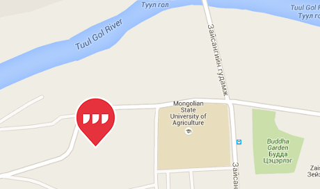
Mongolia has places as familiar as Wrigley Field is to Americans but starting next month, all locations in Mongolia are going to have three-word phrase addresses. Mongolia is changing all its addresses to three-word phrases by Joon Ian Wong.

From the post:

Mongolia will become a global pioneer next month, when its national post office starts referring to locations by a series of three-word phrases instead of house numbers and street names.

The new system is devised by a British startup called What3Words, which has assigned a three-word phrase to every point on the globe. The system is designed to solve the an often-ignored problem of 75% of the earth’s population, an estimated 4 billion people, who have no address for mailing purposes, making it difficult to open a bank account, get a delivery, or be reached in an emergency. In What3Words’ system, the idea is that a series of words is easier to remember than the strings of number that make up GPS coordinates. Each unique phrase corresponds to a specific 9-square-meter spot on the map.

For example, the White House, at 1600 Pennsylvania Avenue, becomes sulk.held.raves; the Tokyo Tower is located at fans.helpless.collects; and the Stade de France is at reporter.smoked.received.

Mongolians will be the first to use the system for government mail delivery, but organizations including the United Nations, courier companies, and mapping firms like Navmii already use What3Words’ system.

The most remarkable aspect of the https://map.what3words.com/ is revealed if you try for:

Gandan Monastery (Gandantegchinlen Khiid), Gandan Monastery District, Ulaanbaatar 16040 (011 36 0354).

Use this URL: https://map.what3words.com/Gandantegchenlen+Khiid+Ulaanbaatar+Mongolia

mongolia-map-460

Now try changing languages (upper-right).

Three-word phrase addresses for the Gandan Monastery:

  • picturing.backfired.riverside (English)
  • schneller.juwelen.schaffen (German)
  • aislados.grifo.acuerde (Spanish)
  • nuageux.lémurien.rejouer (French)
  • turbato.fotografate.tinozza (Italian)
  • chinelo.politicar.molhada (Portugese
  • matte.skivar.kasta (Swedish)
  • vücudu.ırmak.peşini (Turkish)
  • карьера.слог.шелка (Russian)

I have only had time to spot check the site but did find retraced.loudest.teaspoon for Yap Island in Micronesia.

More obscure places to try?

You can find a wealth of additional information, yes, including an API at: http://what3words.com/.

A great opportunity for topic maps as previous ways of identifying locations are not going to wink out of existence. If 3-word addresses catch on, use of other locators may dwindle but that will be over generations. We are facing a very long transition period.

Thoughts on weaponizing 3-word addresses. First, using the wrong 3-word addresses to mis-lead agents of the state. Second, creating new 3-word addresses that can be embedded prose, song, without the dot separators.

Not to mention a server with proper authentication, returns the “correct” map location for a 3-word address, otherwise, you get the standard one.

Enjoy!

June 1, 2016

Guide to Figuring Out the Age of an Undated World Map (xkcd)

Filed under: Mapping,Maps — Patrick Durusau @ 9:18 pm

This is precious! The original.

map_age_guide_large

May 16, 2016

How to create interactive maps with MapHub

Filed under: Journalism,Mapping,Maps,News — Patrick Durusau @ 8:26 am

How to create interactive maps with MapHub by Mădălina Ciobanu.

From the post:

Maps may not be every graphics editor or reporter’s favourite way to illustrate information, particularly a more interesting dataset that can lend itself to a more creative format, but sometimes they are the best way to take your readers from point A to point B – literally.

We have written about mapping tools before, so make sure you check out the list (and stay tuned for an update!), but in the meantime this guide will show you how to create a quick interactive map using free platform MapHub, which is currently available in beta.

After you read about using MapHub, be sure to follow the link to resources on other mapping tools as well.

One quick use of maps for stories such as Congress, Maps and a Research Tale – Part 1, where public land is going to be mined in a noisy and toxic way, is to plot the physical residences of those who support the project versus those who oppose it.

I haven’t gathered that data, yet, but won’t be surprised if supporters DO NOT have the mine in their backyards.

Other examples of how distance increases political support for noxious activities?

May 4, 2016

“Library of Babel” (Jorge Luis Borges)

Filed under: Literature,Mapping,Maps — Patrick Durusau @ 8:05 pm

buzz-feed-tower-of-babel-drewpatroopa17-plotted

Select the image for a larger view. Trust me, it’s worth it.

The illustration is from “Plotted: A Literary Atlas” by Andrew DeGraff and this particular image of the illustration is from the review: 9 Awesome Literary Maps Every Book Lover Needs To See by Krystie Lee Yandoli.

DeGraff has maps for portions of these works:

Adventures of Huckleberry Finn – Mark Twain

Around the World in Eighty Days – Jules Verne

A Christmas Carol – Charles Dickens

A Good Man Is Hard to Find – Flannery O’Connor

Hamlet, Prince of Denmark – William Shakespeare

Invisible Man – Ralph Ellison

The Library of Babel – Jorge Luis Borges

The Lottery – Shirley Jackson

Moby Dick, or, The Whale – Herman Melville

Narrative of the Life of Frederick Douglass, an American Slave – Frederick Douglas

A Narrow Fellow in the Grass – Emily Dickinson

The Odyssey – Homer

The Ones Who Walk Away from Omclas – Ursula K. Le Guinn

Pride and Prejudice – Jane Austen

A Report to the Academy – Franz Kafka

Robinson Crusoe – Daniel Defoe

Waiting for Godot – Samuel Beckett

Watership Down – Richard Adams

Wrinkle in Time – Madeleine L’Engle

Keep a copy of Plotted: A Literary Atlas on hand as inspiration.

At the same time, try your hand at capturing your spatial understanding of a narrative. Your reading experience, will be different.

Enjoy!

April 10, 2016

When Mapping Fails – Big Time

Filed under: Mapping,Maps — Patrick Durusau @ 11:15 am

How an internet mapping glitch turned a random Kansas farm into a digital hell by Kashmir Hill.

From the post:

An hour’s drive from Wichita, Kansas, in a little town called Potwin, there is a 360-acre piece of land with a very big problem.

The plot has been owned by the Vogelman family for more than a hundred years, though the current owner, Joyce Taylor née Vogelman, 82, now rents it out. The acreage is quiet and remote: a farm, a pasture, an old orchard, two barns, some hog shacks and a two-story house. It’s the kind of place you move to if you want to get away from it all. The nearest neighbor is a mile away, and the closest big town has just 13,000 people. It is real, rural America; in fact, it’s a two-hour drive from the exact geographical center of the United States.

But instead of being a place of respite, the people who live on Joyce Taylor’s land find themselves in a technological horror story.

For the last decade, Taylor and her renters have been visited by all kinds of mysterious trouble. They’ve been accused of being identity thieves, spammers, scammers and fraudsters. They’ve gotten visited by FBI agents, federal marshals, IRS collectors, ambulances searching for suicidal veterans, and police officers searching for runaway children. They’ve found people scrounging around in their barn. The renters have been doxxed, their names and addresses posted on the internet by vigilantes. Once, someone left a broken toilet in the driveway as a strange, indefinite threat.

All in all, the residents of the Taylor property have been treated like criminals for a decade. And until I called them this week, they had no idea why.

If you use “IP mapping,” you owe it to yourself and your customers to give Kahsmir’s story a close and careful read.

Nope, no spoilers, you have to read the story to appreciate how reasonable and good faith decisions can over time result in very bad unintended consequences.

Enjoy!

PS: What sort of implied threat is a broken toilet? Just curious, thought you might know.

April 5, 2016

Pentagon Confirms Crowdsourcing of Map Data

Filed under: Crowd Sourcing,Mapping,Maps,Military,Topic Maps — Patrick Durusau @ 10:01 am

I have mentioned before, Tracking NSA/CIA/FBI Agents Just Got Easier, The DEA is Stalking You!, how citizens can invite federal agents to join the gold fish bowl being prepared for the average citizen.

Of course, that’s just me saying it, unless and until the Pentagon confirms the crowdsourcing of map data!

Aliya Sternstein writes
in Soldiers to Help Crowdsource Spy Maps:


“What a great idea if we can get our soldiers adding fidelity to the maps and operational picture that we already have” in Defense systems, Gordon told Nextgov. “All it requires is pushing out our product in a manner that they can add data to it against a common framework.”

Comparing mapping parties to combat support activities, she said, soldiers are deployed in some pretty remote areas where U.S. forces are not always familiar with the roads and the land, partly because they tend to change.

If troops have a base layer, “they can do basically the same things that that social party does and just drop pins and add data,” Gordon said from a meeting room at the annual Esri conference. “Think about some of the places in Africa and some of the less advantaged countries that just don’t have addresses in the way we do” in the United States.

Of course, you already realize the value of crowd-sourcing surveillance of government agents but for the c-suite crowd, confirmation from a respected source (the Pentagon) may help push your citizen surveillance proposal forward.

BTW, while looking at Army GeoData research plans (pages 228-232), I ran across this passage:

This effort integrates behavior and population dynamics research and analysis to depict the operational environment including culture, demographics, terrain, climate, and infrastructure, into geospatial frameworks. Research exploits existing open source text, leverages multi-media and cartographic materials, and investigates data collection methods to ingest geospatial data directly from the tactical edge to characterize parameters of social, cultural, and economic geography. Results of this research augment existing conventional geospatial datasets by providing the rich context of the human aspects of the operational environment, which offers a holistic understanding of the operational environment for the Warfighter. This item continues efforts from Imagery and GeoData Sciences, and Geospatial and Temporal Information Structure and Framework and complements the work in PE 0602784A/Project T41.

Doesn’t that just reek with subjects that would be identified differently in intersecting information systems?

One solution would be to fashion top down mapping systems that are months if not years behind demands in an operational environment. Sort of like tanks that overheat in jungle warfare.

Or you could do something a bit more dynamic that provides a “good enough” mapping for operational needs and yet also has the information necessary to integrate it with other temporary solutions.

April 2, 2016

Time Maps:…

Filed under: Mapping,Maps,Time,Timelines — Patrick Durusau @ 4:49 pm

Time Maps: Visualizing Discrete Events Across Many Timescales by Max Watson.

From the post:

In this blog post, I’ll describe a technique for visualizing many events across multiple timescales in a single image, where little or no zooming is required. It allows the viewer to quickly identify critical features, whether they occur on a timescale of milliseconds or months. It is adopted from the field of chaotic systems, and was originally conceived to study the timing of water drops from a dripping faucet. The visualization has gone by various names: return map, return-time map, and time vs. time plot. For conciseness, I will call them “time maps.” Though time maps have been used to visualize chaotic systems, they have not been applied to information technology. I will show how time maps can provide valuable insights into the behavior of Twitter accounts and the activity of a certain type of online entity, known as a bot.

This blog post is a shorter version of a paper I recently wrote, but with slightly different examples. The paper was accepted to the 2015 IEEE Big Data Conference. The end of the blog also contains sample Python code for creating time maps.

Building a time map is easy. First, imagine a series of events as dots along a time axis. The time intervals between each event are labeled as t1, t2, t3, t4, …

watson-1

A time map is simply a two-dimensional scatterplot, where the xy coordinates of the events are: (t1,t2), (t2, t3), (t3, t4), and so on. On a time map, the purple dot would be plotted like this:

watson-2

In other words, each point in the scatterplot represents an event. The x-coordinate of an event is the time between the event itself and the preceding event. An event’s y-coordinate is the time between the event itself and the subsequent event. The only points that are not displayed in a time map are the first and last events of the dataset.

Max goes on to cover the heuristics of time maps, along with the Python code for generating them.

Max’s time maps use a common time line for events and so aren’t well suited to visualizing overlapping narrative time frames such as occur in novels and/or real life.

I first saw this in a tweet by Data Science Renee

March 25, 2016

Dodging the Morality Police

Filed under: Geography,Georeferencing,Geospatial Data,Mapping — Patrick Durusau @ 7:54 am

This location-based app helps young Iranians avoid ‘morality police’ by Aleks Buczkowski.

From the post:

Many young Iranians are pretty liberated guys. They like to party and wear fancy clothes but they happened to live in a country where it’s prohibited. There is special police force dedicated to ensuring Iranians follow strict rules on clothing and conduct, called the Gasht-e-Ershad (or Guidance Patrol, commonly known as the “morality police”). Part of their activities include setting up checkpoints around cities and randomly inspecting vehicles driving by.

Now there is a way to avoid the Ershad controls. An anonymous team of Iranian developers have come up with a crowdsource app that allow users marking risky spots on the city map to help others avoid it. Something like Waze but for a much different purpose.

The Gershad app is pretty simple and easy to use. Users can mark where they encounter the “morality police”. The data is added to a database and visualised on a map. The more reports in one place, the bolder the warning on the map. When the number decreases, the alert will fade gradually from the map. Simple as it is.

Sounds quite adaptable to tracking police, FBI agents, narcs, etc. in modern urban environments.

Over time, with enough reports, patterns for police patrols would emerge from the data.

Enjoy!

March 22, 2016

Mapping Mountains – Tangram

Filed under: Cartography,Mapping,Maps,Military — Patrick Durusau @ 8:15 pm

Mapping Mountains by Peter Richardson.

From the post:

I’ve been spending a lot of time over the mountains of Northern California lately. To view mountains from above is to journey through time itself: over ancient shorelines, the trails of glaciers, the marks of countless seasons, and the front lines of perpetual tectonic struggle. Fly with me now, on a tour through the world of elevation data:

A stunning display of mapping technology!

Peter starts with an illustrated history of the depiction of elevation on maps, including a map that was a declared to be a military secret!

It’s a quick romp that leads to “Tangram functionality” which is described elsewhere as:

Tangram is a map renderer designed to grant you ludicrous levels of control over your map design. By drawing vector tiles live in a web browser, it allows real-time map design, display, and interactivity.

Using WebGL, Tangram saddles and rides your graphics card into a new world of cartographic exploration. Animated shaders, 3D buildings, and dynamic filtering can be combined to produce effects normally seen only in science fiction.

Map styles, data filters, labels, and even graphics card code can be defined in a human-readable and -writable plaintext scene file, and a JavaScript API permits direct interactive control of the style.

The balance of the post is a lengthy demonstration of Tangram that ends in a call for test pilots!

Tangram reminded of the Art of War by Sun Tzu, where it reads:

All armies prefer high ground to low and sunny places to dark.

Which should now read:

All armies prefer Tangram map renderers to all others.

Seriously. Protesters, direct action movements, irregulars, etc. should take a long look at this post.

I first saw this in a tweet by Lynn Cherny.

February 24, 2016

Superhuman Neural Network – Urban War Fighters Take Note

Filed under: GPS,Machine Learning,Mapping,Maps,Neural Networks — Patrick Durusau @ 9:38 pm

Google Unveils Neural Network with “Superhuman” Ability to Determine the Location of Almost Any Image

From the post:

Here’s a tricky task. Pick a photograph from the Web at random. Now try to work out where it was taken using only the image itself. If the image shows a famous building or landmark, such as the Eiffel Tower or Niagara Falls, the task is straightforward. But the job becomes significantly harder when the image lacks specific location cues or is taken indoors or shows a pet or food or some other detail.

Nevertheless, humans are surprisingly good at this task. To help, they bring to bear all kinds of knowledge about the world such as the type and language of signs on display, the types of vegetation, architectural styles, the direction of traffic, and so on. Humans spend a lifetime picking up these kinds of geolocation cues.

So it’s easy to think that machines would struggle with this task. And indeed, they have.

Today, that changes thanks to the work of Tobias Weyand, a computer vision specialist at Google, and a couple of pals. These guys have trained a deep-learning machine to work out the location of almost any photo using only the pixels it contains.

Their new machine significantly outperforms humans and can even use a clever trick to determine the location of indoor images and pictures of specific things such as pets, food, and so on that have no location cues.

The full paper: PlaNet—Photo Geolocation with Convolutional Neural Networks.

Abstract:

Is it possible to build a system to determine the location where a photo was taken using just its pixels? In general, the problem seems exceptionally difficult: it is trivial to construct situations where no location can be inferred. Yet images often contain informative cues such as landmarks, weather patterns, vegetation, road markings, and architectural details, which in combination may allow one to determine an approximate location and occasionally an exact location. Websites such as GeoGuessr and View from your Window suggest that humans are relatively good at integrating these cues to geolocate images, especially en-masse. In computer vision, the photo geolocation problem is usually approached using image retrieval methods. In contrast, we pose the problem as one of classification by subdividing the surface of the earth into thousands of multi-scale geographic cells, and train a deep network using millions of geotagged images. While previous approaches only recognize landmarks or perform approximate matching using global image descriptors, our model is able to use and integrate multiple visible cues. We show that the resulting model, called PlaNet, outperforms previous approaches and even attains superhuman levels of accuracy in some cases. Moreover, we extend our model to photo albums by combining it with a long short-term memory (LSTM) architecture. By learning to exploit temporal coherence to geolocate uncertain photos, we demonstrate that this model achieves a 50% performance improvement over the single-image model.

You might think that with GPS engaged that the location of images is a done deal.

Not really. You can be facing in any direction from a particular GPS location and in a dynamic environment, analysts or others don’t have the time to sort out which images are relevant from those that are just noise.

Urban warfare does not occur on a global scale, bringing home the lesson it isn’t the biggest data set but the most relevant and timely data set that is important.

Relevantly oriented images and feeds are a natural outgrowth of this work. Not to mention pairing those images with other relevant data.

PS: Before I forget, enjoy paying the game at: www.geoguessr.com.

February 21, 2016

Satellites in Global Development [How Do You Verify Satellite Images?]

Filed under: Cybersecurity,Image Understanding,Mapping,Maps — Patrick Durusau @ 8:06 pm

Satellites in Global Development

From the webpage:

We have better systems to capture, analyze, and distribute data about the earth. This is fundamentally improving, and creating, opportunities for impact in global development.

This is an exploratory overview of current and upcoming sources of data, processing pipelines and data products. It is aimed to offer non GIS experts an exploration of the unfolding revolution of earth observation, with an emphasis on development. See footer for license and contributors.

A great overview of Earth satellite data for the non-specialist.

The impressive imagery of 0.31M resolution, calls to mind the danger of relying on such data without confirmation.

The image of Fortaleza “shows” (at 0.31M) what appears to be a white car parked near the intersection of two highways. What if instead of a white car that was a mobile missile launch platform? It’s not much bigger than a car so would show up on this image.

Would you target that location based on that information alone?

Or consider the counter-case: What reassurance do you have that what appears to be a white car in the image at the intersection is not a mobile missile launcher, but is reported to you on the image as a white car?

Or in either case, what if the image is reporting an inflatable object placed there to deceive remote imaging applications?

As with all data, satellite data is presented to you for a reason.

A reason that may or may not align with your goals and purposes.

I first saw this in a tweet by Kirk Borne.

February 2, 2016

All The Pubs In Britain & Ireland & Nothing Else

Filed under: Mapping,Maps — Patrick Durusau @ 2:44 pm

All The Pubs In Britain & Ireland & Nothing Else by Ramiro Gómez.

From the post:

The map above is elegant in its simplicity. It shows Great Britain and Ireland drawn from pubs. Each blue dot represents a single pub using data extracted from OpenStreetMap with the Matplotlib Basemap Toolkit.

Interestingly, if the same map had been drawn using the number of pubs from 1980 it would have looked quite different.

In total, the map has 29,195 pub locations across both the UK and Ireland. However, the UK alone has lost 21,000 pubs since 1980 according to the Institute of Economic Affairs, with half of these occurring since 2006.

Therefore, a map from 1980 might have had nearly twice as many dots as the one above and possibly not all in the same places. Going back even further, there were a reported 99,000 pubs in the UK in 1905.

See Ramiro’s post for the map but more importantly, book travel to the UK to help stem the loss of pubs!

How many of the 29,195 pubs in the UK have you visited?

February 1, 2016

Where Does Your Dope Come From? [Interviewing Tips]

Filed under: Journalism,Mapping,Maps,News,Reporting — Patrick Durusau @ 4:35 pm

Visualizing Mexico’s Drug Cartels: A Roundup of Maps by Aleszu Bajak.

From the post:

With the big news this week of the arrest of Joaquín “El Chapo” Guzmán’s, the head of Mexico’s largest drug cartel, most of the attention is being paid to actor Sean Penn’s Rolling Stone interview with the kingpin in his mountain hideout in Mexico.

But where’s the context? How powerful is the Sinaloa cartel that he has run for decades and the other Mexican drug cartels, for that matter? Storybench has been sifting through a wealth of graphics on the workings of the drug trade in Mexico and its impact on the United States that help readers begin to understand the bigger picture of this complex drug war. So now that you’ve read your fill on Sean Penn’s (and Rolling Stone’s) editorial shortcomings, check out these impressive visualizations taken from news organizations, non-profits and government agencies.

Bajak presents a stunning array of maps that visualize the influence of Mexican drug cartels.

One of the most interesting has the title: United States: Areas of Influence of Major Mexican Transnational Criminal Organizations.

dea-us-influence

(You will need to select the image to get a useful sized image.)

All of the maps are interesting and some possibly more useful than others, such as if you are planning on expanding drug trade in one area but not another.

What I found missing was a map of all the organizations profiting from the war on drugs. Yes?

Location and approximate incomes of drug cartels, agencies, law enforcement offices, government budgets, etc.

The war on drugs isn’t just about the income (and failure to pay taxes) of the drug cartels, it is also about the allocation of personnel and budgets in law enforcement organizations, prisons that house drug offenders, etc.

One persuasive graphic would be the economic impact on government organizations if the drug trade stopped tomorrow and drug offense prisoners were released from jail.

There is a symbiotic relationship in the war on drugs. Government agents limit available competition and help keep prices artificially high. Drug cartels provide a desired product and a rationale for the existence of police and related agencies.

A rather cozy, if adversarial arrangement. (A topic map could clarify the benefits to both sides but truth telling isn’t a characteristic of either side.)

PS: Do read the piece on what Sean Penn should have done for his interview with El Chapo. It makes a good checklist of what reporters don’t do when interviewing political candidates or sitting members of government.

They want to be asked back if you know what I mean.

January 7, 2016

Search points of interest by radius with Mapbox GL JS

Filed under: MapBox,Mapping,Maps — Patrick Durusau @ 4:47 pm

Search points of interest by radius with Mapbox GL JS by Zach Beattie.

From the post:

Mapbox GL JS provides new and interesting ways to query data found on a map. We built an example that filters points of interest by genre, which uses the featuresAt method to only select data based on the position and radius of the circle. Drag the blue circle around the map to populate points of interest on the left. Zoom in and out on the circle to adjust the radius.

Visually, places of interest appear as colored dots on the map and you can select what type of places appear at all. You use the blue circle to move about the map and as it encompasses dots on the map, additional information appears to the left of the map.

That’s a poor description when compared to the experience. Visit the live map to really appreciate it.

Assuming a map of surveillance cameras and the movement of authorities (in near real time), this would make a handy planning tool.

December 29, 2015

The most contested real estate on Earth? [Noble Sanctuary/Temple Mount]

Filed under: Mapping,Maps — Patrick Durusau @ 7:57 pm

The most contested real estate on Earth? (PDF)

I won’t try to reproduce a smaller version of this image because it would simply befoul rather remarkable work.

From the image (top right):

Muslims call it the Noble Sanctuary. Jews and Christians call it the Temple Mount. Built atop Mount Moriah in Jerusalem, this 36-acre site is the place where seminal events in Islam, Judaism and Christianity are said to have taken place, and it has been a flash point of conflict for millenniums. Many aspects of its meaning and history are still disputed by religious and political leaders, scholars, and even archaeologists. Several cycles of building and destruction have shaped what is on this hilltop today.

Great as far as it goes but the lower left bottom gives the impression that Hezekiah expanded the temple mount after Ahaz (his predecessor) plundered it. So legend holds but that leaves the reader with the false impression that the Jewish temple came to the Noble Sanctuary/Temple Mount first.

If you recall your Sunday School lessons, David conquers Jerusalem (Jebus), as told in 1 Chronicles 11:4-9.

Jerusalem was a sacred site long before David or the Israelites appear in the historical record. How long? Several thousand years at least but the type of excavation required to detail that part of the city’s history won’t happen any time soon.

Do enjoy the map, it is very impressive.

December 21, 2015

D3 Maps without the Dirty Work

Filed under: D3,GIS,Mapping,Maps — Patrick Durusau @ 6:37 pm

D3 Maps without the Dirty Work by

From the post:

For those like me who aren’t approaching mapping in D3 with a GIS background in tow, you may find the propretary goe data structures hard to handle. Thankfully, Scott Murray lays out a simple process in his most recent course through JournalismCourses.org. By the time you are through reading this post you’ll have the guide post needed from mapping any of the data sets found on Natural Earths website in D3.

First in a series of posts on D3 rendering for maps. Layers of D3 renderings is coming up next.

Enjoy!

November 15, 2015

Magnificent Maps of New York

Filed under: Mapping,Maps — Patrick Durusau @ 11:01 am

Magnificent Maps of New York by Kate Marshall.

From the post:

The British Library’s ongoing project to catalogue and digitise the King’s Topographical Collection, some 40,000 maps, prints and drawings collected by George III, has highlighted some extraordinary treasures. The improved and up-dated catalogue records are now accessible to all, anywhere in the world, via the Library’s catalogue, Explore, and offer a springboard for enhanced study.

Your donations to this and other projects enable us to digitise more of our collections, the results of which are invaluable. One such example of further research using material digitised with help from donors is the recently published book by Richard H. Brown and Paul E. Cohen, Revolution. Mapping the Road to American Independence, 1755-1783, which features a number of maps from the K.Top.

The Explore link takes to the main interface for the British Library but Maps is a more direct route to the map collection materials.

Practically everyone has made school presentations about their country’s history. With resources such as the British Map collection becoming available online, it isn’t too much to expect student to supplement their reports with historical maps.

Enjoy!

November 12, 2015

Quartz to open source two mapping tools

Filed under: Journalism,Mapping,Maps,Open Source,Reporting — Patrick Durusau @ 3:53 pm

Quartz to open source two mapping tools by Caroline Scott.

From the post:

News outlet Quartz is developing a searchable database of compiled map data from all over the world, and a tool to help journalists visualise this data.

The database, called Mapquery, received $35,000 (£22,900) from the Knight Foundation Prototype Fund on 3 November.

Keith Collins, project lead, said Mapquery will aim to make the research stage in the creation of maps easier and more accessible, by creating a system for finding, merging and refining geographic data.

Mapquery will not be able to produce visual maps itself, as it simply provides a database of information from which maps can be created – so Quartz will also open source Mapbuilder as the “front end” that will enable journalists to visualise the data.

Quartz aims to have a prototype of Mapquery by April, and will continue to develop Mapbuilder afterwards.

That’s news to look forward to in 2016!

I’m real curious where Quartz is going to draw the boundary around “map data?” The post mentions Mapquery including “historical boundary data,” which would be very useful for some stories, but is traditional “map data.”

What if Mapquery could integrate people who have posted images with geographic locations? So a reporter could quickly access a list of potential witnesses for events the Western media doesn’t cover?

Live feeds of the results of US bombing raids against ISIS for example. (Doesn’t cover out of deference to the US military propaganda machine or for other reasons I can’t say.)

Looking forward to more news on Mapquery and Mapbuilder!

I first saw this in a tweet by Journalism Tools.

October 15, 2015

10,000 years of Cascadia earthquakes

Filed under: Interface Research/Design,Mapping,Maps — Patrick Durusau @ 3:15 pm

10,000 years of Cascadia earthquakes

From the webpage:

The chart shows all 40 major earthquakes in the Cascadia Subduction Zone that geologists estimate have occurred since 9845 B.C. Scientists estimated the magnitude and timing of each quake by examining soil samples at more than 50 undersea sites between Washington, Oregon and California.

This chart is followed by:

Core sample sites 1999-2009

U.S. Geological Survey scientists studied undersea core samples of soil looking for turbidites — deposits of sediments that flow along the ocean floor during large earthquakes. The samples were gathered from more than 50 sites during cruises in 1999, 2002 and 2009.

Great maps but apparently one has nothing to do with the other.

If you mouse over the red dot closest to San Francisco, a pop-up says: “ID M9907-50BC Water Depth in Feet 10925.1972.” I suspect that may mean the water depth for the sample but without more, I can’t really say.

The fatal flaw of the presentation is the data of the second map is disconnected from the first. There may be some relationship between the two but it isn’t evident in the current presentation.

A good example of how to not display data sets on the same subject.

September 2, 2015

Hand-Coloured Bomb Damage Maps of London

Filed under: Government,Mapping,Maps — Patrick Durusau @ 7:23 pm

Hand-Coloured Bomb Damage Maps of London

From the webpage:

The devastation wrought on the capital by the blitz was documented by the architect’s department of London County Council. The impact of the destruction from air raids and V-bombs can still be seen in London today

Bomb Damage Maps 1939-1945 by archivist Laurence Ward was published this week by Thames & Hudson to mark the 75th anniversary of the blitz

Photos of maps for:

  • Bethnal Green, Tower Hamlets and Stepney
  • Waterloo and Elephant & Castle
  • Marylebone, Mayfair and Piccadilly
  • London Bridge, Bermondsey and Wapping
  • King’s Cross, Angel and Barbican
  • Regent’s Park, Euston and Somer’s Town
  • Hampstead Heath, Dartmouth Park and Tufnell Park
  • Deptford and Rotherhithe

The photos are impressive but not of large enough scale to make out details. For that, you will need a copy of Bomb Damage Maps 1939-1945. The current price is £48.00 (without shipping).

As you review this important historical resource, realize that nothing similar will be produced for the U.S.-led wars in Afghanistan, Iraq, Syria, etc.

Rather than confirming and reporting on “allied” bombing strikes, Western news media bases its reports on accounts supplied by the U.S. military and its familiars.

It is certainly possible to have interactive maps that show images of civilian casualties and damages within a matter of days at the outside, but current U.S. military adventures will be some of the least documented on record.

Or should I say least independently documented on record?

Is anyone collating cellphone videos of the results of U.S. airstrikes?

August 23, 2015

1962 United States Tourist Map

Filed under: Mapping,Maps — Patrick Durusau @ 4:48 pm

Visit every place on this vintage US map for the most epic road trip ever by Phil Edwards.

Part of the joy of this map comes from being old enough to remember maps similar to this one.

Critics can scan the map for what isn’t represented as tourist draws.

Consider it to be a snapshot of the styles and interests.

Most notable absence? Cape Canaveral.

I suspect its absence reflects the lead time involved in the drafting and publishing of a map at the time.

Explorer 1 (1958) and the first American in space, Alan Shepard (1961), both preceded this map.

Enjoy!

August 19, 2015

“True” Size?

Filed under: Mapping,Maps — Patrick Durusau @ 4:54 pm

This interactive map shows how ‘wrong’ other maps are by Adam Taylor.

From the post:

Given how popular the Mercator projection is, it’s wise to question how it makes us view the world. Many have noted, for example, how the distortion around the poles makes Africa look smaller than Greenland, when in reality Africa is about 14.5 times as big. In 2010, graphic artist Kai Krause made a map to illustrate just how big the African continent is. He found that he was able to fit the United States, India and much of Europe inside the outline of the African continent.

Inspired by Krause’s map, James Talmage, and Damon Maneice, two computer developers based out of Detroit, created an interactive graphic that really puts the distortion caused by the Mercator map into perspective. The tool, dubbed “The True Size” allows you to type in the name of any country and move the outline around to see how the scale of the country gets distorted the closer it gets to the poles.

Of course, one thing the map shows well is the sheer size of Africa. Here it is compared with the United States, China and India.

africa-clip

This is a great resource for anyone who wants to learn more about the physical size of countries, but it is also an illustration that no map is “wrong,” some display the information you seek better than others.

For another interesting take on world maps, see WorldMapper where you will find gems like:

GDP Wealth

gdp-wealth

Absolute Poverty

poverty-less-than-2-day

Or you can rank countries by their contributions to science:

Science Research

science-research

None of these maps is more “true” than the others.

Which one you choose depends on the cause you want to advance.

August 2, 2015

Mapping the world of Mark Twain (subject confusion)

Filed under: Literature,Mapping,Maps,Visualization — Patrick Durusau @ 8:58 pm

Mapping the world of Mark Twain by Andrew Hill.

From the post:

Mapping Mark Twain

This weekend I was looking through Project Gutenberg and found something even better than a single book, I found the complete works of Mark Twain. I remembered how geographic the stories of Twain are and so knew immediately I had found a treasure chest. For the last few days, I’ve been parsing the books line-by-line and trying to find the localities that make up the world of Mark Twain. In the end, the data has over 20,000 localities. Even counting the cases where sir names are mistaken for places, it is a really cool dataset. What I’ll show you here is only the tip of the iceberg. I put the results together as an interactive map that maybe will inspire you to take a journey with Twain on your own, extend your life a little.

Sounds great!

Warning: Subject Confusion

Mapping the world of Mark Twain (the map)!

The blog entry: http://andrewxhill.com/blog/2014/01/26/Mapping-the-world-of-Mark-Twain/ has the same name as the map: http://andrewxhill.com/maps/writers/twain/index.html.

Both are excellent and the blog entry includes details on how you can construct similar maps.

Topic maps disambiguate names that would otherwise lead to confusion!

What names do you need to disambiguate?

Or do you need to avoid subject confusion with names used by others? (Unknown to you.)

July 21, 2015

Inside the Secret World of Russia’s Cold War Mapmakers

Filed under: Government,Mapping,Maps — Patrick Durusau @ 4:05 pm

Inside the Secret World of Russia’s Cold War Mapmakers by Greg Miller.

From the post:

A MILITARY HELICOPTER was on the ground when Russell Guy arrived at the helipad near Tallinn, Estonia, with a briefcase filled with $250,000 in cash. The place made him uncomfortable. It didn’t look like a military base, not exactly, but there were men who looked like soldiers standing around. With guns.

The year was 1989. The Soviet Union was falling apart, and some of its military officers were busy selling off the pieces. By the time Guy arrived at the helipad, most of the goods had already been off-loaded from the chopper and spirited away. The crates he’d come for were all that was left. As he pried the lid off one to inspect the goods, he got a powerful whiff of pine. It was a box inside a box, and the space in between was packed with juniper needles. Guy figured the guys who packed it were used to handling cargo that had to get past drug-sniffing dogs, but it wasn’t drugs he was there for.

Inside the crates were maps, thousands of them. In the top right corner of each one, printed in red, was the Russian word секрет. Secret.

The maps were part of one of the most ambitious cartographic enterprises ever undertaken. During the Cold War, the Soviet military mapped the entire world, parts of it down to the level of individual buildings. The Soviet maps of US and European cities have details that aren’t on domestic maps made around the same time, things like the precise width of roads, the load-bearing capacity of bridges, and the types of factories. They’re the kinds of things that would come in handy if you’re planning a tank invasion. Or an occupation. Things that would be virtually impossible to find out without eyes on the ground.

Given the technology of the time, the Soviet maps are incredibly accurate. Even today, the US State Department uses them (among other sources) to place international boundary lines on official government maps.

If you like stories of the intrigue of the Cold War and of maps, Greg’s post was made for you.

The maps have been rarely studied but one person is trying to change that:

But one unlikely scholar, a retired British software developer named John Davies, has been working to change that. For the past 10 years he’s been investigating the Soviet maps, especially the ones of British and American cities. He’s had some help, from a military map librarian, a retired surgeon, and a young geographer, all of whom discovered the maps independently. They’ve been trying to piece together how they were made and how, exactly, they were intended to be used. The maps are still a taboo topic in Russia today, so it’s impossible to know for sure, but what they’re finding suggests that the Soviet military maps were far more than an invasion plan. Rather, they were a framework for organizing much of what the Soviets knew about the world, almost like a mashup of Google Maps and Wikipedia, built from paper.

I don’t know any more about Soviet maps that you can gain from reading this article but the line:

they were a framework for organizing much of what the Soviets knew about the world, almost like a mashup of Google Maps and Wikipedia, built from paper.

Has some of the qualities that I associate with topic maps. Granting it chooses a geographic frame of reference but every map has some frame of reference, stated or unstated.

It would make a great paper on topic maps to represent the knowledge of an old-style Soviet map as a topic map.

As a resource, John Davies maintains a comprehensive website about Soviet maps.

July 19, 2015

MapFig

Filed under: Mapping,Maps — Patrick Durusau @ 2:44 pm

MapFig

Whether you are tracking the latest outrageous statements from the Repubicans for U.S. President Clown Car or have more serious mapping purposes in mind, you need to take a look at MapFig. There are plugins from WordPress, Drupal, Joomla, and Omeka, along with a host of useful features.

There is one feature in particular I want to call to your attention: “Create highly customized leaflet maps quickly and easily.”

I stumbled over that sentence because I have never encountered “leaflet” maps before. Street, terrain, weather, historical, geological, archaeological, astronomical, etc., but no “leaflet” maps. Do they mean a format size? As in a leaflet for distribution? Seems unlikely because it is delivered electronically.

FAQ was no help. No hits at all.

Of course, you are laughing at this point because you know that “Leaflet” (note the uppercase “L”) is a JavaScript library developed by Vladimir Agafonkin.

So a “leaflet map” is one created using the Leftlet Javascript Library.

Clearer to say “Create highly customized maps quickly and easily using the Leaflet JS library.”

Yes?

Enjoy!

July 16, 2015

Mapping the Medieval Countryside

Filed under: History,Mapping,Maps — Patrick Durusau @ 8:10 am

Mapping the Medieval Countryside – Places, People, and Properties in the Inquisitions Post Mortem.

From the webpage:

Mapping the Medieval Countryside is a major research project dedicated to creating a digital edition of the medieval English inquisitions post mortem (IPMs) from c. 1236 to 1509.

IPMs recorded the lands held at their deaths by tenants of the crown. They comprise the most extensive and important body of source material for landholding in medieval England. Describing the lands held by thousands of families, from nobles to peasants, they are a key source for the history of almost every settlement in England and many in Wales.

This digital edition is the most authoritative available. It is based on printed calendars of the IPMs but incorporates numerous corrections and additions: in particular, the names of some 48,000 jurors are newly included.

The site is currently in beta phase: it includes IPMs from 1418-1447 only, and aspects of the markup and indexing are still incomplete. An update later this year will make further material available.

The project is funded by the Arts and Humanities Research Council and is a collaboration between the University of Winchester and the Department of Digital Humanities at King’s College London. The project uses five volumes of the Calendars of Inquisitions Post Mortem, gen. ed. Christine Carpenter, xxii-xxvi (The Boydell Press, Woodbridge, 2003-11) with kind permission from The Boydell Press. These volumes are all in print and available for purchase from Boydell, price £195.

One of the more fascinating aspects of the project is the list of eighty-nine (89) place types, which can be used for filtering. Just scanning the list I happened across “rape” as a place type, with four (4) instances recorded thus far.

The term “rape” in this context refers to a subdivision of the county of Sussex in England. The origin of this division is unknown but it pre-dates the Norman Conquest.

The “rapes of Sussex” and the eighty-eight (88) other place types are a great opportunity to explore place distinctions that may or may not be noticed today.

Enjoy!

« Newer PostsOlder Posts »

Powered by WordPress