Another Word For It Patrick Durusau on Topic Maps and Semantic Diversity

December 21, 2015

D3 Maps without the Dirty Work

Filed under: D3,GIS,Mapping,Maps — Patrick Durusau @ 6:37 pm

D3 Maps without the Dirty Work by

From the post:

For those like me who aren’t approaching mapping in D3 with a GIS background in tow, you may find the propretary goe data structures hard to handle. Thankfully, Scott Murray lays out a simple process in his most recent course through JournalismCourses.org. By the time you are through reading this post you’ll have the guide post needed from mapping any of the data sets found on Natural Earths website in D3.

First in a series of posts on D3 rendering for maps. Layers of D3 renderings is coming up next.

Enjoy!

November 15, 2015

Magnificent Maps of New York

Filed under: Mapping,Maps — Patrick Durusau @ 11:01 am

Magnificent Maps of New York by Kate Marshall.

From the post:

The British Library’s ongoing project to catalogue and digitise the King’s Topographical Collection, some 40,000 maps, prints and drawings collected by George III, has highlighted some extraordinary treasures. The improved and up-dated catalogue records are now accessible to all, anywhere in the world, via the Library’s catalogue, Explore, and offer a springboard for enhanced study.

Your donations to this and other projects enable us to digitise more of our collections, the results of which are invaluable. One such example of further research using material digitised with help from donors is the recently published book by Richard H. Brown and Paul E. Cohen, Revolution. Mapping the Road to American Independence, 1755-1783, which features a number of maps from the K.Top.

The Explore link takes to the main interface for the British Library but Maps is a more direct route to the map collection materials.

Practically everyone has made school presentations about their country’s history. With resources such as the British Map collection becoming available online, it isn’t too much to expect student to supplement their reports with historical maps.

Enjoy!

November 12, 2015

Quartz to open source two mapping tools

Filed under: Journalism,Mapping,Maps,Open Source,Reporting — Patrick Durusau @ 3:53 pm

Quartz to open source two mapping tools by Caroline Scott.

From the post:

News outlet Quartz is developing a searchable database of compiled map data from all over the world, and a tool to help journalists visualise this data.

The database, called Mapquery, received $35,000 (£22,900) from the Knight Foundation Prototype Fund on 3 November.

Keith Collins, project lead, said Mapquery will aim to make the research stage in the creation of maps easier and more accessible, by creating a system for finding, merging and refining geographic data.

Mapquery will not be able to produce visual maps itself, as it simply provides a database of information from which maps can be created – so Quartz will also open source Mapbuilder as the “front end” that will enable journalists to visualise the data.

Quartz aims to have a prototype of Mapquery by April, and will continue to develop Mapbuilder afterwards.

That’s news to look forward to in 2016!

I’m real curious where Quartz is going to draw the boundary around “map data?” The post mentions Mapquery including “historical boundary data,” which would be very useful for some stories, but is traditional “map data.”

What if Mapquery could integrate people who have posted images with geographic locations? So a reporter could quickly access a list of potential witnesses for events the Western media doesn’t cover?

Live feeds of the results of US bombing raids against ISIS for example. (Doesn’t cover out of deference to the US military propaganda machine or for other reasons I can’t say.)

Looking forward to more news on Mapquery and Mapbuilder!

I first saw this in a tweet by Journalism Tools.

November 9, 2015

Vintage Infodesign [138] Old Map, Charts and Graphics

Filed under: Graphics,Maps,Visualization — Patrick Durusau @ 11:50 am

Vintage Infodesign [138] Old Map, Charts and Graphics by Tiago Veloso

From the post:

Those who follow these weekly updates with vintage examples of information design know how maps fill a good portion of our posts. Cartography has been having a crucial role in our lives for centuries and two recent books help understand this influence throughout the ages: The Art of Illustrated Maps by John Roman, and Map: Exploring The World, featuring some of the most influential mapmakers and institutions in history, like Gerardus Mercator, Abraham Ortelius, Phyllis Pearson, Heinrich Berann, Bill Rankin, Ordnance Survey and Google Earth.

Gretchen Peterson reviewed the first one in this article, with a few questions answered by the author. As for the second book recommendation, you can learn more about it in this interview conducted by Mark Byrnes with John Hessler, a cartography expert at the Library of Congress and one of the people behind the book, published in CityLab. Both publications seem quite a treat for map lovers and additions to

All delightful and instructive but I think my favorite is How Many Will Die Flying the Atlantic This Season? (Aug, 1931).

The cover is a must see graphic/map.

It reminds me of the over-the-top government reports on terrorism which are dutifully parroted by both traditional and online media.

Any sane person who looks at the statistics for causes of death in Canada, the United States and Europe, will conclude that “terrorism” is a government-fueled and media-driven non-event. Terrorist events should qualify as Trivial Pursuit questions.

The infrequent victims of terrorism and their families deserve all the support and care we can provide. But the same is true of traffic accident victims and they are far more common than victims of terrorism.

November 4, 2015

We Put 700 Red Dots On A Map

Filed under: Humor,Maps,Visualization — Patrick Durusau @ 4:04 pm

We Put 700 Red Dots On A Map

dots

Some statistics can be so unbelievable, or deal with concepts so vast, that it’s impossible to wrap our heads around them. The human mind can only do so much to visualize an abstract idea, and often misses much of its impact in the translation. Sometimes you just need to step back and take a good, long look for yourself.

That’s why we just put 700 red dots on a map.

The dots don’t represent anything in particular, nor is their number and placement indicative of any kind of data. But when you’re looking at them, all spread out on a map of the United States like that—it’s hard not to be a little blown away.

Enjoy!

PS: Also follow ClickHole on Twitter.

Governments will still comfort the comfortable, afflict the afflicted and lie to the rest of us about their activities, but this may keep you from becoming a humorless fanatic.

The benefits of being a humorous fanatic aren’t clear but surely it is better than being humorless.

I first saw this in a tweet by Matt Boggie.

October 30, 2015

Free Your Maps from Web Mercator!

Filed under: CartoDB,Cartography,Maps,Projection — Patrick Durusau @ 4:51 pm

Free Your Maps from Web Mercator! by Mamata Akella.

From the post:

Most maps that we see on the web use the Web Mercator projection. Web Mercator gained its popularity because it provides an efficient way for a two-dimensional flat map to be chopped up into seamless 256×256 pixel map tiles that load quickly into the rectangular shape of your browser.

If you asked a cartographer which map projection you should choose for your map, most of the time the answer would not be Web Mercator. What projection you choose depends on your map’s extent, the type of data you are mapping, and as with all maps, the story you want to tell.

Well, get excited because with a few lines of SQL in CartoDB, you can free your maps from Web Mercator!

Not only can you choose from a variety of projections at CartoDB but you can also define your own projections!

Mamata’s post walks you through these new features and promises that more detailed posts are to follow with “advanced cartographic effects on a variety of maps….”

You are probably already following the CartoDB blog but if not…, well today is a good day to start!

October 15, 2015

10,000 years of Cascadia earthquakes

Filed under: Interface Research/Design,Mapping,Maps — Patrick Durusau @ 3:15 pm

10,000 years of Cascadia earthquakes

From the webpage:

The chart shows all 40 major earthquakes in the Cascadia Subduction Zone that geologists estimate have occurred since 9845 B.C. Scientists estimated the magnitude and timing of each quake by examining soil samples at more than 50 undersea sites between Washington, Oregon and California.

This chart is followed by:

Core sample sites 1999-2009

U.S. Geological Survey scientists studied undersea core samples of soil looking for turbidites — deposits of sediments that flow along the ocean floor during large earthquakes. The samples were gathered from more than 50 sites during cruises in 1999, 2002 and 2009.

Great maps but apparently one has nothing to do with the other.

If you mouse over the red dot closest to San Francisco, a pop-up says: “ID M9907-50BC Water Depth in Feet 10925.1972.” I suspect that may mean the water depth for the sample but without more, I can’t really say.

The fatal flaw of the presentation is the data of the second map is disconnected from the first. There may be some relationship between the two but it isn’t evident in the current presentation.

A good example of how to not display data sets on the same subject.

September 2, 2015

Hand-Coloured Bomb Damage Maps of London

Filed under: Government,Mapping,Maps — Patrick Durusau @ 7:23 pm

Hand-Coloured Bomb Damage Maps of London

From the webpage:

The devastation wrought on the capital by the blitz was documented by the architect’s department of London County Council. The impact of the destruction from air raids and V-bombs can still be seen in London today

Bomb Damage Maps 1939-1945 by archivist Laurence Ward was published this week by Thames & Hudson to mark the 75th anniversary of the blitz

Photos of maps for:

  • Bethnal Green, Tower Hamlets and Stepney
  • Waterloo and Elephant & Castle
  • Marylebone, Mayfair and Piccadilly
  • London Bridge, Bermondsey and Wapping
  • King’s Cross, Angel and Barbican
  • Regent’s Park, Euston and Somer’s Town
  • Hampstead Heath, Dartmouth Park and Tufnell Park
  • Deptford and Rotherhithe

The photos are impressive but not of large enough scale to make out details. For that, you will need a copy of Bomb Damage Maps 1939-1945. The current price is £48.00 (without shipping).

As you review this important historical resource, realize that nothing similar will be produced for the U.S.-led wars in Afghanistan, Iraq, Syria, etc.

Rather than confirming and reporting on “allied” bombing strikes, Western news media bases its reports on accounts supplied by the U.S. military and its familiars.

It is certainly possible to have interactive maps that show images of civilian casualties and damages within a matter of days at the outside, but current U.S. military adventures will be some of the least documented on record.

Or should I say least independently documented on record?

Is anyone collating cellphone videos of the results of U.S. airstrikes?

August 23, 2015

1962 United States Tourist Map

Filed under: Mapping,Maps — Patrick Durusau @ 4:48 pm

Visit every place on this vintage US map for the most epic road trip ever by Phil Edwards.

Part of the joy of this map comes from being old enough to remember maps similar to this one.

Critics can scan the map for what isn’t represented as tourist draws.

Consider it to be a snapshot of the styles and interests.

Most notable absence? Cape Canaveral.

I suspect its absence reflects the lead time involved in the drafting and publishing of a map at the time.

Explorer 1 (1958) and the first American in space, Alan Shepard (1961), both preceded this map.

Enjoy!

August 19, 2015

“True” Size?

Filed under: Mapping,Maps — Patrick Durusau @ 4:54 pm

This interactive map shows how ‘wrong’ other maps are by Adam Taylor.

From the post:

Given how popular the Mercator projection is, it’s wise to question how it makes us view the world. Many have noted, for example, how the distortion around the poles makes Africa look smaller than Greenland, when in reality Africa is about 14.5 times as big. In 2010, graphic artist Kai Krause made a map to illustrate just how big the African continent is. He found that he was able to fit the United States, India and much of Europe inside the outline of the African continent.

Inspired by Krause’s map, James Talmage, and Damon Maneice, two computer developers based out of Detroit, created an interactive graphic that really puts the distortion caused by the Mercator map into perspective. The tool, dubbed “The True Size” allows you to type in the name of any country and move the outline around to see how the scale of the country gets distorted the closer it gets to the poles.

Of course, one thing the map shows well is the sheer size of Africa. Here it is compared with the United States, China and India.

africa-clip

This is a great resource for anyone who wants to learn more about the physical size of countries, but it is also an illustration that no map is “wrong,” some display the information you seek better than others.

For another interesting take on world maps, see WorldMapper where you will find gems like:

GDP Wealth

gdp-wealth

Absolute Poverty

poverty-less-than-2-day

Or you can rank countries by their contributions to science:

Science Research

science-research

None of these maps is more “true” than the others.

Which one you choose depends on the cause you want to advance.

August 2, 2015

Mapping the world of Mark Twain (subject confusion)

Filed under: Literature,Mapping,Maps,Visualization — Patrick Durusau @ 8:58 pm

Mapping the world of Mark Twain by Andrew Hill.

From the post:

Mapping Mark Twain

This weekend I was looking through Project Gutenberg and found something even better than a single book, I found the complete works of Mark Twain. I remembered how geographic the stories of Twain are and so knew immediately I had found a treasure chest. For the last few days, I’ve been parsing the books line-by-line and trying to find the localities that make up the world of Mark Twain. In the end, the data has over 20,000 localities. Even counting the cases where sir names are mistaken for places, it is a really cool dataset. What I’ll show you here is only the tip of the iceberg. I put the results together as an interactive map that maybe will inspire you to take a journey with Twain on your own, extend your life a little.

Sounds great!

Warning: Subject Confusion

Mapping the world of Mark Twain (the map)!

The blog entry: http://andrewxhill.com/blog/2014/01/26/Mapping-the-world-of-Mark-Twain/ has the same name as the map: http://andrewxhill.com/maps/writers/twain/index.html.

Both are excellent and the blog entry includes details on how you can construct similar maps.

Topic maps disambiguate names that would otherwise lead to confusion!

What names do you need to disambiguate?

Or do you need to avoid subject confusion with names used by others? (Unknown to you.)

July 21, 2015

Inside the Secret World of Russia’s Cold War Mapmakers

Filed under: Government,Mapping,Maps — Patrick Durusau @ 4:05 pm

Inside the Secret World of Russia’s Cold War Mapmakers by Greg Miller.

From the post:

A MILITARY HELICOPTER was on the ground when Russell Guy arrived at the helipad near Tallinn, Estonia, with a briefcase filled with $250,000 in cash. The place made him uncomfortable. It didn’t look like a military base, not exactly, but there were men who looked like soldiers standing around. With guns.

The year was 1989. The Soviet Union was falling apart, and some of its military officers were busy selling off the pieces. By the time Guy arrived at the helipad, most of the goods had already been off-loaded from the chopper and spirited away. The crates he’d come for were all that was left. As he pried the lid off one to inspect the goods, he got a powerful whiff of pine. It was a box inside a box, and the space in between was packed with juniper needles. Guy figured the guys who packed it were used to handling cargo that had to get past drug-sniffing dogs, but it wasn’t drugs he was there for.

Inside the crates were maps, thousands of them. In the top right corner of each one, printed in red, was the Russian word секрет. Secret.

The maps were part of one of the most ambitious cartographic enterprises ever undertaken. During the Cold War, the Soviet military mapped the entire world, parts of it down to the level of individual buildings. The Soviet maps of US and European cities have details that aren’t on domestic maps made around the same time, things like the precise width of roads, the load-bearing capacity of bridges, and the types of factories. They’re the kinds of things that would come in handy if you’re planning a tank invasion. Or an occupation. Things that would be virtually impossible to find out without eyes on the ground.

Given the technology of the time, the Soviet maps are incredibly accurate. Even today, the US State Department uses them (among other sources) to place international boundary lines on official government maps.

If you like stories of the intrigue of the Cold War and of maps, Greg’s post was made for you.

The maps have been rarely studied but one person is trying to change that:

But one unlikely scholar, a retired British software developer named John Davies, has been working to change that. For the past 10 years he’s been investigating the Soviet maps, especially the ones of British and American cities. He’s had some help, from a military map librarian, a retired surgeon, and a young geographer, all of whom discovered the maps independently. They’ve been trying to piece together how they were made and how, exactly, they were intended to be used. The maps are still a taboo topic in Russia today, so it’s impossible to know for sure, but what they’re finding suggests that the Soviet military maps were far more than an invasion plan. Rather, they were a framework for organizing much of what the Soviets knew about the world, almost like a mashup of Google Maps and Wikipedia, built from paper.

I don’t know any more about Soviet maps that you can gain from reading this article but the line:

they were a framework for organizing much of what the Soviets knew about the world, almost like a mashup of Google Maps and Wikipedia, built from paper.

Has some of the qualities that I associate with topic maps. Granting it chooses a geographic frame of reference but every map has some frame of reference, stated or unstated.

It would make a great paper on topic maps to represent the knowledge of an old-style Soviet map as a topic map.

As a resource, John Davies maintains a comprehensive website about Soviet maps.

July 19, 2015

MapFig

Filed under: Mapping,Maps — Patrick Durusau @ 2:44 pm

MapFig

Whether you are tracking the latest outrageous statements from the Repubicans for U.S. President Clown Car or have more serious mapping purposes in mind, you need to take a look at MapFig. There are plugins from WordPress, Drupal, Joomla, and Omeka, along with a host of useful features.

There is one feature in particular I want to call to your attention: “Create highly customized leaflet maps quickly and easily.”

I stumbled over that sentence because I have never encountered “leaflet” maps before. Street, terrain, weather, historical, geological, archaeological, astronomical, etc., but no “leaflet” maps. Do they mean a format size? As in a leaflet for distribution? Seems unlikely because it is delivered electronically.

FAQ was no help. No hits at all.

Of course, you are laughing at this point because you know that “Leaflet” (note the uppercase “L”) is a JavaScript library developed by Vladimir Agafonkin.

So a “leaflet map” is one created using the Leftlet Javascript Library.

Clearer to say “Create highly customized maps quickly and easily using the Leaflet JS library.”

Yes?

Enjoy!

July 16, 2015

Mapping the Medieval Countryside

Filed under: History,Mapping,Maps — Patrick Durusau @ 8:10 am

Mapping the Medieval Countryside – Places, People, and Properties in the Inquisitions Post Mortem.

From the webpage:

Mapping the Medieval Countryside is a major research project dedicated to creating a digital edition of the medieval English inquisitions post mortem (IPMs) from c. 1236 to 1509.

IPMs recorded the lands held at their deaths by tenants of the crown. They comprise the most extensive and important body of source material for landholding in medieval England. Describing the lands held by thousands of families, from nobles to peasants, they are a key source for the history of almost every settlement in England and many in Wales.

This digital edition is the most authoritative available. It is based on printed calendars of the IPMs but incorporates numerous corrections and additions: in particular, the names of some 48,000 jurors are newly included.

The site is currently in beta phase: it includes IPMs from 1418-1447 only, and aspects of the markup and indexing are still incomplete. An update later this year will make further material available.

The project is funded by the Arts and Humanities Research Council and is a collaboration between the University of Winchester and the Department of Digital Humanities at King’s College London. The project uses five volumes of the Calendars of Inquisitions Post Mortem, gen. ed. Christine Carpenter, xxii-xxvi (The Boydell Press, Woodbridge, 2003-11) with kind permission from The Boydell Press. These volumes are all in print and available for purchase from Boydell, price £195.

One of the more fascinating aspects of the project is the list of eighty-nine (89) place types, which can be used for filtering. Just scanning the list I happened across “rape” as a place type, with four (4) instances recorded thus far.

The term “rape” in this context refers to a subdivision of the county of Sussex in England. The origin of this division is unknown but it pre-dates the Norman Conquest.

The “rapes of Sussex” and the eighty-eight (88) other place types are a great opportunity to explore place distinctions that may or may not be noticed today.

Enjoy!

July 7, 2015

Ancient [?] Craft of Information Visualization

Filed under: History,Mapping,Maps — Patrick Durusau @ 2:35 pm

Vintage Infodesign [125]: More examples of the ancient craft of information visualization by Tiago Veloso.

From the post:

To open this week’s edition of Vintage InfoDesign, we picked some of the maps published in the 1800s/early 1900’s about the Battle of Waterloo . As we showed you before, on June 18th several newspapers marked with stunning pieces of infographic design the 200th anniversary of Napoleon’s final attempt to rule Europe, and since we haven’t feature any “oldies” related to this topic, we thought it would be interesting to do some Internet “digging”.

Hope you enjoy our findings, and feel free to leave the links to other charts and maps about Waterloo, in the comments section.

I’m not entirely comfortable with using the term “ancient” to describe maps depicting the Battle of Waterloo. I think of the fall of the New Kingdom of Egypt, in about 343 BCE as the beginning of “ancient” history.

June 20, 2015

Creating-maps-in-R

Filed under: Mapping,Maps,R — Patrick Durusau @ 2:37 pm

Creating-maps-in-R by Robin Lovelace.

From the webpage:

Introductory tutorial on graphical display of geographical information in R, to contribute to teaching material. For the context of this tutorial and a video introduction, please see here: http://robinlovelace.net/r/2014/01/30/spatial-data-with-R-tutorial.html

All of the information needed to run the tutorial is contained in a single pdf document that is kept updated: see github.com/Robinlovelace/Creating-maps-in-R/raw/master/intro-spatial-rl.pdf.

By the end of the tutorial you should have the confidence and skills needed to convert a diverse range of geographical and non-geographical datasets into meaningful analyses and visualisations. Using data and code provided in this repository all of the results are reproducible, culminating in publication-quality maps such as the faceted map of London’s population below:

Quite a treat in thirty (30) pages! You will have R and some basic spatial data packages installed and be well on your way to creating maps in R. From a topic map perspective, the joining of attributes to polygons is quite similar to adding properties to topics. Assuming you want to treat each polygon as a subject to be represented by a topic.

Enjoy!

PS:

You will also enjoy:

Cheshire, J. & Lovelace, R. (2014). Spatial data visualisation with R. In Geocomputation, a Practical Primer. In Press with Sage. Preprint available online

and other publications by Robin.

June 18, 2015

Thematic Cartography Guide

Filed under: Cartography,Mapping,Maps — Patrick Durusau @ 8:29 pm

Thematic Cartography Guide

From the webpage:

Welcome! In this short guide we share some insights and tips for making thematic maps. Our goal is to cover the important concepts in cartography and flag the important decision points in the map-making process. As with many activities in life, there isn’t always a single best answer in cartography, and in those cases we’ve tried to outline some of the pros and cons to different solutions.

This is by no means a replacement for a full textbook on cartography; rather it is a quick reference guide for those moments when you’re stumped, unsure of what to do next, or unfamiliar with the terminology. While the recommendations on these pages are short and not loaded with academic references, please appreciate that they represent a thoughtful synthesis of decades of map-making research.

This guide was written by Axis Maps, adapted from documentation written for indiemapper in 2010. However, the content here is about general cartography principles, not software-specific tips. To see the material in its original context, visit indiemapper and its help pages.

If that doesn’t sound exciting, perhaps this will:

Thematic maps are meant not simply to show locations, but rather to show attributes or statistics about places, spatial patterns of those attributes, and relationships between places. For example, while a reference map might show the locations of cities, a thematic map might also represent the population of those cities. It’s the difference between mapping places and mapping data. This site is about thematic maps, describing some of the different types and basic principles.

Hmmm, data about places? Relationships? That’s starting to sound suspiciously like a topic map expressed in a different vocabulary.

The same principles apply, in addition to places on a geographic grid, you can have subjects that exist only on your own intellectual grid, arranged in relationships as you see fit.

Over the years you have no doubt seen a number of offenses against the art of presentation in the name of topic maps. You have the power to break from that tradition. Seeing what works in other mapping domains is one place to start.

Where else would you look for fresh ideas and themes?

June 16, 2015

Vintage Infodesign [122] Naval Yards

Filed under: Graphics,Maps,Visualization — Patrick Durusau @ 4:42 pm

Vintage Infodesign [122] by Tiago Veloso.

From the post:

Published in October, 1940, the set of maps from Fortune magazine that open today’s Vintage Infodesign was part of a special about the industrial resources committed to the war effort by the United States. It used data compiled by the Bureau of the Census and Agricultural Commission, with the financial support by the Defense Commission. The maps within the four page report are signed by Philip Ragan Associates.

It’s just another great gem archived over at Fulltable, followed by the usual selection of ancient maps, graphics and charts from before 1960.

Hope you enjoy, and have a great week!

One original image (1940) and it modern counterpart to temp you into visiting this edition of Vintage Infodesign.

shipyards-1940a

US shipyards and arsenals in 1940.

shipyards-now

Modern map of shipyards. I couldn’t find an image quickly that had arsenals as well.

Notice the contrast in the amount of information given by the 1940 map versus that of the latest map from the Navy.

With the 1940 map, along with a state map I could get within walking distance of any of the arsenals or shipyards listed.

With the modern map, I know that shipyards need to be near water but it is only narrowed down to the coastline of any of the states with shipyards.

That may not seem like a major advantage, knowing the location of a shipyard from a map, but collating that information with a stream of other bits and pieces could be an advantage.

Such as watching wedding announcements near Navy yards for sailors getting married. Which means the happy couple will be on their honeymoon and any vehicle at their home with credentials to enter a Navy yard will be available. Of course, that information has to be co-located for the opportunity to present itself. For that I recommend topic maps.

June 15, 2015

Map of the Tracks of Yu, 1136

Filed under: History,Mapping,Maps — Patrick Durusau @ 12:47 pm

Tracks-of-Yu-1136

I first saw this on Instagram at: https://instagram.com/p/363b2lOpn7/ with the following comment:

Map of the Tracks of Yu, 1136, is the first known map to use a cartographic grid.

The David Rumsey Map Collection, Cartography Associates, offers this more complete image from the Harvard Fine Arts Library:

Yujitu1136

And the following blurb:

Yujitu (Map of the Tracks of Yu), 1136. This map’s title derives from the Yugong, a treatise describing the sage-king Yu’s mythical channeling of China’s rivers. It is a rare surviving example of cartography used in the 12th century for public education, mixing classical references with later administrative history. Carved on a large stone tablet so that students or visitors could make rubbings, the map strikingly depicts a riverine network on a regular grid of squares intended to represent 100 li to a side. Read a more detailed description of this map by Alexander Akin, Ph.D. View the map in Google Earth. The image is courtesy Harvard Fine Arts Library.

To temp you into further reading, Alexander Akin’s description opens with these lines:

The Yijitu (Map of the Tracks of Yu) is the earliest extant map based on the Yugong (introduced below). Engraved in stone in 1136, the map measures about one meter to a side. It was carved into the face of an upright monument on the grounds of a school in Xi’an so that visitors could make detailed rubbings using paper and ink. These rubbings could be taken away for later reference. The stone plaque thus functioned as something like an immovable printing block, remaining in Xi’an while copies of its map found their way further afield. Harvard University holds one such rubbing made from the original stone, and has generously granted permission for the use of this unusually clear image, which shows more detail than any previously published version….

Alexander struggles, as only a modern would, over the “accuracy” of the map. A map that at times accords with the findings of modern map makers and at times accords with its Confucian heritage.

With maps in general and topic maps in particular, a question of “accuracy” cannot be answered with being supplied with the measurement to be applied in answering that question.

June 3, 2015

Mapping the History of L.A.’s Notorious Sprawl

Filed under: Mapping,Maps — Patrick Durusau @ 2:27 pm

Mapping the History of L.A.’s Notorious Sprawl by Betsy Mason.

From the post:

build-la

(Apologies for the distortion, the map really needs a full page and to be seen when interactive.)

From the post:

THE SPRAWLING BUILTSCAPE of Los Angeles always seems to have people there riled up in one way or another. Lately there are rumblings about “classic” L.A. homes being displaced by bigger, more modern houses, changing the face of established neighborhoods. Even people with enormous mansions are complaining about the enormouser mansions people are building next door. And this is just one of the ongoing storylines in an ever-morphing city.

Now, urban designer Omar Ureta has created an interactive map to help tell some of these stories. His Built:LA project shows the ages of almost every existing building in the city, and can break them down by decade to reveal how the city has grown over time (works best in Chrome or Firefox).

“There’s so much discussion going on right now in how L.A. is urbanizing, I wanted to create a tool that could contribute to the dialogue,” Ureta, who moved to L.A. nine years ago from the Inland Empire, told me in an email. “I’m excited that the map is actually making people ask more questions about their neighborhood, their city and the whole region.”

Ureta’s combining of data from a variety of sources enables users to peel back layers of construction in L.A. Makes me curious about forward looking “what-if” maps based on local history of development?

This project should be an inspiration for either historical or future projecting maps of urban construction.

June 2, 2015

Spatial Humanities Workshop

Filed under: Humanities,Mapping,Maps,Spatial Data — Patrick Durusau @ 9:51 am

Spatial Humanities Workshop by Lincoln Mullen.

From the webpage:

Scholars in the humanities have long paid attention to maps and space, but in recent years new technologies have created a resurgence of interest in the spatial humanities. This workshop will introduce participants to the following subjects:

  • how mapping and spatial analysis are being used in humanities disciplines
  • how to find, create, and manipulate spatial data
  • how to create historical layers on interactive maps
  • how to create data-driven maps
  • how to tell stories and craft arguments with maps
  • how to create deep maps of places
  • how to create web maps in a programming language
  • how to use a variety of mapping tools
  • how to create lightweight and semester-long mapping assignments

The seminar will emphasize the hands-on learning of these skills. Each day we will pay special attention to preparing lesson plans for teaching the spatial humanities to students. The aim is to prepare scholars to be able to teach the spatial humanities in their courses and to be able to use maps and spatial analysis in their own research.

Ahem, the one thing Larry forgets to mention is that he is a major player in spatial humanities. His homepage is an amazing place.

The seminar materials don’t disappoint. It would be better to be at the workshop but in lieu of attending, working through these materials will leave you well grounded in spatial humanities.

May 31, 2015

Hand Drawn Map Association

Filed under: Mapping,Maps — Patrick Durusau @ 9:38 am

Hand Drawn Map Association

The homepage promises:

The Hand Drawn Map Association (HDMA) is an ongoing archive of user submitted maps and other interesting diagrams created by hand.

From Here to There: A Curious Collection: A Curious Collection from the Hand Drawn Map Association.

From the page about the book:

The situation is as familiar as it is mundane: planning to visit friends in an unfamiliar part of the city, you draw yourself a basic map with detailed directions. In 2008, artist and designer Kris Harzinski founded the Hand Drawn Map Association to collect simple drawings of the everyday. Fascinated by these accidental records of a moment in time, he soon amassed a wide variety of maps, ranging from simple directions to maps of fictional locations, found maps, and maps of unusual places (such as a map of a high school locker), including examples by such well-known luminaries as Abraham Lincoln, Ernest Shackleton, and Alexander Calder.

From Here to There celebrates these ephemeral documents—usually forgotten or tossed after having served their purpose—and gives them their due as everyday artifacts. The more than 140 maps featured in this book, including, among many others, maps of an imaginary country for ants, of a traffic island in Australia, of a childhood fort, and of the Anne Frank House in Amseterdam, are as varied and touching as the stories they tell.

Does the ephemeral nature of these maps have a lesson for topic maps? While long lived topic maps are one use case, are temporary, even very temporary topic maps another?

Are there topic maps that I don’t need/want to persist beyond their immediate use?

The time and resources would vary from topic maps meant for long term usage, but so should the doctrines for subject identity?

I don’t have a copy of the book, yet, but there is much to be learned here.

May 28, 2015

Understanding Map Projections

Filed under: Cartography,Geography,Mapping,Maps — Patrick Durusau @ 3:22 pm

Understanding Map Projections by Tiago Veloso.

From the post:

Few subjects are so controversial – or at least, misunderstood- in cartography as map projections, especially if you’re taking your first steps in this field. And that’s simply because every flat map misrepresents the surface of the Earth in some way. So, in this matter, your work in map-mapping is basically to choose the best projection that suits your needs and reduces the distortion of the most important features you are trying to show/highlight.

But it’s not because you don’t have enough literature about it. There are actually a bunch of great resources and articles that will help you choose the correct projection for your map, so we decided to bring together a quick reference list.

Hope you enjoy it!

I rather like the remark:

…reduces the distortion of the most important features you are trying to show/highlight.

In part because I read it as a concession that all projections are distortions, including those that suit our particular purposes.

I would argue that all maps are at their inception distortions. They never represent every detail of what is being mapped and that implies a process of selective omission. Someone will consider what was omitted important, but it was less important than some other detail to the map maker.

Would the equivalent of projections for topic maps be choice of associations between topics or choices of subjects? Or both?

I lean towards the choice of associations and subjects because graphical rendering of associations creates impressions of the existence and strengths of relationships. Subjects because they are the anchors of the associations.

Speaking of distortion, I would consider any topic map about George H. W. Bush that doesn’t list his war crimes and members of his administration who were also guilty of war crimes as incomplete. There are other opinions on that topic (or at least so I am told).

Suggestions on how to spot “tells” of omission? What can be left out of a map that clues you in that something is missing? Varies from subject to subject but even a rough list would be helpful.

April 24, 2015

Animation of Gerrymandering?

Filed under: Geographic Data,Geospatial Data,Government,Mapping,Maps — Patrick Durusau @ 1:45 pm

United States Congressional District Shapefiles by Jeffrey B. Lewis, Brandon DeVine, and Lincoln Pritcher with Kenneth C. Martis.

From the description:

This site provides digital boundary definitions for every U.S. Congressional District in use between 1789 and 2012. These were produced as part of NSF grant SBE-SES-0241647 between 2009 and 2013.

The current release of these data is experimental. We have had done a good deal of work to validate all of the shapes. However, it is quite likely that some irregulaties remain. Please email jblewis@ucla.edu with questions or suggestions for improvement. We hope to have a ticketing system for bugs and a versioning system up soon. The district definitions currently available should be considered an initial-release version.

Many districts were formed by aggregragating complete county shapes obtained from the National Historical Geographic Information System (NHGIS) project and the Newberry Library’s Atlas of Historical County Boundaries. Where Congressional district boundaries did not coincide with county boundaries, district shapes were constructed district-by-district using a wide variety of legal and cartographic resources. Detailed descriptions of how particular districts were constructed and the authorities upon which we relied are available (at the moment) by request and described below.

Every state districting plan can be viewed quickly at https://github.com/JeffreyBLewis/congressional-district-boundaries (clicking on any of the listed file names will create a map window that can be paned and zoomed). GeoJSON definitions of the districts can also be downloaded from the same URL. Congress-by-Congress district maps in ERSI ShapefileA format can be downloaded below. Though providing somewhat lower resolution than the shapefiles, the GeoJSON files contain additional information about the members who served in each district that the shapefiles do not (Congress member information may be useful for creating web applications with, for example, Google Maps or Leaflet).

Project Team

The Principal Investigator on the project was Jeffrey B. Lewis. Brandon DeVine and Lincoln Pitcher researched district definitions and produced thousands of digital district boundaries. The project relied heavily on Kenneth C. Martis’ The Historical Atlas of United States Congressional Districts: 1789-1983. (New York: The Free Press, 1982). Martis also provided guidance, advice, and source materials used in the project.

How to cite

Jeffrey B. Lewis, Brandon DeVine, Lincoln Pitcher, and Kenneth C. Martis. (2013) Digital Boundary Definitions of United States Congressional Districts, 1789-2012. [Data file and code book]. Retrieved from http://cdmaps.polisci.ucla.edu on [date of
download].

An impressive resource for anyone interested in the history of United States Congressional Districts and their development. An animation of gerrymandering of congressional districts was the first use case that jumped to mind. 😉

Enjoy!

I first saw this in a tweet by Larry Mullen.

April 21, 2015

Imagery Processing Pipeline Launches!

Filed under: Geographic Data,Geography,Geophysical,Image Processing,Maps — Patrick Durusau @ 7:37 pm

Imagery Processing Pipeline Launches!

From the post:

Our imagery processing pipeline is live! You can search the Landsat 8 imagery catalog, filter by date and cloud coverage, then select any image. The image is instantly processed, assembling bands and correcting colors, and loaded into our API. Within minutes you will have an email with a link to the API end point that can be loaded into any web or mobile application.

Our goal is to make it fast for anyone to find imagery for a news story after a disaster, easy for any planner to get the the most recent view of their city, and any developer to pull in thousands of square KM of processed imagery for their precision agriculture app. All directly using our API

There are two ways to get started: via the imagery browser fetch.astrodigital.com, or directly via the the Search and Publish APIs. All API documentation is on astrodigital.com/api. You can either use the API to programmatically pull imagery though the pipeline or build your own UI on top of the API, just like we did.

The API provides direct access to more than 300TB of satellite imagery from Landsat 8. Early next year we’ll make our own imagery available once our own Landmapper constellation is fully commissioned.

Hit us up @astrodigitalgeo or sign up at astrodigital.com to follow as we build. Huge thanks to our partners at Development Seed who is leading our development and for the infinitively scalable API from Mapbox.

If you are interested in Earth images, you really need to check this out!

I haven’t tried the API but did get a link to an image of my city and surrounding area.

Definitely worth a long look!

April 17, 2015

Join the Letter Hunt from Space with Aerial Bold

Filed under: MapBox,Mapping,Maps — Patrick Durusau @ 2:17 pm

Join the Letter Hunt from Space with Aerial Bold by Alex Barth.

From the post:

Imagine you could write text entirely made up of satellite imagery. Each letter would be a real world feature from a bird’s eye view. A house in the shape of an “A”, a lake in the shape of a “B”, a parking lot in the shape of a “C” and so on. This is the idea behind the nascent kickstarter funded project Aerial Bold. Its inventors Benedikt Groß and Joey Lee are right now collecting font shapes in satellite imagery for Aerial Bold and you can join the letter hunt from space.

mapbox-earth-letters

Letters are recognized from space, based on letter forms. But, more letter forms are needed!

Read the post, join the hunt:

Letter Finder App.

Enjoy!

March 28, 2015

NewsStand: A New View on News (+ Underwear Down Under)

Filed under: Aggregation,Georeferencing,Geospatial Data,Mapping,Maps,News — Patrick Durusau @ 5:05 pm

NewsStand: A New View on News by Benjamin E. Teitler, et al.

Abstract:

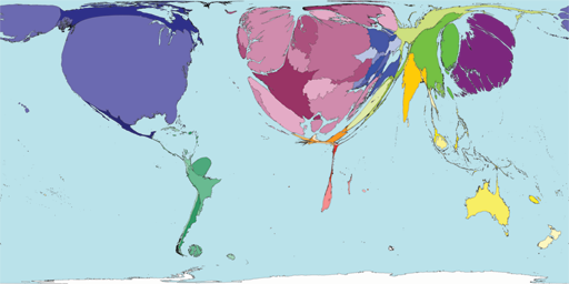
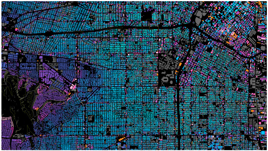
News articles contain a wealth of implicit geographic content that if exposed to readers improves understanding of today’s news. However, most articles are not explicitly geotagged with their geographic content, and few news aggregation systems expose this content to users. A new system named NewsStand is presented that collects, analyzes, and displays news stories in a map interface, thus leveraging on their implicit geographic content. NewsStand monitors RSS feeds from thousands of online news sources and retrieves articles within minutes of publication. It then extracts geographic content from articles using a custom-built geotagger, and groups articles into story clusters using a fast online clustering algorithm. By panning and zooming in NewsStand’s map interface, users can retrieve stories based on both topical signifi cance and geographic region, and see substantially diff erent stories depending on position and zoom level.

Of particular interest to topic map fans:

NewsStand’s geotagger must deal with three problematic cases in disambiguating terms that could be interpreted as locations: geo/non-geo ambiguity, where a given phrase might refer to a geographic location, or some other kind of entity; aliasing, where multiple names refer to the same geographic location, such as “Los Angeles” and “LA”; and geographic name ambiguity or polysemy , where a given name might refer to any of several geographic locations. For example, “Springfield” is the name of many cities in the USA, and thus it is a challenge for disambiguation algorithms to associate with the correct location.

Unless you want to hand disambiguate all geographic references in your sources, this paper merits a close read!

BTW, the paper dates from 2008 and I saw it in a tweet by Kirk Borne, where Kirk pointed to a recent version of NewsStand. Well, sort of “recent.” The latest story I could find was 490 days ago, a tweet from CBS News about the 50th anniversary of the Kennedy assassination in Dallas.

Undaunted I checked out TwitterStand but it seems to suffer from the same staleness of content, albeit it is difficult to tell because links don’t lead to the tweets.

Finally I did try PhotoStand, which judging from the pop-up information on the images, is quite current.

I noticed for Perth, Australia, “A special section of the exhibition has been dedicated to famous dominatrix Madame Lash.”

Sadly this appears to be one the algorithm got incorrect, so members of Congress should not select purchase on their travel arrangements just yet.

Sarah Carty for Daily Mail Australia reports in From modest bloomers to racy corsets: New exhibition uncovers the secret history of women’s underwear… including a unique collection from dominatrix Madam Lash:

From the modesty of bloomers to the seductiveness of lacy corsets, a new exhibition gives us a rare glimpse into the most intimate and private parts of history.

The Powerhouse Museum in Sydney have unveiled their ‘Undressed: 350 Years of Underwear in Fashion’ collection, which features undergarments from the 17th-century to more modern garments worn by celebrities such as Emma Watson, Cindy Crawford and even Queen Victoria.

Apart from a brief stint in Bendigo and Perth, the collection has never been seen by any members of the public before and lead curator Edwina Ehrman believes people will be both shocked and intrigued by what’s on display.

So the collection was once shown in Perth, but for airline reservations you had best book for Sydney.

And no, I won’t leave you without the necessary details:

Undressed: 350 Years of Underwear in Fashion opens at the Powerhouse Museum on March 28 and runs until 12 July 2015. Tickets can be bought here.

Ticket prices do not include transportation expenses to Sydney.

Spoiler alert: The exhibition page says:

Please note that photography is not permitted in this exhibition.

Enjoy!

March 20, 2015

Landsat-live goes live

Filed under: MapBox,Mapping,Maps — Patrick Durusau @ 7:10 pm

Landsat-live goes live by Camilla Mahon.

From the post:

Today we’re releasing the first edition of Landsat-live, a map that is constantly refreshed with the latest satellite imagery from NASA’s Landsat 8 satellite. Landsat 8 data is now publicly available on Amazon S3 via the new Landsat on AWS Public Data Set, making our live pipeline possible. We’re ingesting the data directly from Amazon S3, which is how we’re able to go from satellite to Mapbox map faster than ever. With every pixel captured within the past 32 days, Landsat-live features the freshest imagery possible around the entire planet.

With a 30 meter resolution, a 16 day revisit rate, and 10 multispectral bands, this imagery can be used to check the health of agricultural fields, the latest update on a natural disaster, or the progression of deforestation. Interact with the map above to see the freshest imagery anywhere in the world. Be sure to check back often and observe the constantly changing nature of our planet as same day imagery hits this constantly updating map. Scroll down the page to see some of our favorite stills of the earth from Landsat’s latest collection.

See Camilla’s post, you will really like the images.

Even with 30 meter resolution you will be able to document the impact of mapping projects that are making remote areas more accessible to exploitation.

March 16, 2015

Computing the optimal road trip across the U.S.

Filed under: Mapping,Maps,Python — Patrick Durusau @ 4:31 pm

Computing the optimal road trip across the U.S. by Randal S. Olson.

From the webpage:

This notebook provides the methodology and code used in the blog post, Computing the optimal road trip across the U.S..

This is a nice surprise for a Monday!

The original post goes into the technical details and is quite good.

March 2, 2015

CartoDB and Plotly Analyze Earthquakes

Filed under: CartoDB,Mapping,Maps,Plotly — Patrick Durusau @ 8:06 pm

CartoDB and Plotly Analyze Earthquakes

From the post:

CartoDB lets you easily make web-based maps driven by a PostgreSQL/PostGIS backend, so data management is easy. Plotly is a cloud-based graphing and analytics platform with Python, R, & MATLAB APIs where collaboration is easy. This IPython Notebook shows how to use them together to analyze earthquake data.

Assuming your data/events have geographic coordinates, this post should enable you to plot that information as easy as earthquakes.

For example, if you had traffic accident locations, delays caused by those accidents and weather conditions, you could plot where the most disruptive accidents happen and the weather conditions in which they occur.

« Newer PostsOlder Posts »

Powered by WordPress