“Redlining” has gone digital.
Facebook Lets Advertisers Exclude Users by Race by Julia Angwin and Terry Parris Jr. illustrates my point that improved technology isn’t making us better people, it’s enabling our bigotry to be practiced in new and more efficient ways.
Julia and Parris write:
Imagine if, during the Jim Crow era, a newspaper offered advertisers the option of placing ads only in copies that went to white readers.
That’s basically what Facebook is doing nowadays.
The ubiquitous social network not only allows advertisers to target users by their interests or background, it also gives advertisers the ability to exclude specific groups it calls “Ethnic Affinities.” Ads that exclude people based on race, gender and other sensitive factors are prohibited by federal law in housing and employment.
…
It’s a great read and Facebook points out that it wags its policy finger use of:
…the targeting options for discrimination, harassment, disparagement or predatory advertising practices.
“We take a strong stand against advertisers misusing our platform: Our policies prohibit using our targeting options to discriminate, and they require compliance with the law,” said Steve Satterfield, privacy and public policy manager at Facebook. “We take prompt enforcement action when we determine that ads violate our policies.”
…
Bigots near and far are shaking in their boots, just thinking about the policy finger of Facebook.
In discussion of this modernized form of “redlining,” it may be helpful to know the origin of the term and its impact on society.
Here’s a handy synopsis of the practice:
…
The FHA also explicitly practiced a policy of “redlining” when determining which neighborhoods to approve mortgages in. Redlining is the practice of denying or limiting financial services to certain neighborhoods based on racial or ethnic composition without regard to the residents’ qualifications or creditworthiness. The term “redlining” refers to the practice of using a red line on a map to delineate the area where financial institutions would not invest (see residential security maps).
The FHA allowed personal and agency bias in favor of all white suburban subdivisions to affect the kinds of loans it guaranteed, as applicants in these subdivisions were generally considered better credit risks. In fact, according to James Loewen in his 2006 book Sundown Towns, FHA publications implied that different races should not share neighborhoods, and repeatedly listed neighborhood characteristics like “inharmonious racial or nationality groups” alongside such noxious disseminates as “smoke, odors, and fog.” One example of the harm done by the FHA is as follows:
In the late 1930’s, as Detroit grew outward, white families began to settle near a black enclave adjacent to Eight Mile Road. By 1940, the blacks were surrounded, but neither they nor the whites could get FHA insurance because of the proximity of an inharmonious racial group. So, in 1941, an enterprising white developer built a concrete wall between the white and black areas. The FHA appraisers then took another look and approved the mortgages on the white properties.
…
Yes, segregated housing was due in part to official U.S. (not Southern) government policies.
I live near Atlanta, GA. so here’s a portion of an actual “redlining” map:
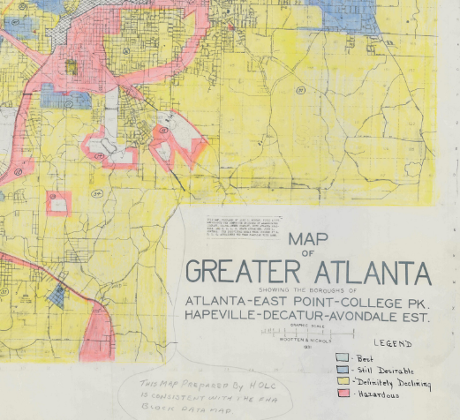
You can see the full version here.
Racially segregated housing wasn’t a matter of chance or birds of a feather, it was official government policy. Public government policy. They lacked the moral sensitivity to be ashamed of their actions.
There are legitimate targeting ad decisions.
Showing me golf club ads is a lost cause. 😉 As with a number of similar items.
But when does race become a legitimate exclusion category? And for what products?
For more historical data on the Home Owners’ Loan Corporation and a multitude of maps, see: Digital HOLC Maps by LaDale Winling. You may also enjoy his main site: Urban Oasis.
Just so you know, redlining isn’t a racist practice of the distant past. Redlining, a/k/a, housing discrimination, is alive and well today.
Does a 50% discrimination rate in Boston (Mass.) sound like it remains a problem?
PS: New Clinton/Podesta posts are coming! I’m posting while my scripts run in the background. New 3.5 GB dump.