Another Word For It Patrick Durusau on Topic Maps and Semantic Diversity

April 22, 2016

Where You Look – Determines What You See

Filed under: Data Analysis,Visualization — Patrick Durusau @ 7:34 pm

Mapping an audience-centric World Wide Web: A departure from hyperlink analysis by Harsh Taneja.

Abstract:

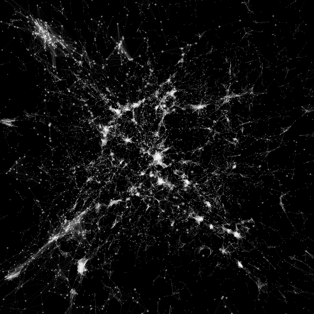
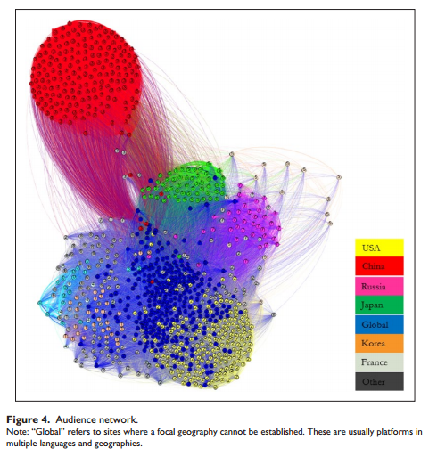
This article argues that maps of the Web’s structure based solely on technical infrastructure such as hyperlinks may bear little resemblance to maps based on Web usage, as cultural factors drive the latter to a larger extent. To test this thesis, the study constructs two network maps of 1000 globally most popular Web domains, one based on hyperlinks and the other using an “audience-centric” approach with ties based on shared audience traffic between these domains. Analyses of the two networks reveal that unlike the centralized structure of the hyperlink network with few dominant “core” Websites, the audience network is more decentralized and clustered to a larger extent along geo-linguistic lines.

Apologies but the article is behind a firewall.

A good example of what you look for determining your results. And an example of how firewalls prevent meaningful discussion of such research.

Unless you know of a site like sci-hub.io of course.

Enjoy!

PS: This is what an audience-centric web mapping looks like:

audience-network

Impressive work!

April 21, 2016

Cosmic Web

Filed under: Astroinformatics,Visualization — Patrick Durusau @ 8:44 pm

Cosmic Web

From the webpage:

Immerse yourself in a network of 24,000 galaxies with more than 100,000 connections. By selecting a model, panning and zooming, and filtering different, you can delve into three distinct models of the cosmic web.

Just one shot from the gallery:

cosmic-web-fll-full-visualization-kim-albrecht

I’m not sure if the display is accurate enough for inter-galactic navigation but it is certainly going to give you ideas about more effective visualization.

Enjoy!

April 14, 2016

Visualizing Data Loss From Search

Filed under: Entity Resolution,Marketing,Record Linkage,Searching,Topic Maps,Visualization — Patrick Durusau @ 3:46 pm

I used searches for “duplicate detection” (3,854) and “coreference resolution” (3290) in “Ironically, Entity Resolution has many duplicate names” [Data Loss] to illustrate potential data loss in searches.

Here is a rough visualization of the information loss if you use only one of those terms:

duplicate-v-coreference-500-clipped

If you search for “duplicate detection,” you miss all the articles shaded in blue.

If you search for “coreference resolution,” you miss all the articles shaded in yellow.

Suggestions for improving this visualization?

It is a visualization that could be performed on client’s data, using their search engine/database.

In order to identify the data loss they are suffering now from search across departments.

With the caveat that not all data loss is bad and/or worth avoiding.

Imaginary example (so far): What if you could demonstrate no overlapping of terminology for two vendors for the United States Army and the Air Force. That is no query terms for one returned useful results for the other.

That is a starting point for evaluating the use of topic maps.

While the divergence in terminologies is a given, the next question is: What is the downside to that divergence? What capability is lost due to that divergence?

Assuming you can identify such a capacity, the next question is to evaluate the cost of reducing and/or eliminating that divergence versus the claimed benefit.

I assume the most relevant terms are going to be those internal to customers and/or potential customers.

Interest in working this up into a client prospecting/topic map marketing tool?


Separately I want to note my discovery (you probably already knew about it) of VennDIS: a JavaFX-based Venn and Euler diagram software to generate publication quality figures. Download here. (Apologies, the publication itself if firewalled.)

The export defaults to 800 x 800 resolution. If you need something smaller, edit the resulting image in Gimp.

It’s a testimony to the software that I was able to produce a useful image in less than a day. Kudos to the software!

April 10, 2016

NSA Grade – Network Visualization with Gephi

Filed under: Gephi,Networks,R,Visualization — Patrick Durusau @ 5:07 pm

Network Visualization with Gephi by Katya Ognyanova.

It’s not possible to cover Gephi in sixteen (16) pages but you will wear out more than one printed copy of these sixteen (16) pages as you become experienced with Gephi.

This version is from a Gephi workshop at Sunbelt 2016.

Katya‘s homepage offers a wealth of network visualization posts and extensive use of R.

Follow her at @Ognyanova.

PS: Gephi equals or exceeds visualization capabilities in use by the NSA, depending upon your skill as an analyst and the quality of the available data.

April 5, 2016

Python Code + Data + Visualization (Little to No Prose)

Filed under: Graphics,Programming,Python,Visualization — Patrick Durusau @ 12:46 pm

Up and Down the Python Data and Web Visualization Stack

Using the “USGS dataset listing every wind turbine in the United States:” this notebook walks you through data analysis and visualization with only code and visualizations.

That’s it.

Aside from very few comments, there is no prose in this notebook at all.

You will either hate it or be rushing off to do a similar notebook on a topic of interest to you.

Looking forward to seeing the results of those choices!

April 3, 2016

Wind/Weather Maps

Filed under: Visualization,Weather Data — Patrick Durusau @ 3:16 pm

A Twitter thread started by Data Science Renee mentioned these three wind map resources:

Wind Map

wind-map-03-April-2016

EarthWindMap Select “earth” for a menu of settings and controls.

wind-earth

Windyty Perhaps the most full featured of the three wind maps. Numerous controls that are not captured in the screenshot. Including webcams.

wind-windyty

Suggestions of other real time visualizations of weather data?

Leaving you to answer the question:

What other data would you tie to weather conditions/locations? Perhaps more importantly, why?

March 29, 2016

WordsEye [Subject Identity Properties]

Filed under: Graphics,Natural Language Processing,Visualization — Patrick Durusau @ 8:50 am

WordsEye

A site that enables you to “type a picture.” What? To illustrate:

A [mod] ox is a couple of feet in front of the [hay] wall. It is cloudy. The ground is shiny grass. The huge hamburger is on the ox. An enormous gold chicken is behind the wall…

Results in:

word-eye

The site is in a close beta test but you can apply for an account.

I mention “subject identity properties” in the title because the words we use to identify subjects, are properties of subjects, just like any other properties we attribute to them.

Unfortunately, words are viewed by different people as identifying different subjects and the different words as identifying the same subjects.

The WordsEye technology can illustrates the fragility of using a single word to identify a subject of conversation.

Or that multiple identifications have the same subject, with side by side images that converge on a common image.

Imagine that in conjunction with 3-D molecular images for example.

I first saw this in a tweet by Alyona Medelyan.

March 28, 2016

Nebula Bliss

Filed under: Graphics,Visualization — Patrick Durusau @ 9:22 pm

Nebula Bliss

Visually impressive 3-D modeling of six different nebula.

I did not tag this with astroinformatics as it is a highly imaginative but non-scientific visualization.

Enjoy!

nebula-bliss

The image is a screen capture from the Butterfly Nebula visualization.

March 27, 2016

Kodály, String Quartet No. 1, 3rd movement

Filed under: Music,Visualization — Patrick Durusau @ 6:39 pm

From the webpage:

Scherzo (3rd movement) of Zoltán Kodály’s first string quartet, performed by the Alexander String Quartet, accompanied by a graphical score.

FAQ

Q: Where can I get this recording?
A: You complete album is available here: http://www.amazon.com/dp/B00FPOOLPG

Q: Who are the performers?
A: The Alexander String Quartet comprises Zakarias Grafilo and Frederick Lifsitz, violins, Paul Yarbrough, viola, and Sandy Wilson, violoncello. You can learn more about the group here: http://asq4.com

Q: What do the colors mean?
A: Each pitch class (C, C-sharp, D, etc.) has its own color, arranged according to the “circle of fifths” so that changes in tonality can be seen; this system is described in more detail here: http://www.musanim.com/mam/pfifth.htm

In the first version of this video … http://www.youtube.com/watch?v=GVhAmV… … the colors are applied to a conventional bar-graph score.

In the second version …http://www.youtube.com/watch?v=DHK5_7… … the “staff” is the 12 pitch classes, arranged in circle-of-fifths order.

Q: Could you please do a video of _______?
A: Please read this: http://www.musanim.com/requests/

If you want to see a data visualization with 26+ million views on YouTube, check out Stephen Malinowski’s YouTube channel.

Don’t miss Stephen Malinowski’s website. Select “site map” for a better idea of what you will find at the site.

March 9, 2016

Exoplanet Visualization

Filed under: Astroinformatics,Visualization — Patrick Durusau @ 9:34 pm

Exoplanet Visualization

You can consider this remarkable eye-candy and/or as a challenge to your visualization skills.

Either way, you owe it to yourself to see this display of exoplanet data.

Quite remarkable.

Pay close attention because there are more planets than the ones near the center that catch your eye.

I first saw this in a tweet by MapD.

March 8, 2016

So You Want To Visualize Data? [Nathan Yau’s Toolbox]

Filed under: Graphics,Visualization — Patrick Durusau @ 11:53 am

What I Use to Visualize Data by Nathan Yau.

From the post:

“What tool should I learn? What’s the best?” I hesitate to answer, because I use what works best for me, which isn’t necessarily the best for someone else or the “best” overall.

If you’re familiar with a software set already, it might be better to work off of what you know, because if you can draw shapes based on numbers, you can visualize data. After all, this guy uses Excel to paint scenery.

It’s much more important to just get started already. Work with as much data as you can.

Nevertheless, this is the set of tools I use in 2016, which converged to a handful of things over the years. It looks different from 2009, and will probably look different in 2020. I break it down by place in my workflow.

As Nathan says up front, these may not be the best tools for you but it is a great starting place. Add and subtract from this set as you develop your own workflow and habits.

Enjoy!

PS: Nathan Yau tweeted a few hours later: “Forgot to include this:”

yau-tablet

March 5, 2016

Network Measures of the United States Code

Filed under: Citation Analysis,Citation Indexing,Law,Visualization — Patrick Durusau @ 5:45 pm

Network Measures of the United States Code by Alexander Lyte, Dr. David Slater, Shaun Michel.

Abstract:

The U.S. Code represents the codification of the laws of the United States. While it is a well-organized and curated corpus of documents, the legal text remains nearly impenetrable for non-lawyers. In this paper, we treat the U.S. Code as a citation network and explore its complexity using traditional network metrics. We find interesting topical patterns emerge from the citation structure and begin to interpret network metrics in the context of the legal corpus. This approach has potential for determining policy dependency and robustness, as well as modeling of future policies.​

The citation network is quite impressive:

uscode-network

I have inquired about an interactive version of the network but no response as of yet.

Overlay Journal – Discrete Analysis

Filed under: Discrete Structures,Mathematics,Publishing,Topic Maps,Visualization — Patrick Durusau @ 10:45 am

The arXiv overlay journal Discrete Analysis has launched by Christian Lawson-Perfect.

From the post:

Discrete Analysis, a new open-access journal for articles which are “analytical in flavour but that also have an impact on the study of discrete structures”, launched this week. What’s interesting about it is that it’s an arXiv overlay journal founded by, among others, Timothy Gowers.

What that means is that you don’t get articles from Discrete Analysis – it just arranges peer review of papers held on the arXiv, cutting out almost all of the expensive parts of traditional journal publishing. I wasn’t really prepared for how shallow that makes the journal’s website – there’s a front page, and when you click on an article you’re shown a brief editorial comment with a link to the corresponding arXiv page, and that’s it.

But that’s all it needs to do – the opinion of Gowers and co. is that the only real value that journals add to the papers they publish is the seal of approval gained by peer review, so that’s the only thing they’re doing. Maths papers tend not to benefit from the typesetting services traditional publishers provide (or, more often than you’d like, are actively hampered by it).

One way the journal is adding value beyond a “yes, this is worth adding to the list of papers we approve of” is by providing an “editorial introduction” to accompany each article. These are brief notes, written by members of the editorial board, which introduce the topics discussed in the paper and provide some context, to help you decide if you want to read the paper. That’s a good idea, and it makes browsing through the articles – and this is something unheard of on the internet – quite pleasurable.

It’s not difficult to imagine “editorial introductions” with underlying mini-topic maps that could be explored on their own or that as you reach the “edge” of a particular topic map, it “unfolds” to reveal more associations/topics.

Not unlike a traditional street map for New York which you can unfold to find general areas but can then fold it up to focus more tightly on a particular area.

I hesitate to say “zoom” because in the application I have seen (important qualification), “zoom” uniformly reduces your field of view.

A more nuanced notion of “zoom,” for a topic map and perhaps for other maps as well, would be to hold portions of the current view stationary, say a starting point on an interstate highway and to “zoom” only a portion of the current view to show a detailed street map. That would enable the user to see a particular location while maintaining its larger context.

Pointers to applications that “zoom” but also maintain different levels of “zoom” in the same view? Given the fascination with “hairy” presentations of graphs that would have to be real winner.

February 25, 2016

16 Famous Designers Show Us Their Favorite Notebooks [Analog Notebooks]

Filed under: Design,Graphics,Visualization — Patrick Durusau @ 5:45 pm

16 Famous Designers Show Us Their Favorite Notebooks by John Brownlee.

From the post:

Sure, digital design apps might be finally coming into their own, but there’s still nothing better than pen and paper. Here at Co.Design, we’re notebook fetishists, so we recently asked a slew of designers about their favorites—and whether they would mind giving us a look inside.

It turns out they didn’t. Across multiple disciplines, almost every designer we asked was thrilled to tell us about their notebook of choice and give us a look at how they use it. Our operating assumption going in was that most designers would probably be pretty picky about their notebooks, but this turned out not to be true: While Muji and Moleskine notebooks were the common favorites, some even preferred loose paper.

But what makes the notebooks of designers special isn’t so much what notebook they use, as how they use them. Below, enjoy a peek inside the working notebooks of some of the most prolific designers today—as well as their thoughts on what makes a great one.

Images of analog notebooks with links to sources!

I met a chief research scientist at a conference who had a small pad of paper for notes, contact information, etc. Could have had the latest gadget, etc., but chose not to.

That experience wasn’t unique as you will find from reading John’s post.

Notebooks, analog ones, have fewer presumptions and limitations than any digital notebook.

Albert Einstein had pen/pencil and paper.

Albert_Einstein_Head

Same was true for John McCarty.

200px-John_McCarthy_Stanford

Not to mention Donald Knuth.

192px-KnuthAtOpenContentAlliance

So, what have you done with your pen and paper lately?*


* I’m as guilty as anyone in thinking that pounding a keyboard = being productive. But the question: So, what have you done with your pen and paper lately? remains a valid one.

February 24, 2016

Visualizing the Clinton Email Network in R

Filed under: Networks,R,Visualization — Patrick Durusau @ 5:04 pm

Visualizing the Clinton Email Network in R by Bob Rudis.

From the post:

This isn’t a post about politics. I do have opinions about the now infamous e-mail server (which will no doubt come out here), but when the WSJ folks made it possible to search the Clinton email releases I though it would be fun to get the data into R to show how well the igraph and ggnetwork packages could work together, and also show how to use svgPanZoom to make it a bit easier to poke around the resulting hairball network.

NOTE: There are a couple “Assignment” blocks in here. My Elements of Data Science students are no doubt following the blog by now so those are meant for you 🙂 Other intrepid readers can ignore them.

A great walk through on importing, analyzing, and visualizing any email archive, not just Hillary’s.

You will quickly find that “…connecting the dots…” isn’t as useful as the intelligence community would have you believe.

Yes, yes! There is a call to Papa John’s! Oh, that’s not a code name, that’s a pizza place. (Even suspected terrorists have to eat.)

Great to have the dots. Great to have connections. Not so great if that is all that you have.

I found a number of other interesting posts at Bob’s blog: http://rud.is/b/.

Including: Dairy-free Parker House Rolls! I bake fairly often so am susceptible to this sort of posting. Looks very good!

February 19, 2016

How I build up a ggplot2 figure [Class Response To ggplot2 criticism]

Filed under: Ggplot2,R,Visualization — Patrick Durusau @ 8:50 pm

How I build up a ggplot2 figure by John Muschelli.

From the post:

Recently, Jeff Leek at Simply Statistics discussed why he does not use ggplot2. He notes “The bottom line is for production graphics, any system requires work.” and describes a default plot that needs some work:

John responds to perceived issues with using ggplot2 by walking through each issue and providing you with examples of how to solve it.

That doesn’t mean that you will switch to ggplot2, but it does mean you will be better informed of your options.

An example to be copied!

February 17, 2016

Rectal and Other Data

Filed under: R,Visualization — Patrick Durusau @ 3:35 pm

Hadley Wickham has posted neiss:

The neiss package provides access to all data (2009-2014) from the National Electronic Injury Surveillance System, which is a sample of all accidents reported to emergency rooms in the US.

You will recall this is the data set used by Nathan Yau in NSFW: Million to One Shot, Doc,, an analysis of rectal injuries.

A lack of features in the data prevents some types of analysis, such as the type of objects plotted as a function of weight, for example.

I’m sure there are other patterns, seasonal?, that you can derive from the data.

Enjoy!

PS: R library.

February 16, 2016

NSFW: Million to One Shot, Doc

Filed under: Humor,Visualization — Patrick Durusau @ 1:56 pm

Million to One Shot, Doc – All the things that get stuck. by Nathan Yau.

Nathan downloaded emergency room data from 2009 to 2014 and filtered the data to reveal:

…an estimated 17,968 emergency room visits for foreign bodies stuck in a rectum. About three-quarters of patients were male, and as you might expect, many of the foreign bodies were sex toys. But, perhaps unexpectedly, about 60 percent of those foreign bodies were not sex toys.

Nathan has created a click-through visualization of objects and ER doctor comments.

I offer this as a counter-example to the claim that all business data has value. 😉

You probably should forward the link to your home computer.

Enjoy!

PS: Is anyone working on a cross-cultural comparison on such data?

February 12, 2016

Tufte in R

Filed under: R,Visualization — Patrick Durusau @ 7:41 pm

Tufte in R by Lukasz Piwek.

From the post:

The idea behind Tufte in R is to use R – the most powerful open-source statistical programming language – to replicate excellent visualisation practices developed by Edward Tufte. It’s not a novel approach – there are plenty of excellent R functions and related packages wrote by people who have much more expertise in programming than myself. I simply collect those resources in one place in an accessible and replicable format, adding a few bits of my own coding discoveries.

Piwek says his idea isn’t novel but I am sure this will be of interest to both R and Tufte fans!

Is anyone else working through the Tufte volumes in R or Processing?

Those would be great projects to have bookmarked.

February 11, 2016

Who Do You Love? (Visualizing Relationships/Associations)

Filed under: Associations,Visualization — Patrick Durusau @ 2:41 pm

This Chart Shows Who Marries CEOs, Doctors, Chefs and Janitors by Adam Pearce and Dorothy Gambrell.

From the post:

When it comes to falling in love, it’s not just fate that brings people together—sometimes it’s their jobs. We scanned data from the U.S. Census Bureau’s 2014 American Community Survey—which covers 3.5 million households—to find out how people are pairing up. Some of the matches seemed practical (the most common marriage is between grade-school teachers), and others had us questioning Cupid’s aim (why do female dancers have a thing for male welders?). High-earning women (doctors, lawyers) tend to pair up with their economic equals, while middle- and lower-tier women often marry up. In other words, female CEOs tend to marry other CEOs; male CEOs are OK marrying their secretaries.

The listing of occupations and spousal relationship is interactive on mouse-over and you can type in the name of a profession. (Warning: On typing in the profession name, it must be a case match for the term in this listing.

Here’s a sample for Librarians:

who-do-you-love

The relationships are gender-coded:

gender-coding

Try to guess which occupations have “marries within occupation” and those which do not.

For each of the following, what is your guess about marrying within the occupation or not?

  • Ambulance Drivers
  • Atmospheric and Space Scientists
  • Economists
  • Postal Service

This looks like a great browsing technique for exploring relationships (associations).

February 8, 2016

Data from the World Health Organization API

Filed under: Medical Informatics,R,Visualization — Patrick Durusau @ 11:28 am

Data from the World Health Organization API by Peter’s stats stuff – R.

From the post:

Eric Persson released yesterday a new WHO R package which allows easy access to the World Health Organization’s data API. He’s also done a nice vignette introducing its use.

I had a play and found it was easy access to some interesting data. Some time down the track I might do a comparison of this with other sources, the most obvious being the World Bank’s World Development Indicators, to identify relative advantages – there’s a lot of duplication of course. It’s a nice problem to have, too much data that’s too easy to get hold of. I wish we’d had that problem when I studied aid and development last century – I vividly remember re-keying numbers from almanac-like hard copy publications, and pleased we were to have them too!

Here’s a plot showing country-level relationships between the latest data of three indicators – access to contraception, adolescent fertility, and infant mortality – that help track the Millennium Development Goals.

With visualizations and R code!

A nice way to start off your data mining week!

Enjoy!

I first saw this in a tweet by Christophe Lalanne.

February 7, 2016

‘Avengers’ Comic Book Covers [ + MAD, National Lampoon]

Filed under: Art,Graphics,Visualization — Patrick Durusau @ 3:31 pm

50 Years of ‘Avengers’ Comic Book Covers Through Color by Jon Keegan.

From the post:

When Marvel’s “Avengers: Age of Ultron” opens in theaters next month, a familiar set of iconic colors will be splashed across movie screens world-wide: The gamma ray-induced green of the Hulk, Iron Man’s red and gold armor, and Captain America’s red, white and blue uniform.

How the Avengers look today differs significantly from their appearance in classic comic-book versions, thanks to advancements in technology and a shift to a more cinematic aesthetic. As Marvel’s characters started to appear in big-budget superhero films such as “X-Men” in 2000, the darker, muted colors of the movies began to creep into the look of the comics. Explore this shift in color palettes and browse more than 50 years of “Avengers” cover artwork below. Read more about this shift in color.

The fifty years of palettes are a real treat and should be used alongside your collection of the Avenger comics for the same time period. 😉

From what I could find quickly, you will have to purchase the forty year collection separately from more recent issues.

Of course, if you really want insight into American culture, you would order Absolutely MAD Magazine – 50+ Years.

MAD issues from 1952 to 2005 (17,500 pages in full color). Annotating those issues to include social context would be a massive but highly amusing project. And you would have to find a source for the following issues.

A more accessible collection that is easily as amusing as MAD would be the National Lampoon collection. Unfortunately, only 1970 – 1975 are online. 🙁

One of my personal favorites:

justice-lampoon

Visualization of covers is a “different” way to view all of these collections and with no promises, could be interesting comparisons to contemporary events when they were published.

Mapping the commentaries you will find in MAD and National Lampoon to current events when they were published, say to articles in New York Time historical archive, would be a great history project for students and an education in social satire as well.

If anyone objects to the lack of a “serious” nature of such a project, be sure to remind them that reading the leading political science journal of the 1960’s, the American Political Science Review would have left the casual reader with few clues that the United States was engaged in a war that would destroy the lives of millions in Vietnam.

In my experience, “serious” usually equates with “supports the current system of privilege and prejudice.”

You can be “serious” or you can choose to shape a new system of privilege and prejudice.

Your call.

February 6, 2016

Between the Words [Alternate Visualizations of Texts]

Filed under: Art,Literature,Visualization — Patrick Durusau @ 8:49 pm

Between the Words – Exploring the punctuation in literary classics by Nicholas Rougeux.

From the webpage:

Between the Words is an exploration of visual rhythm of punctuation in well-known literary works. All letters, numbers, spaces, and line breaks were removed from entire texts of classic stories like Alice’s Adventures in Wonderland, Moby Dick, and Pride and Prejudice—leaving only the punctuation in one continuous line of symbols in the order they appear in texts. The remaining punctuation was arranged in a spiral starting at the top center with markings for each chapter and classic illustrations at the center.

The posters are 24″ X 36.”

Some small images to illustrate the concept:

achistmascarol

ataleoftwocities

aliceinwonderland

I’m not an art critic but I can say that unusual or unexpected visualizations of data can lead to new insights. Or should I say different insights than you may have previously held.

Seeing this visualization reminded me of a presentation too any years ago at Cambridge that argued the cantillation (think crudely “accents”) marks in the Hebrew Bible were a reliable guide to clause boundaries and reading.

FYI, the versification and divisions in the oldest known witnesses to the Hebrew Bible were added centuries after the text stabilized. There are generally accepted positions on the text but at best, they are just that, generally accepted positions.

Any number of alternative presentations of texts suggest themselves.

I haven’t performed the experiment but for numeric data, reordering the data so as to force re-casting of formulas, could be a way to explore presumptions that are glossed over the the “usual form.”

Not unlike copying a text by hand as opposed to typing or photocopying the text. Each step of performing the task with less deliberation increases the odds you will miss some decision that you are making unconsciously.

If you like these posters ore know an English major/professor who may, pass this site along to them. (I have no interest, financial or otherwise in this site but I like to encourage creative thinking.)

I first saw this in a tweet by Christopher Phipps.

January 24, 2016

Introducing d3-scale

Filed under: D3,Graphics,Visualization — Patrick Durusau @ 4:33 pm

Introducing d3-scale by Mike Bostock.

From the post:

I’d like D3 to become the standard library of data visualization: not just a tool you use directly to visualize data by writing code, but also a suite of tools that underpin more powerful software.

To this end, D3 espouses abstractions that are useful for any visualization application and rejects the tyranny of charts.

…(emphasis in original)

Quoting from both Leland Wilkinson (The Grammar of Graphics) and Jacques Bertin (Semiology of Graphics, Mike says D3 should be used for ordinal and categorical dimensions, in addition to real numbers.

Much as been done to expand the capabilities of D3 but it remains up to you to expand the usage of D3 in new and innovative ways.

I suspect you can already duplicate the images (most of them anyway) from the Semiology of Graphics, for example, but that isn’t the same as choosing a graphic and scale that will present information usefully to a user.

Much is left to be done but Mike has given D3 a push in the right direction.

Will you be pushing along side him?

January 17, 2016

Voynich Manuscript:…

Filed under: Manuscripts,Visualization — Patrick Durusau @ 11:09 am

Voynich Manuscript: word vectors and t-SNE visualization of some patterns by Christian S. Perone.

From the post:

voynich_header

The Voynich Manuscript is a hand-written codex written in an unknown system and carbon-dated to the early 15th century (1404–1438). Although the manuscript has been studied by some famous cryptographers of the World War I and II, nobody has deciphered it yet. The manuscript is known to be written in two different languages (Language A and Language B) and it is also known to be written by a group of people. The manuscript itself is always subject of a lot of different hypothesis, including the one that I like the most which is the “culture extinction” hypothesis, supported in 2014 by Stephen Bax. This hypothesis states that the codex isn’t ciphered, it states that the codex was just written in an unknown language that disappeared due to a culture extinction. In 2014, Stephen Bax proposed a provisional, partial decoding of the manuscript, the video of his presentation is very interesting and I really recommend you to watch if you like this codex. There is also a transcription of the manuscript done thanks to the hard-work of many folks working on it since many moons ago.

Word vectors

My idea when I heard about the work of Stephen Bax was to try to capture the patterns of the text using word2vec. Word embeddings are created by using a shallow neural network architecture. It is a unsupervised technique that uses supervided learning tasks to learn the linguistic context of the words. Here is a visualization of this architecture from the TensorFlow site:

Proof that word vectors can be used to analyze unknown texts and manuscripts!

Enjoy!

PS: Glance at the right-hand column of Christian’s blog. If you are interested in data analysis using Python, he would be a great person to follow on Twitter: Christian S. Perone

January 11, 2016

…[N]ew “GraphStore” core – Gephi

Filed under: Gephi,Graphs,Visualization — Patrick Durusau @ 5:29 pm

Gephi boosts its performance with new “GraphStore” core by Mathieu Bastian.

From the post:

Gephi is a graph visualization and analysis platform – the entire tool revolves around the graph the user is manipulating. All modules (e.g. filter, ranking, layout etc.) touch the graph in some way or another and everything happens in real-time, reflected in the visualization. It’s therefore extremely important to rely on a robust and fast underlying graph structure. As explained in this article we decided in 2013 to rewrite the graph structure and started the GraphStore project. Today, this project is mostly complete and it’s time to look at some of the benefits GraphStore is bringing into Gephi (which its 0.9 release is approaching).

Performance is critical when analyzing graphs. A lot can be done to optimize how graphs are represented and accessed in the code but it remains a hard problem. The first versions of Gephi didn’t always shine in that area as the graphs were using a lot of memory and some operations such as filter were slow on large networks. A lot was learnt though and when the time came to start from scratch we knew what would move the needle. Compared to the previous implementation, GraphStore uses simpler data structures (e.g. more arrays, less maps) and cache-friendly collections to make common graph operations faster. Along the way, we relied on many micro-benchmarks to understand what was expensive and what was not. As often with Java, this can lead to surprises but it’s a necessary process to build a world-class graph library.

What shall we say about the performance numbers?

IMPRESSIVE!

The test were against “two different classic graphs, one small (1.5K nodes, 19K edges) and one medium (83K nodes, 68K edges).”

Less than big data size graphs but isn’t the goal of big data analysis to extract the small portion of relevant data from the big data?

Yes?

Maybe there should be an axiom about gathering of irrelevant data into a big data pile, only to be excluded again.

Or premature graphification of largely irrelevant data.

Something to think about as you contribute to the further development of this high performing graph library.

Enjoy!

January 7, 2016

Visual Tools From NPR

Filed under: Graphics,Journalism,News,Visualization — Patrick Durusau @ 3:45 pm

Tools You Can Use

From the post:

Open-source tools for your newsroom. Take a look through all our repos, read about our best practices, and learn how to setup your Mac to develop like we do.

Before you rush off to explore all the repos (there are more than a few), check out these projects on the Tools You Can Use page:

App Template – An opinionated template that gets the first 90% of building a static website out of the way. It integrates with Google Spreadsheets, Bootstrap and Github seamlessly.

Copytext – A Python library for accessing a spreadsheet as a native object suitable for templating.

Dailygraphics – A framework for creating and deploying responsive graphics suitable for publishing inside a CMS with pym.js. It includes d3.js templates for many different types of charts.

Elex – A command-line tool to get election results from the Associated Press Election API v2.0. Elex is designed to be friendly, fast and agnostic to your language/database choices.

Lunchbox – A suite of tools to create images for social media sharing.

Mapturner – A command line utility for generating topojson from various data sources for fast maps.

Newscast.js – A library to radically simplify Chromecast web app development.

Pym.js – A JavaScript library for responsive iframes.

More tools to consider for your newsroom or other information delivery center.

December 29, 2015

Great R packages for data import, wrangling & visualization [+ XQuery]

Filed under: Data Mining,R,Visualization,XQuery — Patrick Durusau @ 5:37 pm

Great R packages for data import, wrangling & visualization by Sharon Machlis.

From the post:

One of the great things about R is the thousands of packages users have written to solve specific problems in various disciplines — analyzing everything from weather or financial data to the human genome — not to mention analyzing computer security-breach data.

Some tasks are common to almost all users, though, regardless of subject area: data import, data wrangling and data visualization. The table below show my favorite go-to packages for one of these three tasks (plus a few miscellaneous ones tossed in). The package names in the table are clickable if you want more information. To find out more about a package once you’ve installed it, type help(package = "packagename") in your R console (of course substituting the actual package name ).

Forty-seven (47) “favorites” sounds a bit on the high side but some people have more than one “favorite” ice cream, or obsession. 😉

You know how I feel about sort-order and I could not detect an obvious one in Sharon’s listing.

So, I extracted the package links/name plus the short description into a new table:

car data wrangling
choroplethr mapping
data.table data wrangling, data analysis
devtools package development, package installation
downloader data acquisition
dplyr data wrangling, data analysis
DT data display
dygraphs data visualization
editR data display
fitbitScraper misc
foreach data wrangling
ggplot2 data visualization
gmodels data wrangling, data analysis
googlesheets data import, data export
googleVis data visualization
installr misc
jsonlite data import, data wrangling
knitr data display
leaflet mapping
listviewer data display, data wrangling
lubridate data wrangling
metricsgraphics data visualization
openxlsx misc
plotly data visualization
plyr data wrangling
psych data analysis
quantmod data import, data visualization, data analysis
rcdimple data visualization
RColorBrewer data visualization
readr data import
readxl data import
reshape2 data wrangling
rga Web analytics
rio data import, data export
RMySQL data import
roxygen2 package development
RSiteCatalyst Web analytics
rvest data import, web scraping
scales data wrangling
shiny data visualization
sqldf data wrangling, data analysis
stringr data wrangling
tidyr data wrangling
tmap mapping
XML data import, data wrangling
zoo data wrangling, data analysis

Enjoy!


I want to use XQuery at least once a day in 2016 on my blog. To keep myself honest, I will be posting any XQuery I use.

To sort and extract two of the columns from Mary’s table, I copied the table to a separate file and ran this XQuery:

  1. xquery version “1.0”;
  2. <html>
  3. <table>{
  4. for $row in doc(“/home/patrick/working/favorite-R-packages.xml”)/table/tr
  5. order by lower-case(string($row/td[1]/a))
  6. return <tr>{$row/td[1]} {$row/td[2]}</tr>
  7. }</table>
  8. </html>

One of the nifty aspects of XQuery is that you can sort, as on line 5, in all lower-case on the first <td> element, while returning the same element as written in the original table. Which gives better (IMHO) sort order than UPPERCASE followed by lowercase.

This same technique should make you the master of any simple tables you encounter on the web.

PS: You should always acknowledge the source of your data and the original author.

I first saw Sharon’s list in a tweet by Christophe Lalanne.

December 23, 2015

10 Best Data Visualization Projects of 2015
[p-hacking]

Filed under: Graphics,Visualization — Patrick Durusau @ 10:11 am

10 Best Data Visualization Projects of 2015 by Nathan Yau.

From the post:

Fine visualization work was alive and well in 2015, and I’m sure we’re in for good stuff next year too. Projects sprouted up across many topics and applications, but if I had to choose one theme for the year, it’d have to be teaching, whether it be through explaining, simulations, or depth. At times it felt like visualization creators dared readers to understand data and statistics beyond what they were used to. I liked it.

These are my picks for the best of 2015. As usual, they could easily appear in a different order on a different day, and there are projects not on the list that were also excellent (that you can easily find in the archive).

Here we go.

As great selection but I would call your attention to Nathan’s Lessons in statistical significance, uncertainty, and their role in science.

It is a review of work on p-hacking, that is the manipulation of variables to get a low enough p-value to merit publication in a journal.

A fine counter to the notion that “truth” lies in data.

Nothing of the sort is the case. Data reports results based on the analysis applied to it. Nothing more or less.

What questions we ask of data, what data we choose as containing answers to those questions, what analysis we apply, how we interpret the results of our analysis, are all wide avenues for the introduction of unmeasured bias.

December 21, 2015

ggplot 2.0.0

Filed under: Ggplot2,Graphics,R,Visualization — Patrick Durusau @ 6:25 pm

ggplot 2.0.0 by Hadley Wickham.

From the post:

I’m very pleased to announce the release of ggplot2 2.0.0. I know I promised that there wouldn’t be any more updates, but while working on the 2nd edition of the ggplot2 book, I just couldn’t stop myself from fixing some long standing problems.

On the scale of ggplot2 releases, this one is huge with over one hundred fixes and improvements. This might break some of your existing code (although I’ve tried to minimise breakage as much as possible), but I hope the new features make up for any short term hassle. This blog post documents the most important changes:

  • ggplot2 now has an official extension mechanism.
  • There are a handful of new geoms, and updates to existing geoms.
  • The default appearance has been thoroughly tweaked so most plots should look better.
  • Facets have a much richer set of labelling options.
  • The documentation has been overhauled to be more helpful, and require less integration across multiple pages.
  • A number of older and less used features have been deprecated.

These are described in more detail below. See the release notes for a complete list of all changes.

It’s one thing to find an error in the statistics of a research paper.

It is quite another to visualize the error in a captivating way.

No guarantees for some random error but ggplot 2.0.0 is one of the right tools for such a job.

« Newer PostsOlder Posts »

Powered by WordPress